How To Rate Articles on MSDN
Something you might have noticed as you perused the updated Windows SharePoint Services or Office SharePoint Server SDKs--or any MSDN technical article in the last week or so--was that the familiar ratings system has been replaced. Since the new ratings system may not be immediately discoverable or intuitive, I figured it was worth taking a few minutes to show you how to rate an article or provide feedback using the new system.
The first thing you'll notice is that MSDN's standard 9 point ratings scale has been replaced by a five star scale. The rating scale now appears on the article menu bar, right underneath the MSDN menu bar:

If an article hasn't yet been rated, all the stars are white, as in the screenshot above. (And I, for one, will not miss the 'Be the first to rate this page!' message on unrated articles. As a technical writer, nothing was more lonely than checking on your article weeks after it had been published and seeing this auto-generated plea for someone, anyone, to rate your article. But I digress.)
Once an article's been rated, colored stars represent the article or topic's current rating. The article pictured below, for example, has a current rating of four out of five:

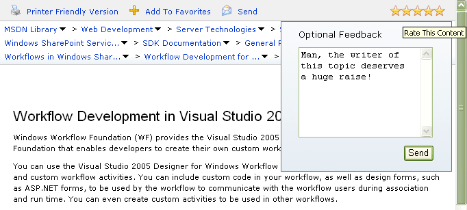
So, how do you actually rate the article and enter feedback using the new system? Simply mouse hover over the stars themselves. You can then click on the star that represents the rating you'd like to give the article. The stars then turn red to reflect the rating you're chosen (and they stay that way until you submit your rating). However, you can change your rating up until you submit it.
In addition, the Optional Feedback form opens, enabling you to send us detailed comments on the article.

When you're done, just click the Send button to submit your rating and comments.
As under the old system, you only get to rate an article once. If you hover over the rating on an article you've already rated, you'll get a tooltip to that effect.
One thing I do wish MSDN had retained from the old system was the graph at the end of each article that told you how many people had rated the article, and showed their raw rating scores. As an MSDN user, I found this information very helpful in deciding whether or not to invest my time in reading longer articles.
After all, this:
Tells a much different story than this:
Even though they both result in an article rating of 4.5 (under the old scale). The first tells me that only two people rated the article, one of whom was very pleased with it (and one who might just be a troll rating everything a 1.) The second tells me that a statistically significant number of people found the article of limited utility. This could be good information for a reader to have before reading a 20 page article.
In any case, another cool new feature is the improved 'breadcrumb' functionality. (The term 'breadcrumb' refers to the hierarchical list of pages/nodes you've had to traverse to get to your current location in the MSDN library.) Now, if you hover over an entry in the breadcrumb, you'll get a hot-linked list of the topics/nodes at that same level in the MSDN library table of contents. I think this is going to make our SDK content a lot more discoverable/navigable in the future.

I'd be interested in what you all think of the new system.
Comments
- Anonymous
June 09, 2008
One of the things I've wanted to do on this blog is give people a clearer view into how we actually produce

