Azure Cost Management
A Microsoft offering that enables tracking of cloud usage and expenditures for Azure and other cloud providers.
2,546 questions
This browser is no longer supported.
Upgrade to Microsoft Edge to take advantage of the latest features, security updates, and technical support.
' cx='32' cy='32' r='32' /%3E%3Ctext x='50%25' y='55%25' dominant-baseline='middle' text-anchor='middle' fill='%23FFF' %3EM%3C/text%3E%3C/svg%3E)
hi
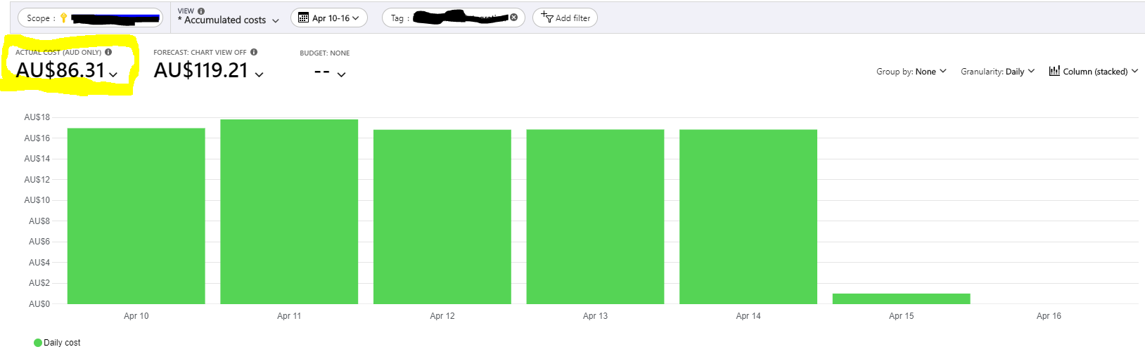
I've created a bar graph and that's ok when I pin it to the dashboard. I also want to pin the widget in Yellow, but when I pin this widget in to the dashboard it change to bar graph!!(so I have 2 same bar graph )
can anyone help me how can I have this two visual as when I pin them in the dashboard
Also is there anyway to create this widget separately? base on a specific criteria
Thanks
Very much appreciated Sadigh,
The other issue that I have is that the cost analysis dashboard is being calculated based on the UTC time zone. Is there any chance to change the calculation based on local zone or AEST not UTC.
when I am in my dashboard I've changed the time zone to local but nothing happened.
Thanks in advance

@Mahriz Currently, all our cost data is emitted and stored in UTC time zone. We are still evaluating on our end how to move forward to enable switching from UTC to local. However, there is no defined ETA to share publicly.
----------------------------------------------------------------------------------------------------------------------
If the response helped, do "Accept Answer" and up-vote it
' cx='32' cy='32' r='32' /%3E%3Ctext x='50%25' y='55%25' dominant-baseline='middle' text-anchor='middle' fill='%23FFF' %3EMW%3C/text%3E%3C/svg%3E)
We are still evaluating on our end how to move forward to enable switching from UTC to local.
how about this feature? any update?
@Mao, Wenjun (SEC) No update yet!
@Mahriz Thank you for your post and I apologize for the delayed response!
The feature we support in Cost Analysis would allow the users to pin the complete overview that’ll remember the scope and the filter selection to the dashboard. It appears you are interested in pinning just the Actual Cost widget that is not supported currently.
Alternative I can suggest is to change the view to just “Table” and no Group By/Granularity and pin that into the dashboard which will project the “Cost” but that’ll not look pretty. Will share if there is any better alternative.
----------------------------------------------------------------------------------------------------------------------
If the response helped, do "Accept Answer" and up-vote it
Thanks for your reply,
Generally is there any way to create a widget or card that can shows only the $ value of something! and then pin that card or widget to the dashboard.
@Mahriz No, this isn’t supported today. It’s in our backlog, but we don’t have an ETA. As a workaround, you can set granularity to None and you’ll get a bar chart with a single column that shows the total.