Excel Trying to make temperature vs. time graph but not coming out correctly

Harper 26 Reputation points
2021-07-29T22:02:47.543+00:00

Hello all, currently I am attempting to plot temperature vs. time. However, whenever I try to plot my data, it keeps coming out like below. How can I fix this?
119086-image.png

Excel Management
Excel Management
Excel: A family of Microsoft spreadsheet software with tools for analyzing, charting, and communicating data.Management: The act or process of organizing, handling, directing or controlling something.
1,705 questions
{count} votes

Accepted answer
  1. Viki Ji_MSFT 4,446 Reputation points
    2021-07-30T08:18:29.363+00:00

    @Harper ,
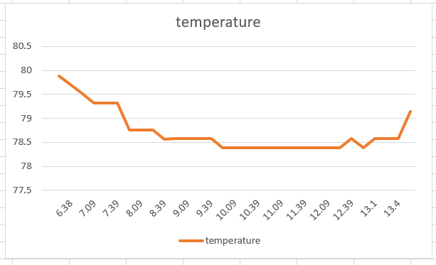
    Based on your description, I think you may need to re-select data for your chart.

    1. Please back up Excel file, and then remove and re-create a new Line chart.
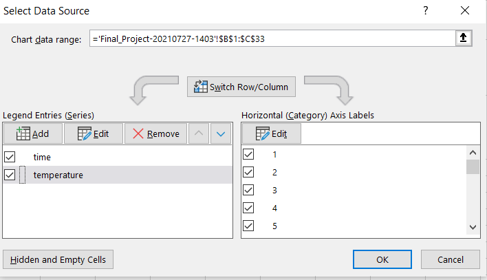
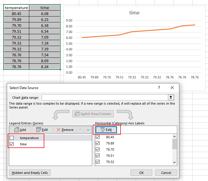
    2. Select the chart, and go to Chart Deign tab, click Select Data.
    3. Edit Legend Entries and Horizontal Axis Labels as needed.
      119289-image.png
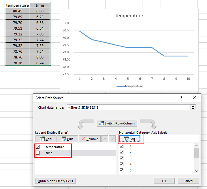
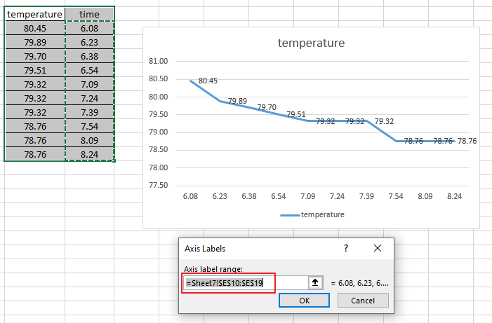
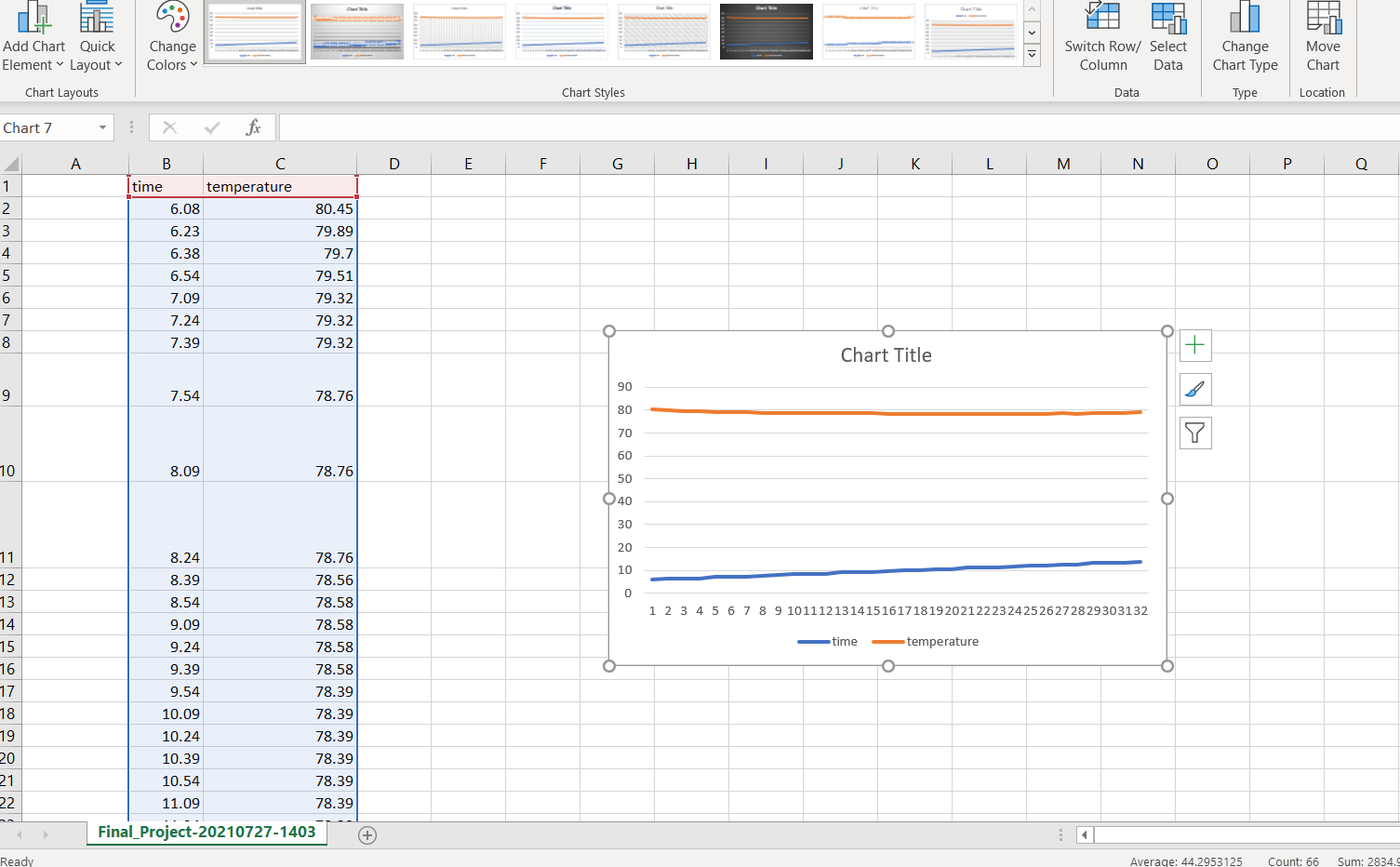
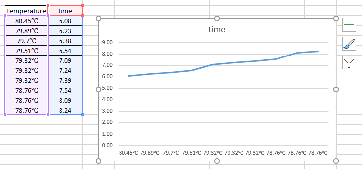
    4. Click Edit. In my test, I set the time column as the horizontal axis label.
      119304-image.png

    Besides, I found this Customize charts Video, you could also have a look.

    Hope the information could be helpful to you. Any updates, please let me know.


    If an Answer is helpful, please click "Accept Answer" and upvote it.
    Note: Please follow the steps in our documentation to enable e-mail notifications if you want to receive the related email notification for this thread.


2 additional answers

Sort by: Most helpful
  1. Harper 26 Reputation points
    2021-08-03T20:27:23.867+00:00

    @Viki Ji_MSFT This worked and I finally got the graph I wanted. Thank you very much for taking your time to help me figure out my problem, I really appreciate it.
    120302-image.png


  2. tvirgil2 1 Reputation point
    2022-10-27T08:28:01.203+00:00

    Need to show status for a simple project schedule with a Gantt chart? Though Excel doesn’t have a predefined Gantt chart type, you can create one using this free template: Gantt project planner template for Excel
    Microsoft 365 subscription offers premium Gantt chart templates designed to help you track project tasks with visual reminders and color-coded categories. If you don't have a Microsoft 365 subscription or the latest Office version
    To create a Gantt chart like the one in our example that shows task progress in days:
    Select the data you want to chart. ...
    Click Insert > Insert Bar Chart > Stacked Bar chart.
    Next, we'll format the stacked bar chart to appear like a Gantt chart. ...
    If you don't need the legend or chart title, click it and press DELETE.

    0 comments No comments

Your answer

Answers can be marked as Accepted Answers by the question author, which helps users to know the answer solved the author's problem.