Windows Presentation Foundation
A part of the .NET Framework that provides a unified programming model for building line-of-business desktop applications on Windows.
2,762 questions
This browser is no longer supported.
Upgrade to Microsoft Edge to take advantage of the latest features, security updates, and technical support.
' cx='32' cy='32' r='32' /%3E%3Ctext x='50%25' y='55%25' dominant-baseline='middle' text-anchor='middle' fill='%23FFF' %3EN%3C/text%3E%3C/svg%3E)
I have a few ToggleButtons where I'm setting a Trigger to give their Content a check when IsChecked is True. This works but for only one ToggleButton at a time. The last ToggleButton has a check by default but as you check the different ToggleButtons only one at a time is checked. No idea why.
Here's my code:
	<StackPanel>
        <StackPanel.Resources>
            <Style TargetType="{x:Type ToggleButton}">
                <Style.Triggers>
                    <Trigger Property="IsChecked" Value="True">
                        <Setter Property="Content">
                            <Setter.Value>
                                <Viewbox Margin="2">
                                    <ContentPresenter Content="{StaticResource ResourceKey=IconCheckmark}" />
                                </Viewbox>
                            </Setter.Value>
                        </Setter>
                    </Trigger>
                </Style.Triggers>
            </Style>
        </StackPanel.Resources>

        <ToggleButton />
        <ToggleButton />
        <ToggleButton />
        <ToggleButton />
    </StackPanel>

You can try my style for the ToggleButton:
 <StackPanel.Resources>
            <Style TargetType="{x:Type ToggleButton}">
                <Setter Property="Template">
                    <Setter.Value>
                        <ControlTemplate TargetType="ToggleButton">
                            <Border Background="{TemplateBinding Background}">
                                <Grid>
                                    <ContentPresenter x:Name="content1" Content="not selected" HorizontalAlignment="{TemplateBinding HorizontalContentAlignment}" VerticalAlignment="{TemplateBinding VerticalContentAlignment}"/>
                                    <ContentPresenter x:Name="content2" Content="SELECTED" HorizontalAlignment="{TemplateBinding HorizontalContentAlignment}" VerticalAlignment="{TemplateBinding VerticalContentAlignment}"/>
                                </Grid>
                            </Border>
                            <ControlTemplate.Triggers>
                                <Trigger Property="IsChecked" Value="True">
                                    <Setter Property="Background" Value="DimGray"/>
                                    <Setter TargetName="content1" Property="Visibility" Value="Hidden"/>
                                    <Setter TargetName="content2" Property="Visibility" Value="Visible"/>
                                </Trigger>
                                <Trigger Property="IsChecked" Value="False">
                                    <Setter TargetName="content1" Property="Visibility" Value="Visible"/>
                                    <Setter TargetName="content2" Property="Visibility" Value="Hidden"/>
                                </Trigger>
                            </ControlTemplate.Triggers>
                        </ControlTemplate>
                    </Setter.Value>
                </Setter>
            </Style>
        </StackPanel.Resources>
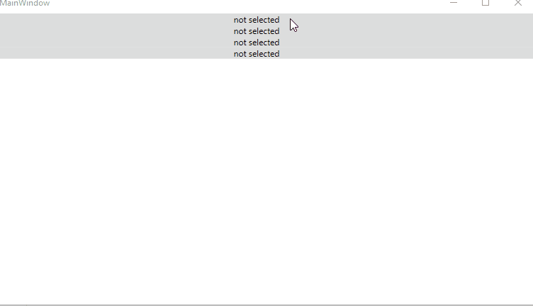
The result is like this:
If the response is helpful, please click "Accept Answer" and upvote it.
Note: Please follow the steps in our documentation to enable e-mail notifications if you want to receive the related email notification for this thread.

Hi Daisy,
your code doesn't work properly if you use resource for content:
      <StackPanel.Resources>
        <Label x:Key="IconCheckmark" Content="IconCheckmark - checked"/>
        <Style TargetType="{x:Type ToggleButton}">
...
                    <ContentPresenter x:Name="content2" Content="{StaticResource IconCheckmark}" HorizontalAlignment="{TemplateBinding HorizontalContentAlignment}" VerticalAlignment="{TemplateBinding VerticalContentAlignment}"/>