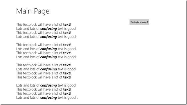
The “Light” theme for Windows store apps
I was recently talking to a developer working on a Windows store app and he said: “Dude, why the dark background for the apps? Shouldn’t Windows 8 apps be a bit brighter and cheerful? I had to show a good amount of text in my app, so I ended up setting the background to white and foreground to black on the various UI elements and it’s awful! Buttons don’t work as expected, they disappear when I do a mouse-over!”
He was pretty frustrated and I could imagine many others potentially facing this issue.
The solution is surprisingly simple, though!
Open your App.xaml file and set the application’s “RequestedTheme” property to Light.
And we’re done!
Undo all the hardcoded backgrounds and foregrounds on all the UI elements – leave them to the defaults and you’ll have a light background with dark UI elements!
The light theme is generally recommended for apps with a lot of text.
Thanks for reading!
Amar
PS: You can follow me on twitter at “_amarnit”, where I share some quick tips/learning at times!
Comments
- Anonymous
November 27, 2012
simple and very useful - Anonymous
November 27, 2012
Simple but good! - Anonymous
November 27, 2012
Also add the HTML side of the story. ui-light and ui-dark - Anonymous
November 30, 2012
Very useful! Thanks for sharing. - Anonymous
December 11, 2012
Thanks all, and glad that you liked it!Wriju, yes, will write another post on Blend for HTML/JS - thank you for the suggestion and inspiration :)

