A Little Bit of Personality
Greetings! Based on the data we’re seeing we know a lot of folks on MSDN/TechNet/Connect are probably busy using the RC (Release Candidate) for Windows 7. Thank you!!! And of course many folks are looking forward to downloading the RC and using it as we expand the downloads—we’re looking forward to the participation and seeing the data that will help us validate the RC. We’ve talked about making sure that you are “in control” of Windows 7 and one of the ways that people are in control of their PC is to personalize the experience. With the RC you’re going to see some of the new personalization “elements” in Windows 7. In this post, Denise Trabona and Samuel Moreau of our product design team provide a behind the scenes look at some of the work. Be sure to check out the links below the images as you can see a lot more work by these talented artists. Note, these are just thumbnails for this post so be sure to enjoy the full screen images in the RC. --Steven
PS: Just a reminder, that just as with the pre-beta and beta we’ll be testing out Windows Update and the system for doing patches and updates. So along with new drivers you might also see some other updates flowing through the system.
One of the most exciting parts of engineering Windows 7 has been the wide variety of work that gets done over the course of a full product cycle. As evidenced by the variety of topics just in this blog, one can see that we are hard at work at all levels of the product. For fun, we thought folks might enjoy hearing some of the story behind the new personalization work in Windows 7.
As some folks have noticed, we are unveiling some new personalization content (wallpapers, glass colors and sounds schemes) in the RC build which allows people greater flexibility to personalize their experience. One thing we know is that Windows users love to express themselves by changing the desktop background and like many past releases, Windows 7 includes content in the box that allows you to begin customizing your experience immediately.
A picture speaks a thousand words
In developing the personalization features, we knew that we wanted great content for people to express their personal style. Because the desktop background is such a vibrant surface, we wanted to focus on providing quality content that demonstrated how creative people could be with this feature. When folks send us screenshots using the feedback button, we are regularly inspired by the rich diversity and personality of the wallpapers that people choose.
As we thought about how we wanted to approach personalization in Windows 7, we knew one way was to honor our lineage. In the past photography has been featured heavily Windows. Some of that photography has been quite beautiful and has become a proud tradition we wanted to maintain. In addition, we also wanted to explore new territory and expand our visual palette. In the realm of photography, we kept a theme focused on landscape photography which is our tradition, but added new themes for architecture and nature. Much of the this imagery is from our stock imagery partners, but we also had the good fortune to work with a talented local photographer named Will Austin, who has photographed all over the world on many subjects with an emphasis on architecture. Will’s photos provide a little bit of the local flavor of the Seattle area that we are proud to call home.
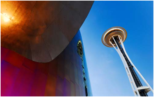
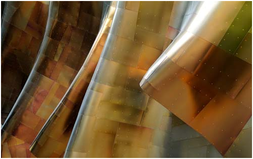
Raising the bar of inspiration and delight
With the photography covered, we tried to broaden our coverage to include additional images that would inspire, delight and invigorate people’s imaginations. We wanted to stretch into some new content that felt unique, timely, and with a distinct point of view. Our goal was content that balanced the timelessness of great photography with graphical illustrations that are energetic, modern, and fresh. On top of it all it was also important to achieve a rich variety in the illustrations to appeal to different tastes, genders and ages, color ranges from quiet to loud, and from large compositions to small and detailed.
Inspired by our neighbors in Zune, we worked with an agency called 72 and Sunny to search for illustrators around the world to create one-of-a-kind art work for you to have in Windows 7. In the process of looking through tons of samples, we sought a group of artists whose styles seemed both incredibly varied, to cover the broad diversity we were after, and maintained a common thread that we felt was applicable to the overall tone we were striving to achieve. Then began the fun part, with little more than some simple guiding words (light, energetic, inspiring, optimistic, etc.), the artists went off with a blank canvas to create concept sketches of their original pieces.
Iterate and refine
We still remember the first chance we got to review the artist’s initial sketches and concept work, and right from that moment, we knew that these images were going to be a lot of fun. The next step was to iterate back and forth a few times to make sure certain goals were achieved and get little details just right. For example, a couple of things that were important to us were how the image flowed under the new task bar and striking the right balance between visually compelling, and not too distracting when it came to finding that important file on your desktop. It’s tricky to find the right balance and we were fortunate to have an amazingly talented set of artists and our friends at 72 and Sunny to work with on this project.
Windows is for the whole world
Finally, we wanted to recognize the global audience of Windows by seeking out illustrators with varied backgrounds and styles with the intention of representing and appealing to people all around the world.
With that, we are honored to introduce the amazingly talented artists and the work that they contributed to Windows 7 personalization.
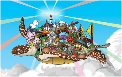
Yuko Kondo
From Japan, now resides in London, England
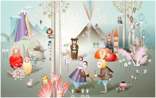
Katharina Leuzinger
Born to Swiss and Japanese parents in Zurich, Switzerland, Katharina Leuzinger now resides in London, England
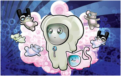
Osmand Nosse
Wicklow, Ireland
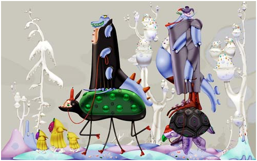
Klaus Haapaniemi
From Finland, now based in London, England
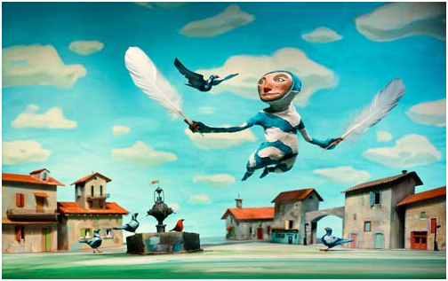
Chris Sickles of Red Nose Studios
Indiana, United States
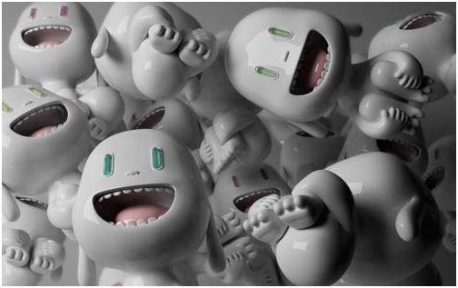
Punga
Buenos Aires, Argentina
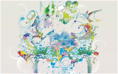
Pomme Chan
Born and educated in Bangkok, Pomme Chan now resides in London, England.
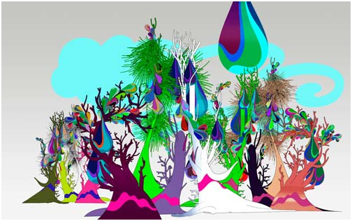
Kustaa Saksi
Amsterdam, Netherlands
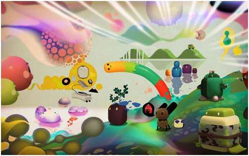
Paul Hwang and Benjamin Lee of Nanosphere
Los Angeles, California
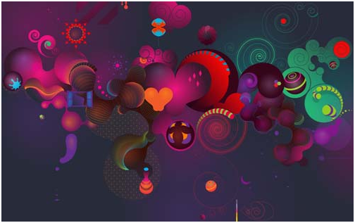
Adhemas Batista
From Sao Paulo Brazil, now resides in Los Angeles, California
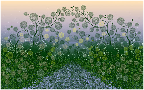
Kai and Sunny
London, England
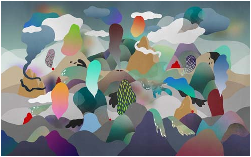
Nan Na Hvass
Born to a Danish father and Chinese mother in Swaziland, Africa, Nan Na Hvass now resides in Copenhagen, Denmark.
We hope this post has given you some insight into the Windows 7 content. We also hope that we achieved the goals we set out for ourselves with this element of Windows 7.
-Denise Trabona and Samuel Moreau
Comments
Anonymous
May 02, 2009
The comment has been removedAnonymous
May 02, 2009
Overall, the work of the Windows Development team has been fantastic. You have turned out a release candidate that is fast, fun, and exciting. Great job!!Anonymous
May 02, 2009
update all previous-version ICONs to win7style Problem: Many ICONs is previous-version (vista style). The style of these previous-version icons does not match that of the new version. Solution: update all previous-version ICONs to win7style screenshot: http://www.windows7taskforce.com/thumb/icons_need_update1.png/x/560Anonymous
May 02, 2009
I don't really like a few of the artworks. Then again, not everyone likes everything. It'll be interesting to see how well these new types of wallpapers take on.Anonymous
May 02, 2009
The comment has been removedAnonymous
May 02, 2009
For the first time since Windows 98 I'm using default wallpapers and I'm quite surprised about all these negative comments. While the "Scenes" pack was not to my taste, all others are awesome. The "Characters" pack was a hit on Digg.Anonymous
May 02, 2009
Hey, I like that Windows is getting a bit more personality. It could use some humor, too. I remember many years ago when I was installing Red Hat Linux for the first time, the installation was naming the different packages that were being copied over, and each one had a description. Some of the descriptions seemed pretty funny, and I thought to myself, "you won't see that in Windows." I know that since Windows has such a large audience, there's a need to be careful about perception differences between cultures. But anyone who gets offended by the backgrounds above needs to get a life.Anonymous
May 02, 2009
Speaking of personalization, you really need to fix it so when in Aero Glass mode, a user can still set the colors of menus running in Legacy apps. The default baby blue color you guys have chose is very annoying. I'd like to make it so my legacy apps use the old WinXP Zune Theme colortable.Anonymous
May 02, 2009
I really love the personality that's being added into Windows 7 along with all the other work!! The abstract and unique designs provide users with more choice and can tailor to just about anyone. The designs don't need to appeal to all, but knowing that their is a large selection is assuring that Microsoft is focusing their attention to the user. Good work!Anonymous
May 02, 2009
Much like many people that have commented, i am delighted that Microsoft is 'gettin' some personality', and i am equally surprised at all the negative comments.. Personally i think the larger selection of wallpapers is a really good thing, and i know that when i download the RC i will be using one of the default. Although, i must agree with 'fuchueh'.. i was expecting some new icons as well.. when i first upgraded to Vista the new icons where dazzling and exciting, can everyone expect the same from Windows 7?Anonymous
May 02, 2009
sorry, but putting a picture on the desktop doesn't constitute "personalizing" to me. anybody can put a picture on the desktop, who cares? what about being able to put the ie icon on the desktop? how about getting rid of full row select? or the ability to have explorer windows open in the size i want them, instead of the size "you" want them (all he same size)? why do you block the ability to change the version number of an xls file in file properties and allow it for an xlsm file? this is customizing the os to my needs, not some stupid picture on the desktop, or any other useless aero effects.Anonymous
May 02, 2009
The comment has been removedAnonymous
May 02, 2009
Okay... YES, YES, YES!! I love this!! Finally :) !! On a side note, I still woulda loved a tweaked UXtheme.dll to the XP-extent, but as long as things become flexible, let's see how things might turn out? Oh, and think that there might be options that turn Explorer.exe into a WINDOWS-ONLY manager? We have a desktop, but no icons (no constant managing needed for it), and I do believe it saves resources. I believe Ubuntu's Openbox windows manager does this, and let me say, it is so much speedier than even XFCE (due to the nature of desktop-vs-window managers). Overall, amazing job. And please, pass on a congrats from me to the photographers. I like how you guys are expanding your horizon -- maybe now MS notices that we aren't all inert and apathetic users ;) ?Anonymous
May 02, 2009
I honestly don't see much here. Wallpapers, sounds, cursors, icons could have been done since XP. Glass Color in Vista. The only major difference is slideshow and the shipped content. Why not make MSStyles for the themes. For example. The Architecture theme: Make an architecture type MSStyles.Anonymous
May 02, 2009
I like that you're adding something less...corporate.. as far as backgrounds go. Total side note, any idea what happened to the Microsoft Generic 802.11b/g/n USB driver in the RC? It was in the earlier beta builds but it seems to have disappeared (which seems odd..)Anonymous
May 02, 2009
The comment has been removedAnonymous
May 02, 2009
The comment has been removedAnonymous
May 02, 2009
Like some of the other posters here, I am a bit skeptical about the addition of this kind of artwork. At least two of those artworks - those by Klaus Haapaniemi and especially the one by Punga - come across as creepy rather than pleasant. They certainly don't look neutral and IMO are not something that should be included by default. I also must concede that one of the posters (the one with the long name) is right - I do not quite see the point of adding many wallpapers by default at all. There certainly is no lack of suitable, free, beautiful wallpapers on the web. Anyone interested in personalizing his desktop will most likely find his pick there.Anonymous
May 02, 2009
The comment has been removedAnonymous
May 03, 2009
Well, Windows 7 themes are cool and will be no lesser hit than Windows 98 themes =). Would we get finishing touches on icons? It could be pretty nice if main icons (like My Computer, Recycle Bin, Folder, etc) were slightly restyled like Windows Update icon was. That will make Windows 7 less like Vista :).Anonymous
May 03, 2009
The comment has been removedAnonymous
May 03, 2009
The comment has been removedAnonymous
May 03, 2009
We might distinguish between customization and personalization. This post is about personalization--like picking the color of a car, bumper stickers, and so on. Customization is more like putting on different shocks, new wheels, changing out engine parts. Windows supports both of course, and pretty extensively. Personalization is "to change something to reflect personality". Customization is "to alter something to make it fit somebody's wishes". Of course one person's customization might be another person's personalization and we definitely understand that. There are many places where we know people want to do more and more to alter Windows--that is to change the way it works. We're always trying to balance compatibility and robustness with the set of items that can be reliably customized. We definitely understand the feedback that some elements of customization have changed from release to release. We've also done work to listen and add some of the elements that have been discussed. Where we make engineering tradeoffs is in how much customization to provide support for because each new release we run the risk of blocking further advances as the combinatorics of what is allowed can get unmanageable very quickly. Many people have enjoyed the ability to personalize Windows and this post was about some of the work we did to allow this broad set of folks to reflect their personality in Windows. --StevenAnonymous
May 03, 2009
Oh come on! Get a real OS all of you people. The Illustrations are really, really great, but i don't think they are good wallpaper material. They are intrusive, distractive and really complex. The only things that MS gets mildly right are the ones that they copy from other OSs.Anonymous
May 03, 2009
Hi Steven Nice backgrounds, I think a lot of people are going to enjoy it. Very nice. As you can see there are a lot of people here (and on the Internet) that care about Windows 7 and that they vent a lot of anger. Mostly regarding the explorer. And yes they are right. MS should reconize that pain (mostly caused by Vista => MS) and act on that, don't you agree? This is not about engineering tradeoffs. That sounds almost like an excuse not to act. I really hope that MS listen to the comments on this blog and the other blogs to make number 7 the best ever. We don't mind 3 other rc's. Sincerly Ed,Anonymous
May 03, 2009
Well there was never a post on Windows Explorer on this blog (maybe MS didn't think the file manager was important enough). These are issues since the Vista betas that have been ignored, not a single one I've listed above (XP->Vista) has been fixed, documented in MSDN as to why the change was made or the feature was completely eliminated. @nwoolls, let me clarify some of the issues which you (and MS) might not have understood:
- Developers can only "fix" shell extensions or redesign them if a way exists. In case of Folder size, Microsoft removed the IColumnProvider interface that broke the shell extension. The replacement, the Property system was probably introduced to enumerate properties out of the process and asynchronously, rather than using shell-item specific IColumnProviders, however it doesn't have a way to display dynamic data, only metadata.
- Not everyone uses Details view and even in Details view, size is only shown in KB instead of MB or GB. Where is the size on the status bar? Why are there now two clicks required just to see size on the Details pane?
- "Network Connections" was earlier accessible from the Start menu (1 click), or right-click notification area. Same goes for connections/connection status/connection properties.
- Executing multiple actions on a set of files means selecting more than 1 item in Explorer and performing the same operation on all of them. Even if this had concerns like accidentally triggering some action, Windows XP warned the users before performing the action. Now it is removed altogether.
- In XP, search parameters could be set using a GUI. Vista reduced the customization from the UI instead forcing the user to remember the advanced query syntax, which isn't even present in Vista's documentation but instead is located online.
- Try setting your taskbar icons to "Never combine" mode and then try separating two IE windows or any two windows of the same app. Not possible in Windows 7.
- The user cannot group close applications as could be done up to Windows Vista. In XP/Vista, try holding down Ctrl and click to select multiple taskbar items. That too isn't possible under Windows 7. I am not believing everything I read on the Internet and blindly posting. These are serious usability issues several users are having everywhere since the release of Vista (a simple web search will reveal more). Why were things moved around and thrown away if they weren't broken at all?
Anonymous
May 03, 2009
I love the variety of themes in Windows 7, and customizing is one of the first things I do when I install a new version of the OS. This is my favorite Windows 7 theme, and I actually wish it was part of the OS: http://blogs.msdn.com/mswanson/archive/2009/01/25/my-windows-7-theme-pack.aspxAnonymous
May 03, 2009
The comment has been removedAnonymous
May 03, 2009
See the TURTLE of enormus girth on his back he holds the entire earth! Way to flashback on the Dark Tower series! But I hope that personalisation can be both simple and advanced, some users just change a background, while some customise WMP's colour, set a specific transparency colour then do the background to match that, then go to the toolbars etc. One question: can we have changing transparency colours to match changing backgrounds, no one wants a blue and brown system, I thinkAnonymous
May 03, 2009
""Network Connections" was earlier accessible from the Start menu (1 click), or right-click notification area. Same goes for connections/connection status/connection properties." This reflects a different philosophy of networking that was introduced with Vista -- the idea being that it's the /networks/ that you're connected to that are most important; the /device/ you use to connect to it is secondary. You really should never need to look at your list of network devices on a day-to-day basis. You're doing something really wrong (or really 1990s) if that's the case. Get your network connections set up right... and then Let It Go. If you want quick access to the Network Connections control panel on /your/ Windows 7 desktop, hit the Start button, type "Network Connections" and press Enter (or navigate to it by clicking the Network notification area icon, clicking Network and Sharing Center, then clicking "Change adapter settings"). You'll be presented with an Explorer window with your network connections. Drag the icon to an empty spot on the taskbar, and it will be pinned to the Control Panel icon on the taskbar. This will also have the effect of pinning the Control Panel icon itself to your taskbar. Now all you have to do is right-click on the control panel icon, and choose "Network Connections". That's the beauty of Windows 7.... you can pin short-cuts to pretty much everywhere in the Control Panel, and they'll all be collected in one place.Anonymous
May 03, 2009
"- The user cannot group close applications as could be done up to Windows Vista. In XP/Vista, try holding down Ctrl and click to select multiple taskbar items. That too isn't possible under Windows 7." As for this, YES YOU CAN do this in Windows 7. Hold down the SHIFT key, not the CTRL key, and right-click the grouped icon on the task bar. Also, try Shift + Right-click on taskbar icons that aren't open -- it gives you the context menu for the application's shortcut icon, including an option that's never been so easily accessible in Windows before -- "Run as different user". Fabulous.Anonymous
May 03, 2009
The comment has been removedAnonymous
May 03, 2009
Okay, i think everyone has lost sight of what everyone is talking about.. This post is about wallpapers and themes and people are arguing about not being able to get to Network Connection in one click.. Microsft is getting some attitude, which is very good, i really want to see how far that will go.. and while yes, Windows doesn't let the user customize (or personalize) EVERYTHING it still has many options which both novices and (so i would assume) pro's alike can use and enjoy, so instead of complaining you could A) Enjoy what we have - which is an absolutly brilliant operating system, which does have alot of useful features, BUT could still be inproved or B) If you are really that urked about not being able to see the folder size the way you want, or not being able to get to Network Connections with a single click; don't complain here, email someone (Steven perhaps?) and suggest these ideas, get your ideas heard. Oh, and i saw someone mention something about 'pain' .. well i daresay that it isn't easy to make and OS to please millions of people..Anonymous
May 03, 2009
My opinion: It's nice to see more effort put into the way an 'average' user sees and customises their desktop. Personaly I find it to be quite a nice experience using the Windows 7 personalisation features. It was very surprising to find out that my desktop wallpaper changes by itself (I'm a bit thick, obviously, because I never noticed the feature until it changed by itself). My compliments to the Windows 7 Development Team for creating something that I believe the masses will flock to and love. Keep up the innovation and good work.Anonymous
May 03, 2009
I could not agree more with you guys on the file manager. I have tried switching to vista, and even win7 multiple times but I leave it for XP every time because the file manager is just unusable. If there was a way to bring back the XP explorer or something similar I would consider switching, but until that happens I'm sticking to XP.Anonymous
May 03, 2009
Have to say I agree with dsmtoday about the icky menu background color in Win7. Unfortunately it's unchanged from Vista -- the same purple-tinted blue, ever so slightly different than the blue used by Explorer's toolbar. It looks even worse on apps like Firefox that try to do the dutiful thing and use the proper system themes. For whatever reason, a slightly different color -- one that looks good -- is used when viewed over remote desktop. Any chance that you can swap in this better color for normal usage?Anonymous
May 03, 2009
Please don't listen to the naysayers. It's great that you finally give the subject more thought, and obviously the wallpapers you show here are varied, so nobody is going to like all of them. Good job.. Perhaps you could create an application (or a tab in some kind of Windows Marketplace app) that would let users share their backgrounds?Anonymous
May 03, 2009
The comment has been removedAnonymous
May 04, 2009
AFter upgrading from Vista Ultimate to Windows7 RC1, if you click on "All Programs" in the Start menu it is empty. Where's my workaround:
- Click on the Start Menu.
- Right Click on All Programs.
- Select Open All Users.
- Open the Programs Folder.
- Create a new folder named A.
- Drag all the other folders into the A folder.
- Close Windows Explorer.
Anonymous
May 04, 2009
Lots of negativity overshadowing the cool artwork on here, congrats to the artists for some excellent work and to Microsoft for taking this initiative. I agree they're all a bit too distracting to use as wallpapers, but then I'm often a solid-color wallpaper guy anyway. Back to the negativity; it is a bit annoying to see Microsoft considering wallpapers to be a way of offering customization. Even without going as far as one of the excellent open-source window managers from the Linux world, we should still be able to change the shape, size and behaviour of a lot more things, at least to the extent you could in older versions of Windows. I shouldn't have to swap DLLs and whatnot just to re-skin things. "Glass color" is a start though.Anonymous
May 04, 2009
It's been pointed out to me that the "shift-right-click" functionality in Windows 7 is not quite the same as the "ctrl-right-click" functionality in Windows XP. Ctrl-click in XP lets you select multiple taskbar icons and perform the same action on them (i.e. treat them as a group), whereas Shift-click on a single grouped taskbar icon gives you the group actions for that icon.Anonymous
May 04, 2009
@Eric Duran, re "It is borderline insulting to dedicate a post to personalization when key customization features are missing." I consider myself a power user of my PC, and nothing you listed are considered "key customization features" to me. Stating things that you think are important do not make them important; this is known as an "I am the world" logical fallacy. There are a number of usage cases for PCs equal to the number of people who own. Features don't exist until they're made, and when existing features have been replaced or superseded, they are removed. Engineering software is an exercise in trade offs: you can't have everything and the kitchen sink and still ship your product. @Warrens: bravo. As a follow up: changes to core systems (like the taskbar) can't always have no changes between versions. Example: TheDesperationOfAntiMicrosoft's your logic, we should not have the windows key after going from 3.1 to 95, and Ctrl+Esc should suffice for all time. If "power users" can't re-learn moving your hand one quarter inch to the left and pressing a different key to use a key combination that I would suspect 99% of windows users have NEVER heard of or used before, not upgrading is an option. Or those same power users can use many of the excellent benefits that the changes to the taskbar have given us along with the minor changes to key combinations, and have the best of both worlds. @commongenius, re "Focus stealing apps": The only apps that can bring programs to the foreground are ones that have already been given permission to bring apps to the foreground. You, the user, have to give those apps permission. The primarily way is by having them selected. If you hate apps that steal your focus, then don't use those apps. If you don't have a choice, it's not Windows' fault that your system administrators installed those apps on your PC and gave them the permission to do it.Anonymous
May 04, 2009
I would love to see a simpler and darker wallpaper featuring the windows logo for the minimalist Win7 fans :)Anonymous
May 04, 2009
I think that this move is bold and fantastic. Some of the pictures look very... Katamari-esque, to be a gamer about it, but there's nothing stopping anyone from using their own images. The photography from Microsoft and its partners is as awesome as ever, and I'm proud to see such fine-quality imagery in my OS of choice. I know it would probably require more lawyers than you care to think about, Steven, but I would love to see a contest where everyday users like me can submit a picture and one picture is chosen to be included with Windows. (Or maybe one per region). I'd be honored to have a picture I took be a part of Windows. One last thing: I love all of the customization in Windows. Now, can I please make the Start Menu MORE transparent and glass-like? It seems darker in the RC than it was in Beta and I really prefer it to be clear and light and glassy. :) Keep up the good work! RC is fantastic, so far.Anonymous
May 04, 2009
Love the new artwork - lots of variety and all extremely creative!Anonymous
May 04, 2009
To the negativity complaints: I don't see anyone complaining about the quality of the wallpapers. What people are complaining about is the inclusion of "New wallpapers in Windows 7" in a blog with "ENGINEERING" in the title, with marketing fobbing us off with "personalisation is control over your Windows experience" twaddle. Rule #1 when speaking to a base of engineers: Lock marketing in a cupboard and hide the matches. @pepkaro You're totally missing the point. When the windows key was instituted (to universal disdain), Ctrl-Esc wasn't removed. Vista, however, changed a lot of learned behaviours to no benefit whatsoever - either in UI terms, structure, or architecture. Your comment about Focus stealing is entirely wide of the mark too. It IS Window's fault, because MS provided the functionality in the first place. These apps haven't been "granted" permission by the user at all - in fact, the only way to get around it was to install a downloadable registry tweaker, and all that did was switch from stealing focus to flashing madly in the taskbar. They shouldn't be given the tools to do it, and it shows a total disregard for what we, the users, want in favour of what a subset of developers want.Anonymous
May 04, 2009
@pepkaro I confess that I did not know that I could set permissions to allow or disallow applications to steal focus. If you would point me to the location where I can change those permissions, I would be forever in your debt.Anonymous
May 04, 2009
THIS IS ART!!!! Congratulation to ALL!! -DomenicoAnonymous
May 04, 2009
The W7 backgrounds are generally very nice. However please consider to add some less dramatic background as well. These vibrant backgrounds can be confusing and for some professionals (f.exp photographers) annoying. I was a bit disappointed with the explorer preview plane. It is not very useful for most case. Some detachable preview plane would be nicer. Also a bit strange thing happened. Maybe it was the same in Vista but I have not used the file explorer a long time. When I renamed a file to a name that was already existed it did not offered option to overwrite. Only to add some increment after the name. And when I renamed that file I ended up with 2 file with the same file name in the same folder with different size and date!!! Is that a bug or a feature??? Anyway pls add overwrite option.Anonymous
May 05, 2009
The comment has been removedAnonymous
May 05, 2009
I got all excited there for a minute. I thought this post would be about personalizing my window manager and it is about wallpaper. This is why windows disappoints me. Where's the info about window managers, changing window managers, configuring window managers, specifying a mouse-windows focus model, having a choice of desktops, etc. wallpaper? you can go any where on the internet and get wallpaper.Anonymous
May 05, 2009
http://www.pretentiousname.com/misc/win7_uac_whitelist2.htmlAnonymous
May 05, 2009
Thank you. We know that the powers that be either haven't read it, or are carefully avoiding it, but thank you for pointing it out again. Wallpapers are nice. Please spend more time fixing some of the massive problems that Windows still has (some of them very very old indeed) next time. Good luck with Windows 8. Hopefully it's a new, 64bit only OS rather than Vista Fixed.Anonymous
May 05, 2009
The comment has been removedAnonymous
May 08, 2009
I can't say I like all of the new wallpapers. I hope, when you release Win7, you add the old wallpapers (that came with the beta version) too. Also, when using small icons on the taskbar, the spacing between pinned links is too big. See here: http://img220.imageshack.us/img220/5190/capturep.png Really ugly, isn't it ?Anonymous
May 08, 2009
Why don't you add some icons on the context menus ? E.g. when you right click on a file, the appearing menu is huge and it has no icons at all. If it had some, it would be much easier to locate what you want to select (and it could be more beautiful too). Look at that: http://img219.imageshack.us/img219/9388/51005012.png Image what will happen aftr a few menu extnsions...Anonymous
May 08, 2009
Try this: Right click on the taskbar, choose properties, go to the "taskbar" tab and on the "taskbar buttons" make sure the "Always combine, hide labels" is selected. Then open IE8, open three or more tabs and minimize IE's window. Why when you click on taskbar button for IE8, IE's window doesn't get restored ? If the setting for "taskbar buttons" is other than "Always combine, hide labels", IE's windows gets restored normally. I would like to use the "Always combine, hide labels" option, but I don't, because I don't think it's working fine. Am I wrong ?Anonymous
May 08, 2009
I wonder if it would be easy to add some "tree lines" on the TreeView control of the start menu (where the programs appear). It would help a lot to distinguish what program belongs in what folder. I would also love some more customizations (generally talking). Can you also make the "Spinning Tool" open the copied image on the clipboard after the user presses the "Print Screen" button ? Generally, Windows 7 seems to be a nice piece work ! But you don't seem to take much into account any of the suggestions posted on this blog, ahhh ? :(Anonymous
May 09, 2009
OK. How about this: I am a Windows XP person. As a Win XP person I like seeing my explorer files ALWAYS in lists. However, when I set the view to list and select "Folder Options..."->"View Tab"->"Apply to folders" this setting doesn't apply to folders with images (where I get thumbnails), the desktop, etc, etc. So. What is going on ? Does Win7 have design flaws or it's just me ? Any way to see lists and only lists ? Finally, look how much better the Win7 TreeViews would look if they had a few lines: http://img206.imageshack.us/img206/3338/capture2o.png Which do you think is better ?Anonymous
May 11, 2009
The comment has been removedAnonymous
May 11, 2009
The comment has been removedAnonymous
May 12, 2009
Well, since Windows 7 will be distributed into a DVD (thus you 'll have much free space to use), why don't you put MANY wallpapers (including those presented here - I'm sure some people will use them - and the ones from Vista+XP collection), so that the user can choose from.Anonymous
May 12, 2009
Generally, I like to use wallpapers that are simple (not too many colors and usually close to uniform) so that I don't loose my icons in it... And don't forget to fix this: http://blogs.msdn.com/e7/archive/2009/05/02/a-little-bit-of-personality.aspx#9598179 Good luck with the Win7 release.Anonymous
May 12, 2009
Don't forget to fix this too: http://blogs.msdn.com/e7/archive/2009/05/02/a-little-bit-of-personality.aspx#9598140Anonymous
May 20, 2009
Come on, the new wall papers are childish. Stop pleasing the little kids who have no right to be on the computer in the first place.Anonymous
June 24, 2009
Be sure to check out the links below the images as you can see a lot more work by these talented artists.Anonymous
June 24, 2009
Finally, look how much better the Win7 TreeViews would look if they had a few lines:Anonymous
June 24, 2009
We've also done work to listen and add some of the elements that have been discussed.Anonymous
June 24, 2009
Then began the fun part, with little more than some simple guiding words (light, energetic, inspiring, optimistic, etc.), the artists went off with a blank canvas to create concept sketches of their original pieces.Anonymous
June 24, 2009
As we thought about how we wanted to approach personalization in Windows 7, we knew one way was to honor our lineage.Anonymous
August 12, 2009
When i open my personalisation window in my windows7 it says the page is not available in your edition of windows and you must do windows anytime upgrade but i have windows 7 ultimate and it has personalisation what do i do???Anonymous
August 24, 2009
Speaking of Will Austin: we just published a very cool interview with him about his work on Windows 7. You can all find it here: http://www.7tutorials.com/will-austin-about-his-trip-desktop-millionsAnonymous
August 24, 2009
Ok I know it is a little bit late for suggestion but please please wouldn't it be awesome to have a background featuring the Windows OS-Tan (http://en.wikipedia.org/wiki/OS-tan) ?? With of course Seven-Tan in front :) and in the background the previous version of windows. I'm serious : it will add a lot of personality to Seven, and people will love it just because the OS-tan are so cute :) Think of all the positive hype if you include such a wallpaper ! People starting to create fan art etc ... the biggest nerd in the worldAnonymous
November 13, 2009
windows 7 is an all around better osAnonymous
February 16, 2010
Sorry pepkaro but you totally miss the point. Focus should not be in the control of ANY program. Just like cooperative multitasking failed, it is a dumb idea. Even a UAC prompt should not steal focus. It should wait until it is addressed. The user should decide what they focus on.Anonymous
March 04, 2010
The comment has been removedAnonymous
March 05, 2010
I am SO GRATEFUL for this information. I recently started with a new company and am using Windows 7. I started to personalize my work station and came across the character options for wallpaper. I immediately fell in love with each and every one. I then wanted to find out who the artists were that created the fantastic work I have displayed on my desktops. Thank you so much for publishing this information. You're the only site that had it and I'm so thankful because now I can check out their work overall. :o)Anonymous
March 07, 2010
The comment has been removedAnonymous
March 23, 2010
I really like the pictures in this article.Anonymous
April 04, 2010
I have edited some resource files that changed the look of windows 7. I want to know that where should I submit it to Microsoft for their evaluation! I will be glad to here the comments from Microsoft on this topic! Some of the Screen-Shots are posted here>> http://picasaweb.google.com/PprrATeekK/PprrATeekKSWin702#slideshow/5446277808436158514Anonymous
April 18, 2010
I confess that I did not know that I could set permissions to allow or disallow applications to steal focus. If you would point me to the location where I can change those permissions, I would be forever in your debt.Anonymous
June 28, 2010
The comment has been removedAnonymous
December 04, 2010
Bravo! To GaryK....absolutely right!Anonymous
February 03, 2011
please does anyone know the name of the caracters in wallpaper by punga fro buenos aires? love them and wanna get pics of them but dont know the name. thankx for help on those who wanna helpAnonymous
February 03, 2011
The comment has been removedAnonymous
March 10, 2011
Yes thanks. I just launched my themes, and chose the illustrators. And was very enthusiastic to learn who they were.Anonymous
February 02, 2012
These desktop wallpapers are so, so, awesome. I'm shocked and amazed to find them on my new Windows system- compared to the more traditional ones of the past. Good work creative team!Anonymous
July 09, 2012
Got a new computer with Windows 7. This wallpaper art is fantastic! Very creative and cool. Thanks for identifying the artists also and giving their work some mass exposure.Anonymous
February 09, 2013
Like "Punga" above, I chose those cute little "tumbling" characters for my wallpaper. But, can anyone tell me what those characters are? Are they from a cartoon? A movie? Another planet?Anonymous
June 18, 2014
The comment has been removed