Automation Foibles Unveiled: Coding Guidelines Part 1 - Basic Layout
It has been awhile since I have written about test automation, so I thought I would start the new year off with a post about test automation. More specifically, I wanted to start talking about coding guidelines. Just as many development teams have adopted coding standards and guidelines the test team should also adopt a set of guidelines and standards for all testers to follow when developing test automation. Some teams have coding standards and guidelines, but some teams just sort of wing it. Of course, those teams that just sort of wing it and allow developers the freedom to develop their own style of coding soon realize the cost of reviews and maintenance increase. Sloppy coding also increases the probability of subtle defects that may go unnoticed. Coding standards or guidelines are not (or should not) restrict a test developers creativity; but consistent coding standards and guidelines improve the efficiency and effectiveness of code reviews and sustained maintenance (which is often performed by someone other than the person who wrote the original code).
This week I want to start by talking about problems with various coding styles in source files such as indentation and general layout issues that make code more difficult to read. Readability is important for efficient code reviews, and when the code is later maintained by someone other than the person who originally wrote the code to begin with. There are many coding standards and guidelines that a team can and should adopt and I plan to discuss various guidelines over time, but for this week I thought I would introduce some commonly accepted guidelines that improve the readability of code by adopting a consistent layout.
Indentation
- Set the indentation or tab size to 4 characters in width
I have seen people set the tab size to as small as 2 and in some rare cases to 3 for some bizarre reason. But, 4 characters in width seems to be the standard tab size, and an additional 2 characters per line is really not going to make that much of a difference, and I think it improves readability of the code by clearly indenting blocks. (I really don't want to get into a long debate about 2 or 4 spaces; the point is that the team should use a consistent indentation size.) - Use spaces instead of tabs
This is often controversial, but spaces are recommended over tabs for a variety of reasons. One reason why one should use spaces instead of tabs is for consistent layout and readability in a variety of editors. Many text editors interpret tab stops differently, and occasionally the editor a reviewer uses to look at source code may be different than the source code editor used by the developer causing the line formatting to change radically. For example, when I need to take a quick look at a .cs file I will often open that file using Notepad instead of launching Visual Studio. Sure, I don't get the pretty colors and such, but it's a lot quicker! (Again, I don't really want to get into a debate about tabs vs. spaces. That subject has been beaten to death on the Internet and there are pundits on both sides of the fence. If file size is a really critical factor than tabs will reduce the overall physical file size in bytes. If readability in different editors is important, or if restricting the use of the 0x09 character code point control code in your source code is important the use of spaces is preferential. Again the important point would be consistency within the team.)
To setup these settings if you are using Visual Studio (including the freely available Visual Studio Express editions)
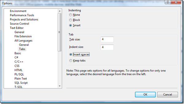
- Select Tools -> Options... menu item
- Select Text Editor -> All Languages -> Tabs item in the Options tree control
- Set the indentation to Smart.
- Set the tab size and indent size to 4
- Select Insert spaces (or Keep tabs; whichever standard your team adopts)
Line length
- Do not extend lines beyond 80 characters in length
Occasionally, developers will simply write a statement that extends well beyond the viewing area of the editor window forcing reviewers to scroll. Or worse yet, when opening a file in Notepad or some other simple text editor the line wraps (if word wrapping is selected) around causing the layout to become quite confusing to the eyes. Word wrapping also becomes a problem when printing source files for review. Either way extending lines beyond 80 columns looks sloppy and makes readability more difficult.

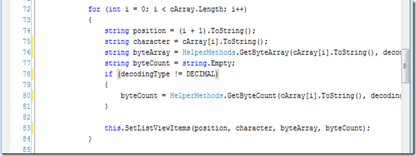
Notice lines 76 and 80 extend well beyond 90 characters. If this source file was printed lines 76, 80, and 83 would wrap to the next lines on the page starting from the left margin impacting the readability of the file.
The column (or character count) per line is usually displayed in the status bar of an IDE, but for Visual Studio (including Visual Studio Express editions) a simple registry setting provides a visual guide in the IDE. The visual guide in the IDE means that I don't have to look at the status bar to see where my column count is, or go back later and reformat lines after I am finished coding a method or class.

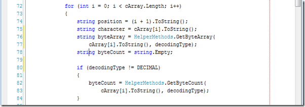
Notice the red dotted line on the right hand side of the code window set at a column width of 80 characters.
To setup these settings if you are using Visual Studio (including the freely available Visual Studio Express editions)
- Select Start -> Run menu item
- Type regedit in the Open control on the Run dialog and press OK
- In the Key tree control select HKEY_CURRENT_USER | Software | Microsoft | Visual Studio | [version] | Text Editor
- Right click in the value pane and select New -> String Value from the pop up menu
- Rename the new value Guides
- Right click on the Guides value item and select the Modify... menu item
- Type RGB(255, 0, 0) 80 in the Value data textbox on the Edit String dialog
I also prefer to display line numbers. This makes it a bit more convenient when doing things such as Finding All References to variables.
In subsequent posts I will discuss additional coding guidelines, but these are just a few ideas to get the discussion started. If you have additional ideas on layout then please let us know!
Comments
Anonymous
January 05, 2008
PingBack from http://geeklectures.info/2008/01/05/automation-foibles-unveiled-coding-guidelines-part-1-basic-layout/Anonymous
January 08, 2008
Good post. In particular your comment that, "the point is that the team should use a consistent indentation size." Taking this one step further, a team can create a VS template for indentation, text colors, and so on as a .vssettings file (Tools | Import and Export Settings | Export) and then read from this template when VS launches (Tools | Options | Importan and Export Settings | Use Team Settings) for a consistent team environment.Anonymous
January 08, 2008
Hi James, Absolutely agree with you on the importance of a team wide VS template, especially for writing automated tests. I guess I will have to discuss that also at some point. For example, my default template for an automated test includes the System.Diagnostics namespace by default as well as the [STAThread] attribute(which was there by default in VS2003, but was removed in VS2005 for some reason). By the way, I highly recommend your book ".NET Test Automation Recipes" and plan to use it as the textbook for a new course on test automation we are planning at UW.
