Web Standards Design with SharePoint, Part 2
In the first part of this series, I explained one approach for building Web sites in Microsoft Office SharePoint Server (MOSS) 2007 based on Web standards and the 960 Grid System. I had intended on following up with a sample solution based on a fictitious company (AdventureWorks Bicycles -- which should be familiar to anyone using SQL Server).
However, two things really started to bother me as I began developing the sample:
- The sample site became increasingly complex in terms of dependencies and deployment (for example, readers interested in downloading and installing the sample SharePoint site would need to first install the sample AdventureWorks OLTP database).
- Since I was the "designer" of the Web site, one could argue that the design was "SharePoint-friendly" to begin with (in other words, the HTML and CSS used to render the pages was created in such a way that it rendered "as expected" in MOSS 2007).
While the first issue didn't necessarily seem like a showstopper, the more I thought about the second issue, the less value I saw in completing the sample -- eventually to the point where I put it on the shelf.
Fast forward nearly ten months later...
I've mentioned before that Dan Cederholm's Web Standards Solutions and Bulletproof Web Design were two of the books I read a few years ago when learning about Web standards design. If you haven't yet read these books, I highly recommend them. (Note that newer editions are available than the ones I read.)
Note that Bulletproof Web Design (at least the first edition that I read) is largely based on handling variable text size (which, admittedly, is something we don't have to worry nearly as much about these days thanks to browser "zoom" features). Nevertheless, the concepts that Dan covers are invaluable to anyone tasked with creating Web sites.
This year, I picked up Dan's newest book, Handcrafted CSS : More Bulletproof Web Design. It's a short read, but nevertheless chock-full of great tips and techniques for creating Web sites that dazzle the eyes. If you haven't read this one yet, do yourself a favor and order it today.
In Handcrafted CSS, Dan uses a sample site to explain various concepts and techniques. The site for the fictitious Tugboat Coffee Company consists of only two pages, but they are filled with lots of "bulletproof" HTML/CSS and even some "progressive enrichment" (or, as more people call it, "progressive enhancement").
A few weeks ago, it occurred to me that Dan's sample site would also make a great example for demonstrating Web standards design in SharePoint. Since it only contains two pages, deployment should be a breeze. Furthermore, the design work was done by actual "Web Designers" (i.e. Dan and his co-author, Ethan Marcotte) who -- and don't take this the wrong way -- are probably completely oblivious to SharePoint. Hmmm...perhaps a better way to say that is there's no mention of SharePoint anywhere in Handcrafted CSS ;-)
The following screenshot shows the Tugboat home page:
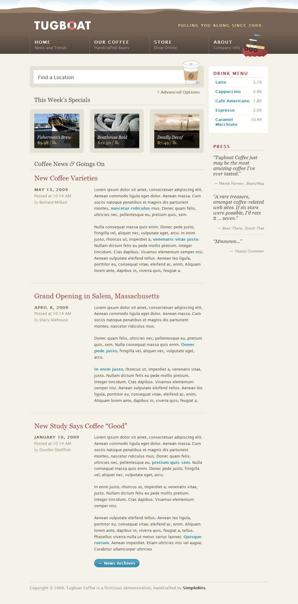
Figure 1: Tugboat - Home page
If you haven't yet read Handcrafted CSS, please take a few moments to appreciate Dan's elegant work -- or, heck, if you just ordered the book and simply can't wait to see the actual site in action, head on over to https://handcraftedcss.com and download the sample for yourself. [Note that I captured the screenshot above with the browser width set to 1024 pixels, so you won't be able to experience the site's fluid layout simply by viewing the static image above.]
The only thing that I can think of that would improve the Tugboat site -- and maybe I'm a little biased here -- is if the site were running in SharePoint ;-)
In truth, I'd really like to see the site running in SharePoint Server 2010, but I fully recognize that many of you out there may still be running the older version. Consequently, in this post, I'll provide a sample solution that deploys to MOSS 2007. You can either take the liberty of upgrading the sample to SharePoint Server 2010, or wait for me to tackle that effort at some later date ;-)
I've talked before about how I like to use "scenarios" and "interim milestones" when tackling projects. Whether you prefer to call these "user stories" (a.k.a. "product backlog items") and "iterations" (a.k.a. "sprints") really doesn't matter to me. The point is, the key to successfully delivering technology solutions -- at least in my experience -- is "biting off" a reasonable chunk that can be delivered within a short period of time.
With that in mind, the following scenario was identified for the first milestone - or, "M1" as I like to call it:
- View Tugboat home page in SharePoint
While I know the Tugboat Coffee Company would benefit immensely from a multitude of SharePoint features (e.g. using a SharePoint list to store the quotes that are shown in the "Press" section of the home page), it is typically wise to start with a simple solution and introduce complexity over time (in other words, as our project stakeholders gain confidence in our abilties to deliver on-time and within budget ;-) ).
In order to manage the Tugboat sample solution, I created a new project in Team Foundation Server 2010 (using the new Scrum template for TFS) and created a bunch of work items (partly because it's just so darn easy using Microsoft Excel and a little copy/paste). I subsequently created a new Visual Studio solution and added my "standard" list of project items (e.g. SharedAssemblyInfo.cs).
For "Sprint 1", the Development team (which is comprised entirely of one person -- me) committed to the following product backlog items:
- Home page
- Masthead
- Find Location (static HTML)
- Weekly Specials (static HTML)
- News (static HTML)
- Drink Menu (static HTML)
- Reviews (static HTML) -- i.e. quotes within the "Press" section
Here are the corresponding work items that I added to the TFS project (note that these are in addition to the "default" work items listed in my previous post):
| Work Item Type | Title |
|---|---|
| Product Backlog Item | Home page |
| Product Backlog Item | Masthead |
| Product Backlog Item | Find Location (static HTML) |
| Product Backlog Item | Weekly Specials (static HTML) |
| Product Backlog Item | News (static HTML) |
| Product Backlog Item | Drink Menu (static HTML) |
| Product Backlog Item | Reviews (static HTML) |
| Task | Create static HTML prototype for Web site |
| Task | Create minimal master page and basic look-and-feel |
| Task | Create HomeSiteConfiguration feature |
| Task | Create deployment scripts for SharePoint WSPs and features |
| Task | Create scripts to build/rebuild Web application |
The "create prototype" task was a really easy one to complete in this particular case (since Dan and Ethan did all the work already), but an important one nonetheless. When developing a Web site that will run in SharePoint, I almost always try to have a static HTML prototype that I can refer to and use for quickly mocking up new features. In general, it will be much faster to develop and refine your HTML/CSS using a tool like Microsoft Expression Web, rather than trying to do the same on a "live" SharePoint site (i.e. your local development VM) using SharePoint Designer.
Tip
I typically check the prototype in on the Dev branch (e.g. $/Tugboat/Dev/TugboatPrototype) instead of the Main branch, since it's not technically part of the solution.
The next task was to create the master page for the Tugboat site. I started with the minimal master page provided on MSDN and then applied some of the changes described in part 1 of this series, including inserting some additional ContentPlaceHolder controls just in case I ever want to use the Tugboat master page in place of application.master. Note that I added the master page in the Tugboat.Web.Publishing.Layouts feature (which is very similar to the out-of-the-box PublishingLayouts feature).
Then I added a Themes folder to the feature along with "Theme1" containing the CSS files and corresponding images from the Tugboat sample site. At this point, the Tugboat.Web.Publishing.Layouts feature looked like this:
- Publishing
- Layouts
- Themes
- Theme1
- css
- enriched.css
- ie.css
- master.css
- reset.css
- screen.css
- img
- h-bg-bottom.gif
- icon-toggle.gif
- input-bg.gif
- logo-lofi.gif
- map-shadow.gif
- css
- Theme1
- Themes
- MasterPages
- Tugboat.master
- Layouts
Note that I only included the images in the Theme1 folder that are referenced in the corresponding CSS files. (There are a number of other images in the Tugboat sample site, but there are better places to put these, depending on their usage. More on that later.)
Also note that one of my goals with the SharePoint solution was to leave the CSS developed by Dan as pristine as possible (meaning I tried to keep them as-is -- despite my desire, for example, to merge them or provide better filtering of IE-specific rules).
When I originally created the Tugboat master page, it was obvious which sections of the page would be rendered by the master page and which sections would be rendered by the actual page content. Specifically, the masthead (a.k.a. "header") at the top of the page and the footer would be included in the master page, whereas everything else is considered page content.
However, it wasn't immediately obvious how the actual page content would be specified. My first thought was to simply use the PageContentfield for the main content (i.e. Find a Location, This Week's Specials, and Coffee News & Goings On) and a Content Editor Web Part for the secondary content (i.e. Drink Menu and Press). However, there was one fundamental problem with that. Any guesses?
The Find a Location feature at the top of the page utilizes an INPUT element -- and SharePoint won't let you specify any HTML form elements in the PageContent field (even if, as in my case, you don't even care about whether the form element actually functions). Consequently I ended up creating the FindLocationWebPart in Sprint 1, although it really just emits the HTML and provides access to the map -- it doesn't actually help a coffee addict find the nearest Tugboat location ;-)
Therefore I knew that I needed a Web Part zone above the PageContent field in order to render an instance of the FindLocationWebPart.
Here is a "wireframe" I put together to help visualize the various fields and Web Parts on the Tugboat home page:
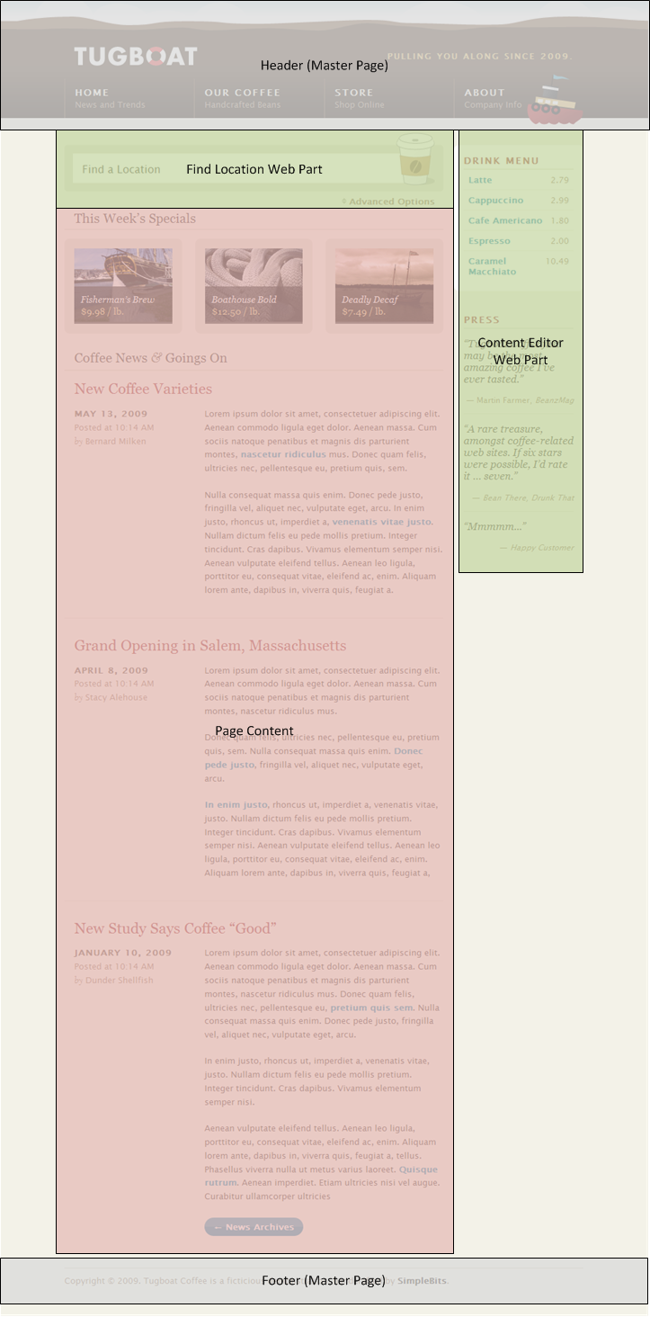
Figure 2: Tugboat - Home page (wireframe)
Next, I created a custom page layout (TugboatWelcomePageLayout1.aspx) for the site. As the name implies, I'm using the OOTB Welcome Page content type.
When creating the page layout, I could have just specified two Web Part zones and the PageContent field (since that is all that is required in this particular case). In fact, I've been involved in some SharePoint projects where this sort of "minimal" approach has been used. However, I'm not a fan of it, and here's why...
Suppose that Tugboat decides to change the home page of the site in order to add something new below the page content; or perhaps after Sprint 1 we decide to continue rendering the "Weekly Specials" using the PageContent field, but render the "News" section from a SharePoint list (via a Web Part). While we could certainly change the page layout in the future -- or add a new page layout to replace the existing one -- my preference is to provide a small number of "robust" page layouts (even to the point where a two-column page layout like the one illustrated above actually "collapses" into a single column, in the case where one of the columns is empty).
The following picture illustrates the various fields and Web Part zones for TugboatWelcomePageLayout1:
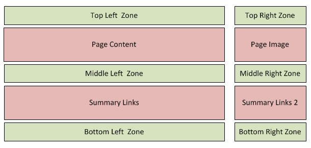
Figure 3: TugboatWelcomePageLayout1
As I mentioned before, for Sprint 1, I'll just be using the PageContent field and a couple of the Web Part zones (Top Left Zone and Top Right Zone). Well, actually, in the end I'll only be using the Top Right Zone. "Why?" you ask. Keep reading.
Note that in order to evaluate the look-and-feel of the site within SharePoint, I started by copying the HTML directly from the static prototype and pasting it into SharePoint (i.e. into the PageContent field, for the main content, and the Content Editor Web Part, for the secondary content).
At that point, the SharePoint site looked very similar to Dan's original design, but some things were a little off. For example, the font style didn't look right and some of the text was a little larger than what it should have been. Also, the color of the links in the Drink Menu section was way off.
Consequently I added a new CSS file (called SharePointFixes.css) containing the following:
 /* =core (SharePoint core.css overrides)
------------------------------------------------------------------------------*/
/* Override .ms-WPBody rules from core.css so that content within Web Parts
 * (e.g. a Content Editor Web Part) appears similar to other text on the page
 * (for example, as defined in the CSS rules for <body>) */
.ms-WPBody {
    /* HACK: Setting the rule to "inherit" works in Firefox, but not in IE8 */
    /* font-family: inherit; */
    font-family: "Lucida Grande", "Lucida Sans Unicode", "Lucida Sans", Helvetica, Arial, sans-serif;
    /* font-size: inherit; */
    font-size: 100%;
}
.ms-WPBody a:link, .ms-WPBody a:visited,
.ms-WPBody a:hover, .ms-WPBody a:active {
    color: #3792B3;
}
.ms-WPBody td {
    /* font-family: inherit; */
    font-family: "Lucida Grande", "Lucida Sans Unicode", "Lucida Sans", Helvetica, Arial, sans-serif;
    /* font-size: inherit; */
    font-size: 100%;
}
.ms-WPBody span {
    /* font-size: inherit; */
    font-size: 100%;
}
/* =pageLayouts (SharePoint pageLayouts.css overrides)
------------------------------------------------------------------------------*/
.pageContent {
    color: inherit;
    /* font-family: inherit; */
    font-family: "Lucida Grande", "Lucida Sans Unicode", "Lucida Sans", Helvetica, Arial, sans-serif;
    /* font-size: inherit; */
    font-size: 100%;
}
I really wish the "inherit" trick worked as well in Internet Explorer as it does in Firefox. Having to duplicate the CSS rules in SharePointFixes.css certainly isn't ideal (it means we would need to change them in multiple places if the designers changed their minds on which particular font the site should use).
Note that I talked more about overriding SharePoint CSS rules in part 1 of this series.
Next, I created a minimal implementation of FindLocationWebPart (no jQuery at this point, just a placeholder) and added it to the page. This was the first point where I could open the SharePoint site in one tab and the static HTML prototype in a second tab and quickly flip back and forth between the two to examine any differences.
That is when I discovered that browsing to the site with IE8, the bottom margin (1.5em) specified for items in the This Week's Specials list was not honored, causing the Coffee News & Goings On section to appear too close to the previous section. [Note that browsing to the SharePoint site using Firefox renders the bottom margin as expected (with the original CSS rules), so this seems to be a bug in Internet Explorer.]
I tried a couple of different approaches to resolving the margin issue, and in the end, I settled on a very minimal change to Dan's original CSS (to specify the bottom margin on the <ol> element -- instead of on child <li> elements). [I really didn't want to change the original CSS files, but the other hacks that I experimented with had their own issues.]
At that point, I marked the "create master page" task in TFS as " Done" and moved on to creating the "HomeSiteConfiguration" feature.
I mentioned earlier how I simply copied the HTML for the home page and pasted it into SharePoint. While that works well in the short term, eventually all of those "trivial" manual steps required to configure a SharePoint site really start to add up -- especially when you start multiplying it by the number of developers on your team and account for all of the different environments you need to deploy the solution to (i.e. each developer's LOCAL environment, DEV, TEST, and PROD) and the number of deployments you are eventually going to perform.
Hence I like to use one or more "*Configuration" features whose sole purpose is to configure a SharePoint site exactly the way we want it. For the Tugboat site, the HomeSiteConfiguration feature is used to:
- Set the master page for the site (SPWeb) to Tugboat.master.
- Upload the various images referenced on the home page (e.g. boat.jpg) to the PublishingImages library.
- Configure the default page for the site (i.e. change the page layout to TugboatWelcomePageLayout1, set the PageContent field to render the main content, add the Content Editor Web Part to render the secondary content, and add an instance of the FindLocationWebPart).
Fortunately, having done this kind of stuff many times in the past, it didn't take very long to write that code and mark the corresponding task as "Done."
I then moved on to my final two tasks for Sprint 1, specifically creating scripts to make the deployment as easy as possible. Again, having done this frequently in the past, it didn't take very long until I could mark those tasks as "Done" in TFS.
Once I had a freshly rebuilt Tugboat site in SharePoint (courtesy of the deployment scripts) I then moved on to performing a little more testing -- just to make sure the site looked the same in SharePoint as it did in the "prototype" (which is really to say the sample site created by Dan).
That's when I discovered that I had forgotten to implement the jQuery functionality to display the map. Whoops!
Note that I chose to deploy the jQuery JavaScript file referenced by the FindLocationWebPart (as well as the images) using the wpresources folder in SharePoint (i.e. via the ClassResources element in the solution manifest file). You certainly don't have to do it this way, but this seems like the cleanest approach -- given the tight coupling between the Web Part and the corresponding resource files.
At that point, I thought I was done. With the jQuery script in place, the "flyout" map (that appears when you click Advanced Options) should just work, right? Well, sort of...
It worked as expected in Firefox, as shown in the following screenshot:
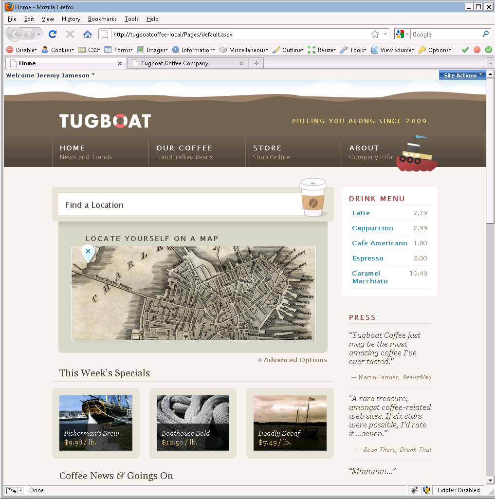
Figure 4: "Find a Location" map (Firefox)
However, take a look at the following screenshot that shows the exact same HTML rendered using IE8:
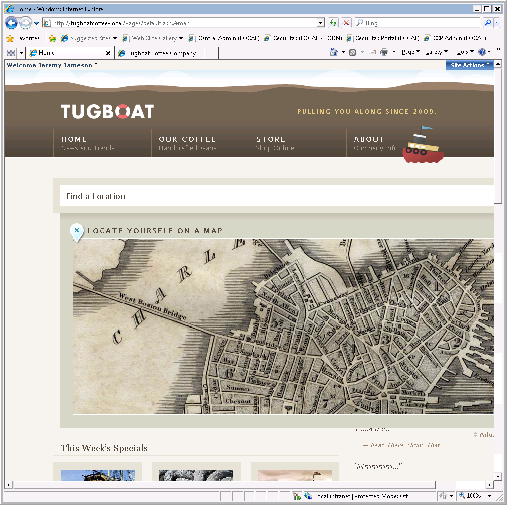
Figure 5: "Find a Location" map (IE8)
Notice how the map completely obscures the secondary content (e.g. Drink Menu)? Obviously that's not the way the designer, Dan, intended for it to work. [Note that this doesn't happen in IE8 when viewing the static HTML site (in other words, outside of SharePoint).]
My first thought was that I must not have copied the HTML correctly when creating the FindLocationWebPart. However, I soon discovered that the inner HTML is the same (in other words, the HTML emitted by the Web Part) but the additional HTML added by the Web Part zone is enough to break Internet Explorer. In the long term, I'd like to fix this problem the right way by creating a custom WebPartZone for SharePoint that doesn't emit any additional markup (at least when DesignMode is false).
However, for Sprint 1, I chose to "punt" and simply embed the FindLocationWebPart directly in the page layout. [Yeah, I know, it's not ideal, but in the world of software, sometimes you have to find creative ways to stay within the "triangle" ;-) ]
For those of you that have somehow managed to make it this far, here are the instructions to deploy the Tugboat sample to your own SharePoint environment. First, download the attachment and unzip the files. Then you simply need to run a few commands from an Administrator command prompt. [You should obviously inspect my scripts before blindly running them with administrative privileges, but honestly, there's nothing malicious in there. It's not like I have anything to gain from formatting your hard drive ;-) ]
To deploy the Tugboat sample site to SharePoint:
Click Start, point to All Programs, point to Accessories, and right-click Command Prompt, and then click Run as administrator.
At the command prompt, type the following command to set the enviroment variable corresponding to a local (developer) environment:
set TUGBOAT_URL=https://tugboatcoffee-local
Note
While you don't have to use this URL, it is recommended for developer environments because it causes the deployment scripts to bypass the SharePoint timer infrastructure when deploying and retracting the solution.
Set environment variables to specify the credentials to use for the Tugboat application pool:
set TUGBOAT_APP_POOL_IDENTITY=%USERDOMAIN%\svc-web-tugboat-dev
set TUGBOAT_APP_POOL_PASSWORD={password}Important
Be sure to specify a valid local or domain user.
Change to the folder containing the deployment scripts:
cd Tugboat\Dev\Lab1\Source\DeploymentFiles\Scripts
Type the following command:
"Create Web Applications.cmd"
Wait for the new Web application and corresponding site collection to be created, and then type the following command:
"Add Solutions.cmd"
Wait for the solution to be added and then type the following command:
"Deploy Solutions.cmd"
Wait for the solution to be deployed and then type the following command:
"Activate Features.cmd"
Wait for the feature activations to complete, and then minimize or close the command prompt.
That's it! You're done.
You are now ready to browse to the Tugboat sample site running in SharePoint. Woohoo!