The Smart in SmartArt
I use Office every day to communicate – email, documents, presentations, spreadsheets. I like to use visual aids to improve my communication -- it’s invaluable to reinforce your ideas with graphics, and if it looks cool, even better. How do you take a textual concept and quickly show your meaning in a graphic that is memorable, relevant, and beautiful?

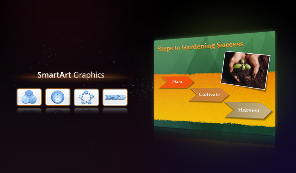
With Office 2008 for Mac, I do it with SmartArt graphics: a new set of tools for creating attractive, effective visuals. With SmartArt, a list becomes a colorful sequence array, a roster becomes an organization chart, or a numbered list awakens as a simple, bold process diagram.
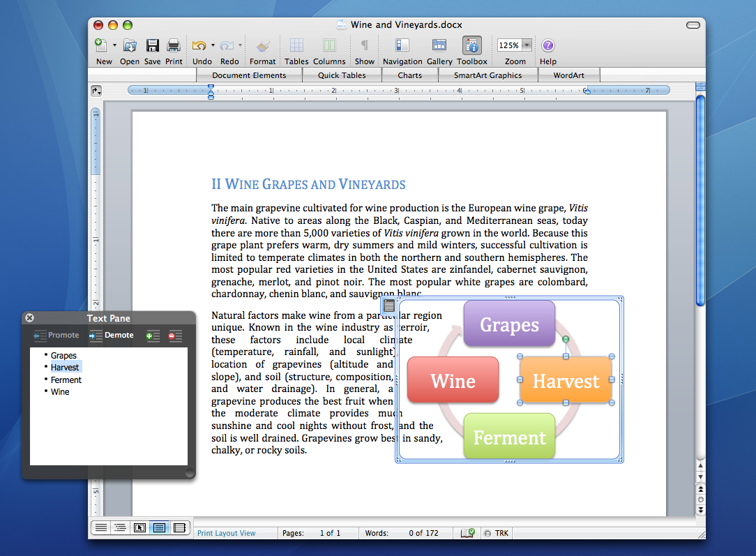
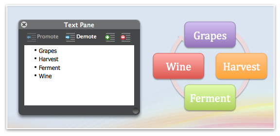
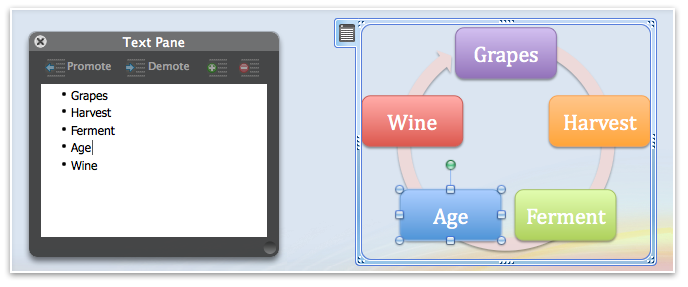
Choose a layout in the Elements Gallery and enter your data in the SmartArt text pane (we added the genie effect when showing/hiding the text pane; not only is it a cool touch, but it highlights the relationship between the SmartArt object and the text content you're bringing to life in the diagram.) In PowerPoint, you can select a bulleted list already in your presentation and click on a SmartArt layout to convert the list into a graphic.
What’s so “smart” about SmartArt graphics? The graphics automatically update and adjust as you add data, creating new diagram parts, moving existing parts to fit, resizing the contextual elements that show relationships.
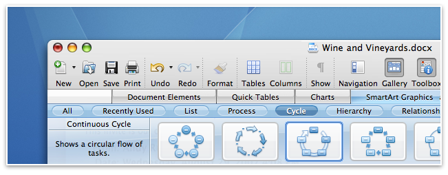
Wine making, for example, is a continuous process of growing and harvesting grapes, fermenting, storing and aging, and finally tasting and enjoying. Describing this in your latest newsletter or school project? There’s a Continuous Cycle layout in the SmartArt gallery. Click in the Gallery to add the graphic, type in your stages of wine production, and click a SmartArt style in the Formatting Palette to add a splash of color. Done, and it looks great!
There are over 80 layouts built-in to Office 2008, and you can flip between them, updating your graphic in the document as you click, until you find the one that best expresses your idea. Add or remove data at any time and the graphic will adjust.
SmartArt graphics you create in Office 2008 for Mac are compatible with Office 2007 and vice-versa; we use the same SmartArt engine underneath. SmartArt graphics are part of the OfficeArt family, and inherit the powerful formatting and document theme awareness of other OfficeArt graphics. Use the Formatting Palette to customize SmartArt graphics, including 3D effects, reflections, transparencies, glows, and shadows. Explore your options willy-nilly; the Reset button takes you back to the crisp default SmartArt Graphic that you started with. SmartArt graphics automatically match your document, spreadsheet, or presentation color scheme, though that too is customizable. Roger Baerwolf and I will talk more about document themes in an upcoming sneak peek blog post.
Comments
Anonymous
October 20, 2007
In demonstrating the function of a cycle graphic, the "cycle" of wine production is flawed. I think of wine production as having a well defined start and end, and not so much a "circle back around" process. If there was not arrowhead pointing from "Wine" to "Grapes" then it can work. Otherwise, it can lead to a whole school of thought on what it is to make wine. Does the act of pouring the last of the summer wine on next years crop guarantee the viticulturalist's a bountiful harvest? Does the wine-in-soil create new growth from unseeded soil? If that's so, my back garden would be thriving with vino based foilage.Anonymous
October 20, 2007
Just two small GUI suggestions:
- The five Aqua buttons in the lower left corner of the Word window will look really out of place once Mac OS X Leopard is released. I think the best bet is to make them glossy and flat like the ones found below Mail's Sidebar. That way it will look good on both Mac OS X 10.4 Tiger and 10.5 Leopard. It will also properly match the glossy bottom bar already present in Word. Example: http://img525.imageshack.us/img525/230/picture1vm1.png
- I couldn't help but notice that when setting the Gallery to "grey" instead of the Office application's own color (blue/green/pink) the Toolbox won't follow suit and retains it's color. Any chance for a fix?
Anonymous
October 20, 2007
There's always one... isn't there hohenja?Anonymous
October 21, 2007
Now I wanna play with it! Public beta? pleeeease?Anonymous
October 22, 2007
One of the nice features of the Elements Gallery is the reduction in dialogs. You can have more control over your documents while enhancing at the same time. Its good to see the focus feature parity between Office for Windows with Smart Draw Graphics and numerous options. This is definitely a powerful release to look forward to.Anonymous
November 14, 2007
I hope that the Elements Gallery could be disabled, it's wasting a LOT of space (about 2x of the toolbar space when closed) for a feature that anyone will be using just once per document. Once I've set up the layout, I'll close it. It's not a feature used as often as Bold, it doesn't deserve that space. I think it's there just for a marketing reason, no more. And I don't buy that "Ribbon doesn't fit with the Apple Guidelines". The Elements Gallery is breaking it in the very same way, but without any of the innovations of Ribbon. I think that a "tabbed bar" is hardly something against the HIG. :| I completely disagree the choice of not following Ribbon, but since I can't do nothing about this, at least give me the possibility to avoid using the worse part of the "innovation" (introducing a third usage paradigm is hadly an innovation).Anonymous
May 05, 2008
Office 2008 podcasts coming in June!