A look at stretchy elements
There are several elements in Wpf that have a "Stretch" property. The basic idea of these properties is to allow you to specify how an element adapts itself to a layout container, such as a Grid. For example, if you have a 100x200 pixel image, and it's being positioned in a 150x300 pixel cell in a Grid, should the image be centered and leave some blank space? Or stretched to fit? And if stretched, should aspect ratio be preserved?
I'll use Image, Viewbox, and Shape (particularly Rectangle and Ellipse) as examples.
Background
First, the basic setup for these examples. Here is a Grid with 9 cells (a 3 by 3 Grid). The center cell (the Border named Content) is where we'll put things that need to be stretched.
<Grid Background='LightGray'>
<Grid.ColumnDefinitions>
<ColumnDefinition Width='*' />
<ColumnDefinition Width='4*' />
<ColumnDefinition Width='*' />
</Grid.ColumnDefinitions>
<Grid.RowDefinitions>
<RowDefinition Height='*' />
<RowDefinition Height='4*' />
<RowDefinition Height='*' />
</Grid.RowDefinitions>
<Border Name='Content' Grid.Column='1' Grid.Row='1' Background='White'>
</Border>
</Grid>
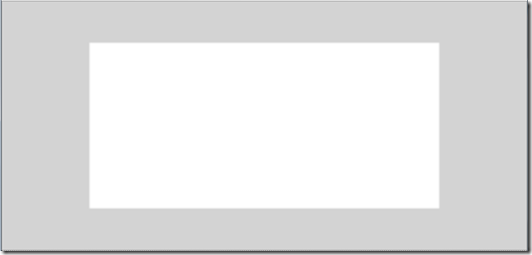
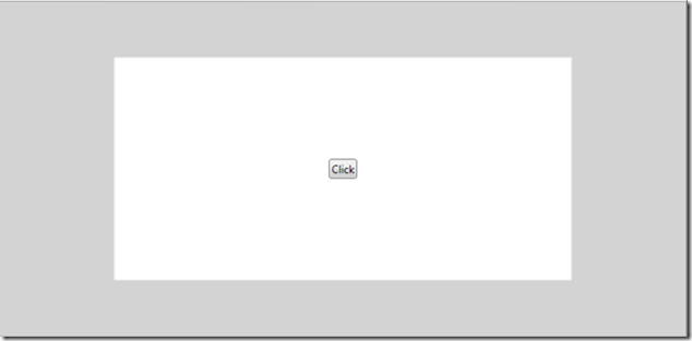
It looks like this so far (the white box in the middle is the 'Content' Border):
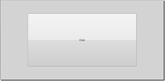
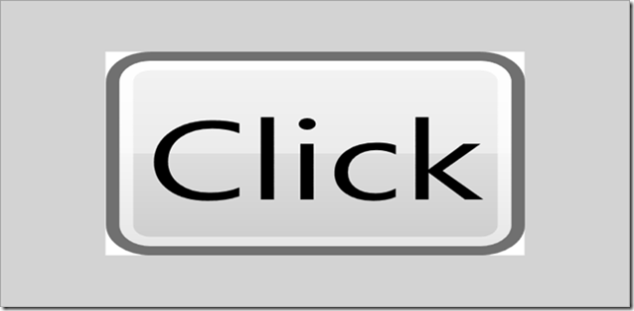
Second, why do we need to stretch at all? The answer is that not every element knows how to size itself to its parent's layout. For example, a Button does know how to size it self; putting a button inside Content gives us:
<Border Name='Content' Grid.Column='1' Grid.Row='1' Background='White'>
<Button>Click</Button>
</Border>
and looks like:
That is, the button sized itself to fit the 'layout slot' provided by the container (the center cell of the Grid). (Specifically, the Button doesn't size itself, but the root of the Button's template is a Border, which does size itself.)
Other elements, such as Image, however, need help to determine how or if they fit into their layout slot. Thus the Image.Stretch property.
Stretching an Image
If we set an image into our content, likely its natural size won't be exactly the same as the layout slot provided by the parent. How the image stretches is specified by the Stretch property, which is an enumerator also named Stretch, and has 4 values:
- None: The element preserves its "natural size", it's not scaled in any way.
- Fill: The element is stretched as necessary to fit the layout slot.
- Uniform: The element is stretched to exactly fill either the height or the width of the layout slot, but the "shape" or "aspect ratio" of the element is not altered, and none of the element is clipped.
- UniformToFill: The element is stretched so that it completely fills both the height and the width of the layout slot, again the aspect ratio is not altered, and the element is clipped as necessary.
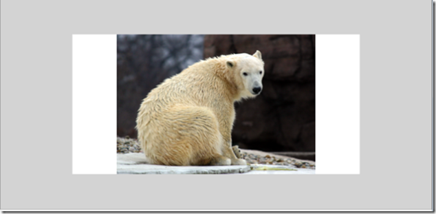
For Image, the default value of Stretch is 'Uniform', so here's an example of that first:
<Border Name='Content' Grid.Column='1' Grid.Row='1' Background='White'>
<Image Source='Picture.jpg' Stretch='Uniform' />
</Border>
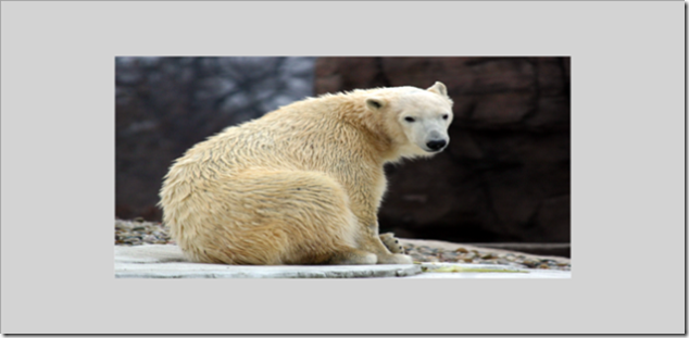
Figure: 'Uniform' stretch on an image
Here, the image was scaled to fit the layout slot, but it preserves the aspect ratio of the picture. That avoids distortion of the image, but doesn't fill the entire slot either, resulting in the white bands on the left/right of the image in this case.
To prevent any scaling of the image, set the Stretch to 'None' and you get:
Figure: 'None' stretch on an image
Here we see the image in its natural size, which is bigger than the space allotted to the image by the Grid. As a result, we're only seeing part of the image. (In this case, the part we're seeing is the upper left corner, but you can control that by setting VerticalAlignment and/or HorizontalAlignment on the image.)
To ensure the image exactly fills the layout slot, set Stretch to 'Fill':
Figure: 'Fill' stretch on an image
But notice that this comes at the expense of distortion.
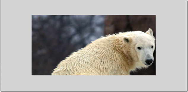
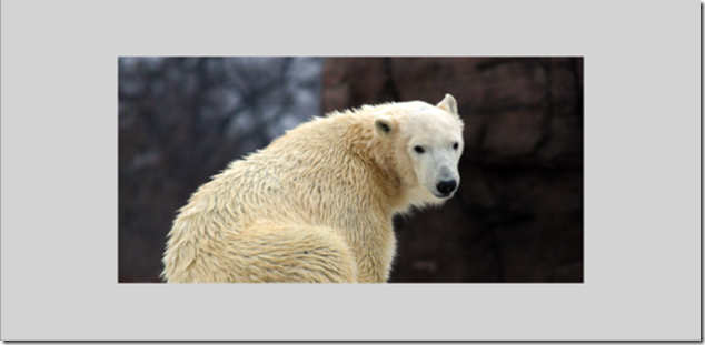
Finally, setting stretch to 'UniformToFill' does a combination of scaling an clipping:
Figure: 'UniformToFill' stretch of an image
In this case, the image is scaled until it's big enough to fit the width of the layout slot, which meant that some of the height had to be clipped.
Stretching any element
You can actually stretch any element tree using the Viewbox decorator. For example, start by replacing the image in our Content with a Viewbox, and start with Stretch set to 'None' so that it has no effect (like Image, the default value for Viewbox.Stretch is 'Uniform'):
<Border Name='Content' Grid.Column='1' Grid.Row='1' Background='White'>
<Viewbox Stretch='None'>
<Button>Click</Button>
</Viewbox>
</Border>
Figure: 'None' stretch on a Viewbox
The only difference between this and the same Button example earlier without the Viewbox is that the Viewbox tells the button to be the size it wants to be, rather than growing itself to fit the larger layout slot in the Grid. That is, the Button here takes on it's "natural size".
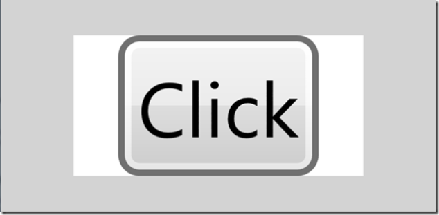
Next, to see the effect of stretch, change Stretch to 'Uniform' (the default value) and get:
Figure: 'Uniform' stretch on a Viewbox
Here, just like the image example above, the button is stretched until it fills either the height or the width of the layout slot (the height in this example), but the aspect ration is preserved, leaving un-rendered bands on the left/right.
If filling the space is more important than the aspect ration, then you can use 'Fill' again:
Figure: 'Fill' stretch on a Viewbox
And similarly, 'UniformToFill' fills the whole layout slot and preserves the aspect ratio, but clips one of the dimensions:
Figure: 'UniformToFill' stretch on a Viewbox
Stretching shapes
Shapes are mostly similar to Image and Viewbox. Rectangle and Ellipse shapes require an understand of their natural size to make sense of, which is covered later in a separate section. For other shapes, such as Path, the behavior is pretty much the same as Image/Viewbox/etc, but there are a few differences which I'll describe here.
Start with this Path as our 'Content':
<Path Stroke="Black" StrokeThickness="10" Fill='Red' Stretch='None' >
<Path.Data>
<PathGeometry>
<PathGeometry.Figures>
<PathFigureCollection>
<PathFigure StartPoint="0,0">
<PathFigure.Segments>
<PathSegmentCollection>
<QuadraticBezierSegment Point1="100,200" Point2="150,50" />
<QuadraticBezierSegment Point1="150,100" Point2="150,100" />
</PathSegmentCollection>
</PathFigure.Segments>
</PathFigure>
</PathFigureCollection>
</PathGeometry.Figures>
</PathGeometry>
</Path.Data>
</Path>
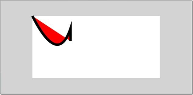
One way that Shape.Stretch is different from other type's Stretch properties is that it defaults to 'None' rather than 'Uniform. So, with the stretch set to 'None' we get the Path in its natural size, which is 150x200 in this case:
Figure: 'None' stretch on a path
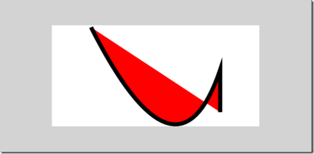
Now try 'Uniform', where as usual we preserve aspect ration and fill one of the dimensions, causing white bands on the left/right in this example:
Figure: 'Uniform' stretch on a path
Other than the default value of Stretch being 'None', that's all the same as the Stretch examples above for Image & Viewbox. One thing that shapes do differently than other types is that not all of the pixels are scaled; if you look closely at the last picture, the overall path was scaled to be larger, but the stroke was not, it is still 10 pixels wide.
The other difference in Shape's Stretch behavior is in an un-constrained layout, it takes up the same space as it does under 'Fill'. To use some pictures as examples, here's the above Path in a StackPanel, with a Gray rectangle above and below it in the stack, and with the width constrained enough to make the Stretch of 'Uniform' interesting:
<StackPanel Width='{Binding ElementName=s, Path=Value}' >
<Rectangle Height='50' Fill='Gray' />
<Path Stroke="Black" StrokeThickness="1" Fill='Red' Stretch='Uniform' >
...
</Path>
<Rectangle Height='50' Fill='Gray' />
</StackPanel>
... which looks like:
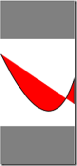
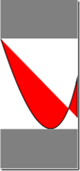
Figure: Path in a StackPanel with over-constrained in width, with Uniform stretch
Since the stretch is Uniform, the Path is scaled down to fit the layout slot while preserving aspect ratio. But notice that there are white bands on the top and bottom. That accounts for the space that the Path would take up under a 'Fill' stretch.
To make that more clear, here's the same Path, next to a Path with a stretch of 'Fill'.
Figure: Same Path in a StackPanel, with 'Uniform' and 'Fill' stretches
Notice that the Path takes up just as much space in the StackPanel in either case.
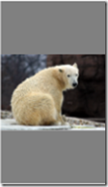
In contrast, Image and Viewbox only size themselves as necessary, such as in this Image example (still in a StackPanel, and with a Stretch of 'Uniform'):
Figure: An Image in a StackPanel with 'Uniform' stretch
Effect of Width and Height (and other layout properties) on stretching
In the examples so far, the width and height of the layout slot was determined by the root Grid (whose size, in turn, is determined by the Window it lives in). If you specify layout properties such as Width/Height, MaxWidth/MaxHeight, Margin, etc., you might alter the layout slot.
For example, take the image again where we had UniformToFill:
<Image Source='Picturejpg' Stretch='UniformToFill' />
... which looks like:
Figure: 'UniformToFill' stretch on an image (again)
Now, force the Width to be 100:
<Image Source='Picture.jpg' Stretch='UniformToFill' Width='100' />
... and we get:
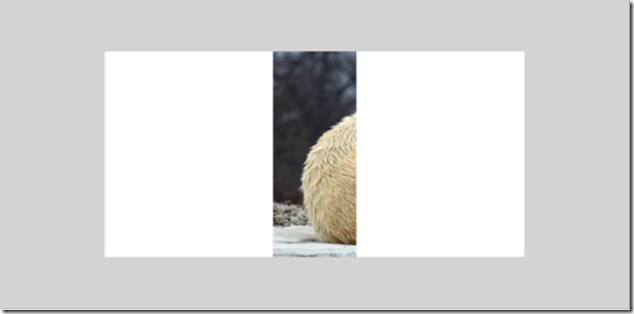
Figure: 'UniformToFill' stretch on the same image with Width=100
In the first case (where Width isn't specified), the layout slot for the image is 500 pixels wide by 250 high in this example. In that case, by the time the image is scaled down enough to get down to 500 wide, the height hasn't shrunk to 250, causing the height to be clipped. In the second case, setting the Width to 100 reduced the layout slot to 100x250. Now, by the time the image is scaled down enough to meet the height of 250, the width is still much more than 100, causing the width to get clipped.
Rectangle and Ellipse
Rectangle and Ellipse are different from other Path types, because they don't have a natural width and height. That's significant, because all of the stretching behavior depends on that. For example, 'None' stretching means just use the natural width/height, 'Uniform' stretching means preserve the natural width/height.
For example, in the Path example above, the natural size of the Path is determined by the PathGeometry. In a Line, the natural size is determined by the start and end points.
Of course, the Rectangle and Ellipse elements do have properties named "Width" and "Height", but recall that these are layout properties that all elements have (along with other layout properties such as Margin).
As a result, the natural size of any Rectangle or Ellipse is 0x0. Let's see what that does under the different stretches ...
Rectangle with 'Fill' stretch
First, for the examples, change the 'Content' Border to contain a Rectangle:
<Border Name='Content' Grid.Column='1' Grid.Row='1' Background='White'>
<Rectangle>
<Rectangle.Fill>
<LinearGradientBrush>
<GradientStop Color='Red'/>
<GradientStop Color='Blue' Offset='0.5' />
<GradientStop Color='Red' Offset='1' />
</LinearGradientBrush>
</Rectangle.Fill>
</Rectangle>
</Border>
... which looks like:
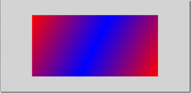
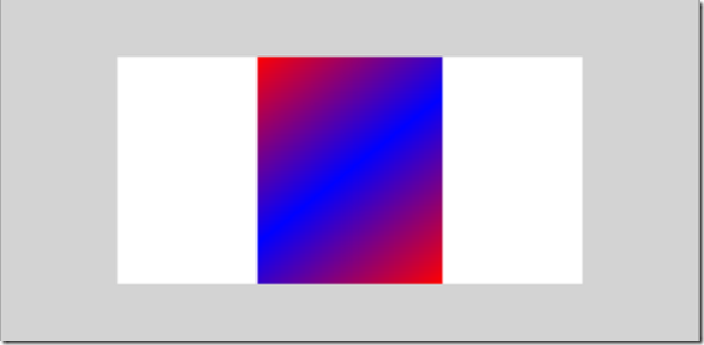
Figure: Rectangle with no Width/Height and default stretch ('Fill')
Notice that the Rectangle has no Width or Height specified. Also note that the default value of the Stretch property on a Rectangle (and Ellipse) is 'Fill', which differs from Image, Viewbox, MediaElement, and Shape, which all default Stretch to 'Uniform'. As a result, the rectangle simply fills the layout slot.
Now specify a Width, say 200, and you get:
Figure: Rectangle with Width and 'Fill' stretch
Here the width of the layout slot is constrained by setting the Width property, but the height is determined by the parent layout. Again, that's all the same as the earlier Image/Viewbox 'Fill' examples.
Rectangle with 'Uniform' stretch
Where Rectangle starts to get interesting is in uniformity. For a Rectangle/Ellipse, "uniform" means "make it a square/circle". So, set our Rectangle with a Width and 'Uniform' stretch (but still no Height):
<Rectangle Width='200' Stretch='Uniform'>
...
... and we get:
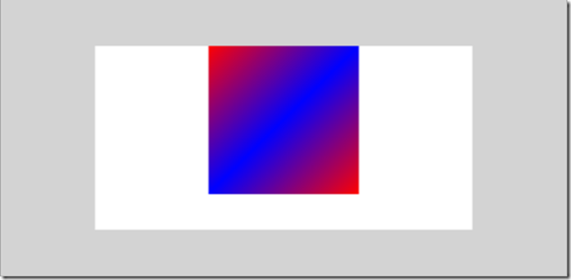
Figure: Rectangle with Width and 'Uniform' stretch
Here we have the Width constrained to be within 200, and the height constrained (by the layout slot) to be within 250. Since the stretch is 'Uniform', the width and height are calculated to be min(200,250)=200, and we get a square that is skinnier and shorter than the layout slot offered by the Grid.
An interesting thing to note here is the positioning of the square; it's centered horizontally but not vertically. The horizontal centering is coming from the Border (recall the parent of this Rectangle is a Border named 'Content'). And the Border actually thinks that it's centering the Rectangle vertically as well; the final height of the rendered Rectangle in this example is reported to be 250 pixels, though it actually only renders 200.
Let's make it more interesting and specify a height of 100:
<Rectangle Width='200' Height='100' Stretch='Uniform'>
...
... this gives us:
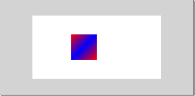
Figure: Rectangle with Width and Height and 'Uniform' stretch
Here, since this Rectangle is constrained to be a square by the 'Uniform' stretch, and since the Height (100) is more constrained than the Width (200), we get a 100x100 square.
Again, here the positioning of the Rectangle within the 'Content' Border results from the Rectangle having a final size of 200x100, but with the 'Uniform' stretch it only renders 100x100.
Rectangle with 'None' and 'UniformToFill' stretch
So far we've looked at Rectangle with 'Fill' and 'Uniform'. A stretch of 'None' means use the natural size of the object. Since the natural size of a Rectangle or Ellipse is 0x0, setting the stretch to 'None' gives you a size of 0x0.
So the only thing left to look at is UniformToFill. For Rectangle and Ellipse, 'UniformToFill' produces a square/circle, just as is the case with 'Uniform'. Like the other stretch behaviors (e.g. Image and Viewbox above), 'UniformToFill' clips as necessary to fill the layout slot without altering the aspect ratio.
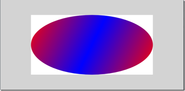
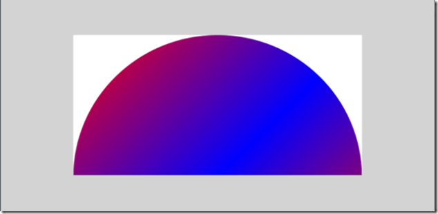
For example, the following shows an Ellipse with no Width or Height specified, and the Stretch set to 'Fill' and then 'UniformToFill':
Figure: Ellipse with no Width/Height and stretch of 'Fill' then 'UniformToFill'
The first picture shows the 'Fill' case, where the Ellipse simply scales to the height and width of the layout slot. In the second picture, the UniformToFill causes the Ellipse to be round, fill the 500x250 pixel layout slot (which is determined by the Grid), and preserve aspect ratio. What this means is that the Ellipse ends up being a 500x500 circle, and the bottom half of it gets clipped.
To sum it up ...
Stretching is about filling your layout slot:
- Your layout slot is a function of your parent element, Width/Height, MinWidth/MinHeight, Margin, etc. (The usual layout system features.)
- 'None' means use your natural size
- 'Fill' means to scale to the slots width and height, at the expense of shape distortion.
- 'Uniform' means fill the slot in one dimension, but not the other, in order to preserve aspect ratio.
- 'UniformToFill' means fill the slot in both dimensions, clipping as necessary, to again preserve aspect ratio.
- The default value for Stretch is usually 'Uniform'
When stretching Shape types:
- The default value of Stretch is usually 'None'
- In unconstrained layouts, such as a StackPanel, the Shape takes up the amount of space that it would under 'Fill' stretch.
Rectangle and Ellipse have some custom handling of stretching:
- The default value of Stretch is 'Fill'
- 'Uniform' means constrain the rectangle/ellipse to be a square/circle
- 'None' is interpreted as a size of 0x0.
Comments
- Anonymous
August 12, 2008
PingBack from http://hubsfunnywallpaper.cn/?p=467
