Customizing Picker Box dialog.
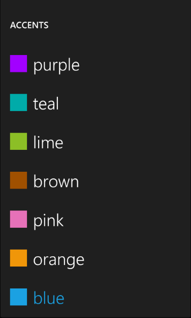
Today I am going to show you how you can customize the Picker Box dialog to display a color picking dialog similar to the one that you see in the Settings\theme applet in the emulator instead of just a list of strings:
In order to be able to display the colored rectangle and the text we need to implement appropriate binding source for the ListBox inside of the dialog. So I've added the following ColorItem class:
   public class ColorItem
  {
      public string Text { get; set; }
      public Color Color { get; set; }
  }
Looks pretty innocent and simple. The next step is to modify the template for the ListBox in the PickerBoxDialog to display the colored rectangle and the binding, So I've copied tand modified the XAML from the generic.xaml into the Resources section of the MainPage.xaml:
   <Style TargetType="control:PickerBoxDialog" x:Key="Custom">
            <Setter Property="Background" Value="{StaticResource PhoneChromeBrush}"/>
            <Setter Property="Width" Value="480" />
            <Setter Property="Height" Value="800" />
            <Setter Property="Margin" Value="0" />

            <Setter Property="Template">
                <Setter.Value>
                    <ControlTemplate TargetType="control:PickerBoxDialog">
                        <Grid x:Name="LayoutRoot" Background="{StaticResource PhoneChromeBrush}" >
                            <Grid.RowDefinitions>
                                <RowDefinition Height="Auto"/>
                                <RowDefinition Height="*"/>
                            </Grid.RowDefinitions>

                            <!--TitlePanel contains the name of the application and page title-->
                            <StackPanel x:Name="TitlePanel" Grid.Row="0" Margin="12,30,0,40">
                                <TextBlock x:Name="DialogTitle" Text="MY DIALOG TITLE" Style="{StaticResource PhoneTextNormalStyle}" />
                            </StackPanel>

                            <!--ContentPanel - place additional content here-->
                            <Grid x:Name="ContentPanel" Grid.Row="1" Margin="12,0,12,0"  >
                                <ListBox Name="listBox" >
                                    <ListBox.ItemTemplate>
                                        <DataTemplate>
                                            <StackPanel x:Name="item" Orientation="Horizontal" Margin="5, 25, 0, 25">
                                                <Rectangle Fill="{Binding Color, Converter={StaticResource ColorToBrushConverter}}" Width="42" Height="42" />
                                                <TextBlock Margin="15, 0, 0, 0" Text="{Binding Text}" FontSize="40" TextWrapping="Wrap" />
                                            </StackPanel>
                                        </DataTemplate>
                                    </ListBox.ItemTemplate>
                                </ListBox>
                            </Grid>
                        </Grid>
                    </ControlTemplate>
                </Setter.Value>
            </Setter>
        </Style>
We will also need to converter that'd do a conversion of the Color to Brush for the Fill property binding:
  public class ColorToBrushConverter : IValueConverter
 {

     #region IValueConverter Members
      public object Convert(object value, Type targetType, object parameter, System.Globalization.CultureInfo culture)
     {
         if (value != null)
         {
             return new SolidColorBrush((Color)(value));
         }

         return null;
     }

     public object ConvertBack(object value, Type targetType, object parameter, System.Globalization.CultureInfo culture)
     {
         throw new NotImplementedException();
     }

     #endregion
}
And don't forget to declare this converter in xaml:
<local:ColorToBrushConverter x:Name="ColorToBrushConverter" />
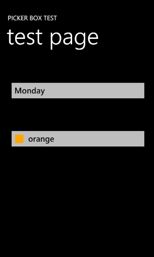
The next step is to add the button on the screen that will show the PickerBox dialog and display the selected color:
 <Button Name="buttonColor" Background="{StaticResource PhoneTextBoxBrush}"
        Click="buttonColor_Click"  BorderThickness="0" Height="72" Style="{StaticResource PickerBoxButton}"
        HorizontalAlignment="Left" Margin="12,200,0,0"  VerticalAlignment="Top" Width="438">
        <StackPanel Orientation="Horizontal" Width="362">
             <Rectangle Fill="{Binding Color, Converter={StaticResource ColorToBrushConverter}}" Margin="-15, 2, 0 0" Width="26" Height="26" />
                 <TextBlock Margin="15, 0, 0, 0" Foreground="{StaticResource PhoneTextBoxForegroundBrush}"
                             Text="{Binding Text}"  />
             </StackPanel>

 </Button>
We are using the same bindings as we did for the ListBox data template to display the selected ColorItem.
Now we should be ready to jump in to the code. First we need to create a data source that will contain an array of ColorItems. So I added the DialogViewModel class:
 public class DialogViewModel
{
     public DialogViewModel()
     {
         this.Items = new List<ColorItem>()
         {
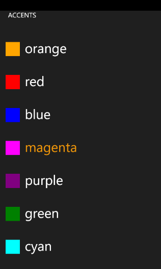
             new ColorItem() {Text="orange", Color = Colors.Orange},
             new ColorItem() {Text="red", Color = Colors.Red},
             new ColorItem() {Text="blue", Color = Colors.Blue},
             new ColorItem() {Text="magenta", Color = Colors.Magenta},
             new ColorItem() {Text="purple", Color = Colors.Purple},
             new ColorItem() {Text="green", Color = Colors.Green},
             new ColorItem() {Text="cyan", Color = Colors.Cyan},
             new ColorItem() {Text="brown", Color = Colors.Brown},
             new ColorItem() {Text="yellow", Color = Colors.Yellow},
         };
    }

    public List<ColorItem> Items
    {
        get;
        set;
    }
}
This is how we initialize our custom PickerBox:
  private void InitCustomPickerDialog()
 {
      // Initialize viewmodel
      this.viewModel = new DialogViewModel();
      this.currentColorItem = viewModel.Items[0];

      // Assing it to the page's DataContext
      this.DataContext = currentColorItem;
      this.customDialog = new PickerBoxDialog();
      this.customDialog.Title = "ACCENTS";

      // Assign our style to the dialog
      this.customDialog.Style = this.Resources["Custom"] as Style;
      this.customDialog.ItemSource = viewModel.Items;
      this.customDialog.Closed += new EventHandler(customDialog_Closed);
 }
In the method above we initialize view model, create an instance of the custom dialog, assign the style that we declared before and ItemSource from the viewmodel. The customDialog_Closed looks like this:
  void customDialog_Closed(object sender, EventArgs e)
 {
      this.currentColorItem = (ColorItem)this.customDialog.SelectedItem;
      this.DataContext = currentColorItem;
 }
In this event handler we get the currently selected item from the dialog and assing it to page's data context.
And that is all what's required to have color picker dialog:
You can download the latest version of the PickerBox control and this sample from here.
One more thing that I wanted to mention is that I consolidated all the WP7 controls and components in place now. I created a resource on MSDN code galleries that contains the latest versions for the List Picker, Scrollable TextBlock and PickerBox.
Comments
Anonymous
September 17, 2010
Hi Alex, Have you thought of submitting these for inclusion in a future release of the Toolkit? They seem like a logical fit for inclusion. I know you don't work in that team but I hope they appreciate your contribution.Anonymous
September 20, 2010
I've just downloaded to try PickerBoxR4.zip and teh solution is missing CustomPage.xaml from the client project and I'm having trouble building the thing altogether.Anonymous
September 20, 2010
@deviruchi - thanks for the heads up. You can go ahead and remove this file from the project and it should compile. Anyway I've uploaded the fixed project.Anonymous
September 23, 2010
I'm somewhat new to Silverlight, XAML, .NET, C#, etc. so forgive me if this question is obviously misguided... Could your ColorItem have a Property that returned a SolidColorBrush which does the ColorToBrushConverter work internally, avoiding the Converter portion of the Binding?Anonymous
October 03, 2010
Can you post how to add rotation support? It seems to only work on portrait mode.Anonymous
October 03, 2010
Hello Alex, This is really great. I had started along a similar method of implementing a PickerBox and was looking to turn it into a custom control when I stumbled upon your code here. It's saved me a lot of time, as I'm a newbie Silverlight developer. I did have one question, if you don't mind. I've been messing around with the binding of the TextBlock within the DataTemplate for listBox, trying to figure out a way to set the Binding dynamically. I'm trying to avoid creating several different style templates for multiple PickerBoxes since I only need to change which property the TextBlock in each ListBox binds to. I'll paste what I've attempted below (forgive me if I'm being naive): Added the following lines to OnApplyTemplate: this.itemTextBlock = this.GetTemplateChild("itemText") as TextBlock; this.ItemTextBinding = itemTextBinding; ItemTextBinding is set as follows: public string ItemTextBinding { get { return this.itemTextBinding; } set { this.itemTextBinding = value; if (this.itemTextBlock != null) { this.itemTextBlock.SetBinding(TextBlock.TextProperty, new System.Windows.Data.Binding(this.ItemTextBinding)); } } } The problem is that itemTextBlock is always null. I'm guessing it's because the ListBoxItems aren't actually loaded at the time OnApplyTemplate is called, but I really don't know. I'm still hacking at it here, but I figured I'd ask if you had any ideas. Thanks and sorry for the novel haha.Anonymous
October 03, 2010
Looks like I may have figured out a solution :-) The changes I noted above have been scrapped. The answer might be fairly obvious to some, but on the off chance that this might help anyone else out, I'll give a small example of why I needed this/how it's used: Expanding off of the example presented by Alex in this post, lets say I have two buttons that link to PickerBoxes. One chooses/lists the color names, the other chooses/lists the color hex codes. Picking one should update the other. I have a class much like the ColorItem class above and a collection of several color objects just like the example here. In order to do the binding for the ListItems correctly, you need to specify the property Name or HexCode, but it would be kind of a pain/wasteful to have two entirely separate Style Templates (in my application I have 6 PickerBoxDialogs, so it would be a lot of repeated code), so I pulled the DataTemplate out of the Custom PickerBoxDialog style template shown highlighted above and made two separate DataTemplates: <DataTemplate x:Key="ColorNameDataTemplate"> <StackPanel x:Name="item" Orientation="Horizontal" Margin="5, 25, 0, 25"> <TextBlock x:Name="itemText" Text="{Binding Name}" Margin="15, 0, 0, 0" FontSize="40" TextWrapping="Wrap" /> </StackPanel> </DataTemplate> <DataTemplate x:Key="ColorHexCodeDataTemplate"> <StackPanel x:Name="item" Orientation="Horizontal" Margin="5, 25, 0, 25"> <TextBlock x:Name="itemText" Text="{Binding HexCode}" Margin="15, 0, 0, 0" FontSize="40" TextWrapping="Wrap" /> </StackPanel> </DataTemplate> Then I added this to the PickerBoxDialog.cs: Added a private and public DataTemplate property private DataTemplate listItemDataTemplate; public DataTemplate ListItemDataTemplate { get { return this.listItemDataTemplate; } set { this.listItemDataTemplate = value; if (this.listBox != null) { this.listBox.ItemTemplate = this.listItemDataTemplate; } } } Added this to the OnApplyTemplate override this.ListItemDataTemplate = listItemDataTemplate; That was all I needed to do. Then you just set ListItemDataTemplate from your application code: this.ColorNameDialog.Style = this.Resources["Custom"] as Style; this.ColorNameDialog.ItemSource = viewModel.Items; DataTemplate colorNameDataTemplate= this.Resources["ColorNameDataTemplate"] as DataTemplate; this.ColorNameDialog.ListItemDataTemplate = colorNameDataTemplate; Hope that was a clear enough explanation :-)Anonymous
October 18, 2010
HI! Great work, THank YOU! I one of your previous articles, you have mentioned, that the PickerBoxDIalog is currently used for internal WP7 things, like i.e. region&language selections. When I look to there, I see them working in veritcal mode too. Unfortunately I do not see that behaviour in your code. What do I miss? What do I need to do, to get the PIckerBox rotated according to the current orientation? Thanbks in advance!Anonymous
October 20, 2010
Awesome! Just what I was looking for! Thanks! Have you thought about submitting this to the Silverlight for Windows Phone Toolkit? Would fit in there nicely.Anonymous
March 14, 2011
Sympa ce blog de dialogue x, il me fait penser à http://www.xcitationautel.com


