Position report parameters the way you want
UPDATE: SQL Server 2016 is now available.
Our previous blog post announced several enhancements to Reporting Services in SQL Server 2016 CTP 2.4: parameter positioning, export to PowerPoint, and printing for modern browsers. In today's post, let's take a closer look at one of those enhancements and see how SQL Server 2016 Reporting Services enables you to position report parameters the way you want.
Consider this simple example with three parameters:
When you run this report, you see the following:
Reporting Services lays out the parameters across two columns in a left-to-right, top-down snaking fashion. You could change the ordering of parameters, but couldn't really change this positioning directly.
The From (StartDate) and To (EndDate) parameters form a pair and define a date range, so you might prefer to have them together on one line rather than wrapping awkwardly across two lines. Although you could reorder the parameters to work around the issue (moving Employee to the end, perhaps), you couldn't force the From parameter to a new line, nor could you have more than two columns of parameters.
With CTP 2.4, for the first time ever, you see the Parameters pane in Design view, handing you, the report author, design-time control of parameter positioning:
Within the Parameters pane, simply drag-and-drop to place parameters where you'd like them:
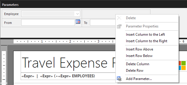
Right-click for additional options:
You can insert additional rows and columns as needed, and you can now have more than two columns (yay!):
You can even create space between groups of parameters by inserting empty rows or columns - useful particularly when you have greater numbers of parameters:
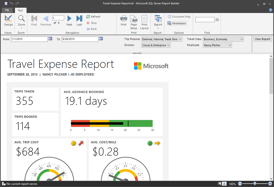
When you preview the report, you'll see the layout that you designed - and that's what your users will see as well:
With the new Parameters pane, you can also differentiate between visible and hidden parameters at a glance. In the example below, Division and Employee are hidden parameters:
Based on your feedback, we prioritized these particular enhancements, but we know there are many more enhancements we could make in this area, so keep your feedback coming.
Stay tuned for more Reporting Services news as PASS Summit 2015 kicks off next week.
Try it now
- Download SQL Server 2016 and install Reporting Services.
- Download Report Builder.
- Check out the preview documentation: What's new in Reporting Services (SQL Server 2016).
- Follow @SQLServerBI on Twitter
Comments
Anonymous
October 22, 2015
Parameter positioning is an awesome feature - I'm elated to see it after more than 10 years without it. How about bug fixes? SSRS remains one of the most cantankerous bits of software that I interact with on a regular basis, with many, many bugs related to hiding fields, page breaks, alignment, rendering consistency, etc. The report designer remains one of the most unhelpful, helpful tools in my toolbox - I frequently spend as much time un-doing things that the designer did to "help" me as I do actually making productive changes to reports. As a user of reporting services since SQL Server 2000, please, please, please - devote a significant amount of time to going through the backlog on Connect and actually fixing some of the warts that have been darkening SSRS for more than a decade.Anonymous
October 25, 2015
Great to hear your enthusiasm about the parameter positioning feature, Carl! We've heard from many long-time Reporting Services users who are pretty elated to see it as well. We do want to strike the right balance of investment in new features and bug fixes. So far for SQL Server 2016, in addition to the new features and enhancements we've introduced in preview, we've fixed a number of bugs as well, including 14 reported by you, our customers, through Connect. We really appreciate you taking the time to report them.Anonymous
November 04, 2015
I am very happy with the positioning feature as well. One of the more common complaints I hear is that text parameter dropdown fields have to be manually dragged wider to see the full content when "Allow multiple values" is selected. This is not the case for single select dropdowns. Any chance this will be addressed at some point?Anonymous
November 05, 2015
@metfrch, great to hear and thanks for the feedback as well. We're working on a new web portal (gave a sneak peek at PASS Summit) and modern browser support, so we'll look out for that issue. We may or may not be able to address every issue in the SQL Server 2016 "GA" release, but we'll try to address these sorts of issues on a continuous basis.Anonymous
November 06, 2015
I would like to see an expression control the visibility of a parameter. Access to system values like folder and userid would be enough to control visibility. For example, if a report was deployed to the Teachers folder, then I could detect that and hide the parameters, since the report is filtered to a specific teacher. For Principals, they would see the teacher parameter, which would be filled with the teachers at his school. I realize there are issues with which-comes-first, parameters or queries, but that's already dealt with by cascading parameters.Anonymous
April 24, 2016
This is a fantastic new feature.However, screens are growing wider and wider- and consequently we have a lot more horizontal spare room, and not as much vertical space. It would be a huge improvement if the parameter pane could be pinned to the left of the screen rather than being displayed on top.- Anonymous
May 04, 2016
Thanks for the feedback!
- Anonymous
Anonymous
May 18, 2016
I was hoping that the prompt for the parameter text was not still a fixed text string.No options for localisation of the prompt text for reports.can the prompt be able to have an expression please?- Anonymous
May 27, 2016
We do plan to continue investing in modernizing and enhancing report parameters and that enhancement is on our backlog.
- Anonymous
Anonymous
June 30, 2016
I would prefer to have the parameter pane be displayed along the right hand side. Since everyone has a wide screen monitor, and if you design your report for either 8.5" x 11" or 11" x 8.5" this space is generally left empty.- Anonymous
June 30, 2016
Thanks for your feedback! The current SharePoint-integrated mode shows the parameter pane exactly this way - along the right side - and we hear from countless customers who want it along the top, which just goes to show that it's a matter of personal preference as well. We'll consider this option going forward.
- Anonymous
Anonymous
July 27, 2016
Hi,I am having some trouble regarding SSRS Report Parameters. If any one could help me out:1) Is there any way that we can add grid in parameter value.2) Can we add the search text functionality in parameter output, which is having a long list of output values.Thanks.- Anonymous
July 27, 2016
Hi Shashank,1) Hmm, I'm not sure what you mean. Could you clarify?2) We definitely have more work to do to modernize and enhance report parameters and that's one of the top enhancements we'd like to make in future.
- Anonymous


