Windows 10: Adaptive User Interface
With the launch of Windows 10, Microsoft changed the whole paradigm of programming. Microsoft took us to era of Universal Applications, which means that our same code will run on all the devices. This is being highly appreciated among developers but at the same time, it’s raising question that how will the same interface work on all devices and different sizes. This article answers the same issue. We’ll be looking on how we can design interface for universal applications, which runs on all devices. The prerequisite for this tutorial are Windows 10, either Technical preview or updated, and Visual Studio 2015.
Discussing some theories of Adaptive Interface, there are different approaches to this. We can either tailor completely different interfaces for different devices and screen sizes, or we can change our existing designs according to device and size. We won’t be going in tailoring different interfaces in the blog, as it’s a topic in its own, but I’ll be covering all the methods through which we can change our existing interface and make it adapt to our Screen sizes.
Let’s start by making our Universal Application:
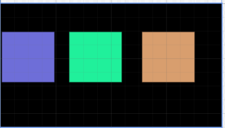
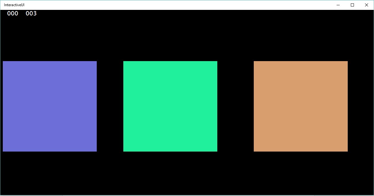
Now, let’s just create a Basic interface, with three rectangles box of different colors. XAML of the interface can be found below:
Code:
1.<Grid Background="Black">
2.
3.     <Rectangle x:Name="rectangle"  Fill="#FF6E6ED8"  HorizontalAlignment="Left"  Height="295" Margin="7,165,0,0" Stroke="Black" VerticalAlignment="Top" Width="306"  d:LayoutOverrides="VerticalAlignment"/>
4.     <Rectangle x:Name="rectangle1"  Fill="#FF20F09B"  HorizontalAlignment="Left"  Height="295" Margin="397,165,0,0" Stroke="Black" VerticalAlignment="Top" Width="306"  d:LayoutOverrides="HorizontalAlignment"/>
5.     <Rectangle x:Name="rectangle2"  Fill="#FFD89E6E"  HorizontalAlignment="Left"  Height="295" Margin="819,165,0,0" Stroke="Black" VerticalAlignment="Top" Width="306"  d:LayoutOverrides="HorizontalAlignment"/>
6.
7. </Grid>
We shall change the position of these boxes on the basis of device screen and size of the application.
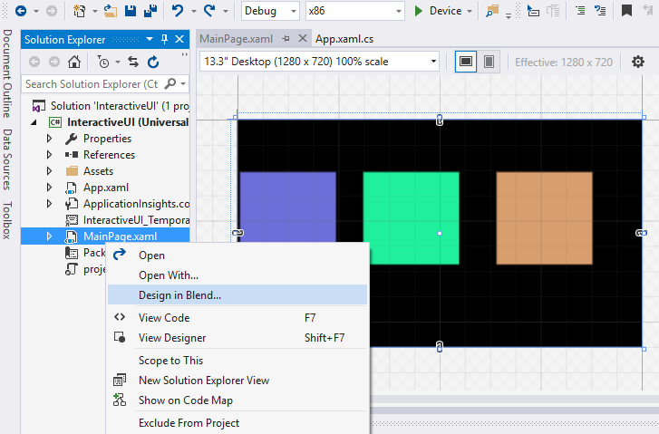
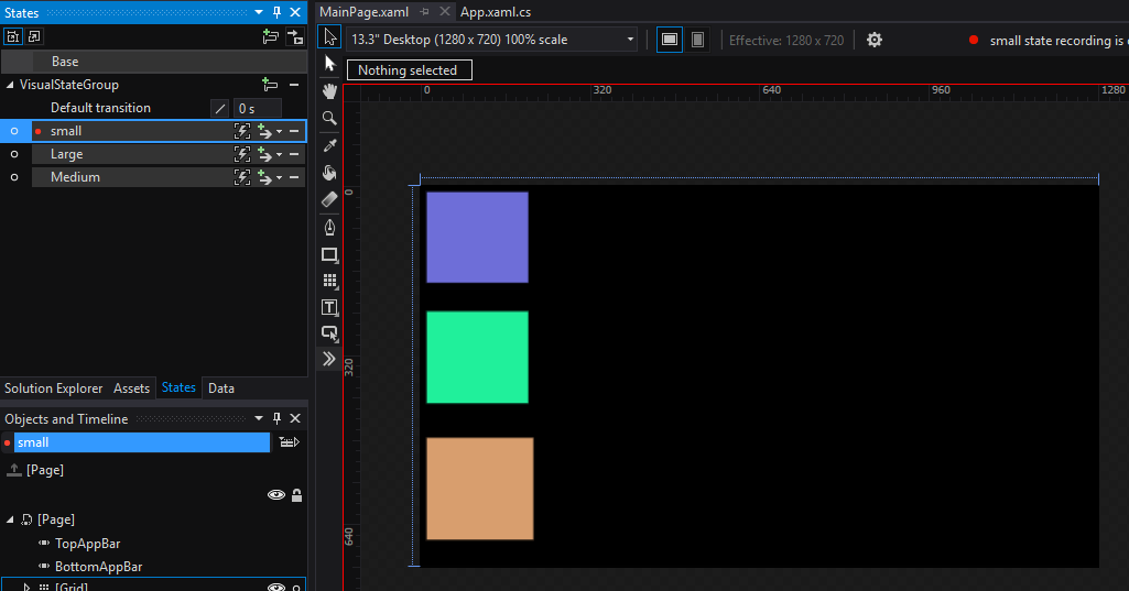
This can be done by two techniques, either using visual states or using state triggers. We’ll be going through both. The initial steps is same for both of techniques, only the final and last step is different. So let’s open our project in blend:
Now, let’s create different Visual states for different screen sizes. If you are wondering what exactly is visual state, well, Visual states are a technique whereby changes to the state of a control will change the UI, by loading XAML control templates for the current state. (MSDN)
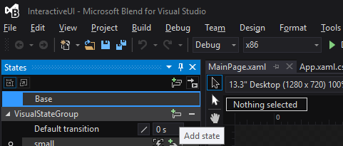
To create a new visual state Group:

Now, let’s create different states by changing the position and size of our rectangle. Every state will represent an interface for different device and screen size. For this tutorial sake’s, I’ll be just making three states. New States can be added in group by:
What we have to do In every Visual state is, just re-manage or you can say scale our interface according to the given size and our needs. In this way, we’ll be re-creating or scaling our single interface for our every Visual State. I’m making scaling my interface as:
Large:

Medium:

Small:
Now save our project (ctrl+s), and let’s move back to visual studio. Visual studio might prompt you and notify that changes outside project has been made and whether you wish to load new changes or not. Click on “yes to all” and that’s it! Your new XAML should look like this:
Code:
01.<Grid Background="Black">
02.        <VisualStateManager.VisualStateGroups>
03.            <VisualStateGroup x:Name="VisualStateGroup">
04.                <VisualState x:Name="small">
05.                    <VisualState.Setters>
06.                        <Setter Target="rectangle.(FrameworkElement.Margin)">
07.                            <Setter.Value>
08.                                <Thickness>10,10,0,0</Thickness>
09.                            </Setter.Value>
10.                        </Setter>
11.                        <Setter Target="rectangle.(FrameworkElement.Width)" Value="194"/>
12.                        <Setter Target="rectangle.(FrameworkElement.Height)" Value="174"/>
13.                        <Setter Target="rectangle1.(FrameworkElement.Margin)">
14.                            <Setter.Value>
15.                                <Thickness>10,236,0,0</Thickness>
16.                            </Setter.Value>
17.                        </Setter>
18.                        <Setter Target="rectangle1.(FrameworkElement.Width)" Value="194"/>
19.                        <Setter Target="rectangle1.(FrameworkElement.Height)" Value="176"/>
20.                        <Setter Target="rectangle2.(FrameworkElement.Margin)">
21.                            <Setter.Value>
22.                                <Thickness>10,475,0,0</Thickness>
23.                            </Setter.Value>
24.                        </Setter>
25.                        <Setter Target="rectangle2.(FrameworkElement.Width)" Value="204"/>
26.                        <Setter Target="rectangle2.(FrameworkElement.Height)" Value="195"/>
27.                    </VisualState.Setters>
28.                </VisualState>
29.                <VisualState x:Name="Large"/>
30.                <VisualState x:Name="Medium">
31.                    <VisualState.Setters>
32.                        <Setter Target="rectangle.(FrameworkElement.Margin)">
33.                            <Setter.Value>
34.                                <Thickness>10,10,0,0</Thickness>
35.                            </Setter.Value>
36.                        </Setter>
37.                        <Setter Target="rectangle1.(FrameworkElement.Margin)">
38.                            <Setter.Value>
39.                                <Thickness>391,10,0,0</Thickness>
40.                            </Setter.Value>
41.                        </Setter>
42.                        <Setter Target="rectangle2.(FrameworkElement.Margin)">
43.                            <Setter.Value>
44.                                <Thickness>10,365,0,0</Thickness>
45.                            </Setter.Value>
46.                        </Setter>
47.                    </VisualState.Setters>
48.                </VisualState>
49.            </VisualStateGroup>
50.        </VisualStateManager.VisualStateGroups>
51.        <Rectangle x:Name="rectangle"  Fill="#FF6E6ED8"  HorizontalAlignment="Left"  Height="295" Margin="7,165,0,0" Stroke="Black" VerticalAlignment="Top" Width="306"  d:LayoutOverrides="VerticalAlignment"/>
52.        <Rectangle x:Name="rectangle1"  Fill="#FF20F09B"  HorizontalAlignment="Left"  Height="295" Margin="397,165,0,0" Stroke="Black" VerticalAlignment="Top" Width="306"  d:LayoutOverrides="HorizontalAlignment"/>
53.        <Rectangle x:Name="rectangle2"  Fill="#FFD89E6E"  HorizontalAlignment="Left"  Height="295" Margin="819,165,0,0" Stroke="Black" VerticalAlignment="Top" Width="306"  d:LayoutOverrides="HorizontalAlignment"/>
54.
55.    </Grid>
Now, comes the decision of whether you want to move with Visual State Manager for adaptive code or State triggers. It’s to be noted here that Visual State manager is c# based and State triggers are XAML based. More-over, we also have to decide the property and the values for which new state is triggered.
Let’s see visual state manager first. The property we’ll be using to change state will be the width of screen size. The widths at which we’ll be changing our states will be 600,900 and 1200. Add the following code in your file:
Code:
01.public MainPage()
02.       {
03.           this.InitializeComponent();
04.
05.           this.SizeChanged += MainPage_SizeChanged;
06.       }
07.
08.       private void  MainPage_SizeChanged ( object sender, SizeChangedEventArgs e )
09.       {
10.           string state = "Large";
11.           if ( e.NewSize.Width < 600 )
12.               state = "small";
13.           else if  ( e.NewSize.Width < 900 )
14.               state = "Medium";
15.           else if  ( e.NewSize.Width < 1200 )
16.               state = "Large";
17.           VisualStateManager.GoToState ( this, state, true  );
18.        }
What’s happening over here is that whenever user changes the screen size of his application, the new size is checked. And the relevant visual state is activated. And that’s it. That’s how we make adaptive screen for different application size.
To use visual state manager for different devices, use the following code.
Code:
01.public MainPage()
02.        {
03.            this.InitializeComponent();
04.            this.Loaded += MainPage_Loaded;
05.            this.SizeChanged += MainPage_SizeChanged;
06.        }
07.
08.        private void  MainPage_Loaded ( object sender, RoutedEventArgs e )
09.        {
10.            var width = Window.Current.Bounds.Width;
11.            string state = "Large";
12.            if ( width < 600 )
13.                state = "small";
14.            else if  ( width < 900 )
15.                state = "Medium";
16.            else if  ( width < 1200 )
17.                state = "Large";
18.            VisualStateManager.GoToState ( this, state, true  );
19.        }
20.
21.        private void  MainPage_SizeChanged ( object sender, SizeChangedEventArgs e )
22.        {
23.            string state = "Large";
24.            if ( e.NewSize.Width < 600 )
25.                state = "small";
26.            else if  ( e.NewSize.Width < 900 )
27.                state = "Medium";
28.            else if  ( e.NewSize.Width < 1200 )
29.                state = "Large";
30.            VisualStateManager.GoToState ( this, state, true  );
31.
32.        }
In addition to screen size being changed, we are also catering different devices by checking the width of our screen at the time page is loaded.
Now coming to state triggers, as I mentioned earlier, it’s all XAML based. All we have to do is notify our visual states, that when should they be triggered. This can be done by adding VisualState.StateTriggers in every VisualState. Our new XAML code for states will look like:
XAML:
01.<Grid Background="Black">
02.        <VisualStateManager.VisualStateGroups>
03.            <VisualStateGroup x:Name="VisualStateGroup">
04.                <VisualState x:Name="small">
05.                    <VisualState.StateTriggers>
06.                        <AdaptiveTrigger MinWindowWidth="399"/>
07.
08.                    </VisualState.StateTriggers>
09.                    <VisualState.Setters>
10.                        <Setter Target="rectangle.(FrameworkElement.Margin)">
11.                            <Setter.Value>
12.                                <Thickness>10,10,0,0</Thickness>
13.                            </Setter.Value>
14.                        </Setter>
15.                        <Setter Target="rectangle.(FrameworkElement.Width)" Value="194"/>
16.                        <Setter Target="rectangle.(FrameworkElement.Height)" Value="174"/>
17.                        <Setter Target="rectangle1.(FrameworkElement.Margin)">
18.                            <Setter.Value>
19.                                <Thickness>10,236,0,0</Thickness>
20.                            </Setter.Value>
21.                        </Setter>
22.                        <Setter Target="rectangle1.(FrameworkElement.Width)" Value="194"/>
23.                        <Setter Target="rectangle1.(FrameworkElement.Height)" Value="176"/>
24.                        <Setter Target="rectangle2.(FrameworkElement.Margin)">
25.                            <Setter.Value>
26.                                <Thickness>10,475,0,0</Thickness>
27.                            </Setter.Value>
28.                        </Setter>
29.                        <Setter Target="rectangle2.(FrameworkElement.Width)" Value="204"/>
30.                        <Setter Target="rectangle2.(FrameworkElement.Height)" Value="195"/>
31.                    </VisualState.Setters>
32.                </VisualState>
33.                <VisualState x:Name="Large">
34.                    <VisualState.StateTriggers>
35.                        <AdaptiveTrigger MinWindowWidth="1199"/>
36.
37.                    </VisualState.StateTriggers>
38.                </VisualState>
39.                <VisualState x:Name="Medium">
40.                    <VisualState.StateTriggers>
41.                        <AdaptiveTrigger MinWindowWidth="899"/>
42.
43.                    </VisualState.StateTriggers>
44.                    <VisualState.Setters>
45.                        <Setter Target="rectangle.(FrameworkElement.Margin)">
46.                            <Setter.Value>
47.                                <Thickness>10,10,0,0</Thickness>
48.                            </Setter.Value>
49.                        </Setter>
50.                        <Setter Target="rectangle1.(FrameworkElement.Margin)">
51.                            <Setter.Value>
52.                                <Thickness>391,10,0,0</Thickness>
53.                            </Setter.Value>
54.                        </Setter>
55.                        <Setter Target="rectangle2.(FrameworkElement.Margin)">
56.                            <Setter.Value>
57.                                <Thickness>10,365,0,0</Thickness>
58.                            </Setter.Value>
59.                        </Setter>
60.                    </VisualState.Setters>
61.                </VisualState>
62.            </VisualStateGroup>
63.        </VisualStateManager.VisualStateGroups>
64.        <Rectangle x:Name="rectangle"  Fill="#FF6E6ED8"  HorizontalAlignment="Left"  Height="295" Margin="7,165,0,0" Stroke="Black" VerticalAlignment="Top" Width="306"  d:LayoutOverrides="VerticalAlignment"/>
65.        <Rectangle x:Name="rectangle1"  Fill="#FF20F09B"  HorizontalAlignment="Left"  Height="295" Margin="397,165,0,0" Stroke="Black" VerticalAlignment="Top" Width="306"  d:LayoutOverrides="HorizontalAlignment"/>
66.        <Rectangle x:Name="rectangle2"  Fill="#FFD89E6E"  HorizontalAlignment="Left"  Height="295" Margin="819,165,0,0" Stroke="Black" VerticalAlignment="Top" Width="306"  d:LayoutOverrides="HorizontalAlignment"/>
67.
68.    </Grid>
Over here, every state has his own trigger, which gets activated on its trigger. The property we are using to activate is MinWindowWidth. The superiority which State Triggers have above visual state managers is that they can be previewed by changing device settings in visual studio at the time of designing. And more over, as it’s XAML based, so we don’t have to code differently for device change and application size change.
Demo:


You can get the whole demo from :
https://gallery.technet.microsoft.com/Adaptive-User-Interface-b0fee344