PowerBI : Data Visualization SQL Saturday with R
Introduction
This article is mainly used to learn more about Power BI and R visualization chart in Power BI. From this article one can learn how can we make some simple and quick visualizations using Power BI desktop taking real SQL Saturday data and publish in PowerBI cloud service also publish those visualization reports to publicly on the web.
Below are the few steps that one can easily go through and learn more about Power BI stuff. Steps for Making Data visualization by using Power BI Desktop.
Steps
Step 1: Microsoft Power BI Desktop tool
First, download and install the Microsoft Power BI Desktop tool, which is free from the link below. Also for R related charts and play around with R codes we need to download R, RStudio IDE and install too. Below is a link for Power BI Desktop, R, and RStudio IDE.
- https://powerbi.microsoft.com/en-us/desktop/?gated=0&number=1
- https://www.r-project.org
- https://cran.r-project.org/src/base/R-3/
- https://www.rstudio.com/products/rstudio/download/
- https://powerbi.microsoft.com/en-us/documentation/powerbi-desktop-r-visuals/
Step 2: Get the data
Get the data related to SQL PASS, SQL Saturday from the link below:
https://drive.google.com/file/d/0BzlPwGX6UtxUNnlfZ01KczF0NHc/view/span>
This zip data file contains the different .sql files with data included within scripts.
Step 3: Load scripts
Load those scripts into SQL Server Database and then use Power BI Desktop ‘Get DATA’ tab to load the Data into Power BI Desktop and do visualizations.
Alternative: If you haven’t installed the SQL Server database then you can use a single file such as ‘dbo.SQLSatSessions.Table.sql’ and then Excel file to manipulate the data in your required format.

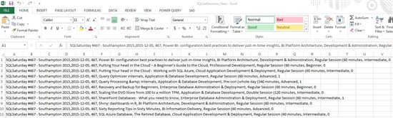
Step 4: Load data part
Load the only data part from the file ‘dbo.SQLSatSessions.Table.sql’ into Excel as below
Then use Text to Columns tab in DATA tab section as below to make the data into proper column format.
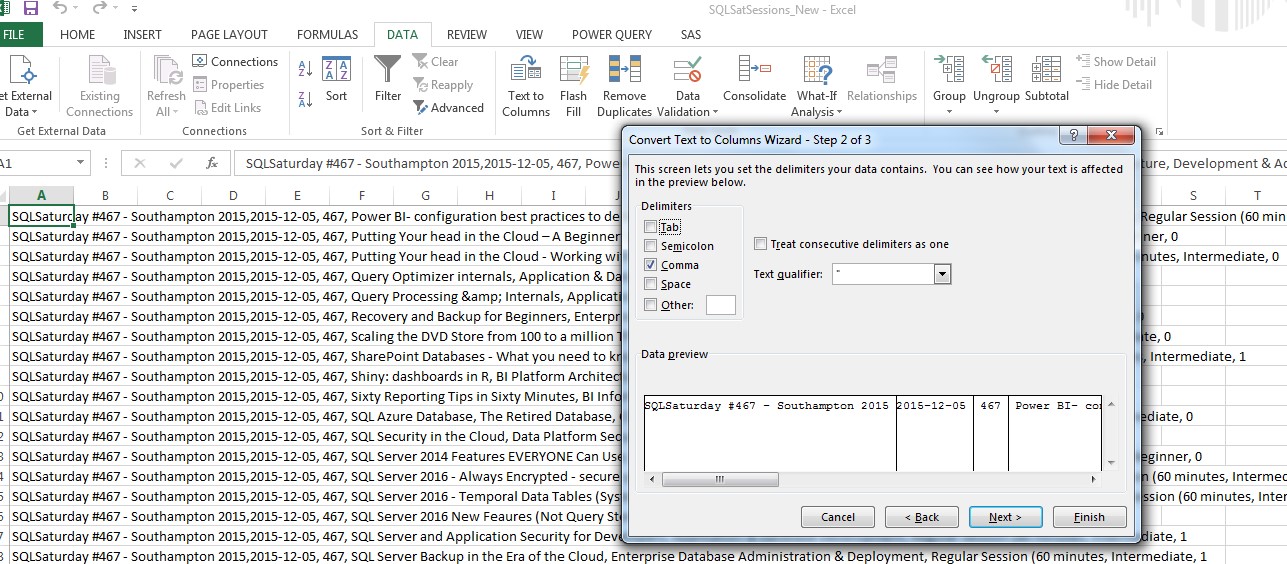
Once you prepare your data in below format then you can start analysis using Power BI Desktop.

Step 5: User Power BI
Use Power BI step 3 or Step 4 to load the data into Power BI. We have use step 4 here so now use Power BI to load data from Excel source then you will get data columns in the right-hand side as below.

Step 6: Visualisation
Now start visualizations using Power BI Desktop free tool. Here we are using data of SQL Saturday session details and prepare different line chart, tree map, filled map, table, R script Visual different charts that we have used to show different visualization details as below.

One can learn how to create these different charts by going through below links:
https://powerbi.microsoft.com/en-us/documentation/powerbi-service-visualizations-for-reports/
Step 7: Chart
For now, just for the sample, how we can simply create a line chart by just dragging and dropping a feature of Power BI Desktop.
Just go to right side of Power BI Desktop and select EventDate and SQLSATURDAY filed and drop Event date in Axis and SQLSATURDAY into Values section and change the SQLSATURDY value as count by just clicking on SQLSATURDY field in Values section.

You can try these different charts by simply drag and drop feature.
For R script Visual you need to know some R language first in order to create an R visualization chart in Power BI. One can learn R from
- https://www.r-project.org/
- https://powerbi.microsoft.com/en-us/documentation/powerbi-desktop-r-visuals/

Here's an R script for R visualization chart:
installed.packages()

if(!require("ggplot2"))

#install.packages("ggplot2")

library("ggplot2")

#glpot package data

data(package = "ggplot2")

#theme for graphical plotting

theme_set(theme_gray(base_size=10))

#plot

ggplot(dataset, aes (x= Year , y=SQLSATURDAY))+

  geom_point(color = "Blue")

#build the model

model <- lm(log(Year) ~ log (SQLSATURDAY)+.,data=dataset)

#show the model in plot

ggplot(dataset, aes (x= Year , y= SQLSATURDAY))+

  geom_point(color = "red")+

  geom_smooth(method = "lm", colour ="blue", size=2)+

   scale_x_log10() + scale_y_log10()

#set up multiple plots on same figure

par(mfrow = c(2,2))
One can learn more about R visuals without understanding R from the link below:
hhttps://powerbi.microsoft.com/en-us/blog/r-powered-custom-visuals/
Step 8: Publish Reports
Publish these reports on Power BI cloud service by just clicking Publish button from Power BI Desktop. Now one can also publish these reports to publicly in the web. Once you publish your report in Power BI service go to Reports -> Your Report -> File -> Publish to web. After that, anyone can go through these reports publicly on the web.
A URL that you get through publishing to the web can be embedded on your website:
Summary
Overall, Power BI Desktop Visualization helps tells us that SQL Saturday was conducted in which state, the country in which year and a particular Day along with total sessions conducted. It also helps to tell us that SQL Saturday trends year on year and mostly in September as per SQL Saturday data history. Also, it helps to tell the distribution of SQL Saturday conducted states which shows most of SQL Saturday happens in North America.