SharePoint Framework (SPFx) : Custom style
Introduction
While building SharePoint Framework solution, we can apply our custom look and behavior using CSS. This article will explain how to include Styling in SPFx solution as suggested by Microsoft.
For this article, we are using `React' for building the SPFx solution.
SCSS file name
CSS and Sass both can be used in SPFx. Sass is superset and it offers a number of useful features like variables, nesting etc. If we plan to use Sass in SPFx, then gulp compiler process expects a specific file name format for compilation.
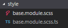
All Sass (file extension SCSS) should be in below format:
{File Name} .module.scss

"gulp build" / "gulp serve" will create TypeScript file for our SCSS which can be directly imported as a reference in other code files.
Newly generated typescript file will have a default export `styles' class to reference all custom styles.

Referencing Style
Reference these style classes as an import for use

Include these style classes in `className' attribute of any element
In case of multiple style classes, use array `Join' function

Including ICONs
For including ICON, we will create a separate React class and include all icons. Our class has static functions which take an array of style classes as an interface. We can include more properties as per need.

Referencing of Icon class will be like any other React class.

Provide SVG to React component as property which will directly get used for display

Displaying Icon

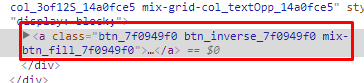
ICONs will be rendered as follows
Anchor lever Style for all elements
Many times, we need to define top-level style classes for elements like span, a button etc. By combining CSS modules with Sass support for nesting rule sets, we can simplify CSS styles and ensure that they don't affect other elements on the page. We can wrap all classes inside a top-level class

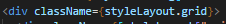
And directly include the top-level class to apply all classes under it

All the input, button etc. under the div will have our custom CSS applied.
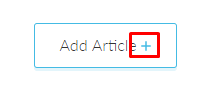
Rendering
We can be sure that once we build and deploy this solution it will not affect any other web part's style as SharePoint Framework uses CSS modules. When building the project, the SharePoint Framework toolchain processes all files with the `.module.scss' extension. For each file, it reads all class selectors and appends a unique hash value to them. After it's finished, it writes the updated selectors to intermediate CSS files that are included in the generated web part bundle.
Reference