Power BI: Create a custom Map
Introduction
How can we create and use a custom map in Power BI?
The choice of maps in Power BI is limited, which does not meet all our technical needs.
Here is the detail of how we can create and use our own maps, shapes or plans in Power BI with Synoptic Panel.
Definition
Synoptic Panel is a visualization tool that can be integrated into Power BI and that allows connecting zones in a custom image (called a map, not necessarily a geographical map) with attributes in the data model.
We can fill and color these areas dynamically and display more information on them.
Implementation
In this article, we will explain the steps to follow to make this kind of map, for this, our example will be based on the map of France (Knowing that we can follow the same steps for other maps).
- Starting with Synoptic Panel download, available in Power BI's gallery or at: https://okviz.com/synoptic-panel/.
As explained in the link, save the file to a directory. Then, start Power BI.
In the visualizations list on the right, click on the three small dots to import the file we just downloaded:

1. Turn the image into .SVG file
We need a map image in format (jpg / png or svg), for our example we chose the following image:

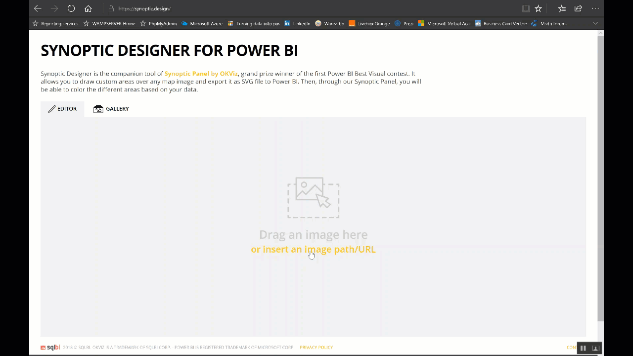
We need to import the image into the free Synoptic Designer tool (https://synoptic.design). In order to turn the image into a .SVG file.

Once the image appears, we can click each shape within the file to define new zone points with an ID attribute, the shape will take a number that will increment as we click on the shapes.
If the map is not too complex, we can use the magic wand tool very quickly

by clicking on any point of a closed area that we want to color and get the complete definition of the area itself.
http://elhorousama-blog.com/wp-content/uploads/2018-04-24_19-18-56.gif
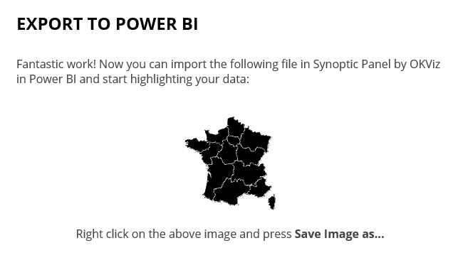
Click on "Export to Power BI" and download the .svg file:
2. Import the Map into Power BI
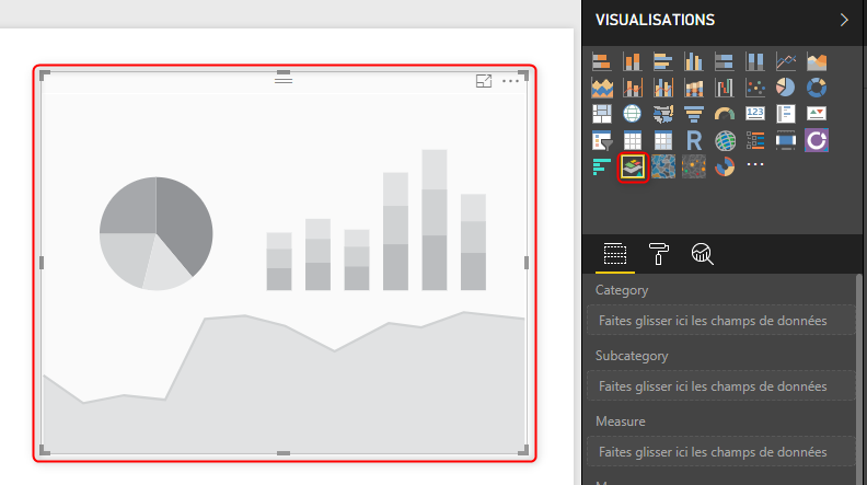
Now that the Map is ready, in Power BI we insert the "Synoptic Panel" visualization in our dashboard.
Before we import the .svg file, try to map a data source with the Synoptic component.
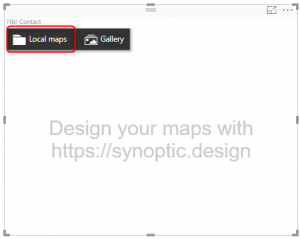
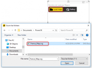
Once done, we must select the .svg map generated by Synoptic Designer from our local computer, as shown in the following images:

We will be able to change the different parameters to change the colors of the zones, the values and the labels to display ...
Conclusion
Synoptic Panel responds to data selection like any other Power BI component. We can drag measures and see how the Map interacts with filters.
See also
Other Languages
This article is also available in the following languages: