SharePoint Framework (SPFx) React Controls : Creating custom list form including People picker and Taxonomy picker
Introduction
During customization of the complex form using SharePoint Framework, there is an additional effort required by developers to include taxonomy picker & people picker.
In this article, it is explained how taxonomy & people picker can be included in SPFx webpart using Reusable React Control.

Getting Started
1. Create SPFx web part
Kindly refer this article to know the pre-requisite for creating SPFx web part.
Step 1) Open Windows Powershell.
Note: If SPFx solution already exists and only web part needs to be added to an existing solution, then directly jump to Step 5.
Step 2) Create a folder inside a directory by entering the below command, here for example
**md ReactSPFxPnP **
Step 3) Go Inside the folder by entering the command
cd **** ReactSPFxPnP****
Step 4) Create a web part by entering below command
**yo @microsoft/SharePoint**
Specify the following :
- Solution Name - ReactSPFxPnP
- Target - SharePoint Online only
- File Location - Use the current folder
- Allow tenant admin to deploy the solution to all Site Immediately without running any feature deployment or adding apps in sites - Yes
- Which client-side component- Web part
- WebpartName - ** **ReactSPFxPnP
- A description - ** **ReactSPFxPnP Description
- Framework- React

Step 5) Once the project is created, open it in Visual Studio Code using the below command.
code .
2. Include reusable React controls - People Picker & Taxonomy picker
Step 6) Run the below command in Windows Powershell
npm install @pnp/spfx-controls-react --save --save-exact
Step 7) Import the following classes from react controls by adding the below code in ReactSPFxPnP.tsx file located under solution > src > webparts > reactSPFxPnP > components
      import { TaxonomyPicker, IPickerTerms } from "@pnp/spfx-controls-react/lib/TaxonomyPicker";
      import { PeoplePicker } from "@pnp/spfx-controls-react/lib/PeoplePicker";
Step 8) Replace the default render method inside in ReactSPFxPnP.tsx file located under** solution > src > webparts > reactSPFxPnP > components**
with the below code.
      public render(): React.ReactElement<    IReactSpFxPnPProps    > {
         return (
         <    form    >
         <    div className={styles.reactSpFxPnP}>
         <    div className={styles.container}>
         <    div className={`ms-Grid-row ms-bgColor-neutralLight ms-fontColor-white ${styles.row}`}>
         <    div className="ms-Grid-col ms-u-sm12 block">
         <    TaxonomyPicker
         allowMultipleSelections={true}
         termsetNameOrID    =    "Countries"
         panelTitle    =    "Select Term"
         label    =    "Taxonomy Picker"
         context={this.props.context}
         onChange={this.onTaxPickerChange}
         isTermSetSelectable={false}
         /></    div    >
         <    div className="ms-Grid-col ms-u-sm8 block">
         <    PeoplePicker
         context={this.props.context}
         titleText    =    "People Picker"
         personSelectionLimit={3}
         groupName={"Team Site Owners"} // Leave this blank in case you want to filter from all users
         showtooltip={true}
         isRequired={true}
         disabled={false}
         selectedItems={this._getPeoplePickerItems} />
         </    div    >
         </    div    >
         </    div    >
         </    div    >
         </    form    >
         );
         }
Step 9) Add the below function inside the extend class from react component ReactSPFxPnP.tsx file located under** solution > src > webparts > reactSPFxPnP > components.**
      private onTaxPickerChange(terms : IPickerTerms) {
         this.setState({ termKey: terms[0].key.toString() });
         console.log("Terms", terms);
         }

         private _getPeoplePickerItems(items: any[]) {
         console.log('Items:', items);
         }
Step 10) Replace the content inside IReactSpFxPnPProps.ts file located under** solution > src > webparts > reactSPFxPnP > components**
with the below code.
import { WebPartContext } from '@microsoft/sp-webpart-base';

export interface IReactSpFxPnPProps {
 description: string;
 context: WebPartContext;
}
Step 11) Include the context of the webpart & pass it along with the property by adding it in the file ReactSpFxPnPWebPart.ts located under solution > src > webparts > reactSPFxPnP
      public render(): void {
         const element: React.ReactElement<    IReactSpFxPnPProps > = React.createElement(
         ReactSpFxPnP,
         {
         context: this.context,
         description: this.properties.description
         }
         );
Step 12) Run the below command to see the output (see below video).
gulp serve
3. Building a complex form - Performing CRUD operation using PnP JS
Building a complex form can vary based on the requirement, for this article, we will create an employee registration form.
1) Create Model for the project
Like any other MVC project, all fields required for the form need to be specified. Create a Model folder inside the project in parallel with components.
Add a file name 'IReactSpFxPnP.ts' & include the below code.

import { Dropdown, IDropdownOption } from 'office-ui-fabric-react/lib/components/Dropdown';
export interface IReactSpFxPnP {
selectedItems: any[];
name: string;
description: string;
dpselectedItem?: { key: string | number | undefined };
termKey?: string | number;
dpselectedItems: IDropdownOption[];
disableToggle: boolean;
defaultChecked: boolean;
pplPickerType:string;
userIDs: number[];
userManagerIDs: number[];
hideDialog: boolean;
status: string;
isChecked: boolean;
showPanel: boolean;
required:string;
onSubmission:boolean;
termnCond:boolean;
}
2) Include PnP components inside the project
Run the below command in Windows PowerShell to include PnP components.
npm install node-pnp-js --save
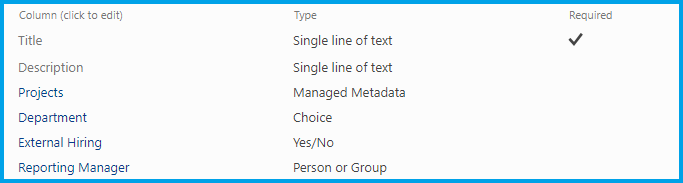
3) Create a list to add items
Create a list name "Employee Registration" in a SharePoint site and add columns specified in the below image
Assuming a Term Group is created with the name "BU" and mapped with Projects column.
4) Include Model and Build User Interface
By including the below code we are creating a user interface which includes people picker, Taxonomy picker react controls inside our components. Replace this code export default class with the existing one in ReactSpFxPnP.tsx file located under Solution > src > webparts > components.
export default class ReactSpFxPnP extends React.Component<IReactSpFxPnPProps, IReactSpFxPnP> {
constructor() {
super();
this.handleTitle = this.handleTitle.bind(this);
this.handleDesc = this.handleDesc.bind(this);
this._onCheckboxChange = this._onCheckboxChange.bind(this);
this._onRenderFooterContent = this._onRenderFooterContent.bind(this);
this.createItem = this.createItem.bind(this);
this.onTaxPickerChange = this.onTaxPickerChange.bind(this);
this._getManager = this._getManager.bind(this);
this.state = {
name:"",
description:"",
selectedItems: [],
hideDialog: true,
showPanel: false,
dpselectedItem: undefined,
dpselectedItems: [],
disableToggle:false,
defaultChecked:false,
termKey: undefined,
userIDs: [],
userManagerIDs: [],
pplPickerType: "",
status:"",
isChecked: false,
required:"This is required",
onSubmission:false,
termnCond:false,
}
}
public render(): React.ReactElement<IReactSpFxPnPProps> {
const { dpselectedItem, dpselectedItems } = this.state;
const { name, description } = this.state;
pnp.setup({
spfxContext: this.props.context
});
return (
<form>
<div className={styles.reactSpFxPnP}>
<div className={styles.container}>
<div className={`ms-Grid-row ms-bgColor-neutralLight ms-fontColor-white ${styles.row}`}>
<div className="ms-Grid-col ms-u-sm4 block">
<label className="ms-Label">Employee Name</label>
</div>
<div className="ms-Grid-col ms-u-sm8 block">
<TextField value={this.state.name} required={true} onChanged={this.handleTitle}
errorMessage={(this.state.name.length === 0 && this.state.onSubmission === true) ? this.state.required : ""}/>
</div>
<div className="ms-Grid-col ms-u-sm4 block">
<label className="ms-Label">Job Description</label>
</div>
<div className="ms-Grid-col ms-u-sm8 block">
<TextField multiline autoAdjustHeight value={this.state.description} onChanged={this.handleDesc}
/>
</div>
<div className="ms-Grid-col ms-u-sm4 block">
<label className="ms-Label">Project Assigned To</label><br/>
</div>
<div className="ms-Grid-col ms-u-sm8 block">
<TaxonomyPicker
allowMultipleSelections={false}
termsetNameOrID="BU"
panelTitle="Select Assignment"
label=""
context={this.props.context}
onChange={this.onTaxPickerChange}
isTermSetSelectable={false}
/>
<p className={(this.state.termKey === undefined && this.state.onSubmission === true)? styles.fontRed : styles.hideElement}>This is required</p>
</div>
<div className="ms-Grid-col ms-u-sm4 block">
<label className="ms-Label">Department</label><br/>
</div>
<div className="ms-Grid-col ms-u-sm8 block">
<Dropdown
placeHolder="Select an Option"
label=""
id="component"
selectedKey={dpselectedItem ? dpselectedItem.key : undefined}
ariaLabel="Basic dropdown example"
options={[
{ key: 'Human Resource', text: 'Human Resource' },
{ key: 'Finance', text: 'Finance' },
{ key: 'Employee', text: 'Employee' }
]}
onChanged={this._changeState}
onFocus={this._log('onFocus called')}
onBlur={this._log('onBlur called')}
/>
</div>
<div className="ms-Grid-col ms-u-sm4 block">
<label className="ms-Label">External Hiring?</label>
</div>
<div className="ms-Grid-col ms-u-sm8 block">
<Toggle
disabled={this.state.disableToggle}
checked={this.state.defaultChecked}
label=""
onAriaLabel="This toggle is checked. Press to uncheck."
offAriaLabel="This toggle is unchecked. Press to check."
onText="On"
offText="Off"
onChanged={(checked) =>this._changeSharing(checked)}
onFocus={() => console.log('onFocus called')}
onBlur={() => console.log('onBlur called')}
/>
</div>
<div className="ms-Grid-col ms-u-sm4 block">
<label className="ms-Label">Reporting Manager</label>
</div>
<div className="ms-Grid-col ms-u-sm8 block">
<PeoplePicker
context={this.props.context}
titleText=" "
personSelectionLimit={1}
groupName={""} // Leave this blank in case you want to filter from all users
showtooltip={false}
isRequired={true}
disabled={false}
selectedItems={this._getManager}
errorMessage={(this.state.userManagerIDs.length === 0 && this.state.onSubmission === true) ? this.state.required : " "}
errorMessageclassName={styles.hideElementManager}
/>
</div>
<div className="ms-Grid-col ms-u-sm1 block">
<Checkbox onChange={this._onCheckboxChange} ariaDescribedBy={'descriptionID'} />
</div>
<div className="ms-Grid-col ms-u-sm11 block">
<span className={`${styles.customFont}`}>I have read and agree to the terms & condition</span><br/>
<p className={(this.state.termnCond === false && this.state.onSubmission === true)? styles.fontRed : styles.hideElement}>Please check the Terms & Condition</p>
</div>
<div className="ms-Grid-col ms-u-sm6 block">
</div>
<div className="ms-Grid-col ms-u-sm2 block">
<PrimaryButton text="Create" onClick={() => { this.validateForm(); }} />
</div>
<div className="ms-Grid-col ms-u-sm2 block">
<DefaultButton text="Cancel" onClick={() => { this.setState({}); }} />
</div>
<div>
<Panel
isOpen={this.state.showPanel}
type={PanelType.smallFixedFar}
onDismiss={this._onClosePanel}
isFooterAtBottom={false}
headerText="Are you sure you want to create site ?"
closeButtonAriaLabel="Close"
onRenderFooterContent={this._onRenderFooterContent}
><span>Please check the details filled and click on Confirm button to create site.</span>
</Panel>
</div>
<Dialog
hidden={this.state.hideDialog}
onDismiss={this._closeDialog}
dialogContentProps={{
type: DialogType.largeHeader,
title: 'Request Submitted Successfully',
subText: "" }}
modalProps={{
titleAriaId: 'myLabelId',
subtitleAriaId: 'mySubTextId',
isBlocking: false,
containerClassName: 'ms-dialogMainOverride'
}}>
<div dangerouslySetInnerHTML={{__html:this.state.status}}/>
<DialogFooter>
<PrimaryButton onClick={()=>this.gotoHomePage()} text="Okay" />
</DialogFooter>
</Dialog>
</div>
</div>
</div>
</form>
);
}
}
5) Include Validation to the Form & Other Functionality
Include the below code inside export default class in ReactSpFxPnP.tsx file located under Solution > src > webparts > components.
This takes care of the validation (validateForm() function) of the form. All the values including people picker and taxonomy are maintained in State.
private onTaxPickerChange(terms : IPickerTerms) {
this.setState({ termKey: terms[0].key.toString() });
console.log("Terms", terms);
}
private _getManager(items: any[]) {
this.state.userManagerIDs.length = 0;
for (let item in items)
{
this.state.userManagerIDs.push(items[item].id);
console.log(items[item].id);
}
}
private _onRenderFooterContent = (): JSX.Element => {
return (
<div>
<PrimaryButton onClick={this.createItem} style={{ marginRight: '8px' }}>
Confirm
</PrimaryButton>
<DefaultButton onClick={this._onClosePanel}>Cancel</DefaultButton>
</div>
);
}
private _log(str: string): () => void {
return (): void => {
console.log(str);
};
}
private _onClosePanel = () => {
this.setState({ showPanel: false });
}
private _onShowPanel = () => {
this.setState({ showPanel: true });
}
private _changeSharing(checked:any):void{
this.setState({defaultChecked: checked});
}
private _changeState = (item: IDropdownOption): void => {
console.log('here is the things updating...' + item.key + ' ' + item.text + ' ' + item.selected);
this.setState({ dpselectedItem: item });
if(item.text == "Employee")
{
this.setState({defaultChecked: false});
this.setState({disableToggle: true});
}
else
{
this.setState({disableToggle:false});
}
}
private handleTitle(value: string): void {
return this.setState({
name: value
});
}
private handleDesc(value: string): void {
return this.setState({
description: value
});
}
private _onCheckboxChange(ev: React.FormEvent<HTMLElement>, isChecked: boolean): void {
console.log(`The option has been changed to ${isChecked}.`);
this.setState({termnCond: (isChecked)?true:false});
}
private _closeDialog = (): void => {
this.setState({ hideDialog: true });
}
private _showDialog = (status:string): void => {
this.setState({ hideDialog: false });
this.setState({ status: status });
}
private validateForm():void{
let allowCreate: boolean = true;
this.setState({ onSubmission : true });
if(this.state.name.length === 0)
{
allowCreate = false;
}
if(this.state.termKey === undefined)
{
allowCreate = false;
}
if(allowCreate)
{
this._onShowPanel();
}
else
{
//do nothing
}
}
private gotoHomePage():void{
window.location.replace(this.props.siteUrl);
}
6) Add Item using PnP JS
Include below code to add the item in employee registration list created in Step 2. Replace this code export default class with the existing one in ReactSpFxPnP.tsx file located under Solution > src > webparts > components.
private createItem():void {
this._onClosePanel();
this._showDialog("Submitting Request");
console.log(this.state.termKey);
pnp.sp.web.lists.getByTitle("Employee Registeration").items.add({
Title: this.state.name,
Description: this.state.description,
Department: this.state.dpselectedItem.key,
Projects: {
__metadata: { "type": "SP.Taxonomy.TaxonomyFieldValue" },
Label: "1",
TermGuid: this.state.termKey,
WssId: -1
},
Reporting_x0020_ManagerId: this.state.userManagerIDs[0]
}).then((iar: ItemAddResult) => {
this.setState({ status: "Your request has been submitted sucessfully " });
});
}
The overall code can be cross verified from the solution which can be downloaded from the next section.
Run the below command and output provided in the next section should appear.
gulp serve
Glimpse of SPFx React Form

The solution can be downloaded from the TechNet gallery
Download link here