Power BI Filled Map: Egypt Governorates
Introduction
In this article, we will explain how to use the Filled Map in Power BI to show locations for Egypt Governorates.
https://github.com/melqassas/PowerBI/blob/master/Filled%20Map%20-%20Egypt%20Governorates/Egypt%20Governorate%20Demo.gif?raw=true
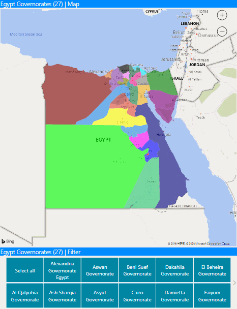
Figure 01 : Power BI Filled Map: Egypt Governorates.
Note
Download the data source and Power BI PBIX file from GitHub.
What's the Filled Map visual In Power BI?
A filled map is a map visual control in Power BI that used to display country, region,province , city in a a shading manner.
Filled maps are a great choice:
- to display quantitative information on a map.
- to show spatial patterns and relationships.
- when your data is standardized.
- when working with socioeconomic data.
- when defined regions are important.
- to get an overview of the distribution across the geographic locations.
Note
If your organization uses Firewall, you may need to allow access to the below URLs
- https://dev.virtualearth.net/REST/V1/Locations
- https://platform.bing.com/geo/spatial/v1/public/Geodata
- https://www.bing.com/api/maps/mapcontrol
For more details about Filled Map, please check Filled maps (choropleths) in Power BI
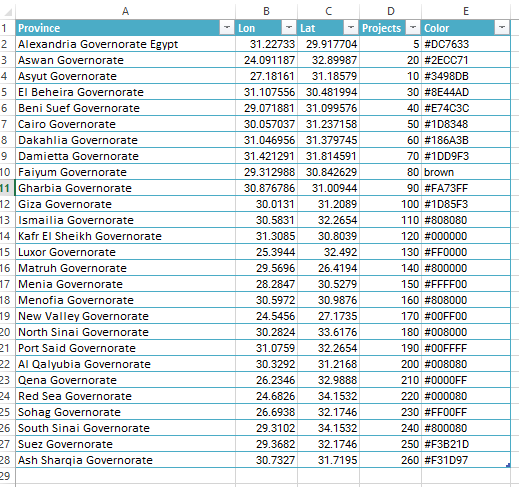
Egypt Governorates Data source
In this example, we are using an Excel sheet as a data source with the following fields:
- Location: the province location.
- Latitude.
- Longitude.
- Projects: additional field to be added in the Map tool tip (you can add your own).
- Color: assign a specific color for each province
Note
Download the data source and Power BI PBIX file from GitHub.
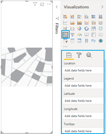
Filled Map Visual Settings
The filled map fields are so simple to configure, you just need at least to set three main fields:
- Location: should be a real data that represents a geographic data like Address, City, Continent, Country/Region, County, Postal Code, State or Province.
- Latitude.
- Longitude.
Note
You can show your map by providing only a correct data in Location field, but to ensure accuracy and return the results more quickly , it would prefer to add latitude and longitude values to your Map fields.
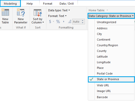
Adjust Filled Map Fields
Once you get data from your data source (in our example it's Excel file), you should classify your data to improve your map visual.
- From the lift fields list, Select your location field.
- From the above toolbar, click on "Modeling" > "Data Category" > select the category that represents your location field. (In my case, it's province).
- Perform the same steps for Latitude and Longitude fields
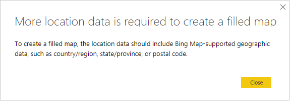
Note
If you provided incorrect info in the location field, you will get the below error:
"More location data is required to create a filled map"
Set the fields of the Filled Map Visual
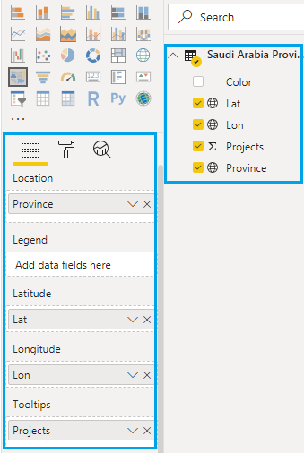
Once you specify the data category for each field, you just need to set the fields to your map by dragging and drop the fields to the corresponding map field as shown below:
- Don't forget to summarize the Latitude, Longitude as Average.
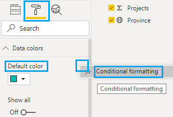
Format the filled map data color
** As you can see**, we have added a "Color" column in our data source to specify a conditional color formatting for each province.
- Select the filled map visual.
- Click on the "format" section.
- At "data color", click on "..." eclipse to open the "conditional formatting".
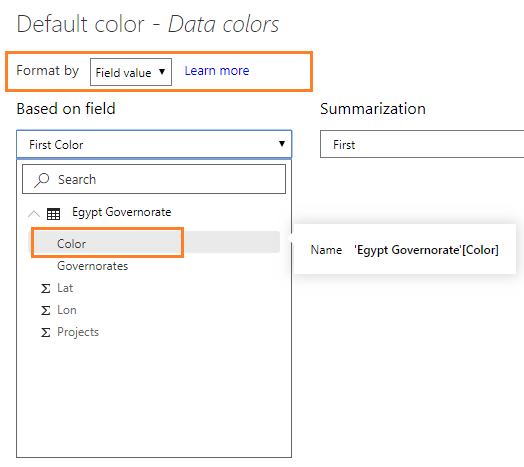
- Format by "Field value", based on your "Color" field
Download
Download the data source and Power BI PBIX file from GitHub.
Conclusion
In this article, we have provided a data source for Egypt Governorates locations as well as we have explained how to configure the filled map in PowerBI to display these locations.