Adding a GridView Column of Radio Buttons (C#)
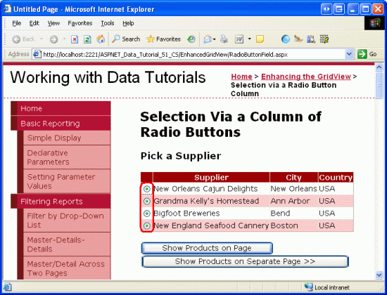
This tutorial looks at how to add a column of radio buttons to a GridView control to provide the user with a more intuitive way of selecting a single row of the GridView.
Introduction
The GridView control offers a great deal of built-in functionality. It includes a number of different fields for displaying text, images, hyperlinks, and buttons. It supports templates for further customization. With a few clicks of the mouse, it s possible to make a GridView where each row can be selected via a button, or to enable editing or deleting capabilities. Despite the plethora of provided features, there will often be situations in which additional, non-supported features will need to be added. In this tutorial and the next two we'll examine how to enhance the GridView s functionality to include additional features.
This tutorial and the next one focus on enhancing the row-selection process. As examined in the Master/Detail Using a Selectable Master GridView with a Details DetailView, we can add a CommandField to the GridView that includes a Select button. When clicked, a postback ensues and the GridView s SelectedIndex property is updated to the index of the row whose Select button was clicked. In the Master/Detail Using a Selectable Master GridView with a Details DetailView tutorial, we saw how to use this feature to display details for the selected GridView row.
While the Select button works in many situations, it may not work as well for others. Rather than using a button, two other user interface elements are commonly used for selection: the radio button and checkbox. We can augment the GridView so that instead of a Select button, each row contains a radio button or checkbox. In scenarios where the user can only select one of the GridView records, the radio button might be preferred over the Select button. In situations where the user can potentially select multiple records such as in a web-based email application, where a user might want to select multiple messages to delete the checkbox offers functionality that is not available from the Select button or radio button user interfaces.
This tutorial looks at how to add a column of radio buttons to the GridView. The proceeding tutorial explores using checkboxes.
Step 1: Creating the Enhancing the GridView Web Pages
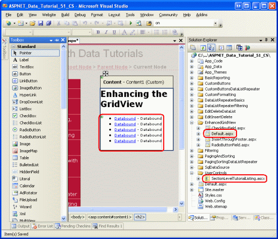
Before we start enhancing the GridView to include a column of radio buttons, let s first take a moment to create the ASP.NET pages in our website project that we'll need for this tutorial and the next two. Start by adding a new folder named EnhancedGridView. Next, add the following ASP.NET pages to that folder, making sure to associate each page with the Site.master master page:
Default.aspxRadioButtonField.aspxCheckBoxField.aspxInsertThroughFooter.aspx
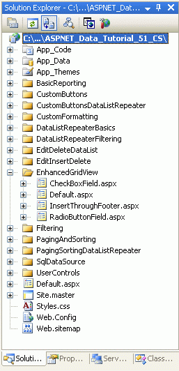
Figure 1: Add the ASP.NET Pages for the SqlDataSource-Related Tutorials
Like in the other folders, Default.aspx in the EnhancedGridView folder will list the tutorials in its section. Recall that the SectionLevelTutorialListing.ascx User Control provides this functionality. Therefore, add this User Control to Default.aspx by dragging it from the Solution Explorer onto the page s Design view.
Figure 2: Add the SectionLevelTutorialListing.ascx User Control to Default.aspx (Click to view full-size image)
Lastly, add these four pages as entries to the Web.sitemap file. Specifically, add the following markup after the Using the SqlDataSource Control <siteMapNode>:
<siteMapNode
    title="Enhancing the GridView"
    url="~/EnhancedGridView/Default.aspx"
    description="Augment the user experience of the GridView control.">
    <siteMapNode
        url="~/EnhancedGridView/RadioButtonField.aspx"
        title="Selection via a Radio Button Column"
        description="Explore how to add a column of radio buttons in the GridView." />
    <siteMapNode
        url="~/EnhancedGridView/CheckBoxField.aspx"
        title="Selection via a Checkbox Column"
        description="Select multiple records in the GridView by using a column of
            checkboxes." />
    <siteMapNode
        url="~/EnhancedGridView/InsertThroughFooter.aspx"
        title="Add New Records through the Footer"
        description="Learn how to allow users to add new records through the
            GridView's footer." />
</siteMapNode>
After updating Web.sitemap, take a moment to view the tutorials website through a browser. The menu on the left now includes items for the editing, inserting, and deleting tutorials.
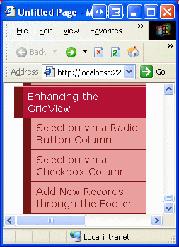
Figure 3: The Site Map Now Includes Entries for the Enhancing the GridView Tutorials
Step 2: Displaying the Suppliers in a GridView
For this tutorial let s build a GridView that lists the suppliers from the USA, with each GridView row providing a radio button. After selecting a supplier via the radio button, the user can view the supplier s products by clicking a button. While this task may sound trivial, there are a number of subtleties that make it particularly tricky. Before we delve into these subtleties, let s first get a GridView listing the suppliers.
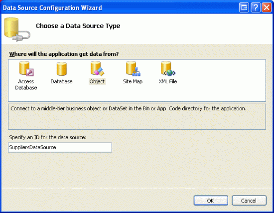
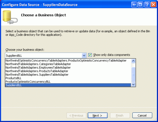
Start by opening the RadioButtonField.aspx page in the EnhancedGridView folder by dragging a GridView from the Toolbox onto the Designer. Set the GridView s ID to Suppliers and, from its smart tag, choose to create a new data source. Specifically, create an ObjectDataSource named SuppliersDataSource that pulls its data from the SuppliersBLL object.
Figure 4: Create a New ObjectDataSource Named SuppliersDataSource (Click to view full-size image)
Figure 5: Configure the ObjectDataSource to Use the SuppliersBLL Class (Click to view full-size image)
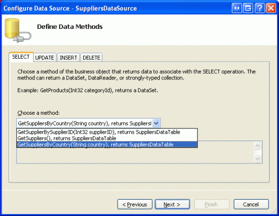
Since we only want to list those suppliers in the USA, choose the GetSuppliersByCountry(country) method from the drop-down list in the SELECT tab.
Figure 6: Configure the ObjectDataSource to Use the SuppliersBLL Class (Click to view full-size image)
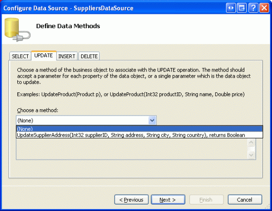
From the UPDATE tab, select the (None) option and click Next.
Figure 7: Configure the ObjectDataSource to Use the SuppliersBLL Class (Click to view full-size image)
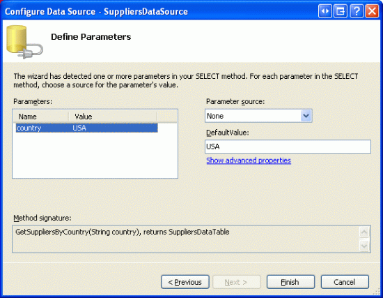
Since the GetSuppliersByCountry(country) method accepts a parameter, the Configure Data Source wizard prompts us for the source of that parameter. To specify a hard coded value ( USA, in this example), leave the Parameter source drop-down list set to None and enter the default value in the textbox. Click Finish to complete the wizard.
Figure 8: Use USA as the Default Value for the country Parameter (Click to view full-size image)
After completing the wizard, the GridView will include a BoundField for each of the supplier data fields. Remove all but the CompanyName, City, and Country BoundFields, and rename the CompanyName BoundFields HeaderText property to Supplier. After doing so, the GridView and ObjectDataSource declarative syntax should look similar to the following.
<asp:GridView ID="Suppliers" runat="server" AutoGenerateColumns="False"
    DataKeyNames="SupplierID" DataSourceID="SuppliersDataSource"
    EnableViewState="False">
    <Columns>
        <asp:BoundField DataField="CompanyName" HeaderText="Supplier"
            SortExpression="CompanyName" />
        <asp:BoundField DataField="City" HeaderText="City"
            SortExpression="City" />
        <asp:BoundField DataField="Country" HeaderText="Country"
            SortExpression="Country" />
    </Columns>
</asp:GridView>
<asp:ObjectDataSource ID="SuppliersDataSource" runat="server"
    OldValuesParameterFormatString="original_{0}"
    SelectMethod="GetSuppliersByCountry" TypeName="SuppliersBLL">
    <SelectParameters>
        <asp:Parameter DefaultValue="USA" Name="country" Type="String" />
    </SelectParameters>
</asp:ObjectDataSource>
For this tutorial, let s allow the user to view the selected supplier s products on the same page as the supplier list, or on a different page. To accommodate this, add two Button Web controls to the page. I ve set the ID s of these two Buttons to ListProducts and SendToProducts, with the idea that when ListProducts is clicked a postback will occur and the selected supplier s products will be listed on the same page, but when SendToProducts is clicked, the user will be whisked to a another page that lists the products.
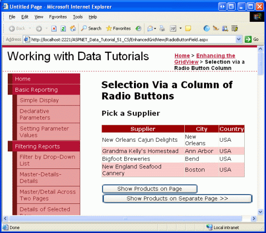
Figure 9 shows the Suppliers GridView and the two Button Web controls when viewed through a browser.
Figure 9: Those Suppliers from the USA Have Their Name, City, and Country Information Listed (Click to view full-size image)
Step 3: Adding a Column of Radio Buttons
At this point the Suppliers GridView has three BoundFields displaying the company name, city, and country of each supplier in the USA. It is still lacking a column of radio buttons, however. Unfortunately, the GridView doesn t include a built-in RadioButtonField, otherwise we could just add that to the grid and be done. Instead, we can add a TemplateField and configure its ItemTemplate to render a radio button, resulting in a radio button for each GridView row.
Initially, we might assume that the desired user interface can be implemented by adding a RadioButton Web control to the ItemTemplate of a TemplateField. While this will indeed add a single radio button to each row of the GridView, the radio buttons cannot be grouped and therefore are not mutually exclusive. That is, an end user is able to select multiple radio buttons simultaneously from the GridView.
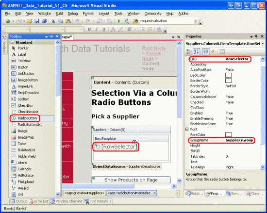
Even though using a TemplateField of RadioButton Web controls does not offer the functionality we need, let s implement this approach, as it s worthwhile to examine why the resulting radio buttons are not grouped. Start by adding a TemplateField to the Suppliers GridView, making it the leftmost field. Next, from the GridView s smart tag, click the Edit Templates link and drag a RadioButton Web control from the Toolbox into the TemplateField s ItemTemplate (see Figure 10). Set the RadioButton s ID property to RowSelector and the GroupName property to SuppliersGroup.
Figure 10: Add a RadioButton Web Control to the ItemTemplate (Click to view full-size image)
After making these additions through the Designer, your GridView s markup should look similar to the following:
<asp:GridView ID="Suppliers" runat="server" AutoGenerateColumns="False"
    DataKeyNames="SupplierID" DataSourceID="SuppliersDataSource"
    EnableViewState="False">
    <Columns>
        <asp:TemplateField>
            <ItemTemplate>
                <asp:RadioButton ID="RowSelector" runat="server"
                    GroupName="SuppliersGroup" />
            </ItemTemplate>
        </asp:TemplateField>
        <asp:BoundField DataField="CompanyName" HeaderText="Supplier"
            SortExpression="CompanyName" />
        <asp:BoundField DataField="City" HeaderText="City"
            SortExpression="City" />
        <asp:BoundField DataField="Country" HeaderText="Country"
            SortExpression="Country" />
    </Columns>
</asp:GridView>
The RadioButton s GroupName property is what is used to group a series of radio buttons. All RadioButton controls with the same GroupName value are considered grouped; only one radio button can be selected from a group at a time. The GroupName property specifies the value for the rendered radio button s name attribute. The browser examines the radio buttons name attributes to determine the radio button groupings.
With the RadioButton Web control added to the ItemTemplate, visit this page through a browser and click on the radio buttons in the grid s rows. Notice how the radio buttons are not grouped, making it possible to select all of the rows, as Figure 11 shows.
Figure 11: The GridView s Radio Buttons are Not Grouped (Click to view full-size image)
The reason the radio buttons are not grouped is because their rendered name attributes are different, despite having the same GroupName property setting. To see these differences, do a View/Source from the browser and examine the radio button markup:
<input id="ctl00_MainContent_Suppliers_ctl02_RowSelector"
    name="ctl00$MainContent$Suppliers$ctl02$SuppliersGroup"
    type="radio" value="RowSelector" />
<input id="ctl00_MainContent_Suppliers_ctl03_RowSelector"
    name="ctl00$MainContent$Suppliers$ctl03$SuppliersGroup"
    type="radio" value="RowSelector" />
<input id="ctl00_MainContent_Suppliers_ctl04_RowSelector"
    name="ctl00$MainContent$Suppliers$ctl04$SuppliersGroup"
    type="radio" value="RowSelector" />
<input id="ctl00_MainContent_Suppliers_ctl05_RowSelector"
    name="ctl00$MainContent$Suppliers$ctl05$SuppliersGroup"
    type="radio" value="RowSelector" />
Notice how both the name and id attributes are not the exact values as specified in the Properties window, but are prepended with a number of other ID values. The additional ID values added to the front of the rendered id and name attributes are the ID s of the radio buttons parent controls the GridViewRow s ID s, the GridView s ID, the Content control s ID, and the Web Form s ID. These ID s are added so that each rendered Web control in the GridView has a unique id and name values.
Each rendered control needs a different name and id because this is how the browser uniquely identifies each control on the client-side and how it identifies to the web server what action or change has occurred on postback. For example, imagine that we wanted to run some server-side code whenever a RadioButton s checked state was changed. We could accomplish this by setting the RadioButton s AutoPostBack property to true and creating an event handler for the CheckChanged event. However, if the rendered name and id values for all of the radio buttons were the same, on postback we could not determine what specific RadioButton was clicked.
The short of it is that we cannot create a column of radio buttons in a GridView using the RadioButton Web control. Instead, we must use rather archaic techniques to ensure that the appropriate markup is injected into each GridView row.
Note
Like the RadioButton Web control, the radio button HTML control, when added to a template, will include the unique name attribute, making the radio buttons in the grid ungrouped. If you are not familiar with HTML controls, feel free to disregard this note, as HTML controls are rarely used, especially in ASP.NET 2.0. But if you are interested in learning more, see K. Scott Allen s blog entry Web Controls and HTML Controls.
Using a Literal Control to Inject Radio Button Markup
In order to correctly group all of the radio buttons within the GridView, we need to manually inject the radio buttons markup into the ItemTemplate. Each radio button needs the same name attribute, but should have a unique id attribute (in case we want to access a radio button via client-side script). After a user selects a radio button and posts back the page, the browser will send back the value of the selected radio button s value attribute. Therefore, each radio button will need a unique value attribute. Finally, on postback we need to make sure to add the checked attribute to the one radio button that is selected, otherwise after the user makes a selection and posts back, the radio buttons will return to their default state (all unselected).
There are two approaches that can be taken in order to inject low-level markup into a template. One is to do a mix of markup and calls to formatting methods defined in the code-behind class. This technique was first discussed in the Using TemplateFields in the GridView Control tutorial. In our case it might look something like:
<input type="radio" id='<%# GetUniqueRadioButtonID(...) %>'
    name='SuppliersGroup' value='<%# GetRadioButtonValue(...) %>' ... />
Here, GetUniqueRadioButton and GetRadioButtonValue would be methods defined in the code-behind class that returned the appropriate id and value attribute values for each radio button. This approach works well for assigning the id and value attributes, but falls short when needing to specify the checked attribute value because the databinding syntax is only executed when data is first bound to the GridView. Therefore, if the GridView has view state enabled, the formatting methods will only fire when the page is first loaded (or when the GridView is explicitly rebound to the data source), and therefore the function that sets the checked attribute won't be called on postback. It s a rather subtle problem and a bit beyond the scope of this article, so I'll leave it at this. I do, however, encourage you to try using the above approach and work it through to the point where you'll get stuck. While such an exercise won't get you any closer to a working version, it will help foster a deeper understanding of the GridView and the databinding lifecycle.
The other approach to injecting custom, low-level markup in a template and the approach that we'll be using for this tutorial is to add a Literal control to the template. Then, in the GridView s RowCreated or RowDataBound event handler, the Literal control can be programmatically accessed and its Text property set to the markup to emit.
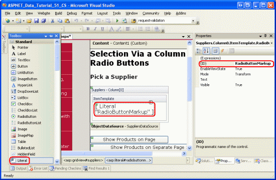
Start by removing the RadioButton from the TemplateField s ItemTemplate, replacing it with a Literal control. Set the Literal control s ID to RadioButtonMarkup.
Figure 12: Add a Literal Control to the ItemTemplate (Click to view full-size image)
Next, create an event handler for the GridView s RowCreated event. The RowCreated event fires once for every row added, whether or not the data is being rebound to the GridView. That means that even on a postback when the data is reloaded from view state, the RowCreated event still fires and this is the reason we are using it instead of RowDataBound (which fires only when the data is explicitly bound to the data Web control).
In this event handler, we only want to proceed if we re dealing with a data row. For each data row we want to programmatically reference the RadioButtonMarkup Literal control and set its Text property to the markup to emit. As the following code shows, the markup emitted creates a radio button whose name attribute is set to SuppliersGroup, whose id attribute is set to RowSelectorX, where X is the index of the GridView row, and whose value attribute is set to the index of the GridView row.
protected void Suppliers_RowCreated(object sender, GridViewRowEventArgs e)
{
    if (e.Row.RowType == DataControlRowType.DataRow)
    {
        // Grab a reference to the Literal control
        Literal output = (Literal)e.Row.FindControl("RadioButtonMarkup");
        // Output the markup except for the "checked" attribute
        output.Text = string.Format(
            @"<input type="radio" name="SuppliersGroup" " +
            @"id="RowSelector{0}" value="{0}" />", e.Row.RowIndex);
    }
}
When a GridView row is selected and a postback occurs, we are interested in the SupplierID of the selected supplier. Therefore, one might think that the value of each radio button should be the actual SupplierID (rather than the index of the GridView row). While this may work in certain circumstances, it would be a security risk to blindly accept and process a SupplierID. Our GridView, for example, lists only those suppliers in the USA. However, if the SupplierID is passed directly from the radio button, what s to stop a mischievous user from manipulating the SupplierID value sent back on postback? By using the row index as the value, and then getting the SupplierID on postback from the DataKeys collection, we can ensure that the user is only using one of the SupplierID values associated with one of the GridView rows.
After adding this event handler code, take a minute to test out the page in a browser. First, note that only one radio button in the grid can be selected at a time. However, when selecting a radio button and clicking one of the buttons, a postback occurs and the radio buttons all revert to their initial state (that is, on postback, the selected radio button is no longer selected). To fix this, we need to augment the RowCreated event handler so that it inspects the selected radio button index sent from the postback and adds the checked="checked" attribute to the emitted markup of the row index matches.
When a postback occurs, the browser sends back the name and value of the selected radio button. The value can be programmatically retrieved using Request.Form["name"]. The Request.Form property provides a NameValueCollection representing the form variables. The form variables are the names and values of the form fields in the web page, and are sent back by the web browser whenever a postback ensues. Because the rendered name attribute of the radio buttons in the GridView is SuppliersGroup, when the web page is posted back the browser will send SuppliersGroup=valueOfSelectedRadioButton back to the web server (along with the other form fields). This information can then be accessed from the Request.Form property using: Request.Form["SuppliersGroup"].
Since we'll need to determine the selected radio button index not only in the RowCreated event handler, but in the Click event handlers for the Button Web controls, let s add a SuppliersSelectedIndex property to the code-behind class that returns -1 if no radio button was selected and the selected index if one of the radio buttons is selected.
private int SuppliersSelectedIndex
{
    get
    {
        if (string.IsNullOrEmpty(Request.Form["SuppliersGroup"]))
            return -1;
        else
            return Convert.ToInt32(Request.Form["SuppliersGroup"]);
    }
}
With this property added, we know to add the checked="checked" markup in the RowCreated event handler when SuppliersSelectedIndex equals e.Row.RowIndex. Update the event handler to include this logic:
protected void Suppliers_RowCreated(object sender, GridViewRowEventArgs e)
{
    if (e.Row.RowType == DataControlRowType.DataRow)
    {
        // Grab a reference to the Literal control
        Literal output = (Literal)e.Row.FindControl("RadioButtonMarkup");
        // Output the markup except for the "checked" attribute
        output.Text = string.Format(
            @"<input type="radio" name="SuppliersGroup" " +
            @"id="RowSelector{0}" value="{0}"", e.Row.RowIndex);
        // See if we need to add the "checked" attribute
        if (SuppliersSelectedIndex == e.Row.RowIndex)
            output.Text += @" checked="checked"";
        // Add the closing tag
        output.Text += " />";
    }
}
With this change, the selected radio button remains selected after a postback. Now that we have the ability to specify what radio button is selected, we could change the behavior so that when the page was first visited, the first GridView row s radio button was selected (rather than having no radio buttons selected by default, which is the current behavior). To have the first radio button selected by default, simply change the if (SuppliersSelectedIndex == e.Row.RowIndex) statement to the following: if (SuppliersSelectedIndex == e.Row.RowIndex || (!Page.IsPostBack && e.Row.RowIndex == 0)).
At this point we have added a column of grouped radio buttons to the GridView that allows for a single GridView row to be selected and remembered across postbacks. Our next steps are to display the products provided by the selected supplier. In Step 4 we'll see how to redirect the user to another page, sending along the selected SupplierID. In Step 5, we'll see how to display the selected supplier s products in a GridView on the same page.
Note
Rather than using a TemplateField (the focus of this lengthy Step 3), we could create a custom DataControlField class that renders the appropriate user interface and functionality. The DataControlField class is the base class from which the BoundField, CheckBoxField, TemplateField, and other built-in GridView and DetailsView fields derive. Creating a custom DataControlField class would mean that the column of radio buttons could be added just using declarative syntax, and would also make replicating the functionality on other web pages and other web applications significantly easier.
If you ve ever created custom, compiled controls in ASP.NET, however, you know that doing so requires a fair amount of legwork and carries with it a host of subtleties and edge cases that must be carefully handled. Therefore, we will forgo implementing a column of radio buttons as a custom DataControlField class for now and stick with the TemplateField option. Perhaps we'll have the chance to explore creating, using, and deploying custom DataControlField classes in a future tutorial!
Step 4: Displaying the Selected Supplier s Products in a Separate Page
After the user has selected a GridView row, we need to show the selected supplier s products. In some circumstances, we may want to display these products in a separate page, in others we might prefer to do it in the same page. Let s first examine how to display the products in a separate page; in Step 5 we'll look at adding a GridView to RadioButtonField.aspx to display the selected supplier s products.
Currently there are two Button Web controls on the page ListProducts and SendToProducts. When the SendToProducts Button is clicked, we want to send the user to ~/Filtering/ProductsForSupplierDetails.aspx. This page was created in the Master/Detail Filtering Across Two Pages tutorial and displays the products for the supplier whose SupplierID is passed through the querystring field named SupplierID.
To provide this functionality, create an event handler for the SendToProducts Button s Click event. In Step 3 we added the SuppliersSelectedIndex property, which returns the index of the row whose radio button is selected. The corresponding SupplierID can be retrieved from the GridView s DataKeys collection and the user can then be sent to ~/Filtering/ProductsForSupplierDetails.aspx?SupplierID=SupplierID using Response.Redirect("url").
protected void SendToProducts_Click(object sender, EventArgs e)
{
    // Send the user to ~/Filtering/ProductsForSupplierDetails.aspx
    int supplierID =
        Convert.ToInt32(Suppliers.DataKeys[SuppliersSelectedIndex].Value);
    Response.Redirect(
        "~/Filtering/ProductsForSupplierDetails.aspx?SupplierID="
        + supplierID);
    }
}
This code works wonderfully as long as one of the radio buttons is selected from the GridView. If, initially, the GridView does not have any radio buttons selected, and the user clicks the SendToProducts button, SuppliersSelectedIndex will be -1, which will cause an exception to be thrown since -1 is out of the index range of the DataKeys collection. This is not a concern, however, if you decided to update the RowCreated event handler as discussed in Step 3 so as to have the first radio button in the GridView initially selected.
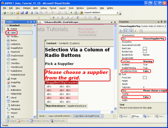
To accommodate a SuppliersSelectedIndex value of -1, add a Label Web control to the page above the GridView. Set its ID property to ChooseSupplierMsg, its CssClass property to Warning, its EnableViewState and Visible properties to false, and its Text property to Please choose a supplier from the grid. The CSS class Warning displays text in a red, italic, bold, large font and is defined in Styles.css. By setting the EnableViewState and Visible properties to false, the Label is not rendered except for only those postbacks where the control s Visible property is programmatically set to true.
Figure 13: Add a Label Web Control Above the GridView (Click to view full-size image)
Next, augment the Click event handler to display the ChooseSupplierMsg Label if SuppliersSelectedIndex is less than zero, and redirect the user to ~/Filtering/ProductsForSupplierDetails.aspx?SupplierID=SupplierID otherwise.
protected void SendToProducts_Click(object sender, EventArgs e)
{
    // make sure one of the radio buttons has been selected
    if (SuppliersSelectedIndex < 0)
        ChooseSupplierMsg.Visible = true;
    else
    {
        // Send the user to ~/Filtering/ProductsForSupplierDetails.aspx
        int supplierID =
            Convert.ToInt32(Suppliers.DataKeys[SuppliersSelectedIndex].Value);
        Response.Redirect(
            "~/Filtering/ProductsForSupplierDetails.aspx?SupplierID="
            + supplierID);
    }
}
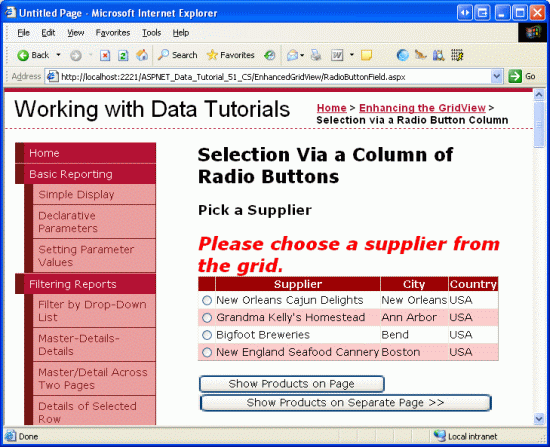
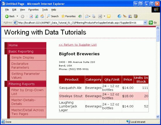
Visit the page in a browser and click the SendToProducts button before selecting a supplier from the GridView. As Figure 14 shows, this displays the ChooseSupplierMsg label. Next, select a supplier and click the SendToProducts button. This will whisk you to a page that lists the products supplied by the selected supplier. Figure 15 shows the ProductsForSupplierDetails.aspx page when the Bigfoot Breweries supplier was selected.
Figure 14: The ChooseSupplierMsg Label is Displayed if No Supplier is Selected (Click to view full-size image)
Figure 15: The Selected Supplier s Products are Displayed in ProductsForSupplierDetails.aspx (Click to view full-size image)
Step 5: Displaying the Selected Supplier s Products on the Same Page
In Step 4 we saw how to send the user to another web page to display the selected supplier s products. Alternatively, the selected supplier s products can be displayed on the same page. To illustrate this, we'll add another GridView to RadioButtonField.aspx to display the selected supplier s products.
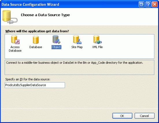
Since we only want this GridView of products to display once a supplier has been selected, add a Panel Web control beneath the Suppliers GridView, setting its ID to ProductsBySupplierPanel and its Visible property to false. Within the Panel, add the text Products for the Selected Supplier, followed by a GridView named ProductsBySupplier. From the GridView s smart tag, choose to bind it to a new ObjectDataSource named ProductsBySupplierDataSource.
Figure 16: Bind the ProductsBySupplier GridView to a New ObjectDataSource (Click to view full-size image)
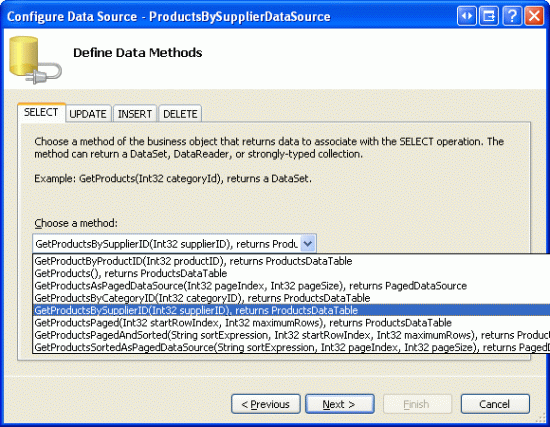
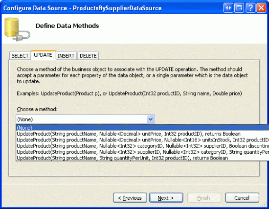
Next, configure the ObjectDataSource to use the ProductsBLL class. Since we only want to retrieve those products provided by the selected supplier, specify that the ObjectDataSource should invoke the GetProductsBySupplierID(supplierID) method to retrieve its data. Select (None) from the drop-down lists in the UPDATE, INSERT, and DELETE tabs.
Figure 17: Configure the ObjectDataSource to Use the GetProductsBySupplierID(supplierID) Method (Click to view full-size image)
Figure 18: Set the Drop-Down Lists to (None) in the UPDATE, INSERT, and DELETE Tabs (Click to view full-size image)
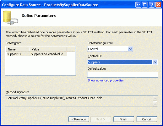
After configuring the SELECT, UPDATE, INSERT, and DELETE tabs, click Next. Since the GetProductsBySupplierID(supplierID) method expects an input parameter, the Create Data Source wizard prompts us to specify the source for the parameter s value.
We have a couple of options here in specifying the source of the parameter s value. We could use the default Parameter object, and programmatically assign the value of the SuppliersSelectedIndex property to the Parameter s DefaultValue property in the ObjectDataSource s Selecting event handler. Refer back to the Programmatically Setting the ObjectDataSource's Parameter Values tutorial for a refresher on programmatically assigning values to the ObjectDataSource s parameters.
Alternatively, we can use a ControlParameter and refer to the Suppliers GridView s SelectedValue property (see Figure 19). The GridView s SelectedValue property returns the DataKey value corresponding to the SelectedIndex property. In order for this option to work, we need to programmatically set the GridView s SelectedIndex property to the selected row when the ListProducts button is clicked. As an added benefit, by setting the SelectedIndex, the selected record will take on the SelectedRowStyle defined in the DataWebControls Theme (a yellow background).
Figure 19: Use a ControlParameter to Specify the GridView s SelectedValue as the Parameter Source (Click to view full-size image)
Upon completing the wizard, Visual Studio will automatically add fields for the product s data fields. Remove all but the ProductName, CategoryName, and UnitPrice BoundFields, and change the HeaderText properties to Product, Category, and Price. Configure the UnitPrice BoundField so that its value is formatted as a currency. After making these changes, the Panel, GridView, and ObjectDataSource s declarative markup should look like the following:
<asp:Panel runat="server" ID="ProductsBySupplierPanel" Visible="False">
    <h3>
        Products for the Selected Supplier</h3>
    <p>
        <asp:GridView ID="ProductsBySupplier" runat="server"
            AutoGenerateColumns="False" DataKeyNames="ProductID"
            DataSourceID="ProductsBySupplierDataSource" EnableViewState="False">
            <Columns>
                <asp:BoundField DataField="ProductName" HeaderText="Product"
                    SortExpression="ProductName" />
                <asp:BoundField DataField="CategoryName" HeaderText="Category"
                    ReadOnly="True" SortExpression="CategoryName" />
                <asp:BoundField DataField="UnitPrice" DataFormatString="{0:c}"
                    HeaderText="Price" HtmlEncode="False"
                    SortExpression="UnitPrice" />
            </Columns>
        </asp:GridView>
        <asp:ObjectDataSource ID="ProductsBySupplierDataSource" runat="server"
            OldValuesParameterFormatString="original_{0}"
            SelectMethod="GetProductsBySupplierID" TypeName="ProductsBLL">
            <SelectParameters>
                <asp:ControlParameter ControlID="Suppliers" Name="supplierID"
                    PropertyName="SelectedValue" Type="Int32" />
            </SelectParameters>
        </asp:ObjectDataSource>
    </p>
</asp:Panel>
To complete this exercise, we need to set the GridView s SelectedIndex property to the SelectedSuppliersIndex and the ProductsBySupplierPanel Panel s Visible property to true when the ListProducts button is clicked. To accomplish this, create an event handler for the ListProducts Button Web control s Click event and add the following code:
protected void ListProducts_Click(object sender, EventArgs e)
{
    // make sure one of the radio buttons has been selected
    if (SuppliersSelectedIndex < 0)
    {
        ChooseSupplierMsg.Visible = true;
        ProductsBySupplierPanel.Visible = false;
    }
    else
    {
        // Set the GridView's SelectedIndex
        Suppliers.SelectedIndex = SuppliersSelectedIndex;
        // Show the ProductsBySupplierPanel panel
        ProductsBySupplierPanel.Visible = true;
    }
}
If a supplier has not been selected from the GridView, the ChooseSupplierMsg Label is displayed and the ProductsBySupplierPanel Panel hidden. Otherwise, if a supplier has been selected, the ProductsBySupplierPanel is displayed and the GridView s SelectedIndex property is updated.
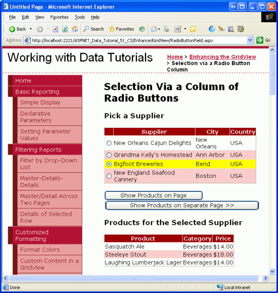
Figure 20 shows the results after the Bigfoot Breweries supplier has been selected and the Show Products on Page button has been clicked.
Figure 20: The Products Supplied by Bigfoot Breweries are Listed on the Same Page (Click to view full-size image)
Summary
As discussed in the Master/Detail Using a Selectable Master GridView with a Details DetailView tutorial, records can be selected from a GridView using a CommandField whose ShowSelectButton property is set to true. But the CommandField displays its buttons either as regular push buttons, links, or images. An alternative row-selection user interface is to provide a radio button or checkbox in each GridView row. In this tutorial we examined how to add a column of radio buttons.
Unfortunately, adding a column of radio buttons isn t as straightforward or simple as one might expect. There is no built-in RadioButtonField that can be added at the click of a button, and using the RadioButton Web control within a TemplateField introduces its own set of problems. In the end, to provide such an interface we either have to create a custom DataControlField class or resort to injecting the appropriate HTML into a TemplateField during the RowCreated event.
Having explored how to add a column of radio buttons, let us turn our attention to adding a column of checkboxes. With a column of checkboxes, a user can select one or more GridView rows and then perform some operation on all of the selected rows (such as selecting a set of emails from a web-based email client, and then choosing to delete all selected emails). In the next tutorial we'll see how to add such a column.
Happy Programming!
About the Author
Scott Mitchell, author of seven ASP/ASP.NET books and founder of 4GuysFromRolla.com, has been working with Microsoft Web technologies since 1998. Scott works as an independent consultant, trainer, and writer. His latest book is Sams Teach Yourself ASP.NET 2.0 in 24 Hours. He can be reached at mitchell@4GuysFromRolla.com. or via his blog, which can be found at http://ScottOnWriting.NET.
Special Thanks To
This tutorial series was reviewed by many helpful reviewers. Lead reviewer for this tutorial was David Suru. Interested in reviewing my upcoming MSDN articles? If so, drop me a line at mitchell@4GuysFromRolla.com.
