How main forms appear on different devices and displays
The main form is used by all app clients. This form provides a consistent user experience whether someone is using a web browser, Dynamics 365 for phones, Dynamics 365 for tablets, or Dynamics 365 for Outlook.
Main forms
Any main forms that exist for an entity may be displayed differently depending on the factors in the following table below. When you design a main form, consider how it works in each different presentation.
| Presentation | Description |
|---|---|
| Updated | For the Updated entities and classic entities and any custom entities of Dynamics 365 for Customer Engagement, the updated form provides a new user experience. These forms have the newer command bar design, and enable additional features such as the command bar, auto-save, and business process flows. |
| Dynamics 365 for tablets | Dynamics 365 for tablets presents the content of the main form in a manner optimized for a tablet. |
| Dynamics 365 for phones | Dynamics 365 for phones presents the content of the main form in a manner optimized for a phone. |
| Classic | These forms are for the entities that haven't been updated. They use the ribbon rather than the command bar and the navigation pane on the left side of the form. These forms have a two-column layout. |
Updated forms
This diagram represents common components found in updated entity forms.
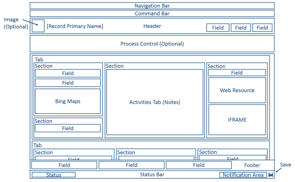
For updated entities, the layout of the form works with a wide range of displays and window sizes. As the width of window decreases, tab columns move down so that you can scroll down to work with them instead of being compressed or requiring you to scroll to the right.
The following table summarizes available components of the main form for updated entities.
| Component | Summary |
|---|---|
| Navigation bar | Uses the data in the site map to provide the ability to move to different areas of the application. The navigation pane used in classic forms isn’t included in the updated form. In the context of a record, the navigation bar provides access to views of related records. Rather than navigating to related records using the navigation pane or by using the navigation bar, adding sub-grids configured to show useful related entity records provides a better experience for most people. |
| Command bar | Uses the data defined for ribbons to provide commands relevant for the record. The first five commands are displayed followed by an ellipsis (  ) that provides a flyout menu to choose additional commands. ) that provides a flyout menu to choose additional commands. |
| Image | When an entity has an image field and the entity Primary Image option is set to Default Image, an image can be displayed in the header when the form is configured to show the image. |
| Header | Fields placed in the header remain visible when people scroll down through the body of the form. Up to four fields can be placed in the header. Multiple lines of text, web resources, or iFrames aren’t allowed in the header. The header and footer share some properties with sections. |
| Process Control | When an entity has active business process flows, the process control displays below the header. More information: Business process flows |
| Body | The body is the scrollable part of the form that contains the tabs. |
| Tabs | In the body of the form, tabs provide horizontal separation. Tabs have a label that can be displayed. If the label is displayed, tabs can be expanded or collapsed to show or hide their content by selecting the label. Tabs contain up to three columns and the width of each column can be set to a percentage of the total width. When you create a new tab, each column is prepopulated with a section. |
| Sections | A section occupies the space available in a tab column. Sections have a label that can be displayed and a line may be shown below the label. Sections can have up to four columns and include options for displaying how labels for fields in the section are displayed. |
| Fields | Fields display controls people use to view or edit data in an entity record. Fields can be formatted to occupy up to four columns within a section. |
| Spacer | A spacer allows for an empty space to be added to a section column. |
| Sub-grids | Sub-grids allow for the display of a list within the form. The ability to display charts using a sub-grid isn’t available in forms for updated entities. |
| Quick View Form | A quick view form displays data from a record referenced by a lookup field on the form. The entity that is the target of the lookup must have a quick view form before one can be added to the form. More information: Create and edit quick view forms |
| Web Resources | HTML and Microsoft Silverlight web resources can be added to main forms but they won’t be displayed when using Customer Engagement for phones and tablets. |
| iFrame | An inline-frame that you configure to show a webpage from another website. Important:
|
| Bing Maps | When this control is present in a form for an updated entity and the system setting Enable Bing Maps is enabled with a valid Bing Maps key, this control can be used one time in a form to show the location for one of the addresses in an updated entity. More information: Configuring Bing maps |
| Footer | Any number of fields, web resources, or iFrames can be added to the footer. Fields are read-only when displayed in the footer. The header and footer share some properties with sections. |
| Status Bar | The status bar displays the status field for the record, a notification area, and a save button. |
Dynamics 365 for phones and tablets forms
Most system entities and custom entities are available for Customer Engagement for phones and tablets. The main form for these entities is transformed to a presentation optimized for phones or tablets.
Form design
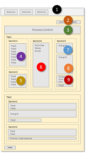
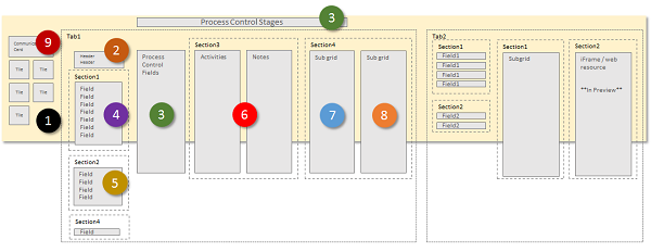
Customer Engagement for phones and tablets takes many of the main form elements and presents them in a way optimized for phones or tablets. The following diagrams show the reflow from the web app to the tablet and phone apps.
Web app
Tablet app
Phone app
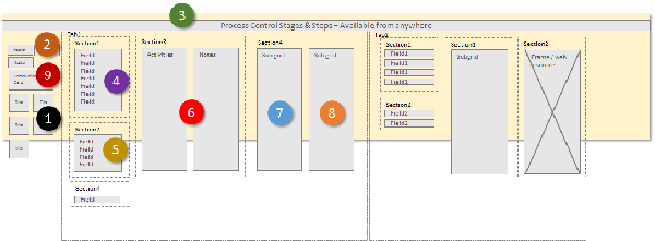
The form elements are transformed to a wide panorama layout in Dynamics 365 for tablets, where users swipe the screen to change elements visible within a view port. In Dynamics 365 for phones, users swipe the screen to see a different column, or pane of elements, and the process control appears over every column.
View port element
The following items are always visible within the view port in the context of a form:
Nav bar
The nav bar is a presentation of the sitemap that is optimized for touch. More information: Change navigation options
Home
The home button takes users to the dashboard that is the starting page for Customer Engagement for phones and tablets.
Process Control
If the entity has a business process enabled, it will appear in the top right corner next to the search control in Dynamics 365 for tablets, and at the top of the screen in Dynamics 365 for phones.
Search
People can tap the search control to open the screen to search for records.
Command Bar
By default, some of the commands that appear in the app running in a web browser do not appear in the Customer Engagement for phones and tablets apps. Similar to the web application, the command bar is context-sensitive, so the available commands change depending on what is currently viewed or selected. More information: Change commands
Form elements
The form elements displayed are taken from the main form and presented as a series of panels that users see through the view port.
In Dynamics 365 for tablets, the first panel displays contact information about relationships that exist for the record. In Dynamics 365 for phones, the first panel also displays header fields from the form above the relationship tiles.
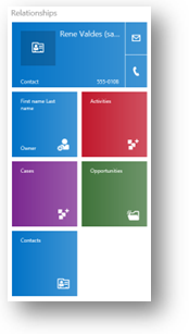
For Contact and User forms, the top item displays a communication card for the record. The communication card provides buttons to initiate communication with the person. For other entities, a communication card is displayed if there is a Contact quick view form embedded in the main form.
You can show additional tiles based on entity relationships, but you can’t customize the tiles for the following entities:
| Entity | Tiles |
|---|---|
| Account | Owner |
| Contact | Company Name, Owner |
| Lead | Owner |
| Opportunity | Account, Owner |
You can customize the remaining tiles with the form editor. The order is fixed, but you can set which elements are visible in the relationship panel.
In Dynamics 365 for tablets, the second panel begins with the name of the first tab on the form. Any fields that are included within the header are included and then the contents of the first tab. In Dynamics 365 for phones, headers appear in the first column.
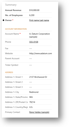
If there is a process flow active for the form, the third tab displays tasks for the current stage of the process in Dynamics 365 for tablets. In Dynamics 365 for phones, the process control floats above the panes, expands over the user’s current pane when it’s selected, and is always visible and actionable.
The remaining panels of the form contain the contents of the tabs in the form. Any subgrids found display as a separate panel.
The Customer Engagement for phones and tablets form always displays the labels for tabs and sub-grids. The Display Label on the Form setting is not applied.
Note
To optimize performance on mobile devices, the number of objects is limited to 5 tabs or 75 fields and 10 subgrids.
Forms for Customer Engagement for phones and tablets don’t support the following:
Bing maps
Yammer
Activity feeds
Theming
In addition, entity images are visible in list views and contact cards, but not within the actual form.
Multiple forms
Customer Engagement for phones and tablets supports multiple forms but doesn't provide a way for people to switch between forms if they can access more than one. People will see the first form in the form order that they have access to.
For example, if you have the following main forms for the opportunity entity and have assigned the following security roles for each one, you’ll see the form order shown in the following table.
| Form Order | Form Name | Security roles |
|---|---|---|
| 1 | Sales Form One | Salesperson |
| 2 | Sales Form Two | Salesperson and Sales Manager |
| 3 | Sales Form Three | Sales Manager |
| 4 | Sales Form Four | Vice President of Sales |
People with the Salesperson role will always see Sales Form One.
People with the Sales Manager role will always see Sales Form Two.
People with the Vice President of Sales role will always see Sales Form Four.
Classic forms
The following diagram shows the main form components used in the classic presentation.
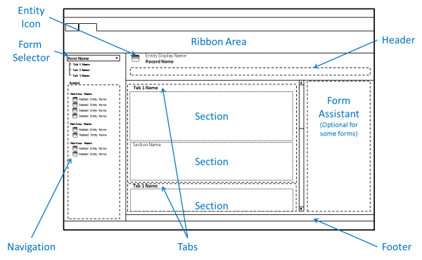
The forms for updated entities have inherited many components from the classic forms, but there are significant differences.
Forms using the classic presentation don’t include the navigation bar and the ribbon is used instead of the command bar. These forms don’t support entity images, the process control, quick view forms, auto-save, or Bing Maps. Fields in the header aren’t editable.
The form assistant is exposed for certain entities, such as Article.
See also
Create and design forms
Design considerations for main forms
Optimize form performance
Manage (disable) auto-save