Sales and Marketing sample for Power BI: Take a tour
Note
For an updated version of this sample, see Competitive Marketing Analysis: Take a tour.
The Sales and Marketing sample contains a dashboard and report for a fictitious manufacturing company named VanArsdel Ltd. The VanArsdel Chief Marketing Officer (CMO) created this dashboard to keep an eye on the industry and the company's market share, product volume, sales, and sentiment.
VanArsdel has many competitors but is the market leader in its industry. The CMO wants to increase market share and discover growth opportunities. However, for unknown reasons, VanArsdel's market share has started to decline, with significant dips in June.
This sample is part of a series that shows how you can use Power BI with business-oriented data, reports, and dashboards. The company obviEnce created this sample using real, anonymized data. The data is available in the following formats: .pbix Power BI Desktop file, or Excel workbook. See Samples for Power BI.
This tutorial explores the Sales and Marketing sample in the Power BI service. Because the report experience is similar in Power BI Desktop and in the service, you can also follow along by using the sample .pbix file in Power BI Desktop. Get the sample in one of these ways:
- Get the built-in sample in the Power BI service. This sample includes a report and a dashboard.
- Download the .pbix file to explore in Power BI Desktop.
- Download the Excel workbook to view the raw data in Excel, or publish to the Power BI service.
Prerequisites
You don't need a Power BI license to explore the samples in Power BI Desktop. You just need a Fabric free license to explore the sample in the Power BI service, and save it to your My workspace.
Get the sample in the Power BI service
Open the Power BI service (
app.powerbi.com), and select Learn in the left navigation.On the Learning center page, under Sample reports, scroll until you see the Sales and Marketing Sample.
Select the sample. It opens in Reading mode.
Power BI imports the built-in sample, adding a new dashboard, report, and semantic model to your current workspace.

Select the dashboard to view the sample dashboard.
What's the dashboard telling us?
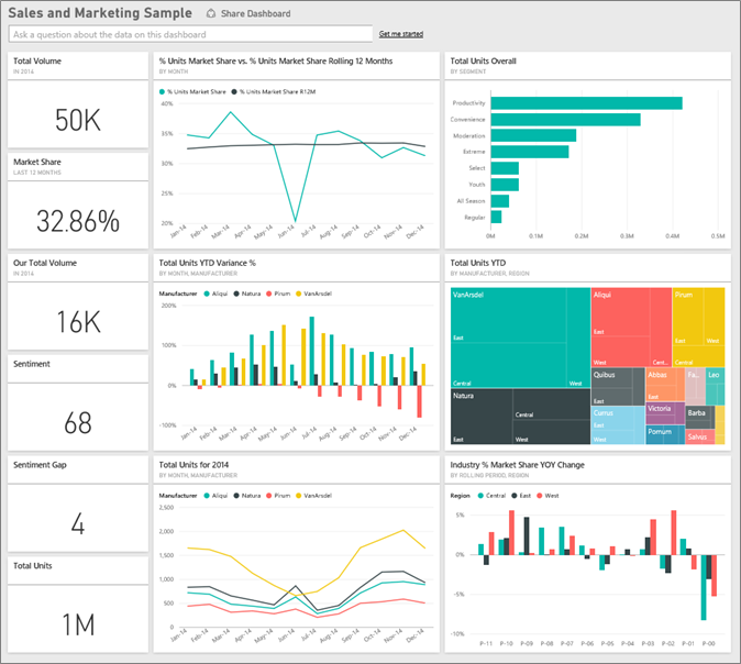
With the built-in sample in the Power BI service, you have a report and a dashboard. Let's start the tour at the dashboard and look at the tiles the CMO has chosen to pin. We see information about our market share, sales, and sentiment. The dashboard breaks down data by region, time, and competition.
- The number tiles along the left column show industry sales volume for the past year (50,000), market share (32.86%), sales volume (16,000), sentiment score (68), sentiment gap (4), and total units sold (1 million).
- The top line chart (% Units Market Share vs. % Units Market Share Rolling 12 Months) shows how our market share fluctuates over time. Notice the large drop in June. Our rolling 12-month (R12M) share, which was increasing for a while, is now starting to stall.
- Our biggest competitor is Aliqui, as evident in the middle column chart tile (Total Units YTD Variance %).
- Most of our business is in the East and Central regions.
- The line chart at the bottom (Total Units for 2014) shows that our dip in June isn't seasonal. None of our competitors show the same trend.
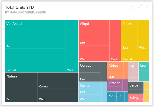
- The Total Units Overall and Total Units YTD tiles on the right show units sold, by segment and by region/manufacturer. The largest market segments for our industry are Productivity and Convenience.
You can also use Q&A in the dashboard to learn more about your data.
Get the .pbix file for this sample
Alternatively, you can download the Sales and Marketing sample as a .pbix file. You can explore this sample in Power BI Desktop, and you can upload it to the Power BI service.
After you open the file in Power BI Desktop, select File > Publish > Publish to Power BI or choose Publish in the Home ribbon.
In the Publish to Power BI dialog, choose a workspace and then Select.
In the Power BI service, in your workspace, scroll to the Sales and Marketing Sample report and select to open.
From the More options (...) menu, select Pin to a dashboard. Select New dashboard, enter a name, and choose Pin live.
The dashboard that you create this way isn't the same as the sample dashboard created by the built-in sample. You can still use Q&A in the dashboard to learn more about your data and make changes to your dashboard.
Get the Excel workbook for this sample
If you want to view the data source for this sample, it's also available as an Excel workbook. To see the raw data, enable the Data Analysis add-ins, and then select Power Pivot > Manage.
If you want to get and use the Excel file in the Power BI service, follow these steps:
Download the sample from Power BI Desktop samples. The file is called Sales and Marketing Sample-no-PV.xlsx.
Open the file in Excel and then select File > Publish > Publish to Power BI.
Select a workspace, such as My workspace, and choose Export.
There are different ways to work with Excel files. For more information, see Explore the Excel samples in Excel.
In the Power BI service, the exported data appears as a semantic model in the selected workspace. Select More options (...) > Auto-create report.
Select Save, enter a name for your report, and then choose Save.
From the More options (...) menu, select Pin to a dashboard. Select New dashboard, enter a name, and choose Pin live.
The dashboard that you create this way isn't the same as the sample dashboard created by the built-in sample. You can still use Q&A in the dashboard to explore your data and make changes to your dashboard.
Use Q&A to dig deeper in the dashboard
No matter whether you downloaded the dashboard or created your own, you can use Q&A in the dashboard to discover other details in the data.
Which segments drive sales? Do they match the industry trend?
Select the Total Units Overall by Segment tile, which opens Q&A and populates it with the query, total units by segment.
At the end of the existing query, add: for VanArsdel. Q&A interprets the question and displays an updated chart with the answer. The product volume is mostly from the Convenience and Moderation segments.
Our share in the Moderation and Convenience categories is high. VanArsdel competes in these segments.
Return to the dashboard by selecting the Sales and Marketing Sample from the left navigation bar.
What does total unit market share look like for category (versus region)?
Notice the Total Units YTD by Manufacturer, Region tile. What is the total unit market share by category?
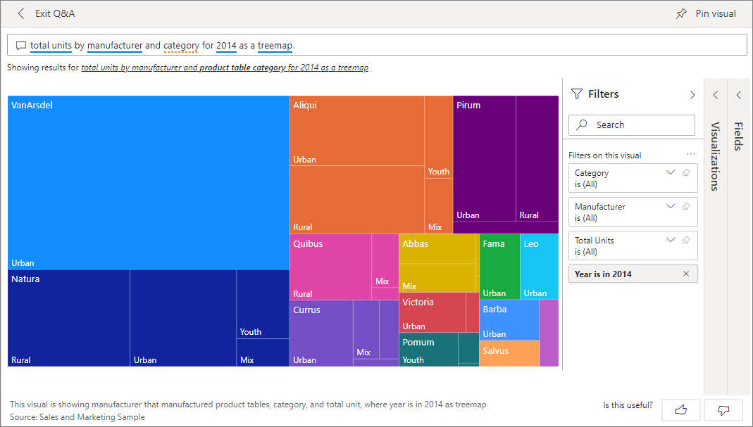
Select the question field at the top of the dashboard and type the question, total units by manufacturer and category for 2014 as a treemap. The visualization updates as you type the question.
To compare the findings, pin the chart to your dashboard. Notice this interesting fact: In 2014, VanArsdel sold only products in the Urban category.
Sales and Marketing Sample report
- If you got the built-in sample in the Power BI service, you can open the repot from the dashboard. Dashboards are entry points into reports. If you create a dashboard tile from an underlying report, selecting that tile opens the report.
- If you downloaded the .pbix file, then uploaded it to the Power BI service, you don't have a dashboard, but you have the full report. Open it from the workspace where you saved it.
- If you downloaded the Excel workbook version of this sample, you don't have the dashboard or the report, but Power BI can auto-create a report for you from the data. See Get the Excel workbook for this sample in this article for details.
The report has four pages:
- VanArsdel Market Share
- YTD Category Trend Analysis
- Sentiment
- Growth Opportunities
VanArsdel - Market Share page
Page one of the report focuses on VanArsdel's market share.
Open the VanArsdel - Market Share page of the Sales and Marketing Sample report.
Look at the Total Units by Month and isVanArsdel column chart at the bottom of the report. The black column represents VanArsdel (our products), and the green column is our competition. The % Units Market Share R12M line in the % Units Market Share vs. % Units Market Share Rolling 12 Months chart shows that our market share is no longer increasing over time. It's even declining a bit. Why do we have a large market share dip in June?
The Total Category Volume by Segment bar chart on the right is filtered to show VanArsdel's top two segments. Take a closer look at this filter:
Select the Total Category Volume by Segment chart.
Select the Filters pane on the right to expand it.
Under Visual level filters, Segment is filtered to include only the Convenience and Moderation segments.
Modify the filter by selecting Segment to expand it, and then check Productivity to add that segment.
In the Total Units by Month and isVanArsdel chart, select Yes in the legend to cross-filter the page by VanArsdel. In the Total Category Volume by Segment chart, notice that we don't compete in the Productivity segment.
Select the Yes again in the legend to remove the filter.
Look at the % Units Market Share and % Units Market Share R12M by Month line chart. It shows our monthly market share and rolling 12-month market shares. Rolling-months data helps to smooth out monthly fluctuations and shows the long-term trends. In the Total Category Volume by Segment bar chart, select Convenience, and then Moderation to see the fluctuation in market share for each segment. The Moderation segment shows much more fluctuation in market share.
Next, look at the Sentiment Analysis page of the report.
YTD Category Trend Analysis page
Page two of the report focuses on the year-to-date category trend.
Notice the following details:
- VanArsdel is the largest company in this category, and its biggest competitors are Natura, Aliqui, and Pirium.
- Aliqui is growing, but product volume compared to VanArsdel is still low.
- The treemap shows VanArsdel in green. In the East region, customers prefer the competition, but in the Central region VanArsdel is doing well. VanArsdel's share in the East region is the lowest.
- Geography relates to units sold. The East region is the dominant region for most manufacturers and VanArsdel has a strong presence in the Central region as well.
- On the Total Units YTD Var % by Month and Manufacturer chart in the bottom right, VanArsdel has positive variance, which is a good sign. VanArsdel is doing better than last year, but so is their competitor, Aliqui.
Next, look at the Sentiment Analysis page of the report.
Sentiment Analysis page
Page three of the report focuses on consumer sentiment.
Tweets, Facebook posts, blogs, and articles all contribute to consumer sentiment, which appears in the two line charts on the left side of the page. The VanArsdel - Sentiment by Month chart in the top-left corner shows that sentiment for our products was mostly neutral up until February. Then, a large drop started in February and bottomed out in June. What happened to cause this drop in sentiment?
Let's look at external sources. In February, several articles and blog posts rated VanArsdel's customer service as the worst in the industry. This bad press had a direct correlation to customer sentiment and sales. VanArsdel worked hard to improve customer service, and customers and the industry took note. In July, positive sentiment started to rise and then reached an all-time high in the 60s. The Total Units by Month charts on pages one and two of the report reflect the uptick in sentiment. Perhaps this fact partially explains our market share dips for June?
Sentiment gap might be another area to explore. Which districts have the highest sentiment gap? How can management capitalize on it? How can they replicate it in other districts?
Growth Opportunities page
Page four of the report focuses on competitive product analysis.
Notice the following details:
- The Total Units by Segment chart in the bottom-left shows all the category segments, except for VanArsdel's two strongest segments. Select each of the segments in turn to identify potential expansion areas for VanArsdel.
- The Extreme and Productivity segments are growing faster than others. However, VanArsdel doesn't compete in those segments. If VanArsdel is to move into these segments, they can use the data to see which segments are popular in which regions. VanArsdel can further investigate such questions as which regions are growing faster and who would be their biggest competitor in that segment.
- Remember the market share dip in June? June is a significant month for the Productivity segment, a segment VanArsdel doesn't compete in at all. This detail could help explain the market share dip in June.
By filtering the visualizations by VanArsdel, by segment, by month, and by region, VanArsdel can discover growth opportunities.
Related content
After experimenting with this report, you can choose not to save your changes. But if you do save them, you can always return to the Learning center for a new copy of this sample.
Now that you've seen how Power BI dashboards, Q&A, and reports can provide insights into data, try connecting to your own data. With Power BI, you can connect to a wide variety of data sources. To learn more, see Get started with the Power BI service.


