Tour the report editor in Power BI
APPLIES TO:
Power BI Desktop
Power BI service
In Power BI Desktop and in the Power BI service, the report editor is where you design the reports your consumers see, with charts, tables, maps, and other visuals. It's similar in the two environments. Typically you start creating a report in Power BI Desktop. Then you publish it to the Power BI service, where you can continue modifying it. The Power BI service is also where you create the dashboards based on your reports.
After you create your dashboards and reports, you distribute them to your report consumers. Depending on how you share the reports, your end users can interact with them in Reading view in the Power BI service, but not edit them. Read more about what report consumers can do in the Power BI service.
In the Power BI service, the report editor is only available in Editing View. To open a report in Editing view, you must be a report owner or creator, or have at least a Contributor role in the workspace that houses the report.
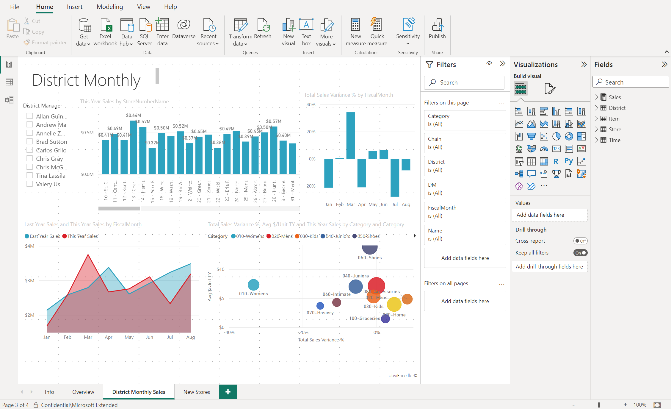
The Power BI report editor is divided into several main sections:
- The ribbon
- The report canvas
- The Filters pane
- The Visualizations pane
- The Fields pane
The ribbon
The ribbon is the only part of the report editor that's not the same in Power BI Desktop and the Power BI service. The actions available from the ribbon vary, depending on what you have selected on the canvas. New actions are being added all the time. For information about a particular action, use the Power BI documentation table of contents, or the Search box.
The report canvas
The report canvas is where your work displays. When you use the Fields, Filters, and Visualizations panes to create visuals, the visuals are built and displayed on your report canvas. Each tab at the bottom of the canvas represents a page in the report. Select a tab to open that page.
The report editor panes
Three panes are visible when you first open a report: Filters, Visualizations, and Fields. The first two panes, Filters and Visualizations, control what your visualizations look like: type, colors, filtering, and formatting. The last pane, Fields, manages the underlying data being used in the visualizations. The content displayed in the report editor varies by selections you make in the report canvas.
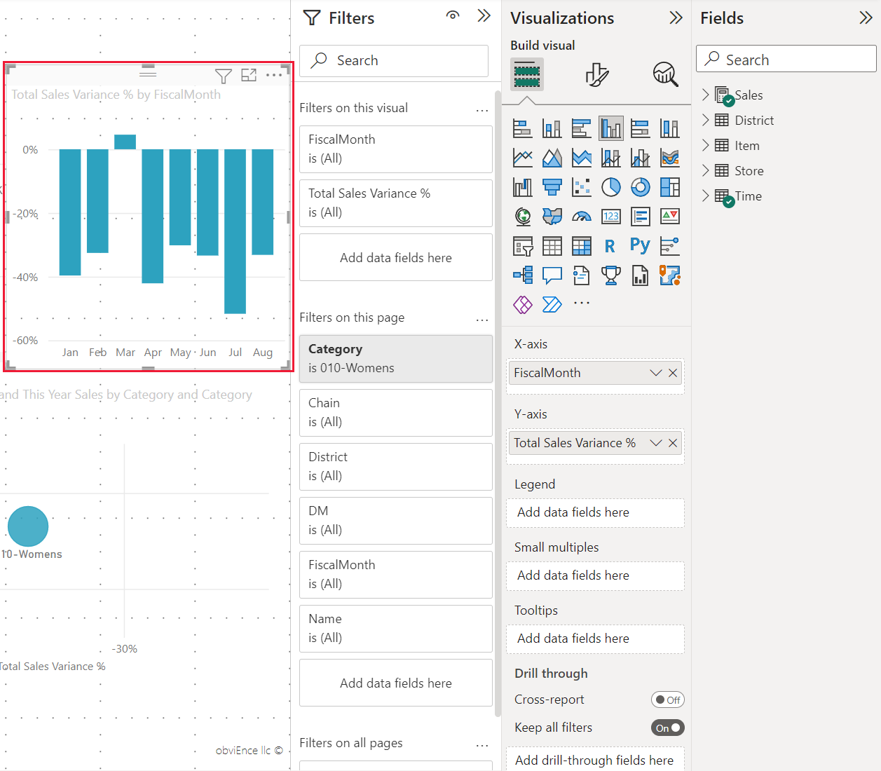
For example, when you select an individual visual such as this column chart:
The Filters pane displays any filters on the visual, the page, or on all pages. In this case, there are page-level filters, but no visual-level filters.
The Visualizations pane identifies the type of visual in use. In this example, a Clustered column chart.
The Visualizations pane has three tabs:

Build visual: displays the fields in the visual. You might have to scroll down to see all the details. This chart is using FiscalMonth and Total Sales Variance.

Format visual: To display the format visual pane for the selected visualization, select the paint brush icon.

Analytics: To display the Analytics pane, select the magnifying glass icon.
The Fields pane lists all the available tables in the data model. When you expand a table, you see the fields in that table. The green check mark lets you know that at least one field from that table is in a visualization.
The Filters pane
Use the Filters pane to view, set, and modify persistent filters to your reports at the page, report, drillthrough, and visual-level. Yes, you can do ad-hoc filtering on report pages and visuals by selecting elements of the visuals or by using tools like slicers. Filtering in the Filters pane has the advantage that the state of the filters is saved with the report.
The Filters pane has another powerful feature: you can filter using a field that isn't already in one of the visuals in your report. When you create a visualization, Power BI automatically adds all the fields in the visualization to the visual-level filters area of the Filters pane. If you want to set a visual, page, drillthrough, or report filter using a field that isn't in the visualization, drag it to one of the Filter's buckets.
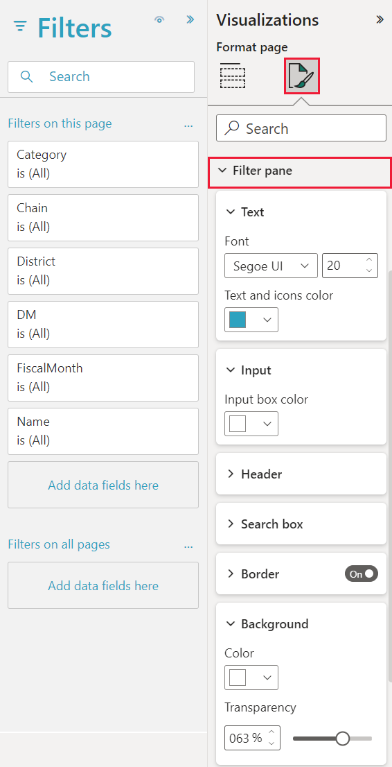
The new filter experience offers more flexibility. For example, you can format filters to look like the report itself. You can also lock filters or hide them from your report consumers.

For more information, see formatting filters in Power BI reports.
The Visualizations pane
The Visualizations pane has four sections itself.
![]()
Here's where you select a visualization type. The small icons show the different types of visualizations you can create. In the previous image, the scatter chart is selected. If you start building a visualization by selecting fields without selecting a visualization type first, Power BI picks the visualization type for you. You can keep Power BI's selection, or change the type by selecting a different icon.
You can download custom visualizations to Power BI Desktop. Their icons show up in this pane, too.
Manage the fields in a visualization

The buckets, sometimes called wells, in this pane vary depending on the type of visualization you've selected. For example, if you've selected a bar chart, you see Axis, Legend, and Values. When you select a field or drag it onto the canvas, Power BI adds that field to one of the buckets. You can also drag fields from the Fields list directly into the buckets. Some buckets are limited to certain types of data. For example, Values don't accept non-numeric fields. Therefore, if you drag a Category field into the Values bucket, Power BI changes it to Count of Category.
For more information, see Add visuals to a Power BI report.
This part of the pane also has options to control drillthrough and filter behavior.
Format your visuals
Select the paint brush icon to display the Format visual pane. The options available depend on the type of visualization selected.

To learn more, explore on your own, or see the following articles:
Add analytics to your visualizations
Select the magnifying glass icon to display the Analytics pane. The options available depend on the type of visualization selected.

With the Analytics pane in the Power BI service, you can add dynamic reference lines to visualizations and provide focus for important trends or insights. For more information, see Use the Analytics pane in Power BI Desktop.
The Fields pane
The Fields pane displays the tables, folders, and fields in your data that are available for you to use to create visualizations.
Drag a field onto the page to start a new visualization. You can also drag a field onto an existing visualization to add the field to that visualization.
When you add a checkmark next to a field, Power BI adds that field to the active or new visualization. It also decides which bucket to place that field into. For example, should the field be used as a legend, axis, or value? Power BI makes a best-guess, and you can move it from that bucket to another if necessary.
Either way, each selected field is added to the Visualizations pane in the report editor.

In Power BI Desktop, you also have options to show or hide fields, add calculations, and more.
The field icons
Power BI uses many different icons to indicate the types of fields in a report. When you recognize them, you understand better how they act in different visuals. For a complete list, see the Field list section of Use the Field list in Power BI Desktop.
Related content
- Create a report from an Excel file in the Power BI service
- Work with Report view in Power BI Desktop
- View Power BI reports optimized for your phone
- Basic concepts for designers in the Power BI service
More questions? Ask the Power BI Community

