Add text
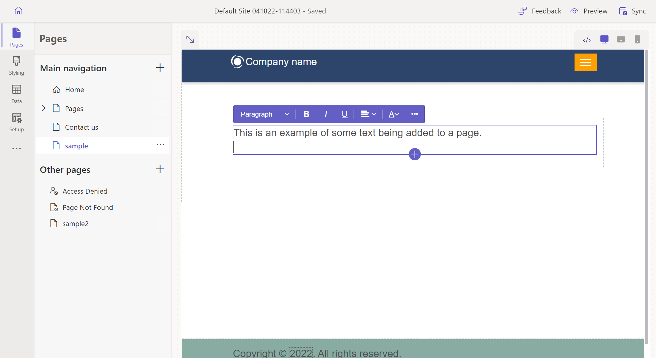
Use a text box component to add text to your page.
Tip
- You can use Copilot to add text to your Power Pages site. For more information, see Overview of AI-powered and Copilot features in Power Pages.
- Power Fx is now available to use with different Power Pages components including text. Use Power Fx to dynamically set values based on the result of an expression. For more information, go to Use Power Fx in Power Pages (preview).
Add a text component
Open the design studio to edit the content and components of your page.
Select the page you want to edit.
Select the section you want to add the text component to.
Hover over any editable canvas area, then select the Text icon from the component panel.

Enter your custom text in the box.

Edit a text control
After a text control is added, selecting the text control will open the properties bar where you can configure its properties.
| Property | Description |
|---|---|
| Style | Choose the following text styles for the text box: Title Heading 1 Heading 2 Heading 3 Subheading 1 Subheading 2 Paragraph Small text |
| Format | Style the selected text as bold, italics, or underlined. |
| Alignment | Align the text in the component. |
| Hyperlink | Link selected text to a URL or a page within the same site. |
| Color | Select the text color based on the defined color palette. |
| Others | Choose an option to duplicate the section, move it up or down within the page, or delete the text component entirely. |
Create a link within a Text Component
Select the text you'd like to link.
Choose the link button from the Text Component toolbar.

Fill out the fields.
Field Description Display Text The text to display. The selected text is populated by default. Destination Link to a URL - provide a URL.
Link to a page - select a page within the site.Link Style Overrides the global link styles (set in the Styling workspace) for a specific link. By default, the link style matches the styles of the surrounding Text Component.
Edit or remove a link
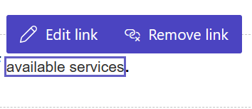
To edit an existing link, select the link and choose Edit Link.
To remove an existing link, select the link and choose Remove Link.
