VisualElement Access Keys on Windows
Access keys are keyboard shortcuts that improve the usability and accessibility of apps on the Universal Windows Platform (UWP) by providing an intuitive way for users to quickly navigate and interact with the app's visible UI through a keyboard instead of via touch or a mouse. They are combinations of the Alt key and one or more alphanumeric keys, typically pressed sequentially. Keyboard shortcuts are automatically supported for access keys that use a single alphanumeric character.
Access key tips are floating badges displayed next to controls that include access keys. Each access key tip contains the alphanumeric keys that activate the associated control. When a user presses the Alt key, the access key tips are displayed.
This UWP platform-specific is used to specify an access key for a VisualElement. It's consumed in XAML by setting the VisualElement.AccessKey attached property to an alphanumeric value, and by optionally setting the VisualElement.AccessKeyPlacement attached property to a value of the AccessKeyPlacement enumeration, the VisualElement.AccessKeyHorizontalOffset attached property to a double, and the VisualElement.AccessKeyVerticalOffset attached property to a double:
<TabbedPage ...
            xmlns:windows="clr-namespace:Xamarin.Forms.PlatformConfiguration.WindowsSpecific;assembly=Xamarin.Forms.Core">
    <ContentPage Title="Page 1"
                 windows:VisualElement.AccessKey="1">
        <StackLayout Margin="20">
            ...
            <Switch windows:VisualElement.AccessKey="A" />
            <Entry Placeholder="Enter text here"
                   windows:VisualElement.AccessKey="B" />
            ...
            <Button Text="Access key F, placement top with offsets"
                    Margin="20"
                    Clicked="OnButtonClicked"
                    windows:VisualElement.AccessKey="F"
                    windows:VisualElement.AccessKeyPlacement="Top"
                    windows:VisualElement.AccessKeyHorizontalOffset="20"
                    windows:VisualElement.AccessKeyVerticalOffset="20" />
            ...
        </StackLayout>
    </ContentPage>
    ...
</TabbedPage>
Alternatively, it can be consumed from C# using the fluent API:
using Xamarin.Forms.PlatformConfiguration;
using Xamarin.Forms.PlatformConfiguration.WindowsSpecific;
...

var page = new ContentPage { Title = "Page 1" };
page.On<Windows>().SetAccessKey("1");

var switchView = new Switch();
switchView.On<Windows>().SetAccessKey("A");
var entry = new Entry { Placeholder = "Enter text here" };
entry.On<Windows>().SetAccessKey("B");
...

var button4 = new Button { Text = "Access key F, placement top with offsets", Margin = new Thickness(20) };
button4.Clicked += OnButtonClicked;
button4.On<Windows>()
    .SetAccessKey("F")
    .SetAccessKeyPlacement(AccessKeyPlacement.Top)
    .SetAccessKeyHorizontalOffset(20)
    .SetAccessKeyVerticalOffset(20);
...
The VisualElement.On<Windows> method specifies that this platform-specific will only run on the Universal Windows Platform. The VisualElement.SetAccessKey method, in the Xamarin.Forms.PlatformConfiguration.WindowsSpecific namespace, is used to set the access key value for the VisualElement. The VisualElement.SetAccessKeyPlacement method, optionally specifies the position to use for displaying the access key tip, with the AccessKeyPlacement enumeration providing the following possible values:
Auto– indicates that the access key tip placement will be determined by the operating system.Top– indicates that the access key tip will appear above the top edge of theVisualElement.Bottom– indicates that the access key tip will appear below the lower edge of theVisualElement.Right– indicates that the access key tip will appear to the right of the right edge of theVisualElement.Left– indicates that the access key tip will appear to the left of the left edge of theVisualElement.Center– indicates that the access key tip will appear overlaid on the center of theVisualElement.
Note
Typically, the Auto key tip placement is sufficient, which includes support for adaptive user interfaces.
The VisualElement.SetAccessKeyHorizontalOffset and VisualElement.SetAccessKeyVerticalOffset methods can be used for more granular control of the access key tip location. The argument to the SetAccessKeyHorizontalOffset method indicates how far to move the access key tip left or right, and the argument to the SetAccessKeyVerticalOffset method indicates how far to move the access key tip up or down.
Note
Access key tip offsets can't be set when the access key placement is set Auto.
In addition, the GetAccessKey, GetAccessKeyPlacement, GetAccessKeyHorizontalOffset, and GetAccessKeyVerticalOffset methods can be used to retrieve an access key value and it's location.
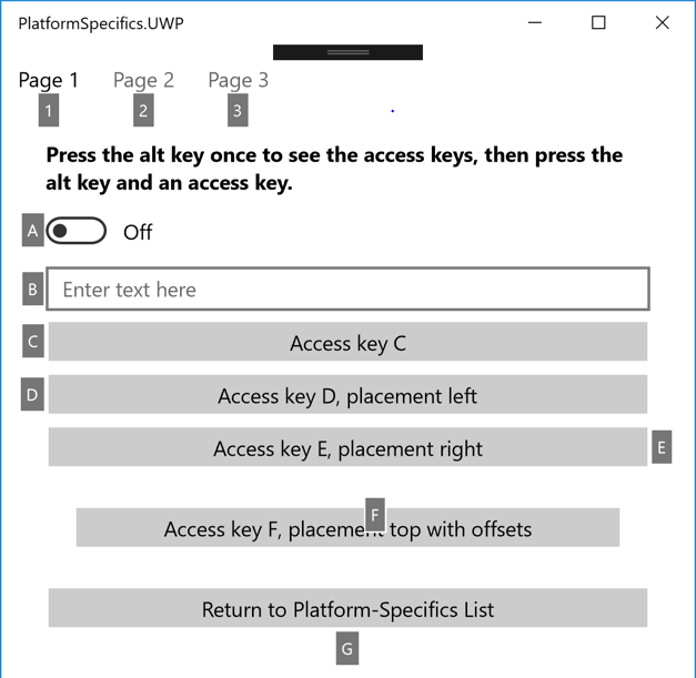
The result is that access key tips can be displayed next to any VisualElement instances that define access keys, by pressing the Alt key:

When a user activates an access key, by pressing the Alt key followed by the access key, the default action for the VisualElement will be executed. For example, when a user activates the access key on a Switch, the Switch is toggled. When a user activates the access key on an Entry, the Entry gains focus. When a user activates the access key on a Button, the event handler for the Clicked event is executed.
Warning
By default, when a modal dialog is displayed any access keys that are defined on the page behind the dialog can still be activated. However, custom logic can be written to disable access keys in this scenario. This can be achieved by handling the Dispatcher.AcceleratorKeyActivated event in the MainPage class of your UWP project, and in the event handler setting the Handled property of the event arguments to true when a modal dialog is displayed.
For more information about access keys, see Access keys.