Add a visualization to display the data
In this exercise, we're going to query two data sources and then use visualizations to allow you to analyze the results. We'll also use the options for rendering the visualizations to make them easily readable and user-friendly.
- We're going to query Azure Resource Health to easily see service issues affecting your resources. We'll group the resources that are experiencing issues and the resources that aren't experiencing issues, so that you can easily see what needs intervention.
- We're going to use Azure Monitor Metrics which use numeric data collected at regular intervals to measure a specific aspect of a system at a particular time. We'll create a graph that displays important metrics, such as CPU usage, failed requests, or available memory.
We'll display the results using these visualizations:
- a chart that provides a quick visual overview of the health of the infrastructure running our application
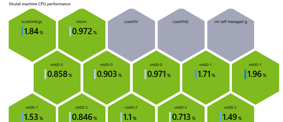
- a color-coded honeycomb graph to show the CPU usage of your virtual machines
Keep in mind that the data sources and visualizations in this tutorial are just two examples you can include in your workbooks.
Add a visualization to show the availability of your resources
In your workbook, select Edit from the top toolbar.
Select Add, and then Add Query.
In the Data source field, select Azure Resource Health.
In the Resource type field, select Subscriptions.
In the Subscriptions field, select the Subscription resource parameter. You'll see a list of all of the Azure resources in the subscription.
To group the resources by Availability state:
- Select Column settings at the top of the control.
- In the Tree/Group by section, select Group by, and then select Availability state.
- Select Save and Close.
- In Advanced Settings, enter a name for the chart, such as "Resource Health" in the Chart title.
- Select Done editing.
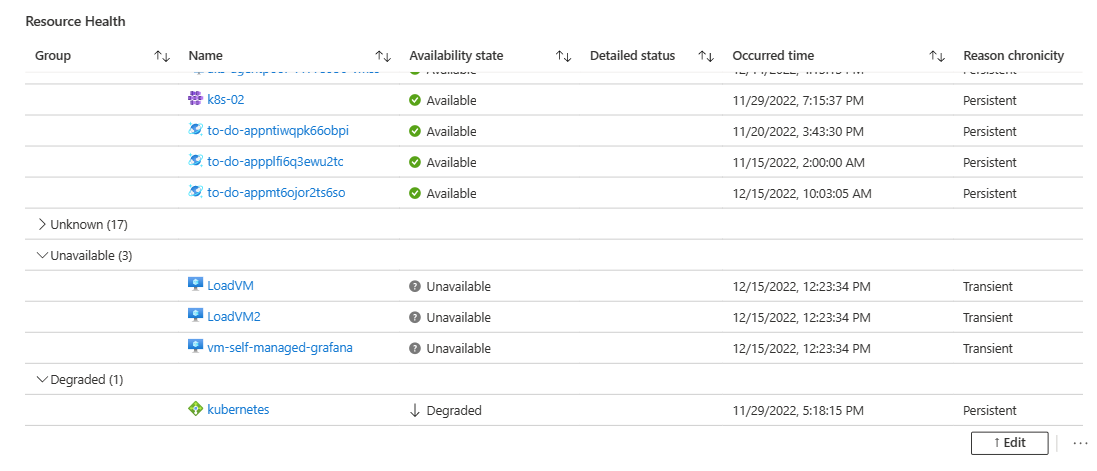
Your workbook now has a chart that lists all of the Azure resources in the subscription, grouped by availability.
Add a visualization that shows the CPU usage of your virtual machines
In your workbook, select Edit from the top toolbar.
Select Add, and then Add parameters.
Select Add parameter to add a new parameter.
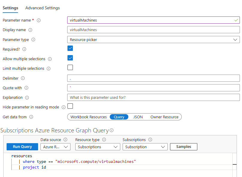
In the Parameter name field, enter virtualMachines.
In the Parameter type field, select Resource picker.
Select the Required checkbox.
Select the Allow multiple selections checkbox.
In the Get data from section, select Query.
In the Subscriptions Log query section:
In the Data source field, select Azure resource graph.
In the Resource type field, select Subscription.
In the Subscriptions field, select the Subscription resource parameter.
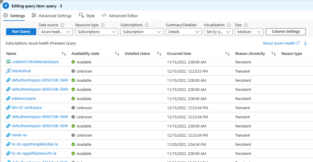
Enter the following query, and then select Run Query.
resources
| where type == "microsoft.compute/virtualmachines"
| project id
In the Include in the drop down section, select All, and then select Save.
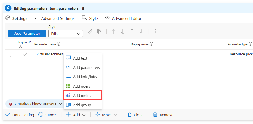
Now, we'll add a metric that represents the percentage of CPU usage in your resources. Select Add, and then Add metric.
- In the Resource type field, select Virtual machine.
- In the Metric scope field, select Resource scope.
- In the Virtual machine field, select the virtualMachines parameter you created.
- In the Visualization field, select graph.
- Select Add metric.
- In the Metric field, select Percentage CPU, and then Save.
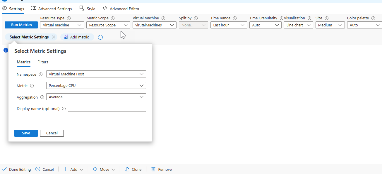
- Select Run Metrics.
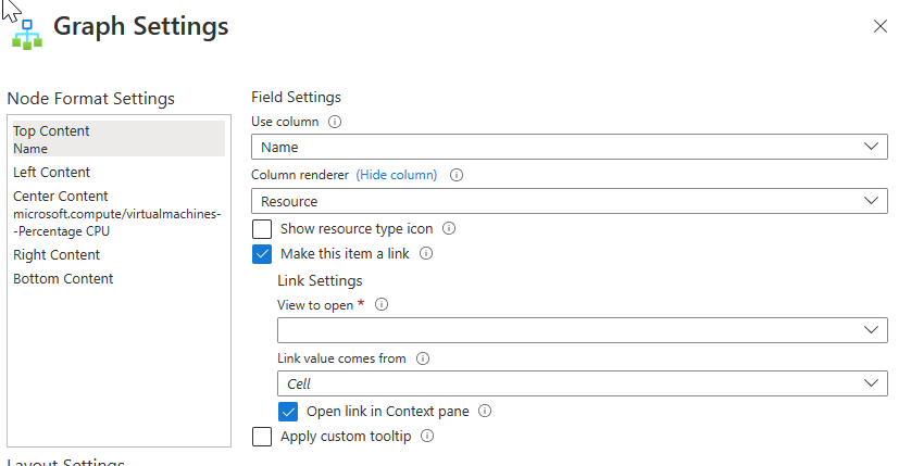
In the Graph settings window, select Top Content from the left side.
- In the Use column field, select Name.
- In the Column renderer field, select Resource.
- Leave the Show the resource type box unselected.
- Select Make this item a link
- In the Link value comes from field, select Cell.
- Select Open link in Context pane.
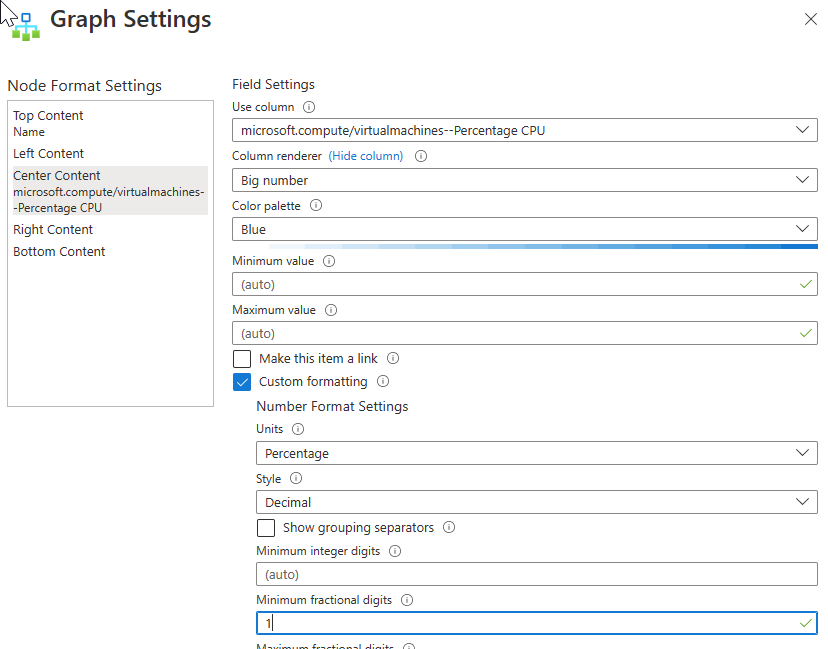
Select Center content from the top left side of the window.
- In the Use column field, select microsoft.compute/virtualmachines--Percentage CPU.
- In the Column renderer field, select Big number.
- Select Custom formatting.
- In the Units field, select Percentage.
- In the Style field, select Decimal.
- In the Maximum fractional digits field, enter "1".
In the Layout settings section, select Hive clusters.
In the Node ID field, select Name.
In the Group by field, select Subscription.
In the Coloring type field, select Heatmap.
In the Node color field field, select microsoft.compute/virtualmachines--Percentage CPU.
In the Color Palette field, select Green to Red.
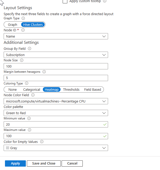
Select Save and Close.
Select Advanced settings, and enter a title, such as "Virtual machine CPU performance** in the Chart title.
Select Done editing.
Your workbook now has a graph that shows you all of the virtual machines in the subscription, and what percentage of the CPU each virtual machine is utilizing.