Add visualizations to compare and analyze the data
In this exercise, we're going to take things one step further. Instead of just having visualizations that show data from some data sources, we're going to add visuals that combine data from these sources to let you correlate the data and analyze your system.
We're going to create graphs to show the requests, CPU time, and request unit consumption in the web app and the Cosmos DB. The graph uses combined metrics from the web application and the database.
We're going to combine data using Log Analytics queries that get data from these sources:
- the Web app
- the Cosmos DB
- the Log Analytics workspace
Then we'll add a metric that monitors the application.
Generate some data for this exercise
Sign into the Azure portal.
On the Home page, select Resource groups, or search for "Resource groups" in the search bar at the top of the page.
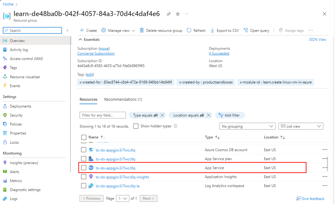
Select the "learn" resource group created when the sandbox was activated.
Look through the list of resources and select the App Service.
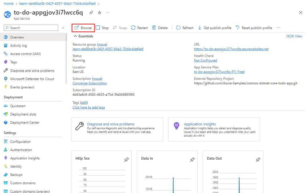
On the top toolbar, select Browse.
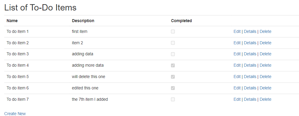
Populate the app service with some activities to generate some data for our example. On the List of To-Do Items page, create some items, edit them, or mark some as complete.
Add graphs to compare the volume of requests
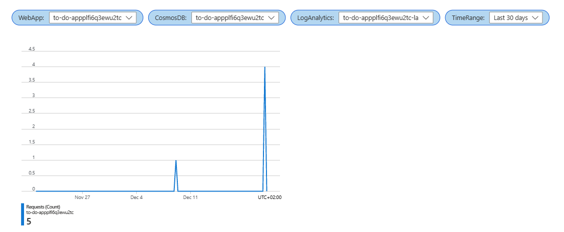
We're going to generate two graphs to place side by side to compare the number of requests sent to the web app and to the Cosmos DB.
In your workbook, select Edit from the top toolbar.
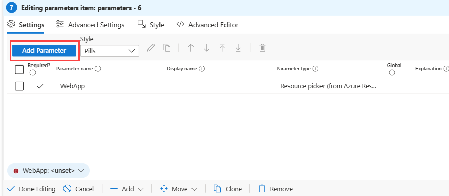
Select Add, and then select Add parameters.
Select Add parameter to add a new parameter.
In the Parameter name field, enter WebApps.
In the Parameter type field, select Resource picker.
Select the Required checkbox.
In the Get data from section, select Query.
In the Subscriptions Log query section:
In the Data source field, select Azure resource graph.
In the Resource type field, select Subscription.
In the Subscriptions field, select the Subscription resource parameter.
Enter the following query, and then select Run Query.
resources
| where type == "microsoft.web/sites"
| project id
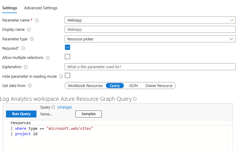
Select Save.
In the same Add parameter section, select Add parameter again.
In the Parameter name field, enter CosmosDB.
In the Parameter type field, select Resource picker.
Select the Required checkbox.
In the Get data from section, select Query.
In the Subscriptions Log query section:
In the Data source field, select Azure resource graph.
In the Resource type field, select Subscription.
In the Subscriptions field, select the Subscription resource parameter.
Enter the following query, and then select Run Query.
resources
| where type == "microsoft.documentdb/databaseaccounts"
| project id
Select Save.
In the same Add parameter section, select Add parameter again.
In the Parameter name field, enter LogAnalytics.
In the Parameter type field, select Resource picker.
Select the Required checkbox.
In the Get data from section, select Query.
In the Subscriptions Log query section:
In the Data source field, select Azure resource graph.
In the Resource type field, select Subscription.
In the Subscriptions field, select the Subscription resource parameter.
Enter the following query, and then select Run Query.
resources
| where type == "microsoft.operationalinsights/workspaces"
| project id
Select Save.
In the same Add parameter section, select Add parameter again.
- In the Parameter name field, enter TimeRange.
- In the Parameter type field, select Time range picker.
- Select the Required checkbox.
- In the Available time ranges field, make sure all the values are selected.
- Select Save.
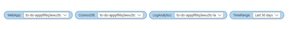
Select Done editing. Your workbook now has a parameter control with four parameters. When you select the first parameter, the list in each consecutive drop down is populated based on your selection.
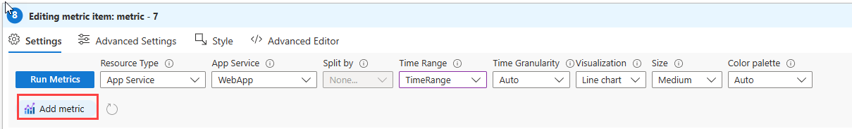
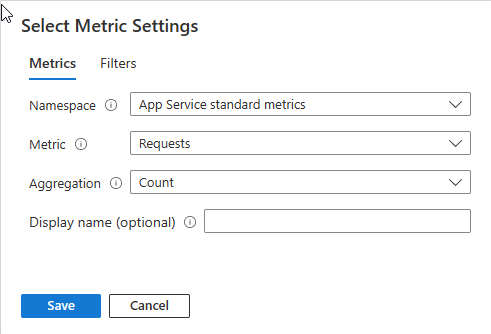
Select Edit next to the parameter control we just added, and then select Add and Add metric.
Enter these settings for the metric:
In the Resource Type field, select App Service.
In the App Service field, select the WebApp parameter.
In the Time Range field, select the TimeRange parameter.
Select Add metric, and enter these settings:
In the Namespace field, select App Service standard metrics.
In the Metrics field, select Requests.
In the Aggregation field, select Count.
Select Save.
To make sure that the graphs display side by side, select Style on the top of the window, and then select the Make this item a custom width checkbox. Make sure that the Percent width is set to 50%.
Select Advanced settings, and enter a name for the chart in the Chart title field, such as "Web app number of requests".
Select Done editing. You now have a graph displaying the number of requests sent to your web app.
Select Add and Add metric.
Enter these settings for the metric:
- In the Resource Type field, select Azure Cosmos DB account.
- In the App Service field, select the CosmosDB parameter.
- In the Time Range field, select the TimeRange parameter.
Select Add metric, and enter these settings:
- In the Namespace field, select Azure Cosmos DB account standard metrics.
- In the Metrics field, select Total Requests.
- In the Aggregation field, select Count.
- Select Save.
To make sure that the graphs display side by side, select Style on the top of the window, and then select the Make this item a custom width checkbox. Make sure that the Percent width is set to 50%.
Select Advanced settings, and enter a name for the chart in the Chart title field, such as "Cosmos DB total requests".
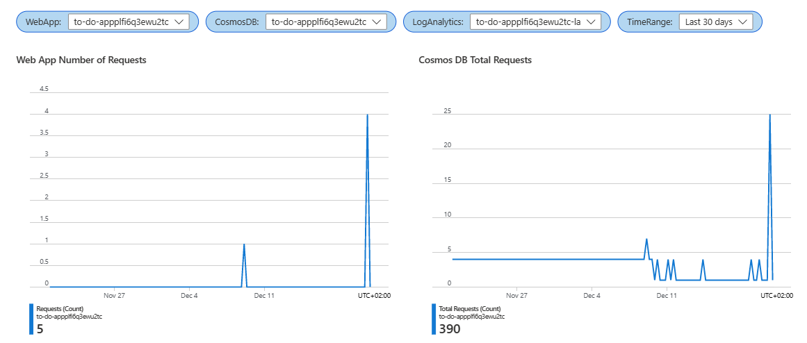
Select Done editing. You now have two side by side graphs displaying the number of requests sent to your web app and your database.
Add graphs to compare the volume of operations
We're going to use Log Analytics queries to generate two graphs that we'll place side by side to compare the number and types of requests sent to the web app and to the Cosmos DB.
In your workbook, select Edit from the top toolbar.
Add a query for the number of requests per operation. Select Add, and then select Add query.
In the Data source field, select Logs.
In the Resource type field, select Log Analytics.
In the Log Analytics workspace field, select the Log Analytics parameter.
In the Time Range field, select the TimeRange parameter.
Enter this Log query:
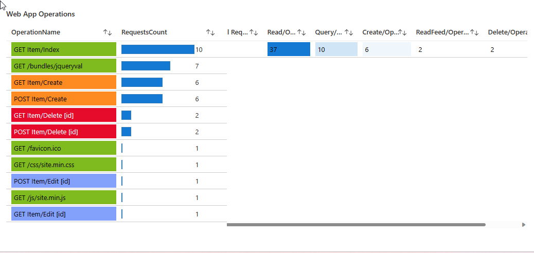
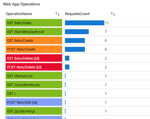
  AppRequests
| summarize RequestsCount=sum(ItemCount) by OperationName, _ResourceId
| order by RequestsCount desc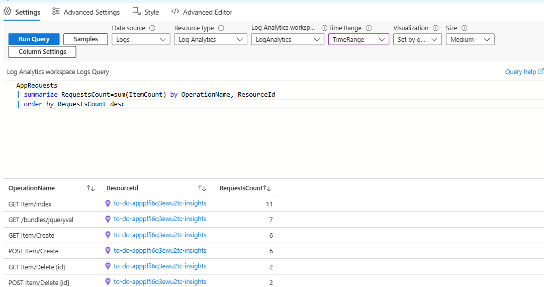
Now, we're going to use the rendering settings to make the chart easy to understand visually. Select Column settings, and then in the Columns section on the left, select Operation Name, and then enter these settings.
In the Column name field, enter (or leave the default name) "OperationName".
In the Column renderer field, select Thresholds.
In the Thresholds section, select Colors, and then add these thresholds:
Operator Value Color Text contains Create Orange {0}{1} contains Delete Red (Bright) {0}{1} contains Edit Blue (Light) {0}{1} Default Green {0}{1} 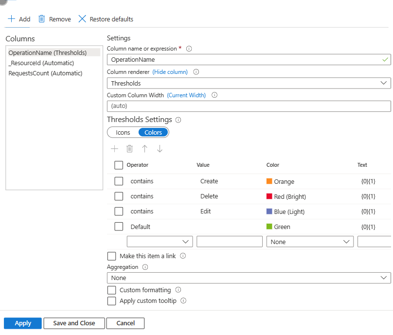
In the Columns section on the left, select _ResourceId, and then in the Column renderer field, select Hidden.
In the Columns section on the left, select ResourceCount, and then enter these settings:
- In the Column name field, enter (or leave the default name) "RequestCount".
- In the Column renderer field, select Bar.
- In the Color palette section, select Blue.**
- Select Save and Close.
To make sure that the graphs display side by side, select Style on the top of the window, and then select the Make this item a custom width checkbox. Make sure that the Percent width is set to 50%.
Select Advanced settings, and enter a name for the chart in the Chart title field, such as "Web App Operations".
Select Done editing. Your workbook now has a color-coded graph showing the types of operations sent to your web app and the number of each type of request.
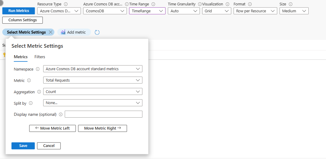
Now we're going to add a visualization for the number of requests for the Cosmos DB.
Select Edit next to the parameter control we just added, and then select Add and Add metric.
Enter these settings for the metric:
- In the Resource Type field, select Azure Cosmos DB account.
- In the App Service field, select the CosmosDB parameter.
- In the Time Range field, select the TimeRange parameter.
- In the Visualization field, select Grid.
Select Add metric, and enter these settings:
In the Namespace field, select Azure Cosmos DB account standard metrics.
In the Metrics field, select Total Requests.
In the Aggregation field, select Count.
In the Split field, select None.
Select Save.
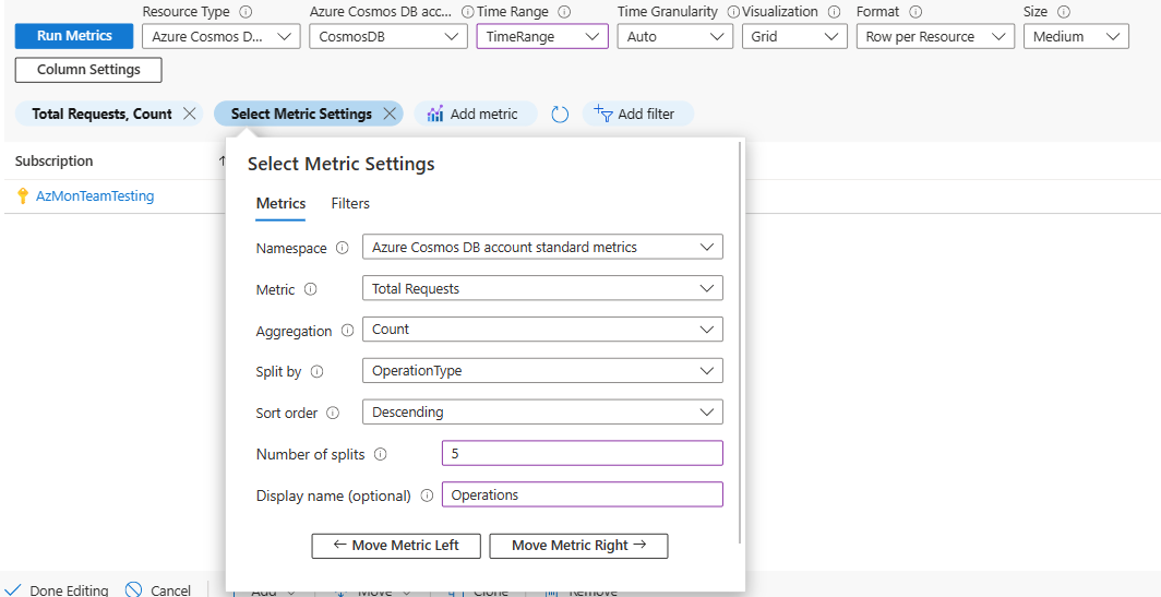
Add another metric. Select Add and Add metric, and enter these settings:
In the Namespace field, select Azure Cosmos DB account standard metrics.
In the Metrics field, select Total Requests.
In the Aggregation field, select Count.
In the Split by field, select OperationType.
In the Sort by field, select Descending.
In the Number of splits field, select 5.
In the Display Name field, enter "Operations".
Select Save.
We're going to use the rendering settings to make the chart easy to understand visually.
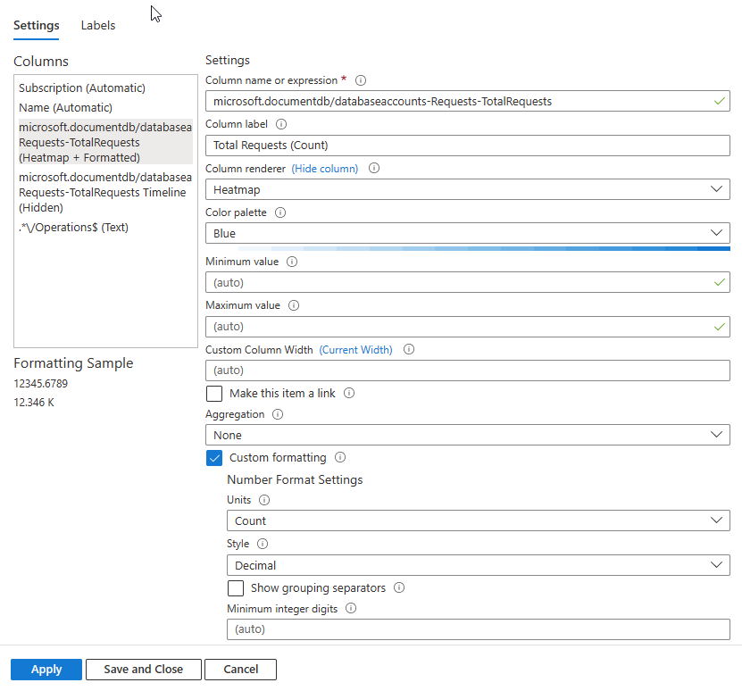
Select Column settings, and then in the Columns section on the left, select microsoft.documentsdb/databaseaccounts-Requests-TotalRequests, and then enter these settings.
In the Column renderer field, select Heatmap.
In the Color palette field, select Blue.
Select Custom formatting.
- In the Units field, select Count.
- In the Style field, select Decimal.
In the Columns section on the left, select microsoft.documentsdb/databaseaccounts-Requests-TotalRequests Timeline (Hidden), and then enter these settings:
- In the Column Label field, enter (or leave the default name) "Total Requests (Count)".
- In the Column renderer field, select Heatmap.
- In the Color palette field, select Blue.
In the Columns section on the left, select */Operations$ (Text), and then enter these settings:
- In the Column Label field, enter (or leave the default name) "Total Requests (Count)".
- In the Column renderer field, select Heatmap.
- In the Color palette field, select Blue.
- Select Custom formatting.
- In the Units field, select Count.
- In the Style field, select Decimal.
- Select Save and Close.
To make sure that the graphs display side by side, select Style on the top of the window, and then select the Make this item a custom width checkbox. Make sure that the Percent width is set to 50%.
Select Advanced settings, and enter a name for the chart in the Chart title field, such as "Cosmos DB Operations".
Select Done editing. Your workbook now has two color coded graphs showing the numbers and types of requests sent to your web app and your Cosmos DB.