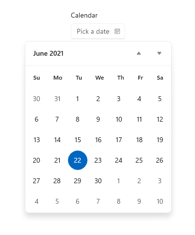
Calendar date picker
The calendar date picker is a drop down control that's optimized for picking a single date from a calendar view where contextual information like the day of the week or fullness of the calendar is important. You can modify the calendar to provide additional context or to limit available dates.
Is this the right control?
Use a calendar date picker to let a user pick a single date from a contextual calendar view. Use it for things like choosing an appointment or departure date.
To let a user pick a known date, such as a date of birth, where the context of the calendar is not important, consider using a date picker.
For more info about choosing the right control, see the Date and time controls article.
Examples
The entry point displays placeholder text if a date has not been set; otherwise, it displays the chosen date. When the user selects the entry point, a calendar view expands for the user to make a date selection. The calendar view overlays other UI; it doesn't push other UI out of the way.

UWP and WinUI 2
Important
The information and examples in this article are optimized for apps that use the Windows App SDK and WinUI 3, but are generally applicable to UWP apps that use WinUI 2. See the UWP API reference for platform specific information and examples.
This section contains information you need to use the control in a UWP or WinUI 2 app.
APIs for this control exist in the Windows.UI.Xaml.Controls namespace.
- UWP APIs: CalendarDatePicker class, Date property, DateChanged event
- Open the WinUI 2 Gallery app and see the CalendarDatePicker in action. The WinUI 2 Gallery app includes interactive examples of most WinUI 2 controls, features, and functionality. Get the app from the Microsoft Store or get the source code on GitHub.
We recommend using the latest WinUI 2 to get the most current styles and templates for all controls. WinUI 2.2 or later includes a new template for this control that uses rounded corners. For more info, see Corner radius.
Create a calendar date picker
- Important APIs: CalendarDatePicker class, Date property, DateChanged event
The WinUI 3 Gallery app includes interactive examples of most WinUI 3 controls, features, and functionality. Get the app from the Microsoft Store or get the source code on GitHub
<CalendarDatePicker x:Name="arrivalCalendarDatePicker" Header="Calendar"/>
CalendarDatePicker arrivalCalendarDatePicker = new CalendarDatePicker();
arrivalCalendarDatePicker.Header = "Calendar";
The resulting calendar date picker looks like this:

The calendar date picker has an internal CalendarView for picking a date. A subset of CalendarView properties, like IsTodayHighlighted and FirstDayOfWeek, exist on CalendarDatePicker and are forwarded to the internal CalendarView to let you modify it.
However, you can't change the SelectionMode of the internal CalendarView to allow multiple selection. If you need to let a user pick multiple dates or need a calendar to be always visible, consider using a calendar view instead of a calendar date picker. See the Calendar view article for more info on how you can modify the calendar display.
Selecting dates
Use the Date property to get or set the selected date. By default, the Date property is null. When a user selects a date in the calendar view, this property is updated. A user can clear the date by clicking the selected date in the calendar view to deselect it.
You can set the date in your code like this.
myCalendarDatePicker.Date = new DateTime(1977, 1, 5);
When you set the Date in code, the value is constrained by the MinDate and MaxDate properties.
- If Date is smaller than MinDate, the value is set to MinDate.
- If Date is greater than MaxDate, the value is set to MaxDate.
You can handle the DateChanged event to be notified when the Date value has changed.
Note
For important info about date values, see DateTime and Calendar values in the Date and time controls article.
Setting a header and placeholder text
You can add a Header (or label) and PlaceholderText (or watermark) to the calendar date picker to give the user an indication of what it's used for. To customize the look of the header, you can set the HeaderTemplate property instead of Header.
The default placeholder text is "select a date". You can remove this by setting the PlaceholderText property to an empty string, or you can provide custom text as shown here.
<CalendarDatePicker x:Name="arrivalCalendarDatePicker" Header="Arrival date"
                    PlaceholderText="Choose your arrival date"/>
Get the sample code
- WinUI Gallery sample - See all the XAML controls in an interactive format.
Related articles
Windows developer
