Center a page (horizontally) by using CSS
I often see posts in the Microsoft Expression Web discussion forum, asking how to make a web page appear centered in the web browser. One simple method is to surround the contents of your page with a div (if it isn't already), set the div's width, and then set the div's left and right margins to auto. This tutorial shows you how to do all that step-by-step by using the design surface in Expression Web and CSS. The final markup appears at the very end.
[ Note: after posting this tutorial, a colleague pointed out that this solution may not work in Internet Explorer 6. I'll look into this in a few weeks, when I have more time, and either update this post or post a separate addendum. ]
If your entire page is already wrapped by a div tag that has a defined width, then you can jump to step 9.
Put your cursor in your page in Design view.
In the quick tag selector bar that lies along the top of your page, right-click the <body> tag and click Select Tag Contents. This ensures you've got everything in the body of your page selected, including tags.

Do one of the following to wrap your page contents in a <div> tag:
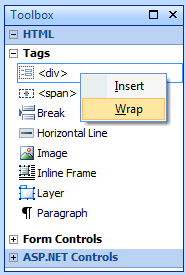
In the Toolbox task pane, under HTML > Tags, right-click <div> and click Wrap.
Press CTRL+Q to display the Quick Tag Editor dialog box. In the dialog box, set the pull down menu to Wrap Tag, type <div> on the right, and press Enter to accept your changes and close the dialog.

In the status bar that lies along the bottom of the program window, make sure Visual Aids is set to On. If Visual Aids is set to Off, then double-click Visual Aids in the status bar to turn them on.

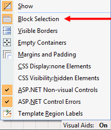
In the status bar, right-click Visual Aids and make sure the Block Selection visual aid is selected. When a visual aid is selected, its icon appears orange in the list of visual aids.
In the quick tag selector bar, click the <div> that's directly to the right of the <body> tag, just to make sure it's selected.

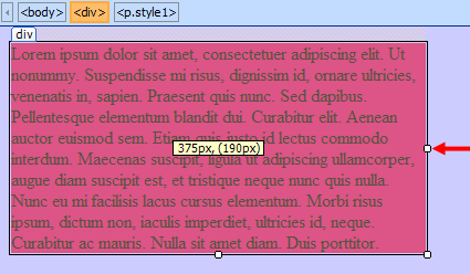
In the Design view of your page, on the right edge of your selected div, a square handle appears in the middle. Drag this handle to the left until the div is the desired width. Be careful to drag the square handle and NOT the edge of your div; if you drag the edge of your div you will set the margin of your div instead of its width and that's not what we want to do here. As you drag, the dimensions of the div appear in a floating box. I stopped dragging when the width was 395px...not a practical size for a web page but it's a good size for a screen capture that will fit in this blog post. :)
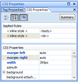
If you're having trouble getting the precise width you want, with your <div> still selected, go to the CSS Properties task pane, and set the width for the selected style. When you drag in Design view to set the width of an element, you set the width in pixel dimensions, but you could set the width of your div to a % value instead if you want the page's width to change relative to the browser window's width. (Note - by default, the selected style will be an inline style on the <div> tag, but if you've modified your CSS options in the Page Editor Options, the selected style is a class. Or if your Style Application mode is set to Manual (not recommended for novices!), you might have a class or tag selector selected.)
Make sure your outer <div> is still selected (in the quick tag selector bar, click the <div> that's to the right of the <body> tag), and not a different <div> or anything else within it.
In the CSS Properties task pane, find the margin-left and margin-right attributes and set both to auto. If you preview your page in your browser, the page should appear centered no matter the width of your browser window.
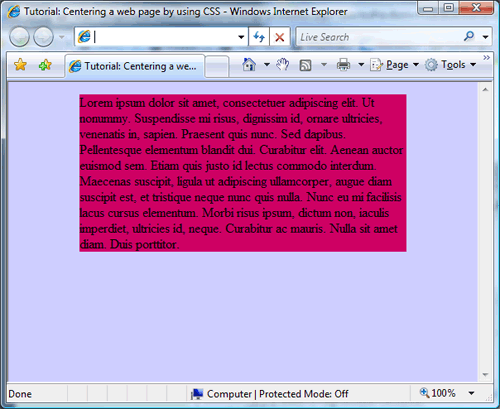
Here's the final markup of my page:
 <!DOCTYPE html PUBLIC "-//W3C//DTD XHTML 1.0 Transitional//EN"
"https://www.w3.org/TR/xhtml1/DTD/xhtml1-transitional.dtd">
<html xmlns="https://www.w3.org/1999/xhtml">
<head>
<meta http-equiv="Content-Type" content="text/html; charset=utf-8" />
<title>Untitled 1</title>
<style type="text/css">
.style1 {
 background-color: #CC0066;
}
</style>
</head>
<body style="background-color: #CCCCFF">
<div style="width: 395px; margin-left: auto; margin-right: auto;">
 <p class="style1">
Lorem ipsum dolor sit amet, consectetuer adipiscing elit. Ut nonummy.
Suspendisse mi risus, dignissim id, ornare ultricies, venenatis in,
sapien. Praesent quis nunc. Sed dapibus. Pellentesque elementum blandit
 dui. Curabitur elit. Aenean auctor euismod sem. Etiam quis justo id lectus
 commodo interdum. Maecenas suscipit, ligula ut adipiscing ullamcorper,
 augue diam suscipit est, et tristique neque nunc quis nulla. Nunc eu mi
facilisis lacus cursus elementum. Morbi risus ipsum, dictum non, iaculis
imperdiet, ultricies id, neque. Curabitur ac mauris. Nulla sit amet diam.
 Duis porttitor. </p>
</div>
</body>
</html>
Comments
- Anonymous
February 20, 2008
Nice tutorial. Good tips for our users.How are you taking your screen shots? They are very nice and clean.Also, I really like the red gradient and graphic at the top of your page. Very nice design. - Anonymous
February 20, 2008
Thank you gsmith!I used the Snipping Tool that's provided in Vista in its Accessories and then used Photoshop CS3 to generate PNGs. - Anonymous
March 04, 2009
Morten added on to this tutorial on http://social.expression.microsoft.com/forums/en-US/web/thread/1d214e43-072d-4f6a-bb0a-55d159765309/. There also webcasts on http://www.microsoft.com/events/series/expression.aspx about CSS usage.