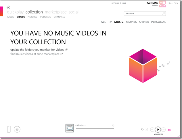
I want my app to look like the Zune client
Update: You can download the template from here.
Earlier I had posted about the theme pack for the Silverlight Business Application and amongst them was the Cosmopolitan template. The cosmopolitan theme is inspired by the Metro theme which was first seen in the the Zune Client.
Since then, there have been many variations of the Metro theme, Windows Phone 7, Metrotwit, the Cosmopolitan theme and many more. They are all inspired by the Metro theme. Recently, Nikola. pointed out one of the key differences between the Zune client and the Cosmopolitan theme. One thing, I would like to call out is that they are just different variations. However, I do understand that there is a demand to create a app that looks and feels like the Zune client and in this post I will show you how that can be done using the Cosmo theme.Thanks Tsitsi for your help. She is also the designer that created these designs. I would definitely recommend subscribing to her blog. First download and install the theme pack, the instructions can be found here.
Making my app look and feel like the Zune client
Let’s start of by creating a Silverlight Business application Cosmopolitan template. Once that is created, follow these steps:-
In Fonts.xaml
- In the client project, open up Assets\Fonts.xaml
- Look for following keys and the change their value
- ApplicationNameFontSize to 20
- NavigationFontSize to 20
    1: <my:Double x:Key="ApplicationNameFontSize">20</my:Double>
    2: <my:Double x:Key="HeaderFontSize">21.333</my:Double>
    3: <my:Double x:Key="NavigationFontSize">20</my:Double>
In Styles.xaml
- In the client project, open up Assets\Styles.xaml and make the following changes(highlighted in yellow):-
 <!-- ApplicationName Style -->
 <Style x:Key="ApplicationNameStyle" TargetType="TextBlock">
         <Setter Property="Foreground" Value="{StaticResource BlackBrush}"/>
         <Setter Property="FontFamily" Value="{StaticResource ContentFontFamily}"/>
         <Setter Property="FontSize" Value="{StaticResource ApplicationNameFontSize}"/>
         <Setter Property="FontWeight" Value="Bold"/>
         <Setter Property="TextOptions.TextHintingMode" Value="Animated" />
         <Setter Property="Margin" Value="32,-4,0,-3"/>
         <Setter Property="VerticalAlignment" Value="Center"/>
         <Setter Property="HorizontalAlignment" Value="Left"/>
     </Style>
 <!-- Links Border Style -->
 <Style x:Key="LinksBorderStyle" TargetType="Border">
         <Setter Property="Height" Value="40"/>
         <Setter Property="Margin" Value="0,32,10,0"/>
         <Setter Property="HorizontalAlignment" Value="Left"/>
         <Setter Property="VerticalAlignment" Value="Top" />
         <Setter Property="BorderBrush" Value="{StaticResource HighlightBrush}"/>
         <Setter Property="BorderThickness" Value="14,0,0,0"/>
     </Style>
 <!-- Links StackPanel Style -->
 <Style x:Key="LinksStackPanelStyle" TargetType="StackPanel">
         <Setter Property="VerticalAlignment" Value="Bottom"/>
         <Setter Property="HorizontalAlignment" Value="Left"/>
         <Setter Property="Orientation" Value="Horizontal"/>
         <Setter Property="Margin" Value="10,0,0,-7"/>
     </Style>
 <!-- Logo Icon Style -->
     <Style x:Key="LogoIcon" TargetType="ContentControl">
         <Setter Property="Height" Value="30"/>
         <Setter Property="Width" Value="35"/>
         <Setter Property="Margin" Value="0,0,53,0"/>
         <Setter Property="VerticalAlignment" Value="Top" />
         <Setter Property="HorizontalAlignment" Value="Right" />
         <Setter Property="Template">
             <Setter.Value>
                 <ControlTemplate TargetType="ContentControl">
                     <Grid>
                         <Rectangle Fill="{StaticResource HighlightBrush}"/>
                     </Grid>
                 </ControlTemplate>
             </Setter.Value>
         </Setter>
     </Style>
 <!-- Content Frame Style -->
     <Style x:Key="ContentFrameStyle" TargetType="navigation:Frame">
         <Setter Property="Background" Value="Transparent"/>
         <Setter Property="BorderBrush" Value="Transparent"/>
         <Setter Property="Margin" Value="0,75,0,0"/>
         <Setter Property="Padding" Value="30,15,58,15"/>
         <Setter Property="VerticalContentAlignment" Value="Stretch"/>
         <Setter Property="HorizontalContentAlignment" Value="Stretch"/>
     </Style>
 <!-- Branding Border Style -->
     <Style x:Key="BrandingBorderStyle" TargetType="Border">
         <Setter Property="Height" Value="Auto"/>
         <Setter Property="Margin" Value="0,0,20,10"/>
         <Setter Property="VerticalAlignment" Value="Top"/>
         <Setter Property="HorizontalAlignment" Value="Stretch"/>
     </Style>
In ApplicationStrings.resx
Open up Assets\Resources\ApplicationStrings.resx file and make the following changes
- AboutPageTitle to “ABOUT”
- HomePageTitle to “HOME”
- ApplicationName to “application name”
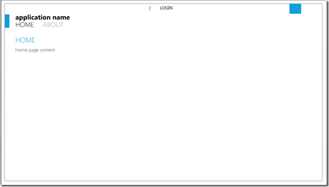
The end result of these changes will be an application that looks like the Zune Client. Here is a screenshot:-
Cheers and enjoy!!
Comments
Anonymous
June 16, 2010
You guys rule :) Thank you very much!Anonymous
June 16, 2010
Hi, Nice work! I suggest making the LinksBorderStyle Top Margin be at least as large as the Height, otherwise the ApplicationName is partially-obscured when hovering over a Link. As a quick test, I found that setting LinksBorderStyle Top Margin to 42 does the trick. Cheers, MartinAnonymous
June 20, 2010
This is Windows Client Developer roundup #29. The Windows Client Developer Roundup aggregates information

