Web Standards Design with SharePoint, Part 4
In part 2 of this series, I provided a sample Microsoft Office SharePoint Server (MOSS) 2007 solution based on Dan Cederholm's Tugboat sample site (from his most recent book, Handcrafted CSS : More Bulletproof Web Design).
Ever since then, I've been meaning to upgrade my sample to SharePoint Server 2010, but too many other priorities preempted that effort -- until now.
In this post, I'll walk you through the process I used to upgrade the Tugboat master page to render as expected in SharePoint 2010. As with my previous Tugboat sample, I think this demonstrates a great way to achieve Web standards design in SharePoint.
As a quick review, the following screenshot shows the Tugboat home page. If you haven't yet picked up a copy of Handcrafted CSS -- or read my earlier post on the MOSS 2007 Tugboat solution -- then take a moment to familiarize yourself with the content.
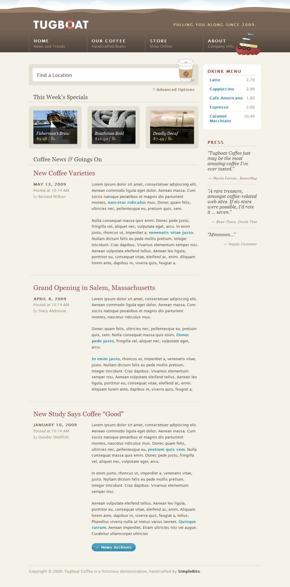
Figure 1: Tugboat - Home page
The first step was to get the actual content for the home page into SharePoint 2010. To achieve this, I created a new site based on the Publishing Portal template and uploaded the home page images (e.g. boat.jpg) to the Site Collection Images library.
Then I added a custom page layout (TugboatWelcomePageLayout1.aspx) that I created previously for MOSS 2007. Note that this custom page layout simply provides the ability to specify "main" content as well as "secondary" content using the out-of-the-box Welcome Page content type.
Next, I upgraded the "Find Location" Web Part used to render the form at the top of the Tugboat home page (since, as I described in my previous post, you can't mockup an HTML form using the SharePoint Publishing HTML field or Content Editor Web Part).
At this point, the Tugboat home page in SharePoint 2010 looked like the following:
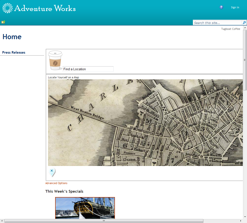
Figure 2: Tugboat home page in SharePoint 2010 (with OOTB nightandday.master)
This obviously has a long way to go before it looks like the final result shown in Figure 1. Let's take it one step at a time...
In "step 1" I swapped out the out-of-the-box nightandday.master with Tugboat.master. However, rather than starting from the MOSS 2007 version of Tugboat.master, I replaced the previous contents of the master page with the contents from nightandday.master. In other words, I chose to essentially start over with creating the Tugboat master page in SharePoint 2010.
You might be wondering why I chose this approach rather than trying to upgrade the previous version of Tugboat.master that I developed for MOSS 2007, perhaps following something like this MSDN article as a guide:
Upgrading an Existing Master Page to the SharePoint Foundation Master Page
https://msdn.microsoft.com/en-us/library/ee539981.aspx
The reason is, quite frankly, I simply haven't had good experience in the past when trying something like that. It seems like one or more nasty bugs inevitably appears due to some missing piece in the upgrade process. For example, I noticed a number of community comments have been added to the above MSDN article about missing pieces (for example, one of the comments states there is a subtle but rather nasty issue when your master page is missing the <div id="MSO_ContentDiv"> element).
Consequently I chose to start from a master page (nightandday.master) that presumably has been extensively tested in SharePoint 2010.
Once I completed "step 1" (having the custom Tugboat.master rendering the exact same "nightandday.master" layout shown in Figure 2), I then replaced the link to nightandday.css with a link to the primary Tugboat CSS file (screen.css):
 <SharePoint:CssRegistration
name="<% $SPUrl:~sitecollection/Style Library/Tugboat/Themes/Theme1/css/screen.css%>"
After="corev4.css" runat="server"/>
Here are the results after step 2:
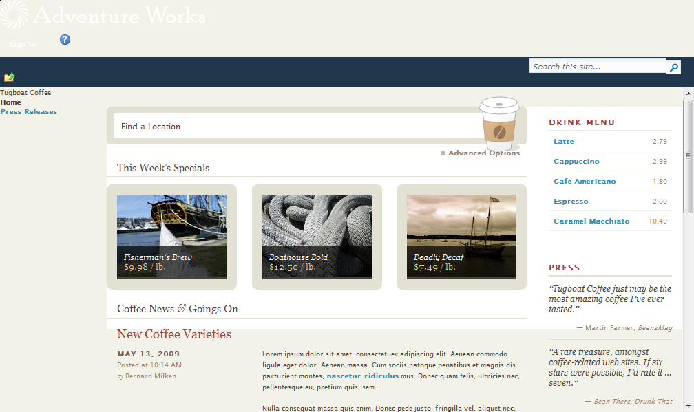
Figure 3: Tugboat home page in SharePoint 2010 (step 2)
Wow! What a difference the "right" CSS makes. As you can see, the main content for the Tugboat home page is now very close to how it should look (i.e. Figure 1). However, by removing the link to nightandday.master, the masthead obviously looks terrible. If you squint really hard, you should be able to still see the Welcome control (i.e. the Sign In link) as well as the help button.
In order to make the Tugboat sample in SharePoint match the HTML "prototype" created by the designers (i.e. Dan Cederholm and Ethan Marcotte), let's remove the SharePoint ribbon content when viewing the site as an anonymous user (in other words, when browing the Internet site using the fully-qualified domain name -- e.g. https://www.tugboatcoffee.com). Note that we'll keep the ribbon for authenticated users (e.g. content authors and administrators accessing the site using the intranet URL -- e.g. https://tugboatcoffee).
The first step in getting rid of the ribbon is to remove the search box and move the "top row elements" (e.g. the Welcome control and help link) into the <div id="s4-searcharea"> element. This is essentially just a cut-and-paste of one section in the master page to another:
 <div id="s4-searcharea" class="s4-search s4-rp">
    <SharePoint:DelegateControl runat="server" ControlId="GlobalSiteLink0" />
    <a href="#" tabindex="-1" style="display:none"></a>
    <SharePoint:DelegateControl ControlId="GlobalSiteLink3-mini"
        Scope="Farm" runat="server" />
    <span class="s4-help">
        <span
style="height:17px;width:17px;position:relative;display:inline-block;overflow:hidden;"
class="s4-clust">
            <a href="javascript:TopHelpButtonClick('HelpHome')"
                style="height:17px;width:17px;display:inline-block;"
                accesskey="<%$Resources:wss,multipages_helplink_accesskey%>"
                id="TopHelpLink" title="<%$Resources:wss,multipages_helplinkalt_text%>"
                runat="server">
                <img src="/_layouts/images/fgimg.png"
alt="<%$Resources:wss,multipages_helplinkalt_text%>"
style="left:-0px !important;top:-309px !important;position:absolute;"
align="absmiddle" border="0" runat="server" />
            </a>
        </span>
    </span>
    <div class="s4-trc-container-menu">
        <wssuc:Welcome id="IdWelcome" runat="server" EnableViewState="false" />
        <wssuc:MUISelector runat="server"/>
    </div>
    <SharePoint:DelegateControl ControlId="GlobalSiteLink2" Scope="Farm" runat="server" />
    <span>
        <span style="display:inline-block;position:relative;">
            <Sharepoint:DeveloperDashboardLauncher
            ID="DeveloperDashboardLauncher"
            NavigateUrl="javascript:ToggleDeveloperDashboard()"
            runat="server"
            ImageUrl="/_layouts/images/fgimg.png"
            Text="<%$Resources:wss,multipages_launchdevdashalt_text%>"
            OffsetX=0
            OffsetY=222
            Height=16
            Width=16 />
        </span>
    </span>
</div>
Note that since I decided to remove the Search box for the sake of simplifying this sample, I had to add a corresponding ContentPlaceHolder control to the hidden Panel near the bottom of the page:
 <asp:Panel Visible="false" runat="server">
    ...
    <asp:ContentPlaceHolder id="PlaceHolderSearchArea" runat="server" />
</asp:Panel>
Here are the results after step 3:
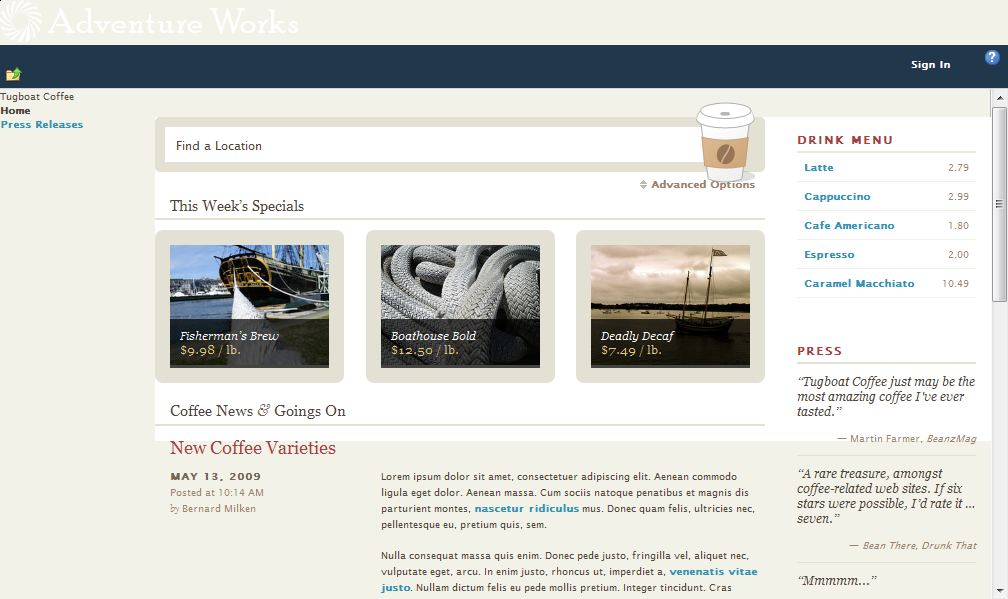
Figure 4: Tugboat home page in SharePoint 2010 (step 3)
After simply rearranging some content, it's now much easier to see the Sign In link.
You might be wondering why I decided to place the "top row elements" inside the <div id="s4-searcharea"> element, since this certainly isn't semantic HTML. Well, to be honest, I actually didn't do this initially (in other words, I placed the "top row elements" inside a different <div> container element).
At first, everything seemed to work just fine (from an anonymous user's perspective). However, when I viewed the site as an authenticated user and then clicked Show Ribbon from the Site Actions menu, I saw the following:
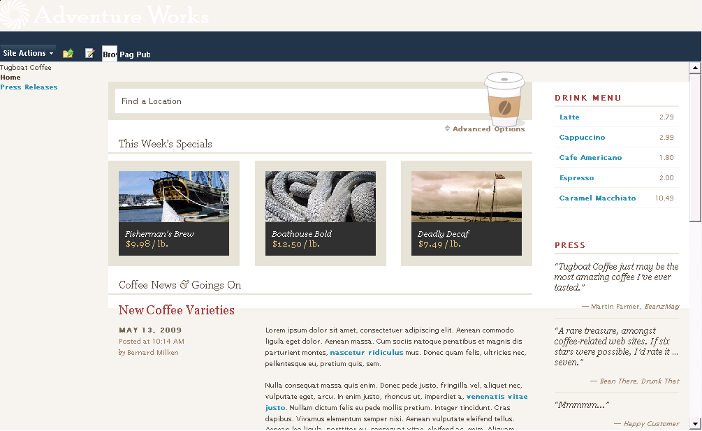
Figure 5: Tugboat home page in SharePoint 2010 (with "top row elements" not inside the "s4-searcharea" <div>)
Notice how the Browse, Page, and Publish tabs do not render correctly. When I moved them into the <div id="s4-searcharea"> element, I noticed the ribbon tabs rendered as expected for authorized users. Remember what I said earlier about "subtle" bugs?!
The next step is get rid of the OOTB <div class="s4-notdlg top-row"> content (i.e. the "Adventure Works" logo) and add the custom Tugboat masthead farther down in the master page:
 <div id="s4-workspace">
  <div class="s4-notdlg top-row">
    <div id="header" class="group">
      <div id="header-inner">
        <div id="nav" class="group">
          <div id="logo" class="group">
            <h1>
              <SharePoint:SPLinkButton id="onetidProjectPropertyTitleGraphic"
                runat="server" NavigateUrl="~site/">
                <img alt="Tugboat"
                  src="/Style Library/Tugboat/Themes/Theme1/img/logo-lofi.gif">
              </SharePoint:SPLinkButton></h1>
              <p>Pulling you along since 2009.</p>
            </div>
            <img id="tugboat" alt="tugboat"
              src="/Style Library/Tugboat/Themes/Theme1/img/tugboat.png">
            <asp:ContentPlaceHolder id="PlaceHolderGlobalNavigation" runat="server">
            <ul class="group">
              <li>
                <a href="#"><strong>Home <em>News and Trends</em></strong></a></li>
              <li>
                <a href="#">
                  <strong>Our Coffee <em>Handcrafted Beans</em></strong></a></li>
              <li>
                <a href="#"><strong>Store <em>Shop Online</em></strong></a></li>
              <li class="last">
                <a href="#"><strong>About <em>Company Info</em></strong></a></li>
            </ul>
            </asp:ContentPlaceHolder>
          </div>
        </div>
      </div>
    </div>
    ...
Here are the results after step 4:
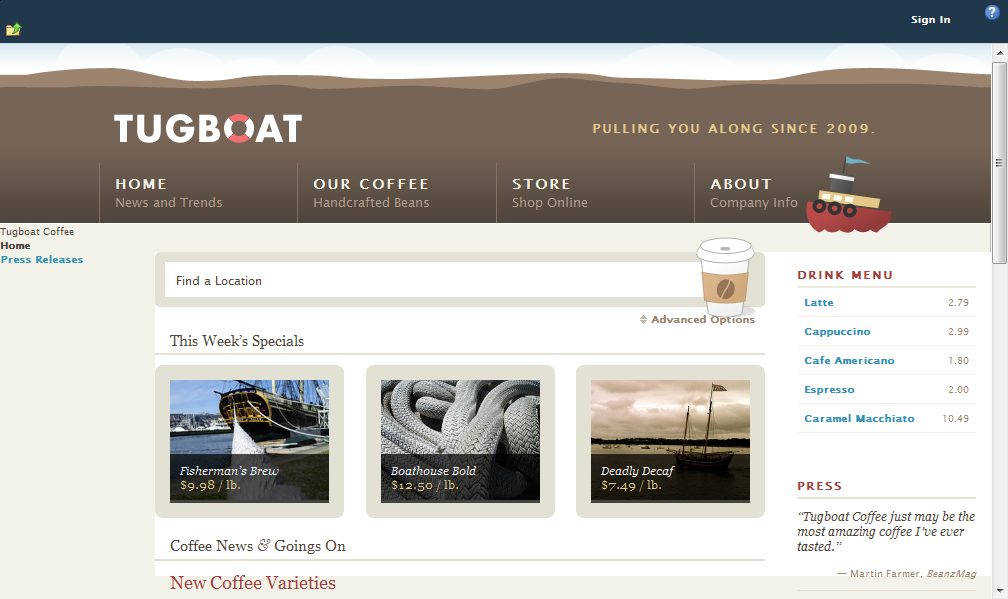
Figure 6: Tugboat home page in SharePoint 2010 (TODO:)
Yes, eventually we will want the global navigation to be dynamically generated from the SharePoint site structure, but for the purposes of what I'm calling "Sprint-2" of the Tugboat project, static HTML is a good starting point.
If you are wondering why I moved the masthead into the <div id="s4-workspace"> element, it's because I chose to maintain the scrolling behavior of the Tugboat site for anonymous users. [I actually created an alternate master page to demonstrate different scrolling behavior (essentially fixing the masthead in place even when scrolling down the page). I might get around to covering that in a different blog post.]
You might also have noticed that I made a few minor tweaks to the HTML provided by the designer (specifically making the Tugboat logo link to the home page and wrapping the global navigation in the <asp:ContentPlaceHolder id="PlaceHolderGlobalNavigation"> control). These changes make the master page content more "SharePoint-like" without sacrificing the clean, semantic HTML and Web standards layout.
At this point, we at least have a site that isn't "hard on the eyes" or potentially offensive to our client (since we are no longer showing the "white-on-light" Adventure Works logo at the top of the Tugboat site).
Now let's get rid of the Tugboat Coffee, Home, and Press Releases content on the left side of the page.
This is simply a matter of removing a few elements (specifically <div id="s4-titlerow"> , <asp:ContentPlaceHolder id="PlaceHolderGlobalNavigationSiteMap" /> and <div id="s4-leftpanel">) and consequently adding some more hidden ContentPlaceHolder controls at the bottom of the page:
 <asp:Panel Visible="false" runat="server">
  ...
  <asp:ContentPlaceHolder id="PlaceHolderPageTitleInTitleArea" runat="server" />
  <asp:ContentPlaceHolder id="PlaceHolderPageDescription" runat="server" />
  <asp:ContentPlaceHolder id="PlaceHolderGlobalNavigationSiteMap" runat="server" />
  <asp:ContentPlaceHolder id="PlaceHolderLeftNavBarDataSource" runat="server" />
  <asp:ContentPlaceHolder id="PlaceHolderCalendarNavigator" runat="server" />
  <asp:ContentPlaceHolder id="PlaceHolderWikiNavigator" runat="server" />
  <asp:ContentPlaceHolder id="PlaceHolderLeftNavBarTop" runat="server" />
  <asp:ContentPlaceHolder id="PlaceHolderLeftNavBar" runat="server" />
  <asp:ContentPlaceHolder id="PlaceHolderLeftActions" runat="server" />
  <asp:ContentPlaceHolder id="PlaceHolderNavSpacer" runat="server" />
</asp:Panel>
Here are the results after step 5:
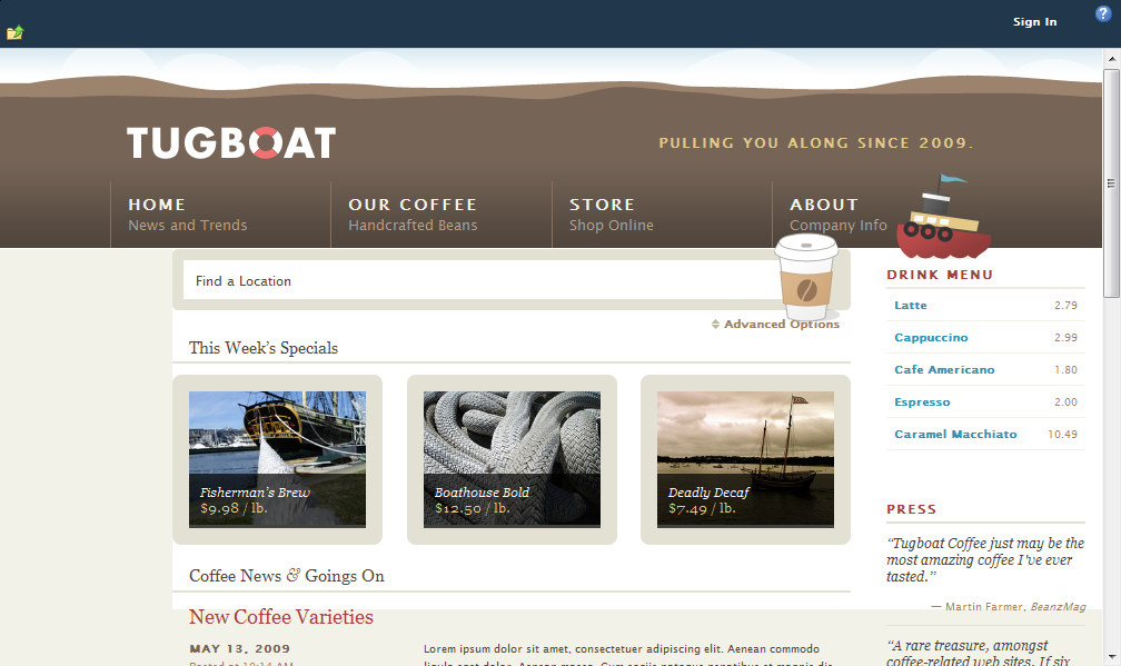
Figure 7: Tugboat home page in SharePoint 2010 (step 5)
Next, let's tweak the OOTB <div class="s4-ca main-container" id="MSO_ContentDiv"> element to add the <div class="group" id="wrap"> element expected by the Tugboat CSS files as well as the page footer:
<div class="s4-ca main-container" id="MSO_ContentDiv" runat="server">
<a name="mainContent"></a>
<div class="group" id="wrap">
<asp:ContentPlaceHolder id="PlaceHolderMain" runat="server" />
<hr/>
<div id="pageFooter">
Copyright © 2009. Tugboat Coffee is a ficticious demonstration,
handcrafted by <a href="https://simplebits.com/">SimpleBits</a>.
</div> <!-- /pageFooter -->
</div>
</div>
As with the previous MOSS 2007 version of the Tugboat sample, I renamed the ID of the footer element to avoid a conflict with the SharePoint Summary Links control (refer to my previous post for more explanation on this).
Here are the results after step 6:
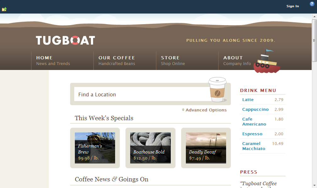
Figure 8: Tugboat home page in SharePoint 2010 (step 6)
Ah...now we're getting close. The image of the coffee cup no longer overlaps the masthead and we have the expected margin on the right side of the page. Now let's fix the left margin.
Even though we got rid of the <div id="s4-leftpanel"> element in the previous step, the OOTB SharePoint corev4.css file still reserves space in the "content area" (a.k.a. "s4-ca") for the current (a.k.a. "left") navigation.
This is easy to change by adding a little CSS to the custom SharePointFixes.css file. [Refer to my previous post for more explanation on the SharePointFixes.css file.]
 .s4-ca {
    background-color: inherit;
    margin-left: 0;
}
Here are the results after step 7:

Figure 9: Tugboat home page in SharePoint 2010 (step 7)
Now that we've got the main area of the page matching the HTML prototype created by the designers, let's turn our attention to hiding the ribbon content (in other words, the dark blue band at the top of the page) for anonymous users.
If you search the Internet for something like SharePoint 2010 hide ribbon anonymous, you'll find a number of different recommendations.
Someone suggested wrapping the SPRibbon control in the <LoggedInTemplate> of an ASP.NET LoginView control. This certainly sounds like a logical choice and indeed it does work in the "anonymous user scenario" as shown below:
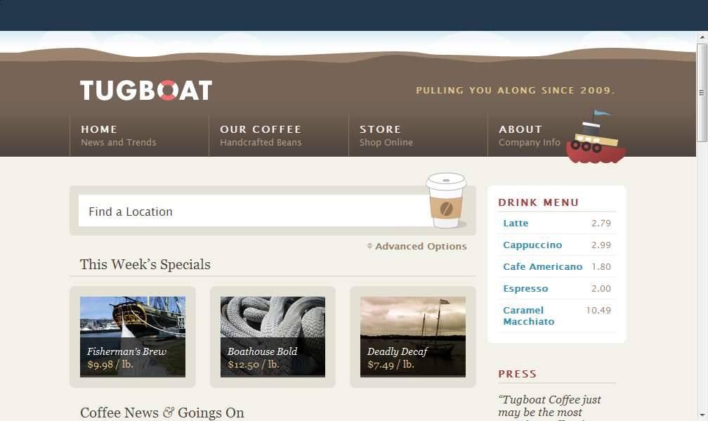
Figure 10: Tugboat home page in SharePoint 2010 (step 8 - SPRibbon content hidden from anonymous users)
Yes, we still see the dark blue band, but notice that the breadcrumb control and Sign In link are no longer visible. However, there's a problem.
Take a look at the following screenshot taken for an authenticated user after clicking Show Ribbon on the Site Actions menu:
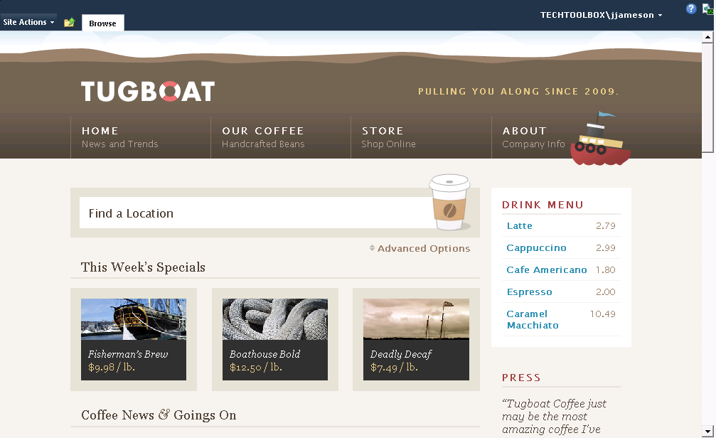
Figure 11: Tugboat home page in SharePoint 2010 (broken ribbon as a result of using ASP.NET LoginView control)
Do you see the problem? [Hint: Imagine you want to view the properties of the page.]
Where the heck did the Page and Publishing tabs go? Good question.
I have no idea why the seemingly trivial change of wrapping the SPRibbon control in a LoginView control fundamentally breaks the OOTB ribbon functionality, but it does (at least in the RTM version of SharePoint Server 2010).
So, instead of using a LoginView control, I wrapped the SPRibbon control in a SPSecurityTrimmedControl instead:
 <div id="s4-ribbonrow" class="s4-pr s4-ribbonrowhidetitle">
  <Sharepoint:SPSecurityTrimmedControl runat="server"
    PermissionMode="Any"
    PermissionsString="AddAndCustomizePages, AddListItems, ApplyThemeAndBorder,
EditListItems, EnumeratePermissions, DeleteListItems, ManageAlerts, ManageLists,
ManageSubwebs, ManageWeb, ViewUsageData ">
    <SharePoint:SPRibbon runat="server"
      PlaceholderElementId="RibbonContainer"
      CssFile="">
      ...
Important
I originally specified
ViewFormPagesin the list of permissions, but discovered anonymous users have this permission by default in SharePoint 2010. I swear this wasn't the case in MOSS 2007 (due to the "form lockdown" feature).
With this approach, the ribbon renders as expected for both anonymous users (Figure 10) and authenticated users (Figure 12).
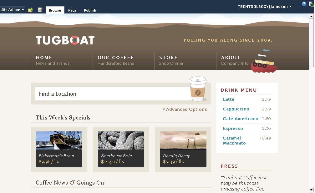
Figure 12: Tugboat home page in SharePoint 2010 ("All ribbon tabs present and accounted for, sir!")
Well, okay, it's not quite "as expected" for anonymous users. We still need to get rid of the dark blue band at the top of the page when viewing the site as an anonymous user. The problem is the SharePoint "ribbon system" is hard-coded to set a specific height for the <div id="s4-ribbonrow"> element.
Fortunately, this is fairly easy to override by adding a little CSS to the master page:
 <head runat="server">
...
<asp:LoginView runat="server">
    <AnonymousTemplate>
        <style type="text/css">
        body #s4-ribbonrow {
            height: auto !important;
            min-height: 0 !important;
        }
        </style>
    </AnonymousTemplate>
</asp:LoginView>
</head>
In this case, using a LoginView control (and <AnonymousTemplate>) works as expected.
Here are the results after step 9:
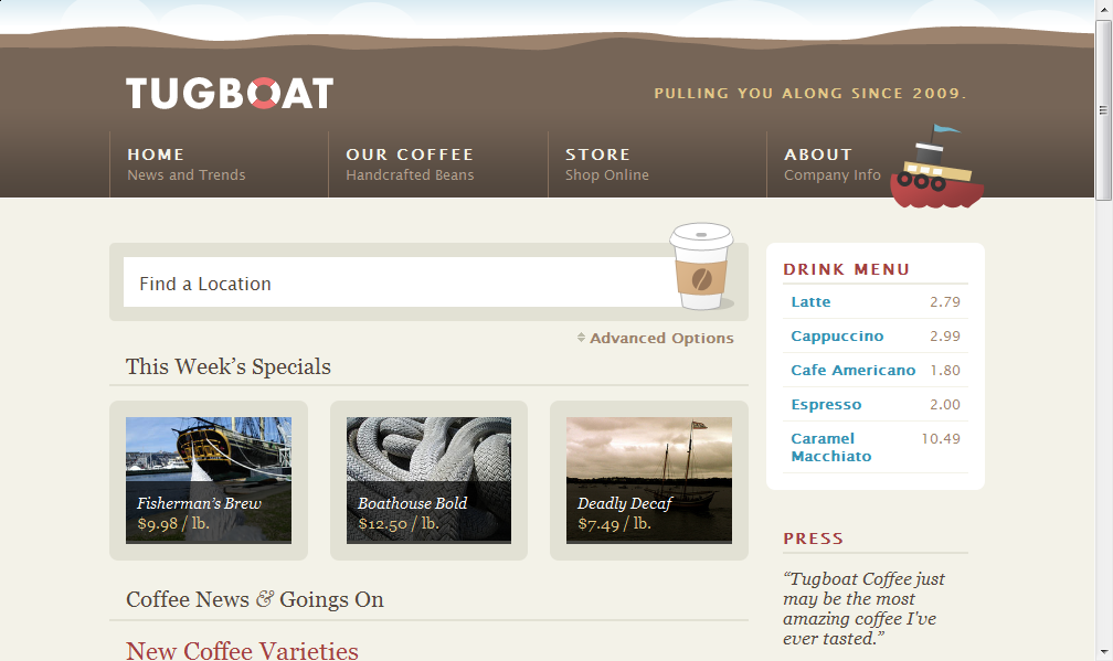
Figure 13: Tugboat home page in SharePoint 2010 (step 9)
Woohoo! We're now seeing the Tugboat home page rendered by SharePoint 2010 with near pixel-by-pixel similarity with the HTML prototype created by the designers. [If you open both the SharePoint site and the HTML prototype in two different tabs and then quickly toggle between them, you'll notice very minor differences.]
There's just one more issue to fix. [I know, I know..."How long must this post go on?" Don't worry, we're almost to the end. ;-) ]
Take a look at the following screenshot, which shows the ribbon "in action" (in other words, as viewed by an authorized user):
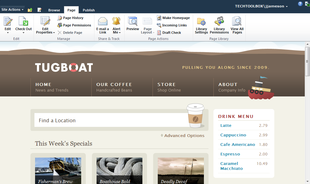
Figure 14: Tugboat home page in SharePoint 2010 (all ribbon items formatted in bold)
The ribbon looks a little "angry" if you ask me. In other words, "What's with all the bold links?!"
The problem is due the default link rules in the custom Tugboat CSS. Fortunately, this is another easy fix simply by tweaking the rule in the Tugboat master.css file:
 /*
    HACK: Avoid making *all* links bold (e.g. buttons in the SharePoint ribbon)

a:link, a:visited {
*/
.main-container a:link, .main-container a:visited {
  font-weight: bold;
  text-decoration: none;
  outline: none;
  color: #3792b3;
}
As you can see, I simply qualified Dan's CSS rules a little bit in order to style only those links that reside in the <div class="s4-ca main-container"> element. However, this change "broke" one of the other CSS rules in the Tugboat solution (specifically the color of the "News Archives" button). Therefore, we need one more tweak to master.css:
 /*
    HACK: The following CSS rule was tweaked slightly due to the change above
    to avoid making *all* links bold (e.g. buttons in the SharePoint ribbon)

div.more-btn a {
*/
div.more-btn a:link, div.more-btn a:visited {
  ...
  color: #fff;
  ...
}
Note
I originally attempted to fix the "bold ribbon links" bug by qualifying on the
<div id="wrap">element but then realized I couldn't easily fix the color of the "News Archives" button.
The only other tweak that I made to the Tugboat master page was to move the page status bar above the masthead. In my opinion, this provides a better user experience for content authors.
If you've managed to read this post all the way up to this point, you deserve a prize. However, since I don't really have anything tangible to give away (much less any budget to send it to you), how about a complete code sample instead?
Sample Tugboat solution for SharePoint Server 2010
I've attached a complete Visual Studio 2010 solution in case you are interested in seeing the Tugboat sample in SharePoint 2010 (or, better yet, using it as a baseline for starting your own Web standards design in SharePoint).
If you've deployed any of my other sample SharePoint solutions, you'll find this one just as easy.
Here are the instructions to deploy the Tugboat sample to your own SharePoint environment. First, download the attachment and unzip the files. Then you simply need to create a few domain users and run a handful of PowerShell scripts, as described below.
To deploy the Tugboat solution to SharePoint:
- Create three service accounts for the Tugboat site:
- {DOMAIN}\svc-web-tugboat-dev - used as the application pool identity for the new Tugboat site
- {DOMAIN}\svc-sp-psr-dev - object cache user account providing Full Read access to Web applications (https://technet.microsoft.com/en-us/library/ff758656.aspx)
- {DOMAIN}\svc-sp-psu-dev - object cache user account providing Full Control access to Web applications
- On the Start menu, click All Programs, click Microsoft SharePoint 2010 Products, right-click SharePoint 2010 Management Shell, and then click Run as administrator. If prompted by User Account Control to allow the program to make changes to the computer, click Yes.
- From the Windows PowerShell command prompt, change to the directory containing the deployment scripts (e.g. C:\NotBackedUp\Tugboat\Dev\Lab2\Source\DeploymentFiles\Scripts), and run the following commands:
$env:TUGBOAT_URL = "https://tugboatcoffee-local"
$env:TUGBOAT_BUILD_CONFIGURATION = "Debug"
& '.\Add Event Log Sources.ps1'
& '.\Create Web Application.ps1'
& '.\Configure Object Cache User Accounts.ps1'
& '.\Create Site Collections.ps1'
& '.\Enable Anonymous Access.ps1'
& '.\Add Solutions.ps1'
& '.\Deploy Solutions.ps1'
& '.\Activate Features.ps1'
Note
Technically, you don't have to set the environment variables (and use the "-dev" accounts). However, I recommend this in order to bypass SharePoint timer jobs when deploying the WSPs.
At this point you should be able to modify your hosts file accordingly and browse to either https://www-local.tugboatcoffee.com (to view the site as an anonymous user) or https://tugboatcoffee-local (to view the site as an administrator).
Okay, that's it...the weather here in Denver is absolutely gorgeous today and I really need to get outside and enjoy it. I think it's time for a long bike ride around Cherry Creek Reservoir :-)
Tugboat - 1.0.25.0 (Sprint 2).zip
Comments
- Anonymous
April 04, 2011
Great post, thanks Jeremy !!