Windows 10 Start Menu Flexibility
Greetings and Happy Halloween from the Platforms PFE ghosts and ghouls.
Believe it or not, some people eagerly welcomed the return of the Start menu in Windows 10.
I'd bet that a lot of you folks are Windows Insiders and you contributed detailed feedback about the various iterations of the Start menu during the development of Windows 10.
To that, we say "thank you" – your feedback helped make Windows 10 what it is.
In today's post, I'll discuss some of the flexible options of the new Start menu as well as a couple other handy details of Windows 10.
Starting with Start
You've likely turned on (or left on) the Start menu so let's begin (or "start") there…
Here's a typical desktop with the Windows 10 Start menu.
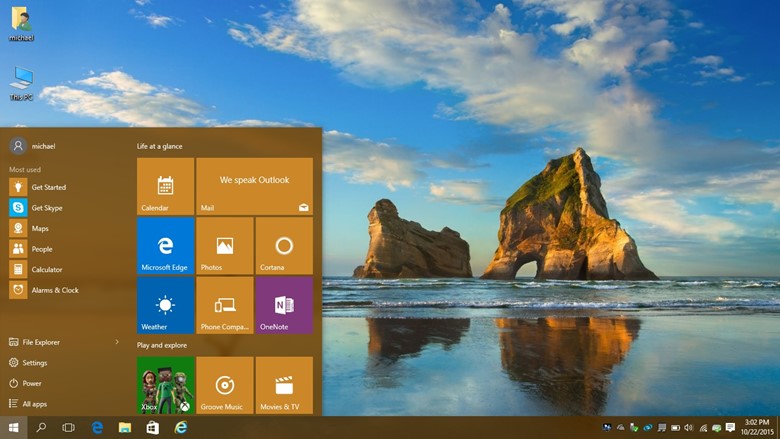
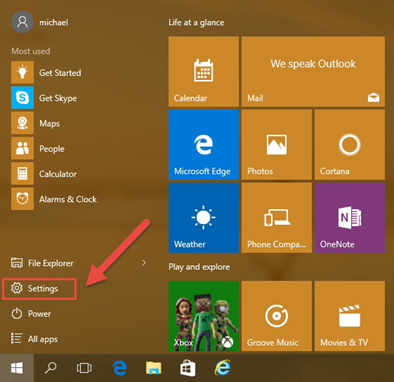
To start customizing how that looks/feels, click "Settings"…
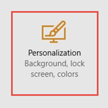
… then Personalization …
… and then click Start. From here, we'll start to tinker with some of the Start options:
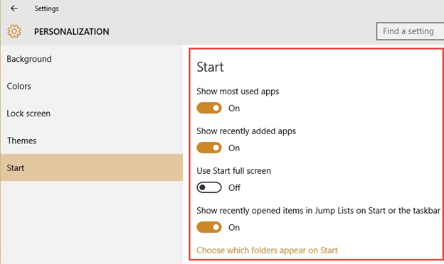
Starting at the top:
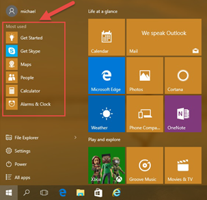
"Show most used apps" toggles this list of your most used programs on the Start menu:
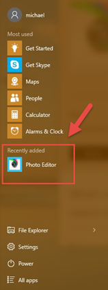
"Show recently added apps" toggles a list of recent apps you've installed on the Start menu:
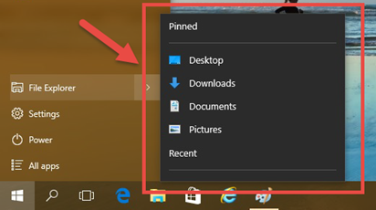
"Show recently opened items in Jump Lists on Start or the taskbar" will give you these:
- "Use Start full screen" will give you the full-screen Start experience, similar to the Windows 8/8.1 Start Screen.
Note the clickable symbols at the top-left (called a hamburger) and bottom-left of the Start screen

Clicking the hamburger button flies-out additional elements of Start:
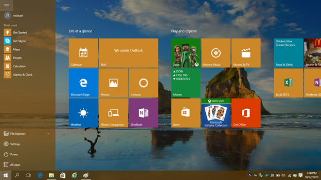
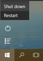
While the bottom buttons are Power and the "All Apps" list
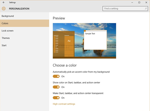
Some of the other Personalization settings are for colors and transparency on the Start menu.
"Automatically pick an accent color from my background" will display some UI elements such as the Start menu "box" and the taskbar in a color derived from the background (in this case, a tan color was chosen).
Alternatively, you can turn that "off" and select a color of your choice - note the cool visual 'Preview' of what your desktop will look like. I spent 5 minutes checking out all sorts of colors here:
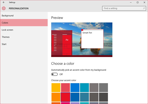
You can explore the other options in here to turn off a specific color choice for Start elements as well as the (semi) transparency option.
The last elements I'll discuss on Start are some things you can do right from the Start menu/desktop itself
Rearrange – pin, unpin and/or move/group Tiles
Resize – click and drag to make the Start menu tall and narrow or short and wide. The Tiles can be resized, too.
Off/on - turn off/on the "Live" Tile refreshes
Simplify – you can remove all the Tiles and, if you've turned off the other elements above, you are left with a very simple Start screen/menu.
Here's a visual progression of some Start options…
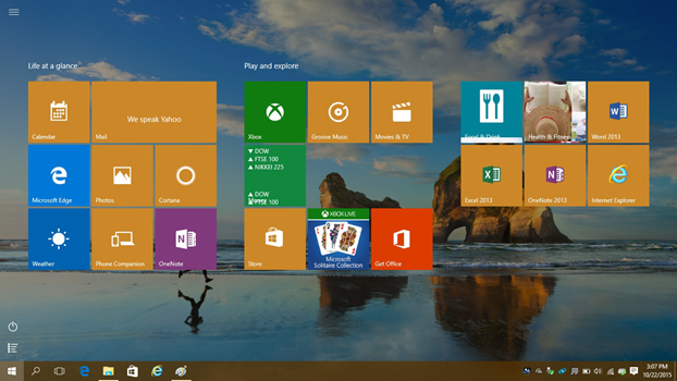
A sample full-screen Start (even if you didn't like the Windows 8/8.1 Start screen, at least try this out on Win 10…it's beautiful)
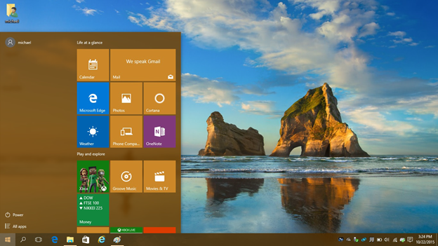
A sample Start menu with two rows of Live Tiles…
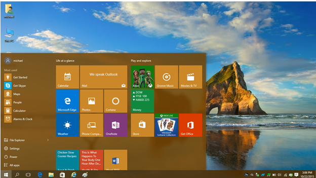
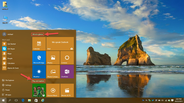
Not only can you move around the Tiles to your liking, you can also group them and name the Tile Groups
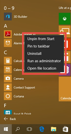
Here are the options for an app when right-clicked in the All Apps list:
Here are the options for Live Tile adjustments:
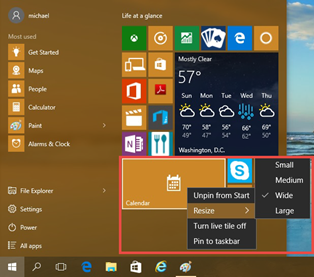
Another variation on a Start menu with a variety of Tile sizes. Note the Weather "Live" Tile and how helpful that is.
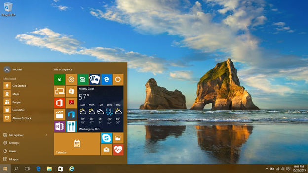
Here, we start to remove items…
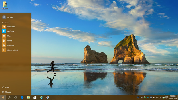
Finally, here is a very minimal Start menu.
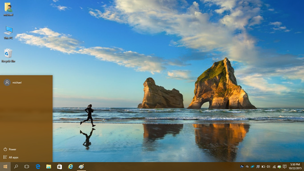
Does that jogger make anyone else want to go for a run or is it just me?
File Explorer View
In File Explorer, by default, you see the "Quick Access" view:
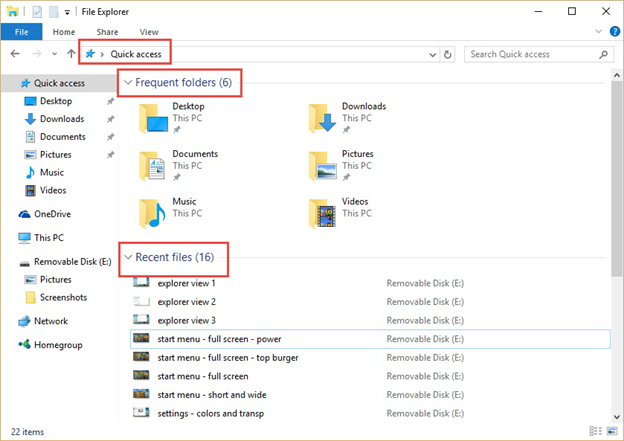
I didn't much care for the Quick Access view at first and I wanted to see the more-familiar "This PC" view when I opened File Explorer.
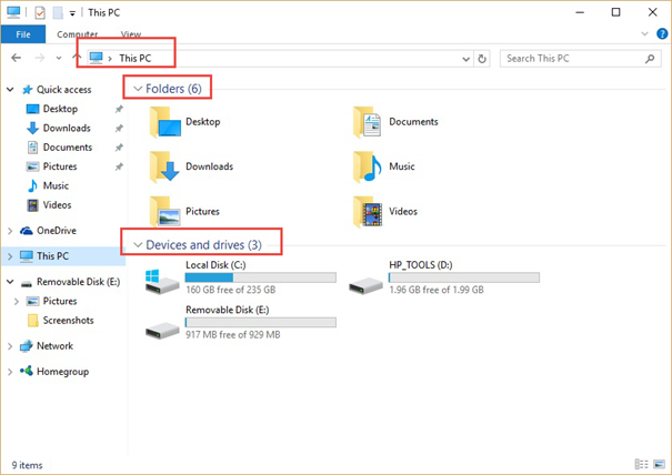
In Windows 10, there is a simple UI "flip" you can toggle to change the view:
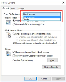
Again, as is often the case with me, I've come to find that nowadays, I work more efficiently via the Quick Access view. Whooda thunk it?
Welcome Back, Kotter
The last thing I'll cover today has to do with Windows 7. I hear you exclaim "C'MON MAN! This is a Windows 10 post; Windows 7 is soooo yesterday. "
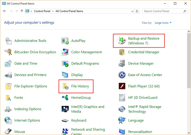
Well, as you may know from reading my posts, I love me some DR and it was a sad day when I couldn't use the GUI to schedule image-based backups in Windows 8.1.
It was quite a joyful day when I learned of the return of the Windows 7 backup and restore elements (including scheduling) to Windows 10.
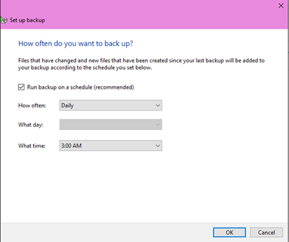
File History is there, too, which is a nice file recovery tool but it's only helpful if you turn it on <nudge>
Well folks, that's it for the Halloween edition of the Ask PFE Platforms blog.
Do the kids a solid this year and be one of the heroes who hands out "full-sized" candy.
Hilde