Branch Hierarchy Visualization
One of the new branch visualizations we’ve added allows users to see the hierarchical relationship between branches. That is, the visualization shows the logical relationships between a family of related branches. Typically, branches only have parent-child relationships that are established when a new branch is created. Additionally, branches may have merge relationships, that are created after performing a baseless merge. It is only the parent-child relationships that are shown in this visualization.
Physical Branch Structure
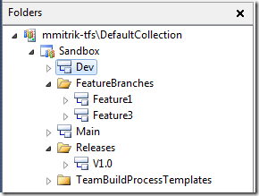
Any time I’m demoing the new View Hierarchy feature, I like to show the folder structure as a point of comparison for the visualization. In the picture to the left, notice that the Main and Dev branch are siblings in the physical structure – that is, they both reside directly under the Sandbox team project. Two feature branches have been created under the FeatureBranches folder, but in this picture, their parent branch is not evident. Keep this in mind when viewing the hierarchy further down this post.
It is also worth noting a few things about how branches can be organized in TFS 2010. Branches can be organized in any folder structure, so long as they are not contained within another branch. This is done to avoid nesting of branches, which if enabled makes merging extremely complex and confusing. We also have a restriction that prevents folders which contain branches from being branched. Using the example above, the FeatureBranches folder cannot be branched (attempting to do so will result in an error message pointing out that Feature1 is contained in FeatureBranches).
Logical Branch Structure
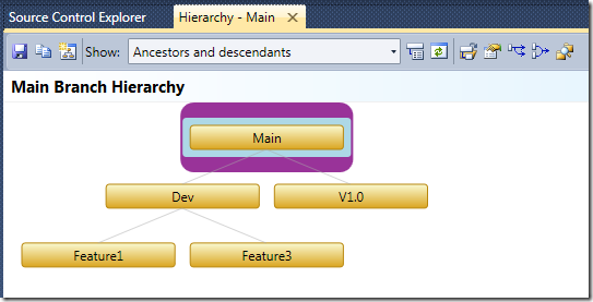
To see the logical branch hierarchy for the branches shown above, I selected the Main branch, and from the “Branching and Merging” context menu, I selected the “View Hierarchy” option. The image below shows exactly what this branch hierarchy looks like.
 Notice that in this picture it is clearly shown that Main is the parent branch of Dev and V1.0 (i.e. Dev and V1.0 were branched from Main), and Dev is the parent of Feature1 and Feature3. Although none of this information is shown in SCE, together they give the full picture of how branches are related and how they are organized.
For this simple branching structure, I chose to show all of the ancestors and descendants of the branch I chose to visualize (note the combo box at the top). In a larger branch hierarchy, I might have wanted to trim down the view a bit to show only those branches I’m interested at the time. To do this, we have multiple features to enable custom views.
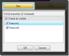
The quickest was to remove branches is to simply select them, and then press the delete key or click on the “X” in the upper right corner. Adding branches can be done by clicking on the “+” in the upper right corner for a selected branch or pressing the insert key, which will bring up a box like the one shown on the left.
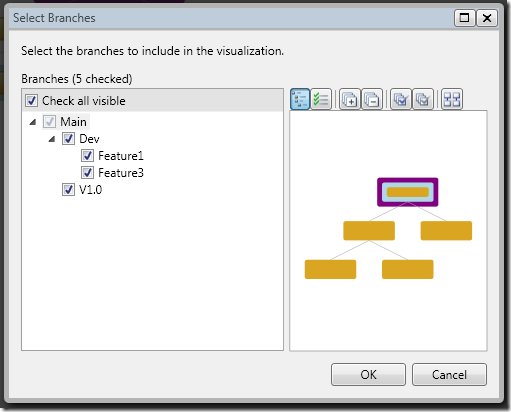
There is also a button on the toolbar that allows users to fully customize their branch view. In this view, a tree representing the logical hierarchy is shown, and specific branches can be selected to be included in the visualization. We also have a preview to help understand how many branches will be shown based on the current selection. Note that if you select a branch, but not its parent, the parent will still be shown. You also cannot deselect the branch that was originally chosen to be visualized. To do that, you can select a branch in the hierarchy view, and choose the option to view it’s hierarchy from the toolbar or context menu.
Besides just being a pretty picture, this visualization is very actionable. You can save the visualization, copy it to the clipboard, drag & drop to perform merges, create branches, view branch properties, compare branches, and navigate to a branch’s location in SCE. Making all of our visualizations and tools actionable is one of the themes we’ve had for version control in Dev 10, so you’ll see this in other future posts.
One final topic that I wanted to cover, since I’ve been asked about it many times in the past – what is that purple rectangle for around the Main branch? In this visualization, it is intended to be a frame of reference. It marks the branch which was selected originally when entering the experience. It is also the branch which the “Show” combo box is referring to when you choose, “Ancestors” or “Children”. I’m still looking for feedback from customers on whether this is helpful or just a distraction, and that will help us decide what we’ll do in RTM. I can also say that we’ve worked with our user experience team on the colors and theme, and are planning to pick a more consistent set of colors and styles. As these changes develop, I’ll post more here.

