Windows 10 SplitView – Build Your First Hamburger Menu
With all of the new and exciting features coming out with Windows 10 development, the SplitView control is a new addition to XAML. For a quick intro to the SplitView, you can check out my previous post here. This post covers the basics of implementing a SplitView in XAML, some of the key properties, etc. Regalrdess, it’s basic use is to display a side menu, such as the one usually called “hamburger menu”. This is something that you have probably seen before on other platforms and maybe even some custom implementations on Windows, but now we, the developers, have access to it for the first time on the Windows platform. So, let’s take a look at how we actually build one of these menus!
The first thing you need to do it make sure you are running some version of Windows 10, which you can find here. You also need to have Visual Studio 2015 community installed as well, which you can find here. Those are the only two things that you need to ensure that you have installed. If you have those installed, let’s continue!
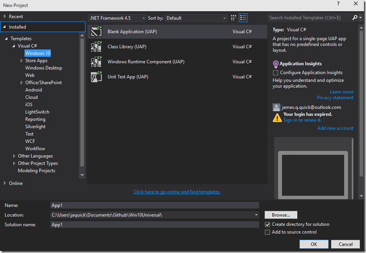
Open up Visual Studio and create a new blank Windows 10 Application. Give it a name and click OK.
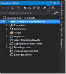
Now that we have our project created let’s take a quick look at the Project Architecture in the Project Explorer. Notice that unlike Universal Windows Applications for Windows 8.1 and Windows Phone 8.1, we only have one project head now instead of three different ones. They key here is that Windows 10 applications use the SAME BINARY regardless of the device they are being run on. This is super important, and SUPER AWESOME!
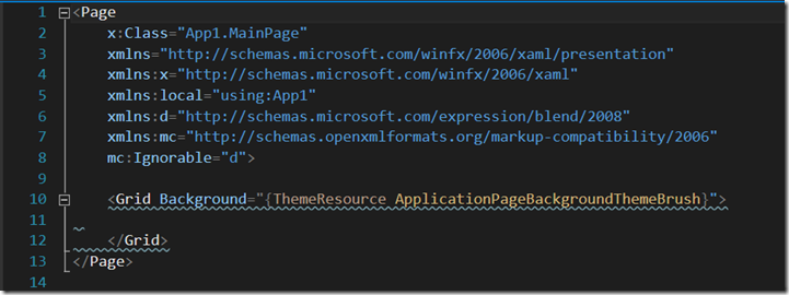
Go ahead and open up your MainPage.xaml file so we can get started created out SplitView! You don’t start with much here just an empty grid.
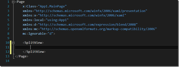
Let’s scrap the grid, and just ad a simple blank SplitView.
Now that we have our SplitView created we can add its two main elements, the pane and the content. The pane represents the menu that you want to be able to interact with, and the content represents the main content of your page.
 <SplitView>
        <SplitView.Pane>

        </SplitView.Pane>
        <SplitView.Content>

        </SplitView.Content>
 </SplitView>
Ignore the Blue squigglies above. It’s just tell us that we need to fill in the definition of the pane and the content. Let’s start with the content as it is the easiest. I just want to add a TextBlock here centered inside of a grid that says “SplitView”.
 <SplitView>
        <SplitView.Pane>

        </SplitView.Pane>
        <SplitView.Content>
            <Grid>
                <TextBlock Text="SplitView Basic" FontSize="54" Foreground="White"
                           HorizontalAlignment="Center" VerticalAlignment="Center"/>
            </Grid>
        </SplitView.Content>
 </SplitView>
Ok, so we have some content there. It’s enough for this simple demo, but obviously in the future, use your typical XAML there to create whatever kind of page you want. Next step is obviously to fill in the SplitView Pane, which will be the menu. I am going to start by adding some properties to the definition of the SplitView. For reference, you can again look back to my SplitView Intro post. Really quickly, I am going to give a name, set the DisplayMode to Compact Overlay, set the pane to not be open by default, and set the open and company panel lengths like so.
 <SplitView x:Name="MySplitView" DisplayMode="CompactOverlay"  IsPaneOpen="False"
                CompactPaneLength="50" OpenPaneLength="150">
Now, we can go in and actually create our menu. Since I want our menu to be vertical, as you might expect, I am simply going to create a vertical StackPanel as the container for all of our buttons with a background of Gray. Our whole XAML should look like this now.
 <SplitView x:Name="MySplitView" DisplayMode="CompactOverlay"  IsPaneOpen="False"
               CompactPaneLength="50" OpenPaneLength="150">
        <SplitView.Pane>
            <StackPanel Background="Gray">
            </StackPanel>
        </SplitView.Pane>
        <SplitView.Content>
            <Grid>
                <TextBlock Text="SplitView Basic" FontSize="54" Foreground="White"
                           HorizontalAlignment="Center" VerticalAlignment="Center"/>
            </Grid>
        </SplitView.Content>
 </SplitView>
Inside of our stack panel, I want to add our hamburger button, and below that a couple of dummy buttons just for reference. To see how to build a hamburger button (because it isn’t all that obvious), you can follow me previous post, Creating a Hamburger Button. In addition to simply create the hamburger button, I am also going to add its Click Handler. As a hint, if you start typing in the Click property you get some intellisense that gives you the option to auto generate the name and then the method in the code behind. Regardless, it looks like this.
<Button x:Name="HamburgerButton" FontFamily="Segoe MDL2 Assets" Content=""
Width="50" Height="50" Background="Transparent" Click="HamburgerButton_Click"/>
We can take a look at the code behind for the HamburgerButton click handler shortly, but first let’s finish our menu. The next thing we will do is at a couple of more buttons. In addition to simply adding a couple of buttons, i want each of those buttons to have text to the right of them explaining what each button does. Therefore, for each new button, I am going to add a horizontal StackPanel to hold a button and text. All in all it looks like this.
<StackPanel Orientation="Horizontal">
<Button x:Name="MenuButton1" FontFamily="Segoe MDL2 Assets" Content=""
Width="50" Height="50" Background="Transparent"/>
<TextBlock Text="Button 1" FontSize="18" VerticalAlignment="Center" />
</StackPanel>
<StackPanel Orientation="Horizontal">
<Button x:Name="MenuButton2" FontFamily="Segoe MDL2 Assets" Content=""
Width="50" Height="50" Background="Transparent"/>
<TextBlock Text="Button 2" FontSize="18" VerticalAlignment="Center" />
</StackPanel>
<StackPanel Orientation="Horizontal">
<Button x:Name="MenuButton3" FontFamily="Segoe MDL2 Assets" Content=""
Width="50" Height="50" Background="Transparent"/>
<TextBlock Text="Button 3" FontSize="18" VerticalAlignment="Center" />
</StackPanel>
Now, our total XAML Page looks like this.
<Page
x:Class="App1.MainPage"
xmlns="https://schemas.microsoft.com/winfx/2006/xaml/presentation"
xmlns:x="https://schemas.microsoft.com/winfx/2006/xaml"
xmlns:local="using:App1"
xmlns:d="https://schemas.microsoft.com/expression/blend/2008"
xmlns:mc="https://schemas.openxmlformats.org/markup-compatibility/2006"
mc:Ignorable="d">
<SplitView x:Name="MySplitView" DisplayMode="CompactOverlay" IsPaneOpen="False"
CompactPaneLength="50" OpenPaneLength="150">
<SplitView.Pane>
<StackPanel Background="Gray">
<Button x:Name="HamburgerButton" FontFamily="Segoe MDL2 Assets" Content=""
Width="50" Height="50" Background="Transparent" Click="HamburgerButton_Click"/>
<StackPanel Orientation="Horizontal">
<Button x:Name="MenuButton1" FontFamily="Segoe MDL2 Assets" Content=""
Width="50" Height="50" Background="Transparent"/>
<TextBlock Text="Button 1" FontSize="18" VerticalAlignment="Center" />
</StackPanel>
<StackPanel Orientation="Horizontal">
<Button x:Name="MenuButton2" FontFamily="Segoe MDL2 Assets" Content=""
Width="50" Height="50" Background="Transparent"/>
<TextBlock Text="Button 2" FontSize="18" VerticalAlignment="Center" />
</StackPanel>
<StackPanel Orientation="Horizontal">
<Button x:Name="MenuButton3" FontFamily="Segoe MDL2 Assets" Content=""
Width="50" Height="50" Background="Transparent"/>
<TextBlock Text="Button 3" FontSize="18" VerticalAlignment="Center" />
</StackPanel>
</StackPanel>
</SplitView.Pane>
<SplitView.Content>
<Grid>
<TextBlock Text="SplitView Basic" FontSize="54" Foreground="White"
HorizontalAlignment="Center" VerticalAlignment="Center"/>
</Grid>
</SplitView.Content>
</SplitView>
</Page>
Our last and final step is to add the logic to our Hamburger Button to open and close the menu. Go ahead and open up the MainPage.XAML.cs. Notice the handler has already been created for me. If it hasn’t for you then, go ahead and create it.
Inside of the handler we simply want to set pane to closed if it is open and visa versa like this.
MySplitView.IsPaneOpen = !MySplitView.IsPaneOpen;
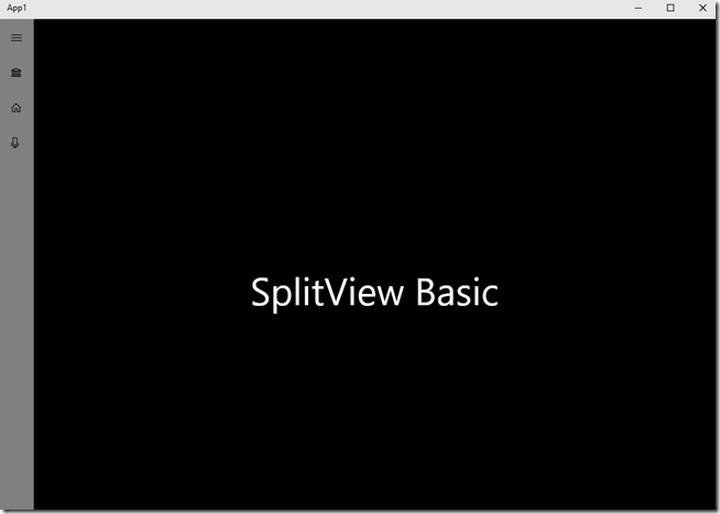
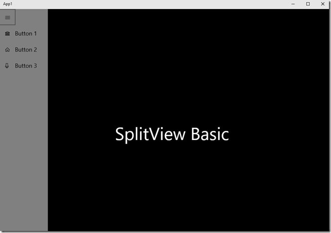
That should be everything. Go ahead and run your project and should be able to open and close your menu with the hamburger buton.
Closed
Open
Awesome! You have now created your very first Hamburger Button Menu in Windows 10. For additional reference, you can find the sample project on Github. As always with any questions comments of concerns, please comment below or find me on twitter @jamesqquick.
Comments
Anonymous
June 09, 2015
Best Start up tutorial for SplitView. Other tutorials use too complex controls inside Pane (RadioButton etc, etc). Please keep them coming. Please do a SplitView tutorial using Visual State Manager to adjust to different screen widths. Thanks, AnilAnonymous
June 15, 2015
Awesome, thank you for the example. Couldn't be easier.Anonymous
June 17, 2015
Absolutely great tutorial, made this seemlessAnonymous
June 18, 2015
Guys, thanks a ton for the feedback. More coming soon! If you follow me on twitter, @jamesqquick, I'll announce when new posts become available! :)Anonymous
June 23, 2015
Finally, a really concise and clear demo of the Hamburger and SplitView controls. Thanks a ton for this example.Anonymous
June 26, 2015
This is a really good intro example... really appreciate it!Anonymous
July 01, 2015
Excellent. Is really simple and functionally. Thanks!!!! Greetings from Argentina.Anonymous
July 02, 2015
OMG this is the best tutorial ever. Easy to follow.Anonymous
July 06, 2015
Guys thanks for all of the feedback and glad you enjoyed it!!!Anonymous
July 10, 2015
I see a few issues with this example code. First, it doesn't use the same style that is used by the Microsoft apps. These use a size of 48x48 instead of 50x50 and a smaller text size. Also, it the code above does not permit clicking on the button descriptions, it requires you to click on the icons which is not the expected behaviour. Still, your example could be useful as the first steps with SplitView but maybe you can refine the code a bit to make it more usable for real applications?Anonymous
July 14, 2015
Hey Jason, the interesting thing with the Splitview is that it is completely customizable here. As far as the icon size and smaller text size, the focus here is not on having all of the specific details of the logo, text size, etc. In fact, that is up to the designer regardless of Microsoft recommendations. Additionally, good point about the text not being clickable, but they could simply be tied to the same event handler.Anonymous
July 31, 2015
@Jason Personally, I ended up putting a ListView in the SplitView.Pane and then put in each single ListViewItem all the content I desire and in the way I want. In this way you can put two TextBlock for example, one with the icon and one with the text, and then you can click it as it is a single element (and it fact it is, as you click/select the entire container). Moreover, because it's a ListView, it's also easy to manage the "selected item" stuff. :)Anonymous
August 03, 2015
@Jason Really liked your tutorial but I have one question when I click the button it navigates to different page but then I loose my splitview how to retain it in all pages keeping splitview in mainpage.Anonymous
August 04, 2015
@Shriyansh You have to have fixed page where to put your SplitView and a content page that you navigate inside the SplitView (put in the SplitView.Content). For example, you have a Page that we can call (e.g.) Shell.xaml that contains the SplitView.Pane Then in your App.xaml.cs OnLaunched you navigate to Shell: protected override void OnLaunched(LaunchActivatedEventArgs e) { var rootFrame = Window.Current.Content as Frame; if (rootFrame == null) { rootFrame = new Frame(); Window.Current.Content = new Shell(rootFrame); } } Then in your Shell.xaml.cs constructor you navigate to your MainPage public Shell(Frame frame) { InitializeComponent(); ShellSplitView.Content = frame; // ShellSplitView is the SplitView we put in Shell.xaml (ShellSplitView.Content as Frame).Navigate(typeof(MainPage)); } Then, you'll always have to navigate the Frame in SplitView.Content and not the RootFrame.Anonymous
August 07, 2015
@Jason Thank you soo much for the help.Anonymous
August 09, 2015
Hello, how could i do in the smallest screen to can hide all the sliptview except the hamburger button? Thanks.Anonymous
August 10, 2015
@Warfield: Where it says.... Displaymode="CompactOverlay", replace it instead with Displaymode="Overlay".Anonymous
August 16, 2015
Awesome. thank you. clean, simple and clear.Anonymous
August 17, 2015
@Jason thanks for the follow up on that! I will add a post soon! :)Anonymous
August 17, 2015
@TheKingHippo thanks for the comment above. Yes, changing the DisplayMode can fix how the pane is hidden or note :)Anonymous
August 21, 2015
Great starting point! Instead of the stackpanels with buttons and text, i used a listview there, with each item being a listview item with similar content inside (except 2 textblocks instead of button+textblock). that lets the entire item have mouseover/hover/click behavior, instead of just the button.Anonymous
August 26, 2015
The comment has been removedAnonymous
August 31, 2015
@Brad Have You changed StackPanel Orientation to Horizontal?Anonymous
September 01, 2015
Great tutorial easy to follow and much simpler than the other stuff out there. One question I have: I have a button which rotates when I click and at the same time opens the pane, however I need it to rotate the other way when I press the button again, but I can't do this and this as the pane closes itself when it loses focus, anyway to disable that behaviour on the pane?Anonymous
September 06, 2015
I found this post extremely helpful and much simplier than other posts that use radio buttons and re-styling.Anonymous
September 29, 2015
The comment has been removedAnonymous
November 07, 2015
Two questions, where do you place the 2nd part of the coding in App.xaml.cs and also how do you change the images next to the text in the hamburger menu?Anonymous
November 09, 2015
How to make the burger menu without that sidebar fixed ???Anonymous
November 10, 2015
@HSP you can simply change the DisplayMode property in your XAML.Anonymous
November 10, 2015
@Sebastian I don't think I am changing anything in the App.Xaml.CS. To change the images next to the text you need to change the Content property. For example, Content="" . Change the code inside to match a code for a given image. Reference here, blogs.msdn.com/.../win-10-splitview-creating-a-hamburger-button.aspxAnonymous
January 13, 2016
hi, Really liked your tutorial but I want one suggestion from you that Shall I use this control as User Control and used it on multiple pages? Thanks in advance.
