Building a WPF Emulator – Part 1
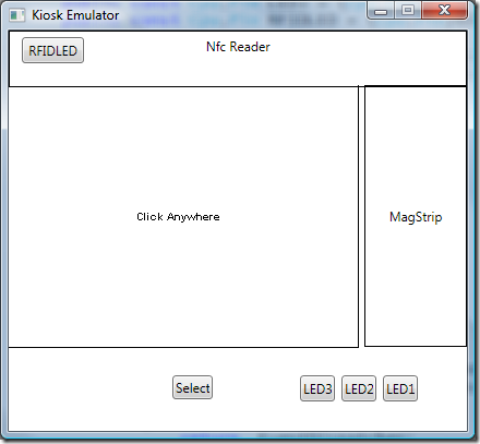
So, you want to know more about building an emulator with WPF? Well, so did I. Of course the first question to ask when encountering something new is why bother? (E.g. What’s it going to do for me that the stuff I already have isn’t going to do?) Well in the case of WPF, it’s going to do a LOT. More than I could possibly cover in this blog series. However, there is a major theme of WPF that has a big impact on creating an emulator. Separation of the UI from the business logic of an application. This isolation of concerns is key to making an application look great without a lot of headache. The engineers can create a basic functional, but ugly and clumsy UI then hand things over to a designer who makes it all look great without modifying the code. I wanted to maintain that theme with the emulator. In particular I wanted to whip up something quick and ugly to get on with testing code, but I also wanted something that looked like the real device, which meant a non-rectangular window and GUI control to replace the normal functionality found on a Window’s tile bar. As an Example, here’s a screen shot of the “engineer’s design”:
Not exactly pretty, eh? But it works and let’s me get on with testing things. (Don’t worry I will make it look a LOT better in a later post and I won’t have to change a single line of the rest of the emulator code to do it either!) There are a few items on the screen worth discussing. There are some buttons acting as LEDs that will change color when the LED is on. There is a “Select” button which is acting as a GPIO button on the device. (The actual unit doesn’t have any buttons but having that was useful for running some of the test applications provided in the SDK like the touch calibration samples.) The box with the text “Click Anywhere” is the LCD display area showing the Touch sample application running on the emulator. The Nfc Reader and MagStrip areas are just simple boxes with Drag and drop support to allow dropping a file onto each region to trigger interrupts into the emulator.
The card reader items support more than just an interrupt, the data is read from the file and fed back up to the .NET Micro Framework application from within the emulator. Thus the application doesn’t need to know it’s on an emulated system. The card readers are implemented with a custom interop library with a special version for the emulator to handle moving the data from the emulation into the .NET MF application.
Implementing this UI with the XAML designer built into Visual Studio 2008 is rather easy. Drop a canvas element on to the window and then add the other items. (Enabling the LCD, select button and touch support requires the WPF emulator library this series of articles will detail.) Using a canvas like this is generally not the best idea. However it makes for a quick and dirty UI that’s easy for an engineer familiar with Windows Forms to get on with things. In my next post in this series I’ll cover the actual XAML code for this UI and the WPF emulator library features it uses. Then we’ll dig into the “Model-View-View Model” design pattern in a bit more detail and apply it to the emulator to create a view model for the custom emulator diving into the details of the library and eventually ending up with a nice pretty UI for the emulated KIOSK device.
