IndicatorView
 サンプルを参照する
.NET Multi-platform App UI (.NET MAUI) IndicatorView は、項目の数と現在の位置を表すインジケーターを CarouselView に表示するコントロールです。
IndicatorView は次の特性を定義します。
int型のCountは、インジケーターの数です。bool型のHideSingleは、インジケーターが 1 つだけ存在する場合に非表示にする必要があるかどうかを示します。 既定値はtrueです。- Color 型の
IndicatorColorは、インジケーターの色です。 double型のIndicatorSizeは、インジケーターのサイズです。 既定値は 6.0 です。Layout<View>型のIndicatorLayoutは、IndicatorView のレンダリングに使用するレイアウト クラスを定義します。 このプロパティは .NET MAUI によって設定されるため、通常は開発者が設定する必要はありません。- DataTemplate 型の
IndicatorTemplateは、各インジケーターの外観を定義するテンプレートです。 IndicatorShape型のIndicatorsShapeは、各インジケーターの形状です。IEnumerable型のItemsSourceは、インジケーターが表示されるコレクションです。 このプロパティは、CarouselView.IndicatorViewプロパティが設定されると自動的に設定されます。int型のMaximumVisibleは、表示されるインジケーターの最大数です。 既定値はint.MaxValueです。int型のPositionは、現在選択されているインジケーター インデックスです。 このプロパティは、TwoWayバインディングを使用します。 このプロパティは、CarouselView.IndicatorViewプロパティが設定されると自動的に設定されます。- Color 型の
SelectedIndicatorColorは、CarouselView 内の現在の項目を表すインジケーターの色です。
これらのプロパティは、BindableProperty オブジェクトが基になっています。つまり、これらは、データ バインディングの対象にすることができ、スタイルを設定できます。
IndicatorView を作成する
ページにインジケーターを追加するには、IndicatorView オブジェクトを作成し、IndicatorColor と SelectedIndicatorColor のプロパティを設定します。 さらに、IndicatorView オブジェクトの名前に CarouselView.IndicatorView プロパティを設定します。
次の例は、XAML で IndicatorView を作成する方法を示しています。
<Grid RowDefinitions="*,Auto">
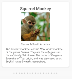
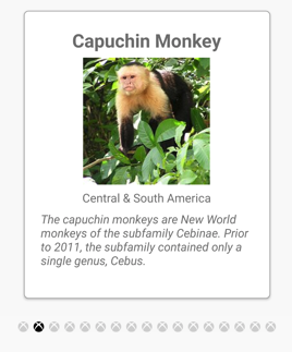
<CarouselView ItemsSource="{Binding Monkeys}"
IndicatorView="indicatorView">
<CarouselView.ItemTemplate>
<!-- DataTemplate that defines item appearance -->
</CarouselView.ItemTemplate>
</CarouselView>
<IndicatorView x:Name="indicatorView"
Grid.Row="1"
IndicatorColor="LightGray"
SelectedIndicatorColor="DarkGray"
HorizontalOptions="Center" />
</Grid>
この例では、IndicatorView が CarouselView の下にレンダリングされ、CarouselView 内の各項目のインジケーターが表示されます。 IndicatorView には、CarouselView.IndicatorView プロパティを IndicatorView オブジェクトに設定することでデータが入力されます。 各インジケーターは薄い灰色の円ですが、CarouselView 内の現在の項目を表すインジケーターは濃い灰色です。
重要
CarouselView.IndicatorView プロパティを設定すると、IndicatorView.Position プロパティが CarouselView.Position プロパティにバインドされ、IndicatorView.ItemsSource プロパティが CarouselView.ItemsSource プロパティにバインドされます。
インジケーターの形状を変更する
IndicatorView クラスには、インジケーターの形状を決定する IndicatorsShape プロパティがあります。 このプロパティは、IndicatorShape 列挙型メンバーのいずれかに設定することができます。
Circleは、インジケーターの形状が円形であることを指定します。 これは、IndicatorView.IndicatorsShapeプロパティの既定値です。Squareは、インジケーターの形状が正方形であることを示します。
次の例は、正方形のインジケーターを使用するように構成した IndicatorView を示しています。
<IndicatorView x:Name="indicatorView"
               IndicatorsShape="Square"
               IndicatorColor="LightGray"
               SelectedIndicatorColor="DarkGray" />
インジケーターのサイズを変更する
IndicatorView クラスには、デバイスに依存しないユニットでのインジケーターのサイズを決定する double 型の IndicatorSize プロパティがあります。 このプロパティの既定値は 6.0 です。
次の例は、大きなインジケーターを表示するように構成された IndicatorView を示します。
<IndicatorView x:Name="indicatorView"
               IndicatorSize="18" />
表示されるインジケーターの数を制限する
IndicatorView クラスには、表示されるインジケーターの最大数を決定 int 型の MaximumVisible プロパティがあります。
次の例では、最大 6 つのインジケーターを表示するように構成された IndicatorView を示します。
<IndicatorView x:Name="indicatorView"
               MaximumVisible="6" />
インジケーターの外観を定義する
各インジケーターの外観は、IndicatorView.IndicatorTemplate プロパティを DataTemplate に設定して定義できます。
<Grid RowDefinitions="*,Auto">
<CarouselView ItemsSource="{Binding Monkeys}"
IndicatorView="indicatorView">
<CarouselView.ItemTemplate>
<!-- DataTemplate that defines item appearance -->
</CarouselView.ItemTemplate>
</CarouselView>
<IndicatorView x:Name="indicatorView"
Grid.Row="1"
Margin="0,0,0,40"
IndicatorColor="Transparent"
SelectedIndicatorColor="Transparent"
HorizontalOptions="Center">
<IndicatorView.IndicatorTemplate>
<DataTemplate>
<Label Text=""
FontFamily="ionicons"
FontSize="12" />
</DataTemplate>
</IndicatorView.IndicatorTemplate>
</IndicatorView>
</Grid>
DataTemplate に指定された要素では、各インジケーターの外観を定義します。 この例では、各インジケーターはフォント アイコンを表示する Label です。
次のスクリーンショットは、フォント アイコンを使用してレンダリングされたインジケーターを示しています。
表示状態を設定する
IndicatorView には Selected 表示状態があり、IndicatorView で現在の位置のインジケーターに対する視覚的な変更を開始するために使用できます。 この VisualState に対する一般的なユース ケースは、現在の位置を表すインジケーターの色を変更することです。
<ContentPage ...>
<ContentPage.Resources>
<Style x:Key="IndicatorLabelStyle"
TargetType="Label">
<Setter Property="VisualStateManager.VisualStateGroups">
<VisualStateGroupList>
<VisualStateGroup x:Name="CommonStates">
<VisualState x:Name="Normal">
<VisualState.Setters>
<Setter Property="TextColor"
Value="LightGray" />
</VisualState.Setters>
</VisualState>
<VisualState x:Name="Selected">
<VisualState.Setters>
<Setter Property="TextColor"
Value="Black" />
</VisualState.Setters>
</VisualState>
</VisualStateGroup>
</VisualStateGroupList>
</Setter>
</Style>
</ContentPage.Resources>
<Grid RowDefinitions="*,Auto">
...
<IndicatorView x:Name="indicatorView"
Grid.Row="1"
Margin="0,0,0,40"
IndicatorColor="Transparent"
SelectedIndicatorColor="Transparent"
HorizontalOptions="Center">
<IndicatorView.IndicatorTemplate>
<DataTemplate>
<Label Text=""
FontFamily="ionicons"
FontSize="12"
Style="{StaticResource IndicatorLabelStyle}" />
</DataTemplate>
</IndicatorView.IndicatorTemplate>
</IndicatorView>
</Grid>
</ContentPage>
この例では、Selected 表示状態は、現在の位置を表すインジケーターの TextColor が黒に設定されることを指定します。 それ以外の場合、インジケーターの TextColor は薄い灰色になります。

ビジュアルの状態の詳細については、「表示状態」をご覧ください。
.NET MAUI