演習 - NumPy を使用して線形回帰を実行する
散布図により、データを視覚化するための便利な手段が提供されますが、散布図と一定期間のデータの傾向を示す傾向線を重ね合わせたい場合を考えてみましょう。 このような傾向線を計算する方法の 1 つが線形回帰です。 この演習では、NumPy を使用して線形回帰を実行し、Matplotlib を使用してデータから傾向線を描画します。
ノートブックの下部にある空のセルにカーソルを置きます。 セルの種類を Markdown に変更し、"Perform linear regression" (線形回帰を実行する) をテキストとして入力します。
コード セルを追加し、次のコードを貼り付けます。 コメント (# 記号で始まる行) を読み、このコードが行う内容を把握します。
# Creates a linear regression from the data points
m,b = np.polyfit(yearsBase, meanBase, 1)

# This is a simple y = mx + b line function
def f(x):
    return m*x + b

# This generates the same scatter plot as before, but adds a line plot using the function above
plt.scatter(yearsBase, meanBase)
plt.plot(yearsBase, f(yearsBase))
plt.title('scatter plot of mean temp difference vs year')
plt.xlabel('years', fontsize=12)
plt.ylabel('mean temp difference', fontsize=12)
plt.show()

# Prints text to the screen showing the computed values of m and b
print(' y = {0} * x + {1}'.format(m, b))
plt.show()
次に、セルを実行して回帰直線がある散布図を表示します。
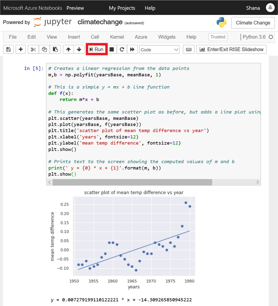
回帰直線がある散布図
回帰直線からは、30 年間の平均気温と 5 年間の平均気温との差が、時間の経過と共に増加していることがわかります。 回帰直線を生成するために必要な計算作業のほとんどは、NumPy の polyfit 関数により行われ、これにより式 y = mx + b の m と b の値が計算されました。