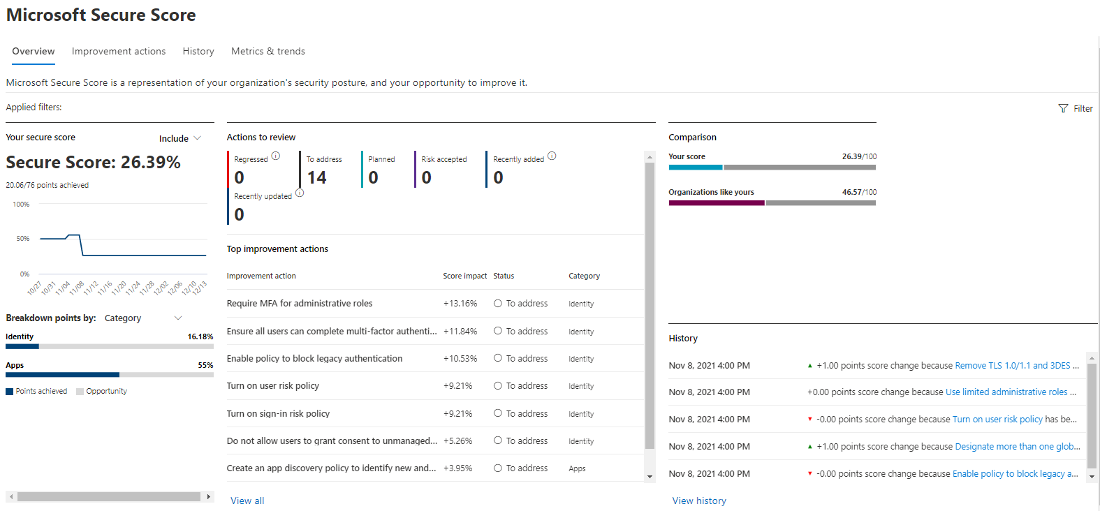
Microsoft Secure Score is a measurement of an organization's security posture, with a higher number indicating more recommended actions taken.
Organizations can view a graph of their score over time in the History tab. Below the graph is a list of all the actions taken in the selected time range and their attributes, such as resulting points and category. You can customize a date range and filter by category.
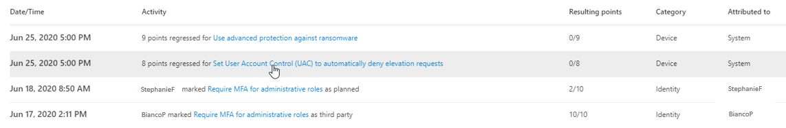
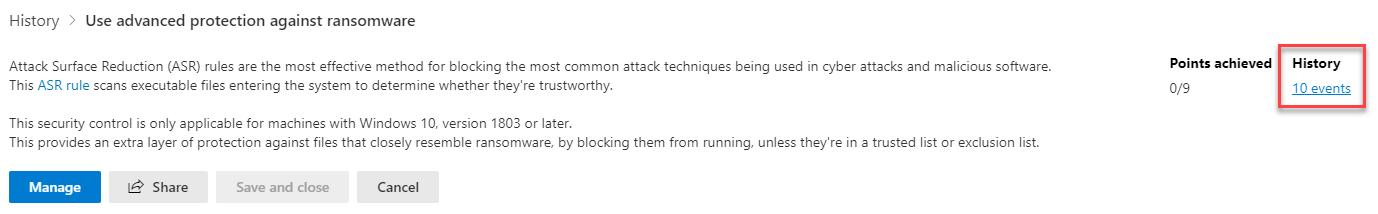
If you select the recommended action associated with an activity, the full recommended action flyout appears. To view all history for that specific recommended action, select the History link in the flyout.
Discover trends and set goals
The Metrics and trends tab displays several graphs and charts to give organizations more visibility into trends and set goals. You can set the date range for the whole page of visualizations. The visualizations include:
- Your Secure Score zone. Customized based on your organization's goals and definitions of good, okay, and bad score ranges.
- Regression trend. A timeline of points that regressed because of configuration, user, or device changes.
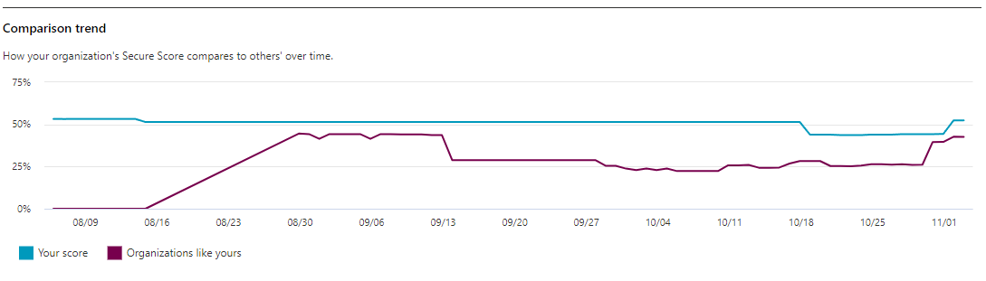
- Comparison trend. How your organization's Secure Score compares to others' over time. This view can include lines representing the score average of organizations with similar seat count and a custom comparison view that you can set.
- Risk acceptance trend. Timeline of recommended actions marked as "risk accepted."
- Score changes. The number of points achieved, points regressed, and changes to your score in the specified date range.
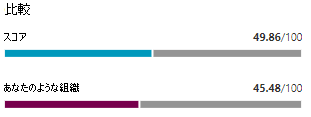
Compare your score to organizations like yours
There are two places to see how your score compares to organizations that are similar to yours - in the Comparison bar chart and in the Comparison trend line graph.
Comparison bar chart
The comparison bar chart is available on the Overview tab. Hover over the chart to view the score and score opportunity.
Note
The comparison data is anonymous, so Microsoft doesn't know exactly whose tenants are in the mix.
Comparison trend
In the Metrics and trends tab, view how your organization's Secure Score compares to others' over time.