Graph Colouring, Part Four
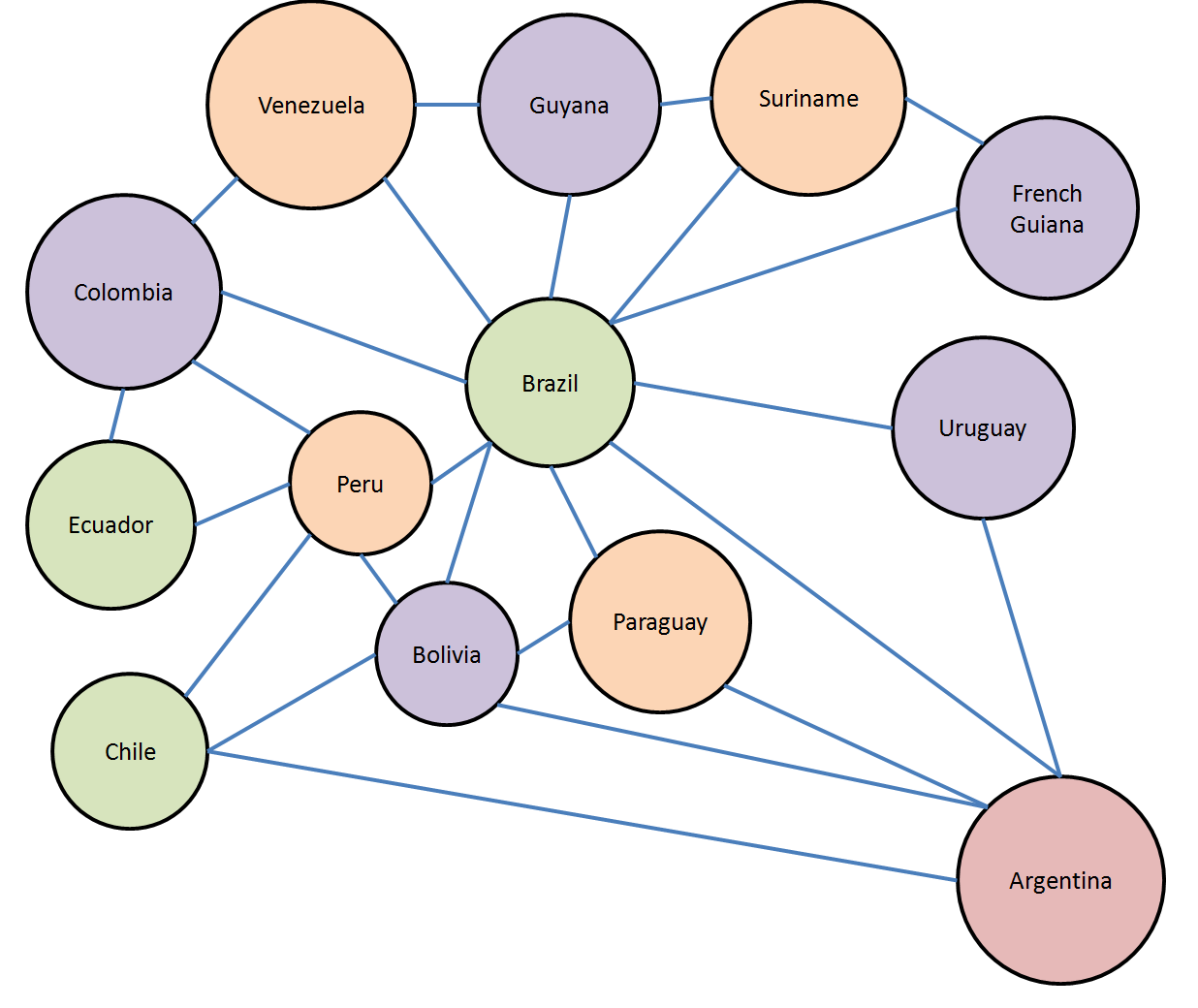
Let's give it a try. Can we colour South America with only four colours? Let's start by stating what all the edges are in the graph of South America:
const int Brazil = 0;
const int FrenchGuiana = 1;
const int Suriname = 2;
const int Guyana = 3;
const int Venezuala = 4;
const int Colombia = 5;
const int Ecuador = 6;
const int Peru = 7;
const int Chile = 8;
const int Bolivia = 9;
const int Paraguay = 10;
const int Uruguay = 11;
const int Argentina = 12;
var SA = new Dictionary<int, int[]>()
{
{Brazil, new[] { FrenchGuiana, Suriname, Guyana, Venezuala, Colombia, Peru, Bolivia, Paraguay, Uruguay, Argentina}},
{FrenchGuiana, new[] { Brazil, Suriname }},
{Suriname, new[] {Brazil, FrenchGuiana, Guyana}},
{Guyana, new[] {Brazil, Suriname, Venezuala}},
{Venezuala, new[] {Brazil, Guyana, Colombia}},
{Colombia, new [] {Brazil, Venezuala, Peru, Ecuador}},
{Ecuador, new[] {Colombia, Peru}},
{Peru, new[] {Brazil, Colombia, Ecuador, Bolivia, Chile}},
{Chile, new[] {Peru, Bolivia, Argentina}},
{Bolivia, new[] {Chile, Peru, Brazil, Paraguay, Argentina}},
{Paraguay, new[] {Bolivia, Brazil, Argentina}},
{Argentina, new[] {Chile, Bolivia, Paraguay, Brazil, Uruguay}},
{Uruguay, new[] {Brazil, Argentina}}
};
We can transform this dictionary mapping nodes to neighbours into a list of edge tuples and build the graph:
var sagraph = new Graph(13, from x in SA.Keys
from y in SA[x]
select Tuple.Create(x, y));
Notice that this illustrates both a strength and a weakness of our earlier design decision to make the graph take a list of edges as its input. The graph could just as easily have taken a dictionary mapping nodes to neighbours, and then we wouldn't have to do this transformation in the first place! It might have been a bad design decision. Such decisions always have to be made in the context of understanding how the user is actually going to use the type.
Anyway, now finding a four-colour solution is easy with our solver:
var sasolver = new Solver(sagraph, 4);
var solution = sasolver.Solve();
foreach (var colour in solution )
Console.WriteLine(colour);
We run this and get 0, 1, 2, 1, 2, 1, 0, 2, 0, 1, 2, 1, 3 for the colours. On the graph, that looks like this:
Which is clearly a legal colouring, and manages to almost do it in three colours; only Argentina has to be the fourth. This of course is not a desirable property of real political maps; it would make Argentina stand out unnecessarily. But the way the algorithm priortizes hypothesizing lower colours over higher colours means that it is likely that in many real-world graphs, the higher colours will be rare with our solver.
Notice that the graph of South America is planar; it can be drawn without any of the edges crossing. In fact, all graphs that correspond to neighbouring regions on a plane or a sphere are planar graphs. (Do you intuitively see why?) However there is nothing stopping our solver from looking at more exotic graphs. Consider a torus, a doughnut shape. We can represent a torus on this flat screen by imagining that we "roll up" the square below so that the left edge meets the right edge, making a cylinder. And then bend the cylinder into a circle so that the the top edge meets the bottom edge:
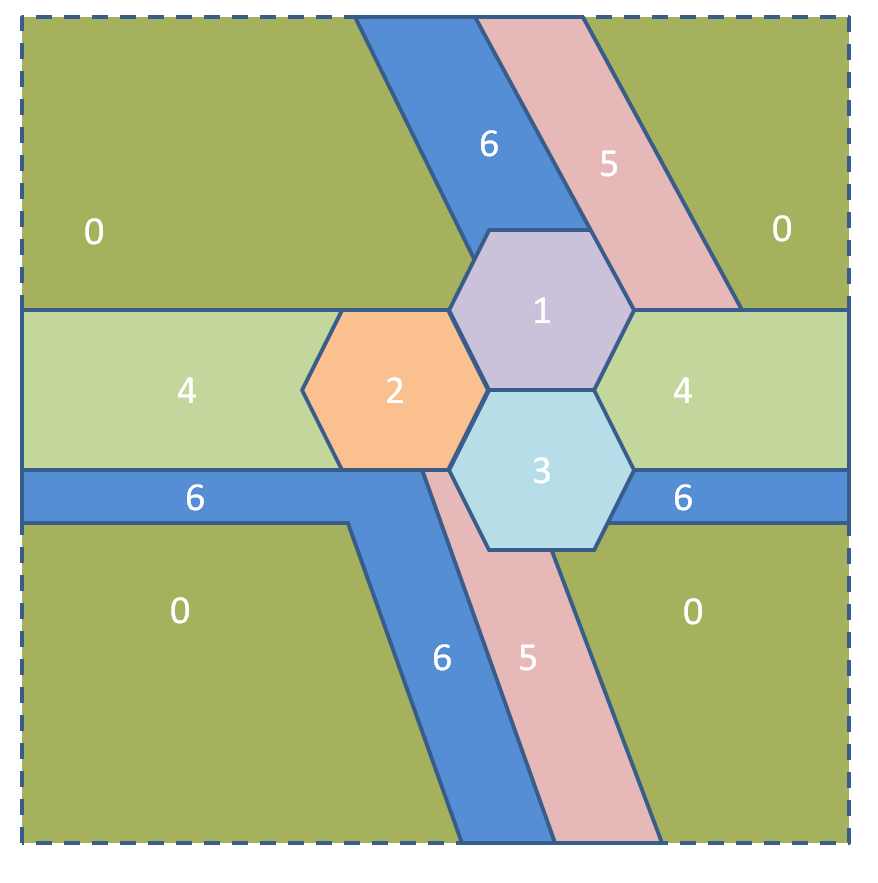
Just to be clear: there are only seven regions on this rather bizarre map. All the regions with the same number that appear to be disjoint are connected because the torus "wraps around" to the opposite side, if you see what I mean.
Notice how on this map every region touches every other region, and therefore cannot be coloured with fewer than seven colours. The four-colour theorem does not hold on a torus! (The seven-colour theorem does; you can colour any map that "wraps around on both sides" with seven or fewer colours.)
You can't graph this as a planar graph, so I'm not even going to try. The graph of this thing looks like this mess:
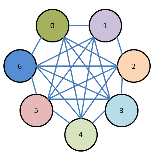
And indeed, if we fed this graph into our graph colourizer and asked for a four-colouring, it would not find one.
Let's call a subset of a graph where every node in the subset is connected to every other node in the subset a "fully connected subset". (In graph theory jargon that's called a clique.) Clearly if any graph has a fully connected subset of size n then the graph requires at least n colours (and perhaps more). Graphs that have a lot of fully connected subsets are interesting to a lot of people. Next time we'll look at some particularly interesting graphs that have lots of fully connected subsets, throw our graph colourizer at them, and see what happens.
Comments
Anonymous
July 26, 2010
"Let's call a subset of a graph where every node in the subset is connected to every other node in the subset a "fully connected subset" Is that not just a clique? Yes. - EricAnonymous
July 26, 2010
How could a fully connected subset of size n require more than n colors? That doesn't seem to make sense. I didn't say that a fully connected subset of size n ever requires more than n colours. I said "if any graph has a fully connected subset of size n then the graph requires at least n colours (and perhaps more)" which is a completely different statement than your statement. For example, consider the graph A--B--C--D--E--back to A. That graph has five fully connected subgraphs of size two: {A, B}, {B, C}, {C, D}, {D, E} and {E, A}. It has no fully connected subgraphs of any size larger than two. We therefore know that it requires at least two colours; in fact, it requires three. Knowing the size of the largest clique only gives us a lower bound; the topology of the rest of the graph is also relevant. - EricAnonymous
July 26, 2010
If you didn't want to write the backtracking algorithm yourself, you could also solve this problem using Microsoft Solver Foundation: var context = SolverContext.GetContext(); var model = context.CreateModel(); var domain = Domain.IntegerRange(1, 4); Decision Brazil = new Decision(domain, "Brazil"); Decision FrenchGuinea = new Decision(domain, "FrenchGuinea"); Decision Suriname = new Decision(domain, "Suriname"); Decision Guyana = new Decision(domain, "Guyana"); Decision Venezuela = new Decision(domain, "Venezuela"); Decision Colombia = new Decision(domain, "Colombia"); Decision Ecuador = new Decision(domain, "Ecuador"); Decision Peru = new Decision(domain, "Peru"); Decision Chile = new Decision(domain, "Chile"); Decision Bolivia = new Decision(domain, "Bolivia"); Decision Paraguay = new Decision(domain, "Paraguay"); Decision Uruguay = new Decision(domain, "Uruguay"); Decision Argentina = new Decision(domain, "Argentina"); model.AddDecisions(Brazil, FrenchGuinea, Suriname, Guyana, Venezuela, Colombia, Ecuador, Peru, Chile, Bolivia, Paraguay, Uruguay, Argentina); model.AddConstraints("neighbors", Brazil != FrenchGuinea, Brazil != Suriname, Brazil != Guyana, Brazil != Venezuela, Brazil != Colombia, Brazil != Peru, Brazil != Bolivia, Brazil != Paraguay, Brazil != Uruguay, Brazil != Argentina, FrenchGuinea != Suriname, Suriname != Guyana, Guyana != Venezuela, Venezuela != Colombia, Colombia != Ecuador, Ecuador != Peru, Peru != Bolivia, Peru != Chile, Chile != Bolivia, Chile != Argentina, Bolivia != Paraguay, Bolivia != Argentina, Paraguay != Argentina, Argentina != Uruguay); var solution = context.Solve(); Console.Out.Write(solution.GetReport());Anonymous
July 26, 2010
Eric - thanks. I mis-read your original statement - hence the confusion. =)Anonymous
July 26, 2010
Everyone makes the "map requiring 7 colours" on the torus look so complicated and ugly, but it isn't really. Start with a hexagonal tiling of the plane (pardon what follows...each "*" is a tile but it should really be in a monospaced font):
Now number the tiles in each row from 0 to 6, but stagger each row differently. Each "0" tile in each row should be two and a half tiles to the right of a "0" tile in the row below it: 5 6 0 1 2 3 4 0 1 2 3 4 5 6 0 3 4 5 6 0 1 2 5 6 0 1 2 3 4 5 Now (this is the part where ascii fails me) draw a parallelogram with vertices in the centre of four tiles marked "0" (such as the four leftmost "0" tiles in the diagram above), and identify opposite edges as before. There's your map. If you want your torus to be constructed from a square instead of a parallelogram you can apply an affine transformation.
Anonymous
July 26, 2010
...and the commenting software ate the leading spaces in my awful ascii diagrams. I should really know better.Anonymous
July 28, 2010
Maybe I missed something but is there any significance to the fact that you draw your graphs such that sometimes you have multiple lines leading out from a single point and sometimes not? Consider Chile which has 3 lines leading out from two points. Does that mean anything? It means that I am (1) not very good at using PowerPoint, and (2) too lazy to install Visio. - EricAnonymous
July 29, 2010
Ha! Ok, thanks. Wasn't trying to cause trouble, just wondering if I had missed something of significance.