The burden of locked grids & blooming dots
Stuck in a rut, boxed in by restraints, griddled by grids?
You know what I love? Beautiful type. Gorgeous books, letterpress, ink and the swish of the pen. The flow of thought communicated through the way words are placed on a page, and the artistry and design intent hidden behind a functional form.
You know what I work with? Yep that’s right. Grids and dots. LCD displays and CRT monitors. I also work with developers, architects and mad mathematicians – let alone the infamous fearless Scotsman who runs our group!
For a typophile such as myself, you know where I’d like to be? I’d like screen viewing and reading to be as flawless as possible. But at the moment we have a ways to go before we get there and that’s the challenge.
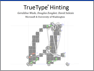
In the past and at the moment type on-screen is limited by the resolution of the screen. No matter how delicate and subtle the outline shapes may be, when they are being rendered onscreen at small sizes they have to be mapped to a fairly crude grid of pixels. Here’s a short video for those of you who have not come across hinting for type before:
This video explains what a fairly coarse grid does to black and white rendering. Black & white rendering is pretty stark, and aliased stair-stepped jaggy text is just plain ugly. It’s a far cry from the original intent of the design, although it was the best we could do at the time.
And simply put whether the edges of these pixels are sharply defined or blurred depends on the method of rendering, the kind of anti-aliasing used and the quality of the light emission behind the screen and so on.
Also for starters there’s a small matter of hardware and screen resolution. Now don’t get me wrong, there’s been huge leaps in improvements along this axis. Today, most displays are 100DPI or less, but there are newer displays out there with a resolution of around 130DPI, 150DPI, and 200DPI. And the higher you go the smaller the grid, the smaller the pixel, until eventually you won’t even notice there is a grid, or dot behind the line…more to follow…
Hi. My name is Geraldine Wade and I’m a Design Program Manager in the Advanced Reading Technologies team. Our group is particularly involved with rasterisation, technological type advancement and the science of reading. I have been involved with hinting, designing and managing font projects tied to technology advancements for Microsoft since the Windows 3.1 core fonts and I want to talk about the restraints we have with designing for onscreen reading, where we have been, where we are now and where we’d like to go in the future.
Edit: Update Image References
Comments
Anonymous
October 27, 2005
Good blog! Keep up the good work. ;)Anonymous
October 27, 2005
Great start - subscribed!
oh, for any CSS gurus who manage blogs.msdn.com -- the fonts on this blog appear unreadably small on Firefox :( ... a fix would be great. And thanks for the Vista fonts preview!Anonymous
October 28, 2005
Is it my imagination or does the article get cut off just after the video link? It looks like it starts mid-paragraph.
Love the blog though, keep up the good work!Anonymous
October 29, 2005
GW > I also work with developers, architects and mad mathematicians...
don't forget researchers :-)
Will > Is it my imagination...
NoAnonymous
October 31, 2005
Thanks Will! Have updated this - should make more sense now;)Anonymous
November 11, 2005
Either you guys need bigger pipes on the server streaming that video or you need to allow us to download it. It's essentially unwatchable because of al the audio and video dropouts...Anonymous
December 08, 2005
The video is GREAT... i never knew how that worked and now i'm hooked -- awesomeAnonymous
September 17, 2008
PingBack from http://www.blogx.us/288.htmlAnonymous
September 19, 2008
PingBack from http://windows-7.com.ua/2008/09/20/developing/35Anonymous
October 10, 2008
The comment has been removedAnonymous
October 10, 2008
The comment has been removedAnonymous
October 27, 2008
The comment has been removedAnonymous
January 08, 2009
몇 가지 흥미로웠던 논의와 함께, High DPI에 대한 많은 댓글을 달아주셨습니다. 대부분은 우리가 수집해 온 데이터와 일치하는 좋은 예들 입니다. 우리가 데이터를 가지지 않는 분야에Anonymous
June 22, 2009
PingBack from http://tune-up-pc.com/blog/?p=2579Anonymous
June 22, 2009
PingBack from http://portal.lacaterinca.com/engineering-changes-to-cleartype-in-windows-7/Anonymous
June 23, 2009
PingBack from http://securityowned.com/engineering-changes-to-cleartype-in-windows-7.htmlAnonymous
June 24, 2009
PingBack from http://tune-up-pc.com/blog/?p=2584Anonymous
June 25, 2009
PingBack from http://windows7info.net/engineering/engineering-changes-to-cleartype-in-windows-7/Anonymous
August 01, 2009
Ping back from <a href="http://technews.com.ua/tag/windows-7">