Supporting multi-valued "listboxes" in PowerApps
One the current limitations of PowerApps is the lack of support for multi-valued fields - a column in a data source that can take zero or more of a predefined set of values. One example is a Choice column in SharePoint that allows multiple selections, which is a required scenario for some users. - if you add it to a form it currently doesn't allow you to see or edit the values. Even without the use of forms, if you want to use a listbox to display / select multiple items, it still doesn't work today as currently the listbox doesn't let you set multiple default selected values.
In this post I'll give a workaround for this scenario, using a gallery in place of the listbox to support having multiple items selected by default. The gallery gives you some additional capability not present in the listbox, such as the ability to format items individually (which has been requested in the forums as well).
Scenario
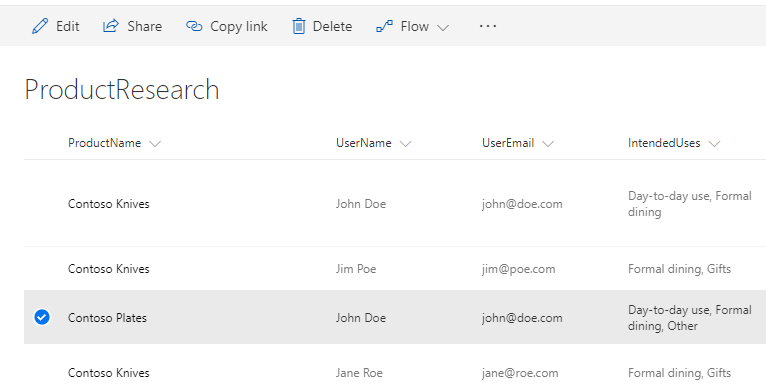
To talk about something concrete, the scenario I'll be talking in this post is the following: in my app, the user can choose to show interest in one of the products of my company. I'll define an app that will be created in this post. I want to save a list of potential customers for my products, and I'll collect how they intend to use them, given a set of choices. To do that, I have the following SharePoint list:

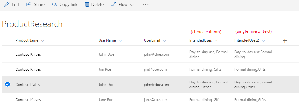
The list of usages (IntendedUses) is set as a Choice column, with multiple selection allowed. And here is where we hit the first block - as I mentioned before, those columns are not supported. But we can still make the scenario work, if we store the same information in a string column (Single line of text), and store the usages in a comma-separated value (if any of the values has a comma another separator would need to be used).

Creating the app
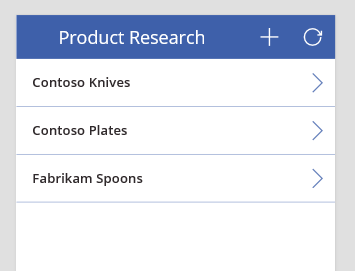
The app will show all the products that the current user has shown interest, and lets them register to be notified about new products - for simplicity I'll make it as a 2-screen phone app, with the first screen listing the existing registrations, and the next screen to view / add / update existing ones.

Those are the significant formulas that are used in this screen, shown in the <control name>.<property name>: expression format:
BrowseGallery.Items: Filter(ProductResearch, UserEmail = User().Email) (inside gallery) TitleLabel.Text: ThisItem.Title (inside gallery) NextArrow.OnSelect: Navigate(DetailsScreen, ScreenTransition.Fade, {item: ThisItem}) NewItemIcon.OnSelect: Navigate(DetailsScreen, ScreenTransition.Fade, {item:Defaults(ProductResearch)}) RefreshIcon.OnSelect: Refresh(ProductResearch)
In this example, when we navigate to the details screen, we're passing the item that needs to be edited as a parameter to it. When we're editing an item, we pass the selected item in the gallery; when we create a new item, we pass an empty record (using the Defaults function).
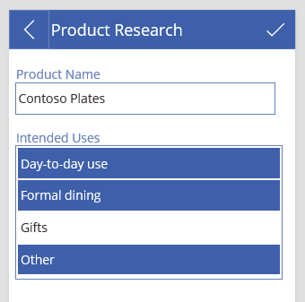
Now on to the second screen, which will look something like this:

And for the main formulas used in the screen:
DetailsScreen.OnVisible: ClearCollect(coll, AddColumns(["Day-to-day use", "Formal dining", "Gifts", "Other"], "On", Value in Split(item.IntendedUses2, ","))) ProductNameTextInput.Default: item.Title IntendedUsesGallery.Items: coll (inside gallery) IntendedUseLabel.Text: ThisItem.Value (inside gallery) IntendedUseLabel.Color: If(ThisItem.On, Color.White, RGBA(47,41,43,1)) (inside gallery) IntendedUseLabel.Fill: If(ThisItem.On, RGBA(62,96,170,1), RGBA(0, 0, 0, 0)) (inside gallery) IntendedUseLabel.OnSelect: Patch(coll, ThisItem, {On: !ThisItem.On}) SubmitButton.OnSelect: Patch(ProductResearch, item, { Title: ProductNameTextInput.Text, UserName: User().FullName, UserEmail: User().Email, IntendedUses2: Concat(Filter(coll, On), Value, ",") }); Navigate(BrowseScreen, ScreenTransition.Fade) BackButton.OnSelect: Navigate(BrowseScreen, ScreenTransition.Fade)
Let's go through the formulas. When the screen is shown (via navigation from the previous screen), we create a collection ('coll') that holds all possible choices for the column; in addition, we add an additional column to the table, with a value true if the value is part of the existing choices for the record, or false otherwise. This is the source that will be used as the list of items for the gallery (our "fake" listbox).
In the gallery, we have one single child element - a label that shows one of the possible choices. To make it look like a list box, you'll need to stretch the label to fill the entire template cell, and possibly adjust padding options. The color of the text (which changes based on whether the choice is selected) we adjust based on the 'On' column of the collection that was created when the user navigated to the screen - if the choice is selected, then it will show with the background inverted, just like in the default listbox behavior. The last thing we need to define is how to "toggle" the value of the selection - and we do this by Patching the local collection, for the selected item, inverting the value of the 'On' column. At this point we have a listbox that supports multiple selection working.
The final part of the scenario is to get the choices selected by the user and save them back to the data source. This is where the Patch call in the SelectButton comes up. By using the Concat function, we can Filter the local collection and recreate the comma-separated list of values that we can write back to save the changes made by the user.
And this completes this scenario - support for multi-valued fields is possible in PowerApps, albeit not as simple as it should be (and in the future this support will certainly be made easier).
Limitations
It's worth to notice some limitations of this approach. First, it doesn't work natively with multi-valued choice columns in Sharepoint (or a similar column type in other data sources). We needed to create a column to store the value in a way that PowerApps can work with (in this case, a string column).
Also, galleries cannot be inserted inside forms. So if you are working with a form for all other columns of the data source, you will not be able to add this "fake listbox" inside one of the cards of the form. You may be able to add it outside of the form (and possibly make it look as if it was part of the same form), but if the form has too many cards that it needs to scroll, then the gallery will not be a part of the scrollable area (and will not look good in this case).
Again, this post is an attempt to unblock a scenario that currently isn't possible (at least not easily) to do in PowerApps, and I expect that it will be made easier in the future.
As usual, let us know of any comments / questions you have by posting in our forums, we want to hear your feedback!