Available dashboard cards in Viva Connections
The Viva Connections dashboard uses dynamic cards that can be targeted to specific users to help them perform tasks like clock in for a shift, access training materials or links to department resources, look up contact information, manage assigned tasks, and more. If your organization has a specific task in mind, you can also use the card designer to quickly build "custom" cards using a template, without the need for custom code.
Edit the dashboard
You need member or owner level permissions to access the card designer from the dashboard card toolbox. See the article on creating a Viva Connections dashboard and adding cards for information on getting started.
Available dashboard cards
Select a dashboard icon for more information.
| Toolbox icon | Description |
|---|---|
| Create your own cards or use quick views for a more interactive experience utilizing the adaptive cards framework. | |
| Use Approvals to approve vacation requests, documents, and expense reports. | |
| Use Tasks to manage your team's work, assign tasks, and track tasks. | |
| Display a summary of upcoming and past due assignments for students. | |
| Display a summary of courses a student is enrolled in. | |
| View and join upcoming events within your organization. | |
| Provide users links to frequently accessed SharePoint sites. | |
| Promote news from various sources that you wish to prominently display, including boosted news from SharePoint. | |
| View and access recent, shared, and favorite files from your OneDrive account. | |
| Provide an option to look up contact information and directly chat, email, or call with others in your organization. | |
| Design a lightweight card using your power apps account for simple tasks like checking sales requests, vacation requests, and more. | |
| Provide list of relevant links or files to users selected by admins. | |
| Display information about the next or current shift from the Shifts app in Teams. | |
| Display a list of videos to users that can be viewed in Microsoft Stream. | |
| Use to open a Teams personal app or bot specified by the dashboard author. | |
| Varies | Use cards that integrate partner services. |
 |
Use Topics cards to encourage knowledge discoverability, engagement, and sharing. |
| Provide a link to the Viva Learning app that can be targeted to show to certain audiences. | |
| Provide a short status of a recently sent pulse with a link to the Viva Pulse app for users to learn more. | |
| Access a site without leaving the Viva Connections app. |
Add the Approvals card
The Approvals card connects to Approvals in Microsoft Teams and is a way to streamline all of your requests and processes with your team or partners. You can create new approvals, view the ones sent your way, and see all of your previous approvals in one place.
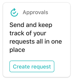
While in edit mode, select + Add a card from the dashboard.
Select Approvals from the dashboard toolbox.

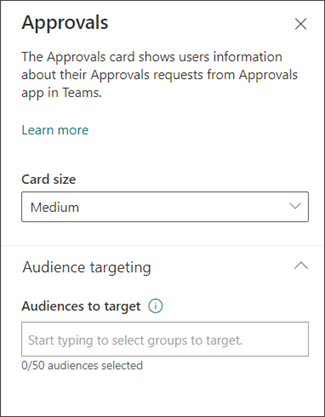
Select the pencil icon to Edit the card. In the property pane that opens on the right side of the screen, choose your card size from the Card size drop-down list.
Once you’re satisfied with how the dashboard looks in preview, select Publish or Republish at the top-right of your dashboard to make it available for use on your SharePoint home site, in Teams, and in the Teams mobile app.
Add the Assigned tasks card
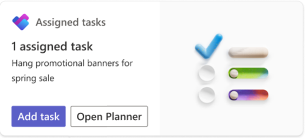
The Assigned tasks card allows users to create and view tasks from the card or open the Planner app from the card. Task information is retrieved from the Planner app in Teams.
While in edit mode, select + Add a card from the dashboard.
Select Assigned Tasks from the dashboard toolbox.
In the property pane on the right, choose your card size from the Card size drop-down list.
Note
The size of the card affects how many buttons are available on the card. The Add tasks and Open Planner buttons appear on large cards (default size), while on medium sized cards only the Add tasks button is shown.
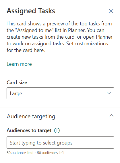
To target your card to specific audiences (that is, the card only displays in the dashboard to the audience you specify), select one or more groups to target. For more information on audience targeting, see Audience targeting.
For more information on using the Planner app, see the articles on how to Manage the Planner app for your organization in Microsoft Teams and Getting started with Planner in Teams, or see the blog post announcing the Assigned tasks card.
Add the Assignments card
The Assignments card displays a summary of upcoming and past due assignments. Students can select the card to view more details on their assignment list and open them in Microsoft Teams.
Note
The Assignments card is only available to Education tenants.

While in edit mode, select + Add a card from the dashboard.
Select Assignments from the dashboard toolbox.
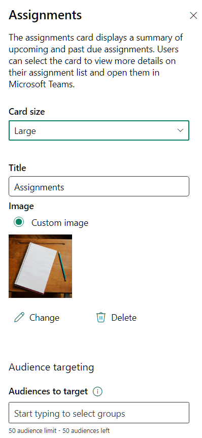
In the property pane on the right, choose your card size from the Card size drop-down list.
Enter a Title for the assignments card.
To change the card image, select Change, then select an image or upload your own.
To target your card to specific audiences (that is, the card only displays in the dashboard to the audience you specify), select one or more groups to target. For more information on audience targeting, see Audience targeting.
Add the Courses card
The Courses card displays a summary of courses a student is enrolled in. Students can select the card to view their course list and open them in Microsoft Teams.
Note
The Courses card is only available to Education tenants.
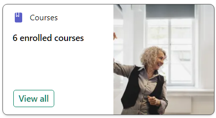
While in edit mode, select + Add a card from the dashboard.
Select Courses from the dashboard toolbox.

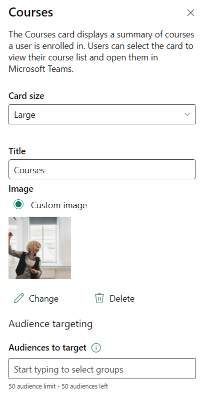
In the property pane on the right, choose your card size from the Card size drop-down list.
Enter a Title for the assignments card.
To change the card image, select Change, then select an image or upload your own.
To target your card to specific audiences (that is, the card only displays in the dashboard to the audience you specify), select one or more groups to target. For more information on audience targeting, see Audience targeting.
Add the Events card
The events card can help your users stay informed and engaged with upcoming events in their organization, such as webinars, trainings, town halls, and celebrations. Users can view more upcoming events or join via teams via the links on the Events card. The card can be customized and even targeted to specific audiences so only relevant events are displayed.
The Events card is tied to the SharePoint Events web part. Site owners and members need to access their SharePoint site and use the SharePoint Events web part to add events to their site. For more information, see the article on using the Events web part.
Note
Recurring events aren't supported, even if you manually set up a recurrence in the events list that you're using. You need to create a new event for each occurrence.
While in edit mode, select + Add a card from the dashboard.
Select Events from the dashboard toolbox.

Select the edit pencil to the left of the card to open the properties pane for the Event card.
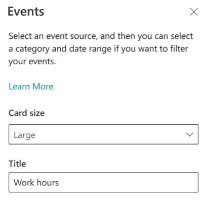
In the property pane on the right, choose your card size from the Card size drop-down list.
Enter a Title for the event card.
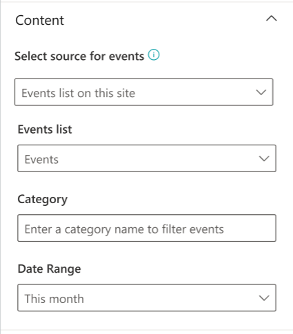
Under Content, select a Source for your events: Events list on this site, This site, This site collection, Select sites, or All sites. If your site is connected to a hub site, you'll also able to select All sites in the hub or Select sites from the hub.
Note
- When you choose Select sites, you can search for the site you want to add, or select one or more sites from Frequent sites, or Recent sites. You can select up to 30 sites.
- The Select sites option isn't available in SharePoint Server, U.S. Government GCC High and DoD, and Office 365 operated by 21Vianet.
- If there's more than one events list on the site, you can select the one you want. If you don't have an existing list, the Events card creates an empty Events list for you, with the default settings of a Calendar list.
- If you choose to show events from multiple sites, and don't see all of your events displayed on the page, see How events from multiple sites are found and displayed.
- When you choose Select sites, you can search for the site you want to add, or select one or more sites from Frequent sites, or Recent sites. You can select up to 30 sites.
If your list has categories, you can select one by which to filter the events you show.
Select a date range by which to filter your events in the Date range drop-down list. You can choose All upcoming events (the default), This week, Next two weeks, This month, or This quarter.
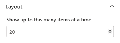
Under the layout section, select how many events to be shown at once from the dropdown. Up to 30 events can be shown on one event card.
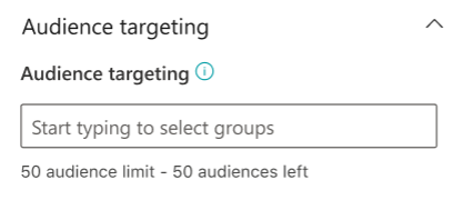
To target your card to specific audiences (that is, the card only displays in the dashboard to the audience you specify), enable audience targeting. For more information on audience targeting, see Audience targeting.
When finished with your selection, you can close the panel. Your settings will autosave.
Add the My Sites card
Add the My Sites card to provide users links to their frequently visited or followed SharePoint sites in an easily accessible list.
While in edit mode, select + Add a card from the dashboard.
Select My Sites from the dashboard toolbox.

Select the edit pencil to the left of the card to open the properties pane for the My Sites card.
Enter a Title for the card.
Choose your card size from the Card size drop-down list.
To change the card image, select Change, then select an image or upload your own.
To target your card to specific audiences (that is, the card only displays in the dashboard to the audience you specify), select one or more groups to target. For more information on audience targeting, see Audience targeting.
Add the News card
Add the News card to the Viva Connections Dashboard to promote news from various sources that you wish to prominently display, including boosted news from SharePoint. If you choose a boosted news post, they'll display in the News card during the boost period.

While in edit mode, select + Add a card from the dashboard.
Select News from the dashboard toolbox.

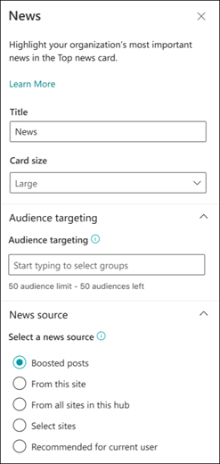
Select the edit pencil to the left of the card to open the properties pane for the News card.
Add a title and select a card size.
To target your card to specific audiences (that is, the card only displays in the dashboard to the audience you specify), select one or more groups to target. For more information, see the section on Audience targeting.
For a news source, select one of the following options:
Boosted posts: Displays any SharePoint boosted news posts from the organization's news sites only. The word "Boosted" displays at the top of the card.
From this site: Pulls news from the hub site that the current site is a part of.
From all sites in this hub: Pulls news from all sites within your SharePoint hub.
Select sites: Pulls news from one or more individual sites (if selected, a list of sites associated with your SharePoint hub displays).
Recommended for current user: Displays news posts for the current user from people the user works with; managers in the chain of people the user works with, mapped against the user's own chain of management and connections; the user's top 20 followed sites; and the user's frequently visited sites.
Add the OneDrive card
The OneDrive card (previously known as Files) connects individuals to their own recent, shared, or favorite files in their OneDrive account. Users can review files they have access to from their Connections experience and open them from the OneDrive card.
Note
Office files like Word, PowerPoint, and Excel will be opened in their respective Teams app. All other file types will be opened in their respective web or local app.
While in edit mode, select + Add a card from the dashboard.
Select OneDrive from the dashboard toolbox.
Select the edit pencil to the left of the card to open the properties pane for the OneDrive card.
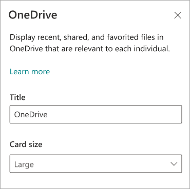
In the property pane on the right, enter a Title for the OneDrive card.
Choose your card size from the Card size drop-down list.
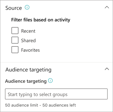
Select a Source for files to be displayed from:
- Recent: Recent files the user accessed display.
- Shared: Files that shared with the user display.
- Favorites: Files that the user marked as "favorite" display.
To target your card to specific audiences (that is, the card only displays in the dashboard to the audience you specify), enter one or more Microsoft 365 groups into the Audience targeting field. For more information on audience targeting, see Audience targeting.
Add the People card
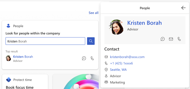
The People Search card automatically retrieves contact information from members of your organization using Microsoft Entra ID. Users can access the People Search card to look up contact information and can jump into chat, email, or a call with the contact directly from the card view.
While in edit mode, select + Add a card from the dashboard.
Select People from the dashboard toolbox.

Select the edit pencil to the left of the card to open the properties pane for the People card.
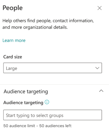
In the property pane on the right, choose your card size from the Card size drop-down list.
To target your card to specific audiences (that is, the card only displays in the dashboard to the audience you specify), select one or more groups to target. For more information on audience targeting, see Audience targeting.
Add the Power Apps card
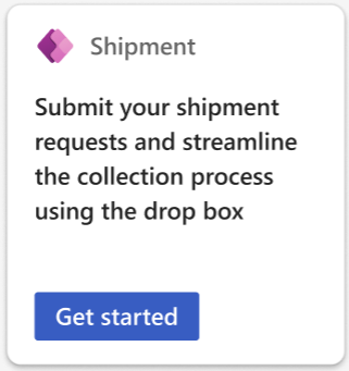
You can create a dashboard card using Power Apps for use in Viva Connections. Design a lightweight power app to check daily sales numbers, shipment requests, vacation requests then bring it into Viva Connections by pasting a URL.
Note
- You'll need a Power Apps account and have created a card in Power Apps in order to bring one into Viva Connections.
- Only cards based on the Dataverse connector are supported.
- All Viva Connections users need to have the Basic User security role in the Power Apps environment where the card is created.
Access your Power Apps account to create your card. For more information about cards for Power Apps, see the overview documentation.
After creating your Power App, select Send and choose Enable card in Viva Connections.
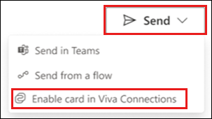
When asked to Enable as a card in Viva Connections, select Enable.
Note
If you're updating a Power App card that was previously enabled and added to Viva Connections, the new version will automatically update in Viva Connections once enabled.
Copy the URL for your card.
Access your Viva Connections instance.
While in edit mode, select + Add a card from the dashboard.
Select Power Apps from the dashboard toolbox.

Select the edit pencil to the left of the card to open the properties pane for the Power Apps card.
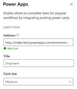
In the property pane on the right, paste the URL from your created Power Apps card in the Address field.
Enter a Title for the event card.
Choose your card size from the Card size drop-down list.
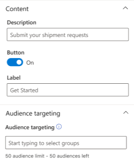
Enter a Description for your card.
The Button can be toggled on and off. If enabled, enter a name in the Label field.
To target your card to specific audiences (that is, the card only displays in the dashboard to the audience you specify), select one or more groups to target. For more information on audience targeting, see Audience targeting.
For more information, see the documentation on using Power Apps.
Add the Quick links card
Use the Quick links card to provide a list of relevant links or files selected by admins to users. Users can select the link to be taken to the respective web page or file.

While in edit mode, select + Add a card from the dashboard.
Select Quick links from the dashboard toolbox.

Select the edit pencil to the left of the card to open the properties pane for the Quick links card.
In the property pane on the right, enter the title for the Quick links card.
To change the card image, select Change, then select an image or upload your own.
Select a card size for the Quick links card.

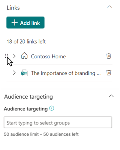
Under links, select + Add link to add a URL, SharePoint page, or files. Added links show below the + Add link button. You can add up to 20 links.
Once added, links can be edited in the following ways:
- Rearrange – Select and drag to the left of the link to reposition it within your quick link list.
- Delete – Select the trashcan to delete the selected link.
- Edit – Select the arrow to edit the link URL, title, and thumbnail image.
To target your card to specific audiences (that is, the card only displays in the dashboard to the audience you specify), select one or more groups to target. For more information on audience targeting, see Audience targeting.
Add the Shifts card
The Shifts card shows users information about their next or current shift from the Shifts app in Teams. They can also clock in and out and track break time when Time clock is enabled in Teams.
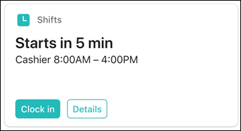
While in edit mode, select + Add a card from the dashboard.
Select Shifts from the dashboard toolbox.

In the property pane on the right, choose your card size from the Card size drop-down list.
To target your card to specific audiences (that is, the card only displays in the dashboard to the audience you specify), select one or more groups to target. For more information on audience targeting, see Audience targeting.
Add the Stream playlist card
The Stream playlist card displays a list of videos to users that can be viewed in Microsoft Stream by selecting an existing playlist from a SharePoint site. For more information, see the article on creating a playlist from SharePoint.
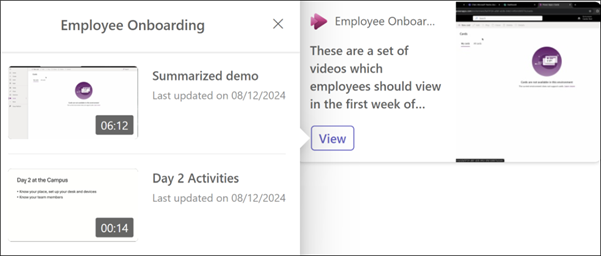
While in edit mode, select + Add a card from the dashboard.
Select Stream playlist from the dashboard toolbox.

Select the edit pencil to the left of the card to open the properties pane for the Play list card.
In the property pane on the right, choose your card size from the Card size drop-down list.
Under source, select a SharePoint site that has the playlist you wish to display. You can search for a SharePoint site by its title, URL, or select from a list of frequented sites.
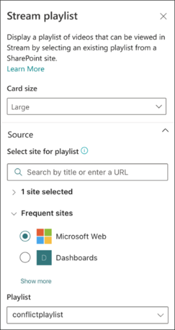
Under playlist, select the playlist from the drop-down of available playlists found from your selected source.
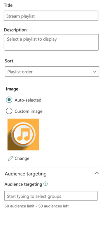
Enter a Title and Description for the selected playlist.
Under sort, select one of the following options:
- Playlist Order: Videos play in the order set within the selected SharePoint playlist.
- Last Created: Videos play in order based on the date they were last created.
- Last Updated: Videos play in order based on the date they were last updated.
Under Image, select Auto-selected or Custom image:
- Auto-selected: Displays an image for your playlist that comes from your selected SharePoint page.
- Custom image: Select custom image then Change to upload your own image or select an existing image from your site or from an online source (for example, web search, OneDrive, Site).
To target your card to specific audiences (that is, the card only displays in the dashboard to the audience you specify), select one or more groups to target. For more information on audience targeting, see Audience targeting.
Add the Teams app card
A Teams app card allows you to create a card for an existing Teams app.

While in edit mode, select + Add a card from the dashboard.
Select Teams app from the web toolbox.
In the property pane on the right side of the page, select your options.
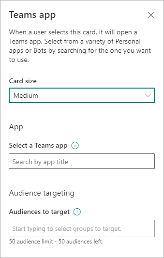
Select a size for the card from the Card size drop-down list.
Search for the Teams app you want to use, and then select it from the list.
Set the card-display options:
- Enter a title for the card in the Card title text box. (This title won't change your page title; it's the title that is displayed on the top of the card.)
- Enter a description for the card in the Card description text box. This description is displayed in larger text under the title.
If you want to target your card to specific audiences (that is, the card only displays in the dashboard to the audience you specify), select one or more groups to target. For more information on audience targeting, see Audience targeting.
Add a partner card or Microsoft app
The Viva Connections dashboard and mobile experience can be extended and customized using cards, which are based on adaptive cards and the SharePoint Framework (SPFx). These adaptive cards are used to display data, complete tasks, and connect to Teams Apps, Websites, and mobile apps on Viva Connections. They provide a low-code solution to bring your line-of-business apps into the dashboard.
To create custom experiences on Viva Connections dashboard and Viva Connections Mobile App, developers must use the SPFx to create custom Adaptive Card Extensions (ACE). To learn more about creating ACE, see the following tutorial: Build your first SharePoint Adaptive Card Extension. Learn more about Viva Connections extensibility.
Add a partner card
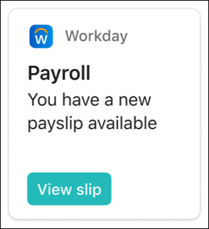
There are three ways to get partner apps and solutions integrated with the Viva Connections dashboard. The following image shows an example of a partner card.
Option 1: Discover and request apps from the Viva Connections card toolbox
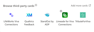
Partner cards and an entry point to browse more cards in the app store will automatically display in the card toolbox. Depending on your level of permissions, you might need to request the app before it can be used on the dashboard. Learn more about managing partner apps.
Note
- Site owners managing the Viva Connections dashboard will need to request partner apps before they're available in the card toolbox.
- Some partner apps require a service plan agreement with your organization.
- While in edit-mode, select + Add card from the dashboard.
- Partner options appear in the Suggested cards section. Select one of the cards displayed or browse more cards by selecting Add more cards.
- Request the cards you’d like to add to the toolbox and the requests will be sent to the App Catalog Admin for their approval.
- You'll receive an email to confirm if your request has been approved or denied by the App Catalog Admin.
- Once your request has been approved, refresh the page to see the new card display in the toolbox.
Option 2: Acquire the app from a Microsoft AppSource or the SharePoint store
- If you're building a dashboard, you can request the app directly, but you need approval from an admin of the tenant-level app catalog to continue with the installation
- If you're an admin of a tenant-level app catalog, you can deploy business apps directly. You can acquire apps from non-Microsoft developers by browsing the Microsoft AppSource or SharePoint store (recommended).
Get step-by-step guidance on how to request and deploy an app, and add an app to your site. For tenant admin, learn how to manage apps in the App Catalog.
Option 3: Acquire the app directly from the partner developer
Note
SharePoint administrative permissions are required to complete this task.
You can request apps directly from the Viva Connections partner developers and partners. Admin permissions are required to add the app to tenant level app catalog.
Add a Microsoft app as a card on the dashboard
A Microsoft app card allows you to create a card that links to Microsoft apps (For example: Shifts, Approvals, Task, etc.). Microsoft apps cards are available out of the box when Viva Connections is enabled.
While in edit mode, select + Add a card from the dashboard.
Select the Microsoft App you want to add from the web toolbox.
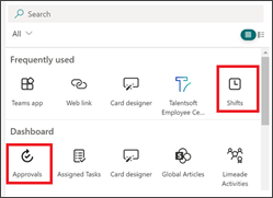
Select your options in the property pane on the right side of the page.
When you Republish, the card appears on your dashboard.
Add the Viva Topics card
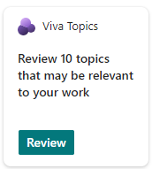
Topics has two different cards. The Topics Contribute card can be used to reach people who are known knowledge managers and are already engaged with topics and knowledge areas. Topics and knowledge areas are dynamically displayed in the card based on the viewers interests, current projects, and expertise. The Topics Discover card can be used to view topics and knowledge areas for people who could be interested in learning more or contributing to a topic.
Learn more about the two different cards.
Add the Viva Learning card
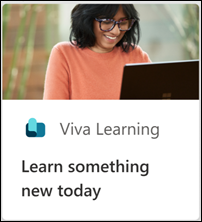
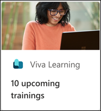
The Viva Learning card provides users quick-links to recommended trainings, and can be set to target specific trainings to certain individuals. Users can easily access their required trainings by selecting the Viva Learning link.
Content in the cards is dynamic and changes according to settings in Viva Learning. The following are three examples of Viva Learning card states that display different information depending on the viewer and Viva Learning settings.

While in edit mode, select + Add a card from the dashboard.
Select Viva Learning from the dashboard toolbox.
In the property pane on the right, choose your card size from the Card size drop-down list.
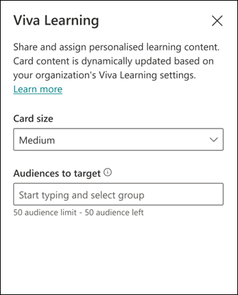
To target your card to specific audiences (that is, the card only displays in the dashboard to the audience you specify), select one or more groups to target. For more information on audience targeting, see Audience targeting.
Add the Viva Pulse card
Invite managers and team leads to send requests for feedback or view feedback results using the Viva Pulse card. The card provides a way for feedback authors to access and interact with active or recently closed feedback pulses. This provides feedback authors and feedback providers with a direct link to their account in the Viva Pulse Teams app.
Note
- It’s recommended admins set up the Viva Pulse app for their organization and pin it as an app in Microsoft Teams so users can fully experience the Viva Pulse card. For more information, see the article on manage, install, and pin Viva Pulse in the Teams admin center.
- Users will only see the Viva Pulse card if their organization is licensed for Viva Pulse.
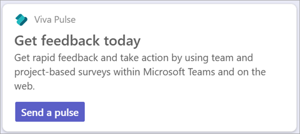
Content in the card is dynamic and changes according to the users role in Viva Pulse and if a feedback pulse is active. The following are examples of Viva Pulse card states that display different information depending on the viewer’s role and if any active or recently closed feedback pulses are available.
The Pulse card tells feedback authors the number of responses an active or recently closed pulse received and provides a link to feedback results in their Viva Pulse account for the recently closed pulse. When multiple feedback results are available, authors are directed to their Pulses sent tab within the Viva Pulse Teams app.

When no open pulses are available, the card displays send a pulse, which brings the author to the Viva Pulse Teams app where they can create a new request for feedback to be sent out.
Note
- Viva Pulse requires a license to send pulse requests for feedback and to review results. A license is not required to respond to a pulse. For more information on Viva Pulse licensing, see the article on Licensing requirements.
- The Viva Pulse card requires the Viva Pulse app to be enabled in Microsoft Teams for the card to display information
To add the Viva Pulse card to your dashboard:
While in edit mode, select + Add a card from the dashboard.
Select Viva Pulse from the dashboard toolbox.

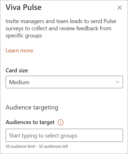
In the property pane on the right, choose your card size from the Card size drop-down list.
To target your card to specific audiences (that is, the card only displays in the dashboard to the audience you specify), select one or more groups to target. For more information on audience targeting, see Audience targeting.
For more information on using Viva Pulse as a feedback author or feedback recipient, see the Viva Pulse documentation here.
Add the Web link card
Add a web link card when you want your users to go to an internal or external link on a web site.

While in edit mode, select + Add a card from the dashboard.
Select Web link from the web toolbox.
In the property pane on the right side of the page, select your options.
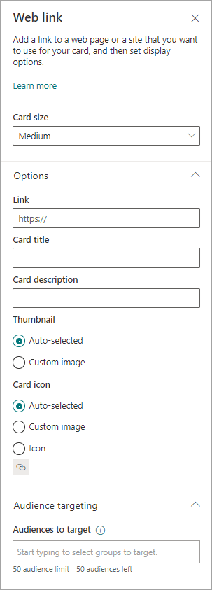
Select a size for the card from the Card size drop-down list.
Enter the URL for your link in the Link text box.
Set the card-display options:
- Enter a title for the card in the Card title text box. (This title won't change your page title; it's the title that is displayed on the top of the card.)
- Enter a description for the card in the Card description text box. This description is displayed in larger text under the title.
Under Thumbnail, select one of the following options:
- Auto-selected: This option when chosen automatically displays an image at the top of your card that comes from your page.
- Custom image: This option when chosen enables the Change button. You can select this button to choose an image you want to use.
Under Card icon, select one of the following options that enable the icon to be displayed on the left side of the card title:
- Auto-selected: This option when chosen automatically displays a built-in icon associated with the page.
- Custom image: This option when chosen enables the Change button. You can select this button to choose an image you want to use.
- Icon: This option when chosen enables the Change button. You can select this button to choose from a set of stock icons.
To target your card to specific audiences (that is, the card only displays in the dashboard to the audience you specify), select one or more groups to target. For more information on audience targeting, see Audience targeting.


