用於雙螢幕偵測的 CSS 檢視區區段媒體查詢
跨越CSSmedia功能可用來測試輸出裝置是否為雙螢幕 (或可折迭的) ,而且瀏覽器檢視區橫跨兩個顯示區域。 環境變數 也可用來計算螢幕上的可見區域,如果兩者之間有任何) ,則轉軸區域 (。
此 API Microsoft Edge 97 版和更新版本提供。
檢視區區段
當瀏覽器跨越水準或垂直轉軸時,宣告樣式的 CSS 語法:
@media (horizontal-viewport-segments: <count>) { }
@media (vertical-viewport-segments: <count>) { }
針對 Surface Duo,符合雙螢幕顯示器的值如下:
horizontal-viewport-segments: 2
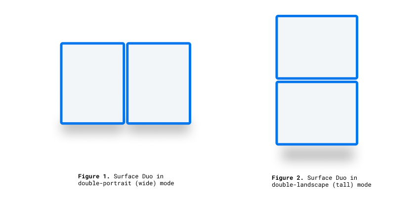
- 描述瀏覽器檢視區跨越單一折迭 (兩個顯示區域) 且折迭狀態為垂直的狀態。 這個值符合雙直向 (寬) 模式的 Surface Duo。
vertical-viewport-segments: 2
- 描述瀏覽器檢視區跨越單一折迭 (兩個顯示區域) 且折迭狀態為水準時的狀態。 此值符合雙橫向 (高) 模式的 Surface Duo。
此範例 CSS 程式碼片段示範如何使用 -viewport-segments 媒體功能在 Surface Duo 上套用樣式:
@media (horizontal-viewport-segments: 2) {
   /* styles applied in double-portrait (wide) mode */
   /* matches Figure 1. below */
}
@media (vertical-viewport-segments: 2) {
   /* styles applied in double-landscape (tall) mode */
   /* matches Figure 2. below */
}
CSS 環境變數
Web 開發人員可以利用瀏覽器定義的環境變數來取得顯示區域 (或區域) 的幾何,並在出現) 時計算遮蔽轉軸區域的幾何 (。 您可以使用下列環境變數定義來查詢每個檢視區的屬性, (使用最上層區段的座標) :
env(viewport-segment-width <x> <y>);
env(viewport-segment-height <x> <y>);
env(viewport-segment-top <x> <y>);
env(viewport-segment-left <x> <y>);
env(viewport-segment-bottom <x> <y>);
env(viewport-segment-right <x> <y>);
座標會從左上方區段指派:
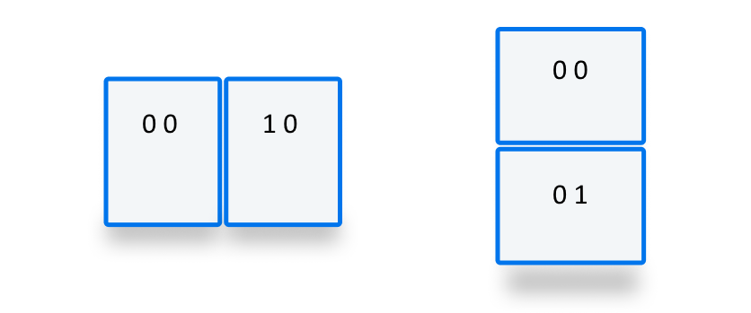
這些值可用來推斷轉軸區域的座標:
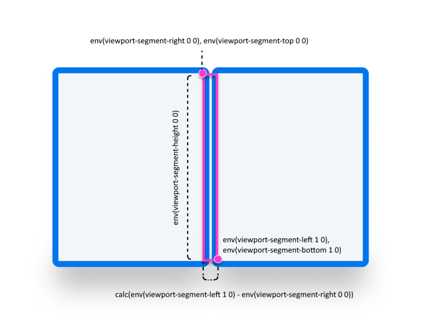
/* double-portrait */
env(viewport-segment-right 0 0);      /* hinge left */
env(viewport-segment-left 1 0);       /* hinge right*/
calc(env(viewport-segment-left 1 0) - env(viewport-segment-right 0 0))
                                      /* hinge width */
/* double-landscape */
env(viewport-segment-bottom 0 0);     /* hinge top */
env(viewport-segment-top 0 1);        /* hinge bottom */
calc(env(viewport-segment-top 0 1) - env(viewport-segment-bottom 0 0))
                                      /* hinge height */
範例
基本
建立回應式頁面,其中 <body> 背景色彩會在手機和 green 任何狀態的雙螢幕裝置上設定 yellow 為 。
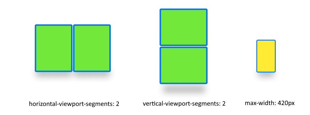
/* maximum width of our customers phones is 420px */
/* spanning: none is optional in this case */
@media (max-width: 420px) {
   body {
      background-color: yellow;
   }
}

/* Separating media features with comma `,` is equivalent to the logical operation OR  */
@media (horizontal-viewport-segments: 2), (vertical-viewport-segments: 2) {
   body {
      background-color: green;
   }
}
Flexbox
使用 flexbox 建立間距感知的兩欄配置,其中第一欄包含可捲動的描述,而第二欄包含影像。
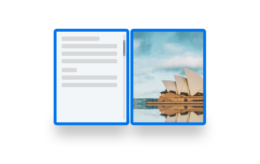
要建立此配置的 HTML 和 CSS 如下所示:
   <body>
      <article class="article">
         ...
      </article>
      <figure class="figure">
         <img src="/sydney-opera-house.jpg"
               alt="Sydney Opera House">
      </figure>
   </body>
body {
   height: 100vh;
   display: flex;
}

.article {
   /* grow: no, shrink: no, basis: fold-left */
   flex: 0 0 env(viewport-segment-right 0 0);

   /* equals to margin-right when writing mode is left-to-right (english)  */
   /* equals to margin-left when writing mode is right-to-left (arabic, hebrew)  */
   /* this will prevent content from being rendered behind the device mask */
   margin-inline-end: calc(env(viewport-segment-left 1 0) - env(viewport-segment-right 0 0)) ; /* hinge width */

   overflow-y: scroll;
}

.figure {
   /* fill the rest of the space */
   flex: 1;

   margin: 0;
   overflow: hidden;
}

.figure img {
   height: 100%;
}