練習 - 以 Seaborn 分析資料
Azure Notebooks (和一般的 Python) 的妙處之一是有數千個開放原始碼程式庫,您可以利用這些程式庫來執行複雜的工作,而不需要撰寫許多程式碼。 在本單元中,您將使用 Seaborn (統計視覺效果的程式庫) 來繪製所載入兩個資料集的第二個資料集,其涵蓋範圍為 1882 年至 2014 年。 Seaborn 可以建立一條伴隨投影的迴歸線,該投影會顯示資料點根據使用一個簡單函式呼叫的迴歸應該落在何處。
將資料指標置於筆記本底部的空白資料格上。 將資料格類型變更為 [Markdown],並輸入 "Perform linear regression with Seaborn" 作為文字。
新增 [程式碼] 資料格,然後貼上下列程式碼。
plt.scatter(years, mean) plt.title('scatter plot of mean temp difference vs year') plt.xlabel('years', fontsize=12) plt.ylabel('mean temp difference', fontsize=12) sns.regplot(yearsBase, meanBase) plt.show()執行程式碼資料格來產生散佈圖,其中包含迴歸線「和」資料點預期落入範圍的視覺呈現。
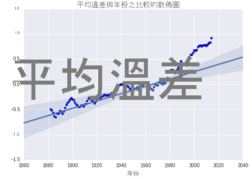
實際值與使用 Seaborn 所產生之預測值的比較
請注意,前 100 年的資料點準確地符合預測值,但大約從 1980 年之後,資料點就不再相符。 這類模型導致科學家認為氣候變遷的速度愈來愈快。