Quickstart: Get insights from your processed data
Important
Azure IoT Operations Preview – enabled by Azure Arc is currently in preview. You shouldn't use this preview software in production environments.
You'll need to deploy a new Azure IoT Operations installation when a generally available release is made available. You won't be able to upgrade a preview installation.
See the Supplemental Terms of Use for Microsoft Azure Previews for legal terms that apply to Azure features that are in beta, preview, or otherwise not yet released into general availability.
In this quickstart, you populate a Real-Time Dashboard to capture insights from the OPC UA data that you sent to Event Hubs in the previous quickstart. Using Microsoft Fabric Real-Time Intelligence, you bring your data from Event Hubs into Microsoft Fabric, and map it into a KQL database that can be a source for Real-Time Dashboards. Then, you build a dashboard to display that data in visual tiles that capture insights and show the values over time.
These operations are the last steps in the sample end-to-end quickstart experience, which goes from deploying Azure IoT Operations Preview at the edge through getting insights from that device data in the cloud.
Prerequisites
Before you begin this quickstart, you must complete the following quickstarts:
- Quickstart: Run Azure IoT Operations Preview in GitHub Codespaces with K3s
- Quickstart: Add OPC UA assets to your Azure IoT Operations Preview cluster
- Quickstart: Send asset telemetry to the cloud using a dataflow
You also need a Microsoft Fabric subscription. In your subscription, you need access to a premium workspace with Contributor or above permissions.
Additionally, your Fabric tenant must allow the creation of Real-Time Dashboards. This is a setting that can be enabled by your tenant administrator. For more information, see Enable tenant settings in the admin portal.
What problem will we solve?
Once your OPC UA data has arrived in the cloud, you'll have a lot of information available to analyze. You might want to organize that data and create reports containing graphs and visualizations to derive insights from the data. The steps in this quickstart illustrate how you can connect that data to Real-Time Intelligence and build a Real-Time Dashboard.
Ingest data into Real-Time Intelligence
In this section, you set up a Microsoft Fabric eventstream to connect your event hub to a KQL database in Real-Time Intelligence. This process includes setting up a data mapping to transform the payload data from its JSON format to columns in KQL.
Create an eventstream
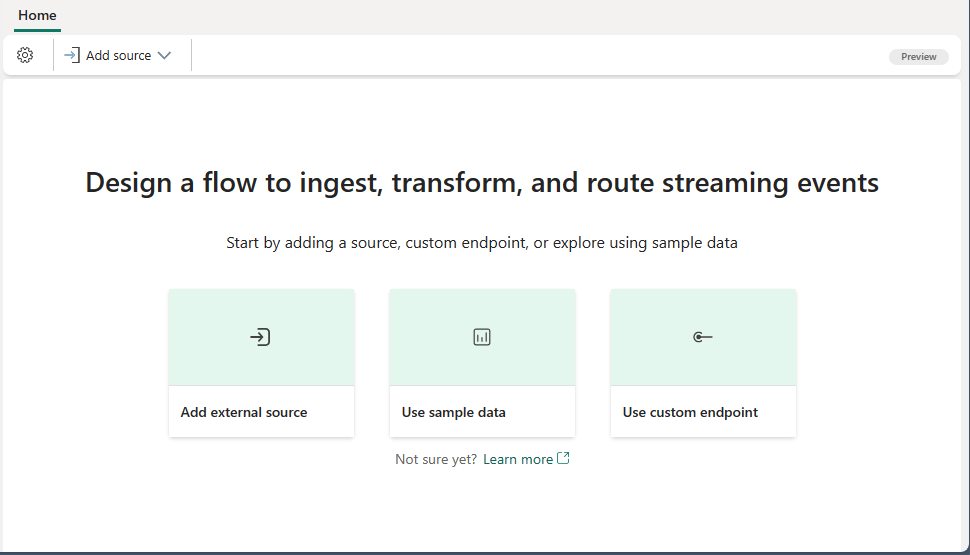
In this section, you create an eventstream that will be used to bring your data from Event Hubs into Microsoft Fabric Real-Time Intelligence, and eventually into a KQL database.
Start by navigating to the Real-Time Intelligence experience in Microsoft Fabric.
Follow the steps in Create an eventstream in Microsoft Fabric to create a new eventstream from the Real-Time Intelligence capabilities.
After the eventstream is created, you'll see the main editor where you can start adding sources to the eventstream.
Add event hub as a source
Next, add your event hub from the previous quickstart as a data source for the eventstream.
Follow the steps in Add Azure Event Hubs source to an eventstream to add the event source. Keep the following notes in mind:
- When it's time to select a Data format, choose Json (it might be selected already by default).
- Make sure to complete all the steps in the article through selecting Publish on the ribbon.
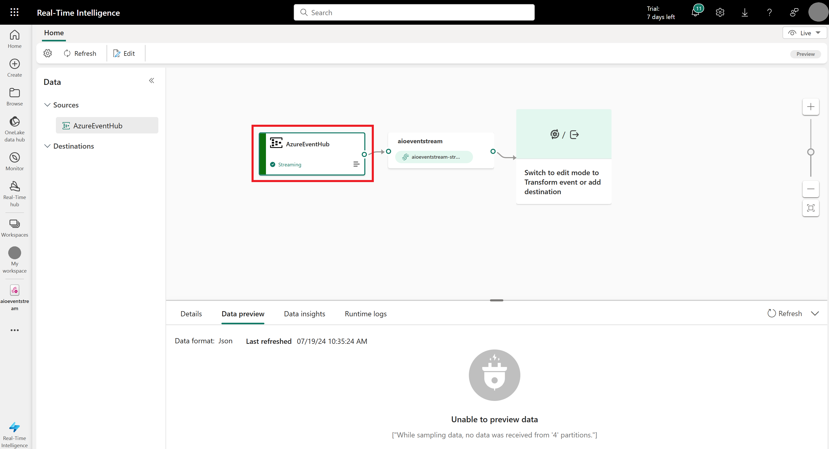
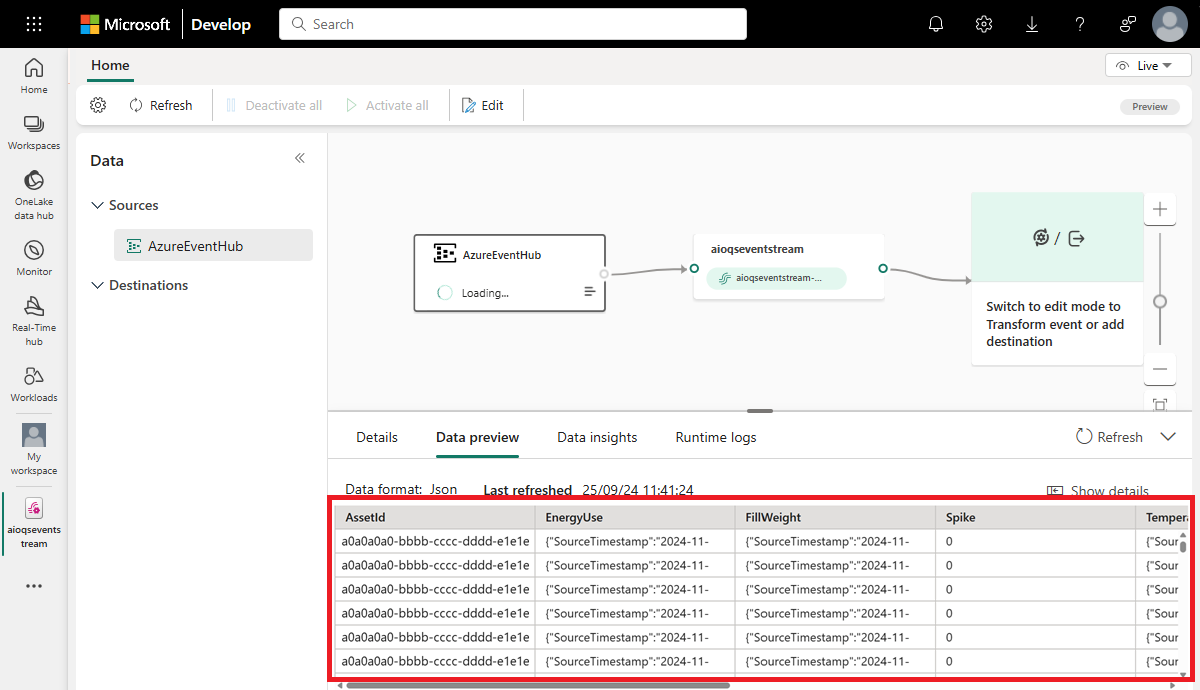
After completing this flow, the Azure event hub is visible in the eventstream live view as a source.
Verify dataflow
Follow these steps to check your work so far, and make sure data is flowing into the eventstream.
Start your cluster where you deployed Azure IoT Operations in earlier quickstarts. The OPC PLC simulator you deployed with your Azure IoT Operations instance should begin running and sending data to the MQTT broker. You can verify this part of the flow using mqttui as described in Verify data is flowing.
Wait a few minutes for data to propagate. Then, in the eventstream live view, select the AzureEventHub source and refresh the Data preview. You should see JSON data from the simulator begin to appear in the table.
Tip
If data has not arrived in your eventstream, you may want to check your event hub activity to verify that it's receiving messages. This will help you isolate which section of the flow to debug.
Prepare KQL resources
In this section, you create a KQL database in your Microsoft Fabric workspace to use as a destination for your data.
Follow the steps in Create an eventhouse to create a Real-Time Intelligence eventhouse with a child KQL database. You only need to complete the section entitled Create an eventhouse.
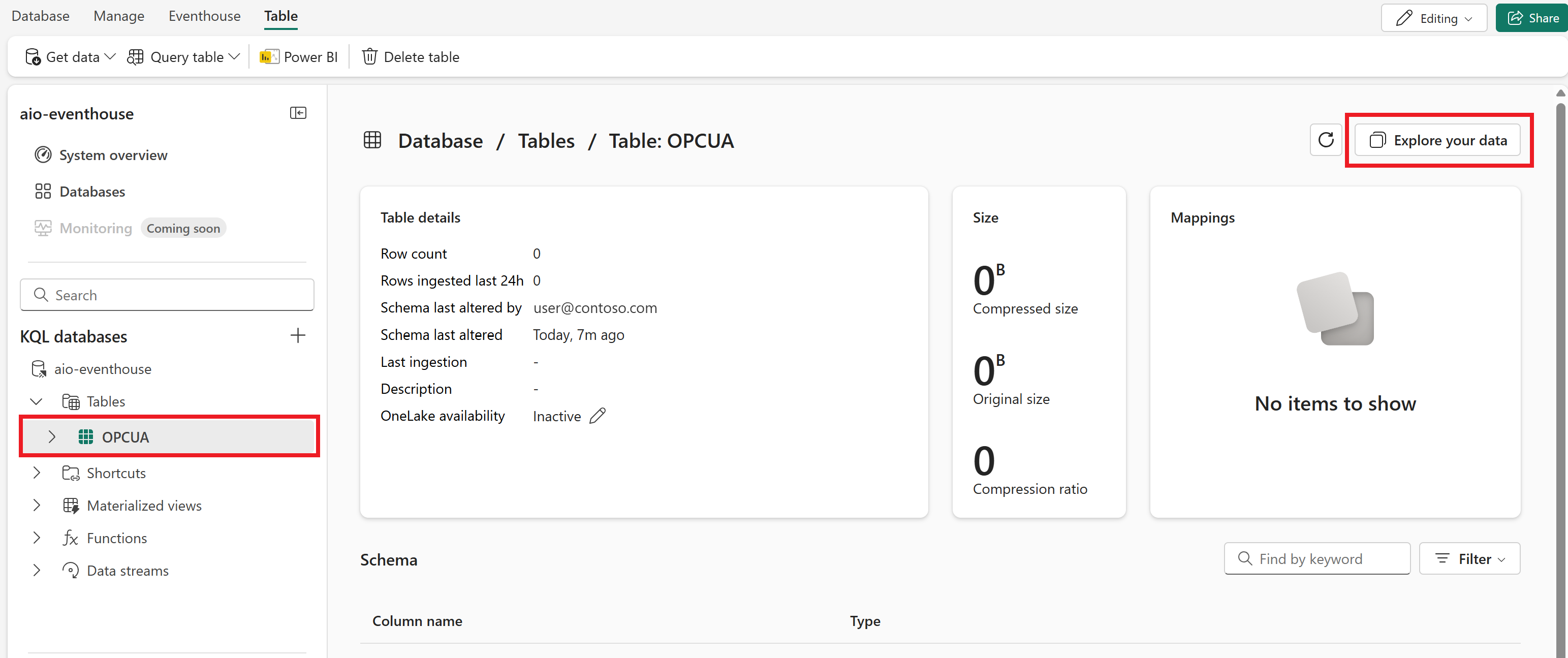
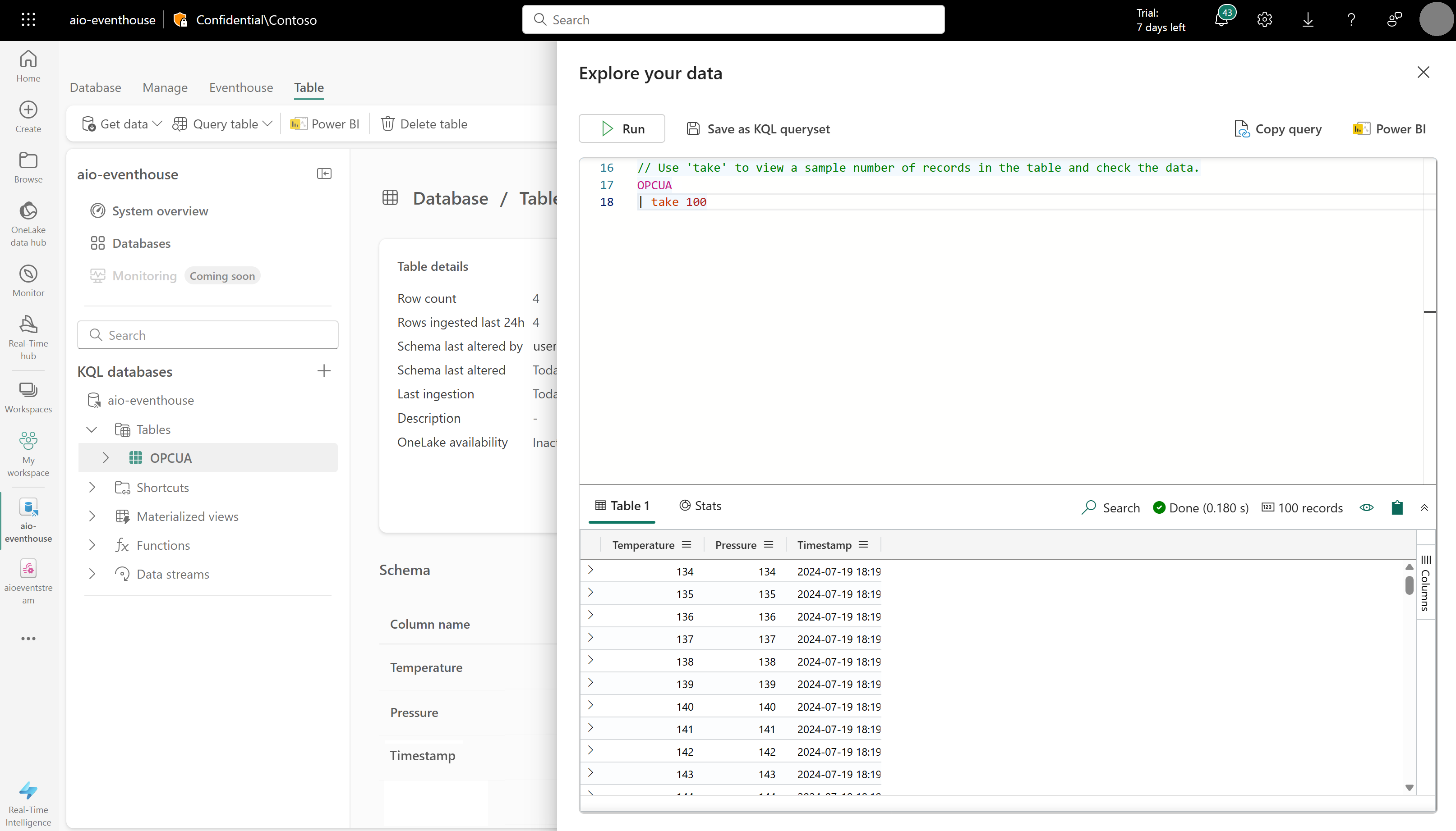
Next, create a KQL table in your database. Call it OPCUA and use the following columns.
Column name Data type Temperature decimal Pressure decimal Timestamp datetime After the OPCUA table has been created, select it and use the Explore your data button to open a query window for the table.
Run the following KQL query to create a data mapping for your table. The data mapping will be called opcua_mapping.
.create table ['OPCUA'] ingestion json mapping 'opcua_mapping' '[{"column":"Temperature", "Properties":{"Path":"$.temperature.Value"}},{"column":"Pressure", "Properties":{"Path":"$.[\'Tag 10\'].Value"}},{"column":"Timestamp", "Properties":{"Path":"$[\'EventProcessedUtcTime\']"}}]'
Add data table as a destination
Next, return to your eventstream view, where you can add your new KQL table as an eventstream destination.
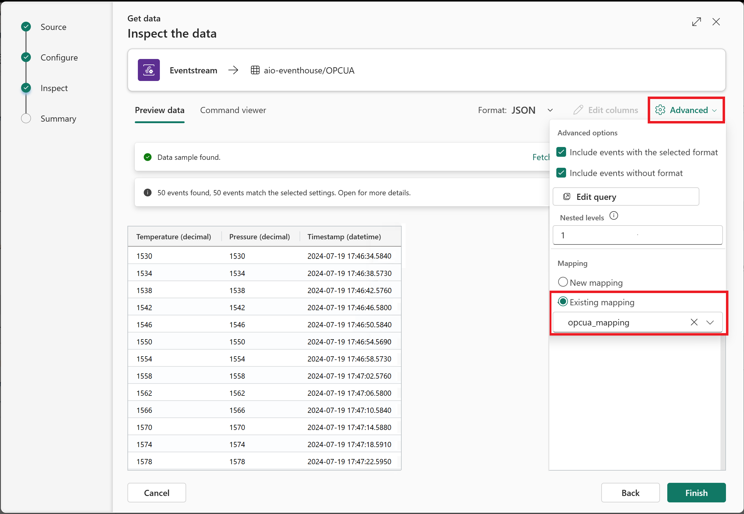
Follow the steps in Add a KQL Database destination to an eventstream to add the destination. Keep the following notes in mind:
Use direct ingestion mode.
On the Configure step, select the OPCUA table that you created earlier.
On the Inspect step, open the Advanced options. Under Mapping, select Existing mapping and choose opcua_mapping.
Tip
If no existing mappings are found, try refreshing the eventstream editor and restarting the steps to add the destination. Alternatively, you can initiate this same configuration process from the KQL table instead of from the eventstream, as described in Get data from Eventstream.
After completing this flow, the KQL table is visible in the eventstream live view as a destination.
Wait a few minutes for data to propagate. Then, select the KQL destination and refresh the Data preview to see the processed JSON data from the eventstream appearing in the table.
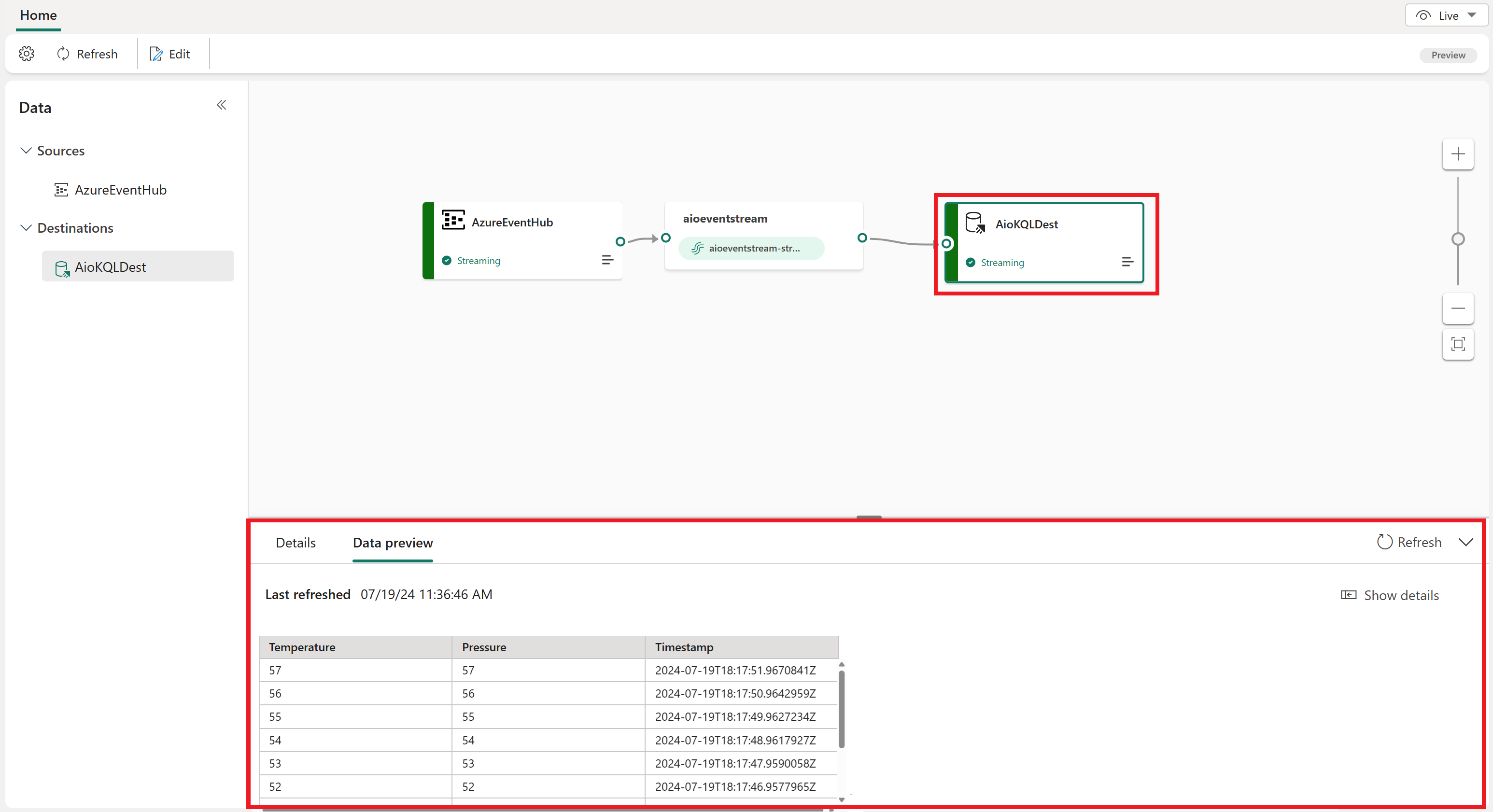
If you want, you can also view and query this data in your KQL database directly.
Create a Real-Time Dashboard
In this section, you'll create a new Real-Time Dashboard to visualize your quickstart data. The dashboard will automatically allow filtering by timestamp, and will display visual summaries of temperature and pressure data.
Note
You can only create Real-Time Dashboards if your tenant admin has enabled the creation of Real-Time Dashboards in your Fabric tenant. For more information, see Enable tenant settings in the admin portal.
Create dashboard and connect data source
Follow the steps in the Create a new dashboard section to create a new Real-Time Dashboard from the Real-Time Intelligence capabilities.
Then, follow the steps in the Add data source section to add your database as a data source. Keep the following notes in mind:
- In the Data sources pane, your database will be under OneLake data hub.
Create line chart tile
Next, add a tile to your dashboard to show a line chart of temperature and pressure over time for the selected time range.
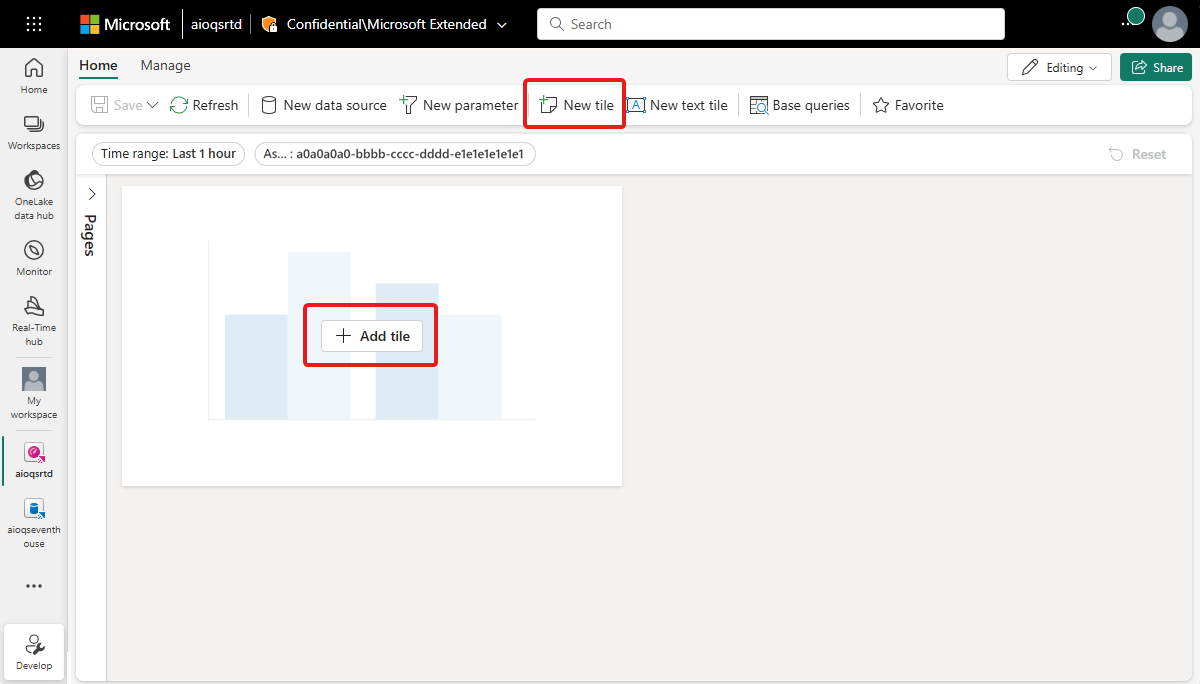
Select either + Add tile or New tile to add a new tile.
Enter the following KQL query for the tile. This query applies a built-in filter parameter from the dashboard selector for time range, and pulls the resulting records with their timestamp, temperature, and pressure.
OPCUA
| where Timestamp between (_startTime.._endTime)
| project Timestamp, Temperature, Pressure
Run the query to verify that data can be found.
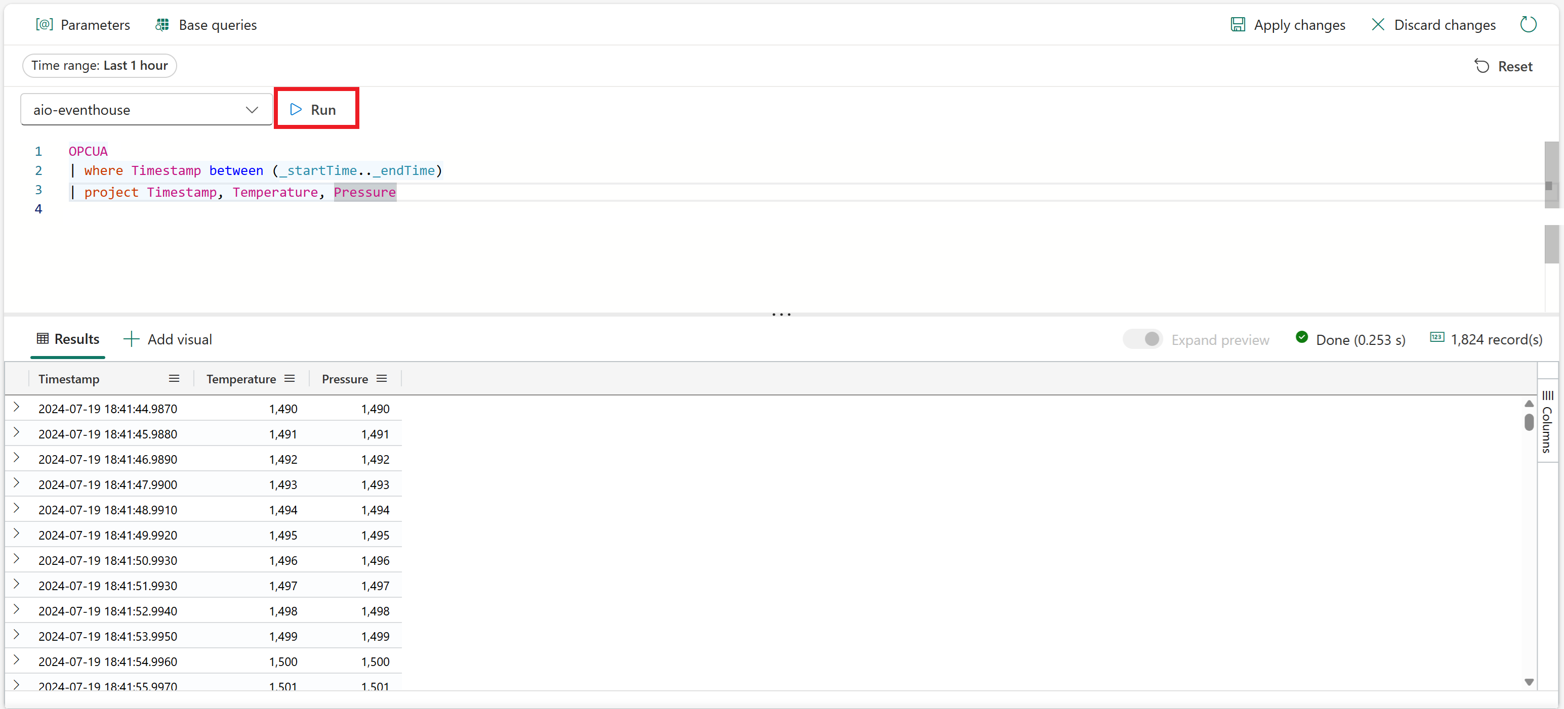
Select + Add visual next to the query results to add a visual for this data. Create a visual with the following characteristics:
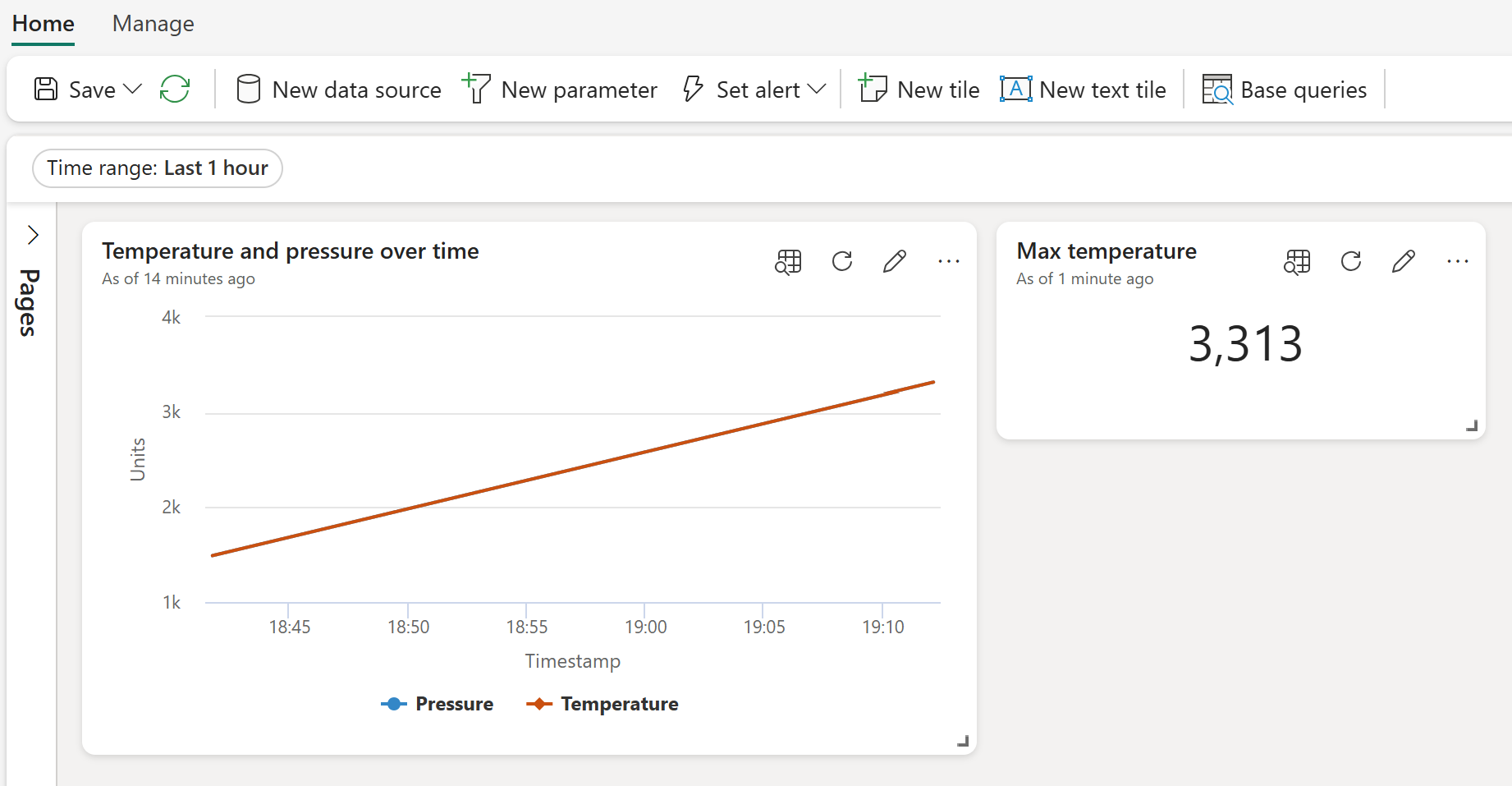
- Tile name: Temperature and pressure over time
- Visual type: Line chart
- Data:
- Y columns: Temperature (decimal) and Pressure (decimal) (already inferred by default)
- X columns: Timestamp (datetime) (already inferred by default)
- Y Axis:
- Label: Units
- X Axis:
- Label: Timestamp
Select Apply changes to create the tile.
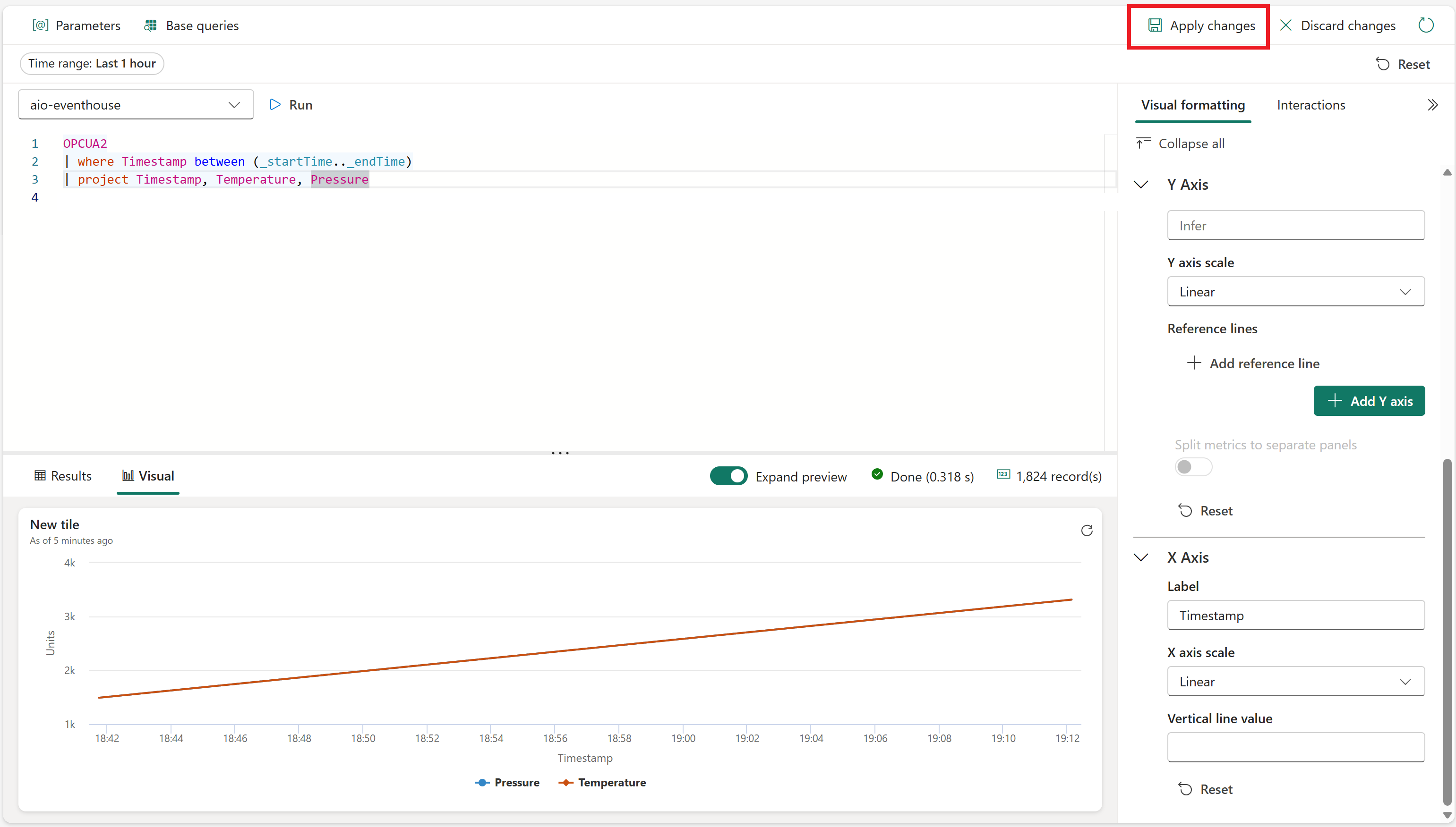
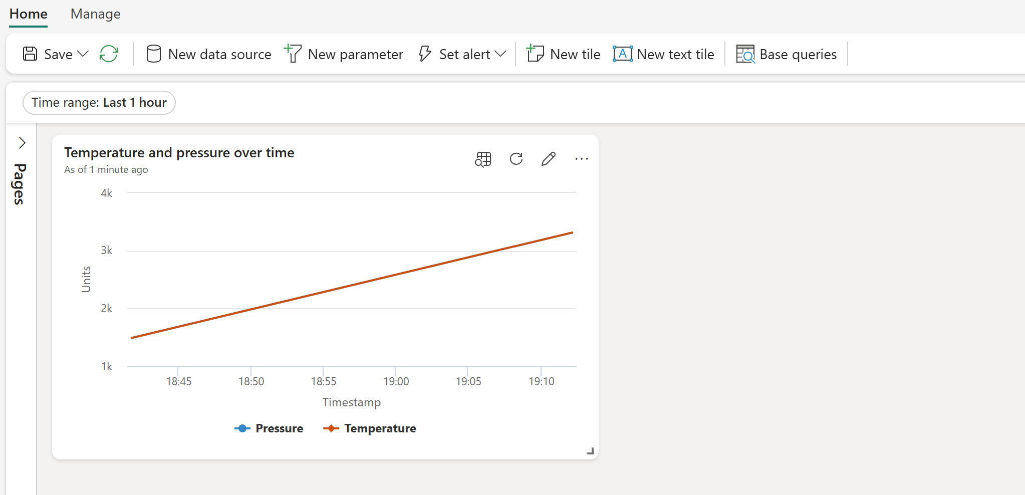
View the finished tile on your dashboard.
Create max value tiles
Next, create some tiles to display the maximum values of temperature and pressure.
Select New tile to create a new tile.
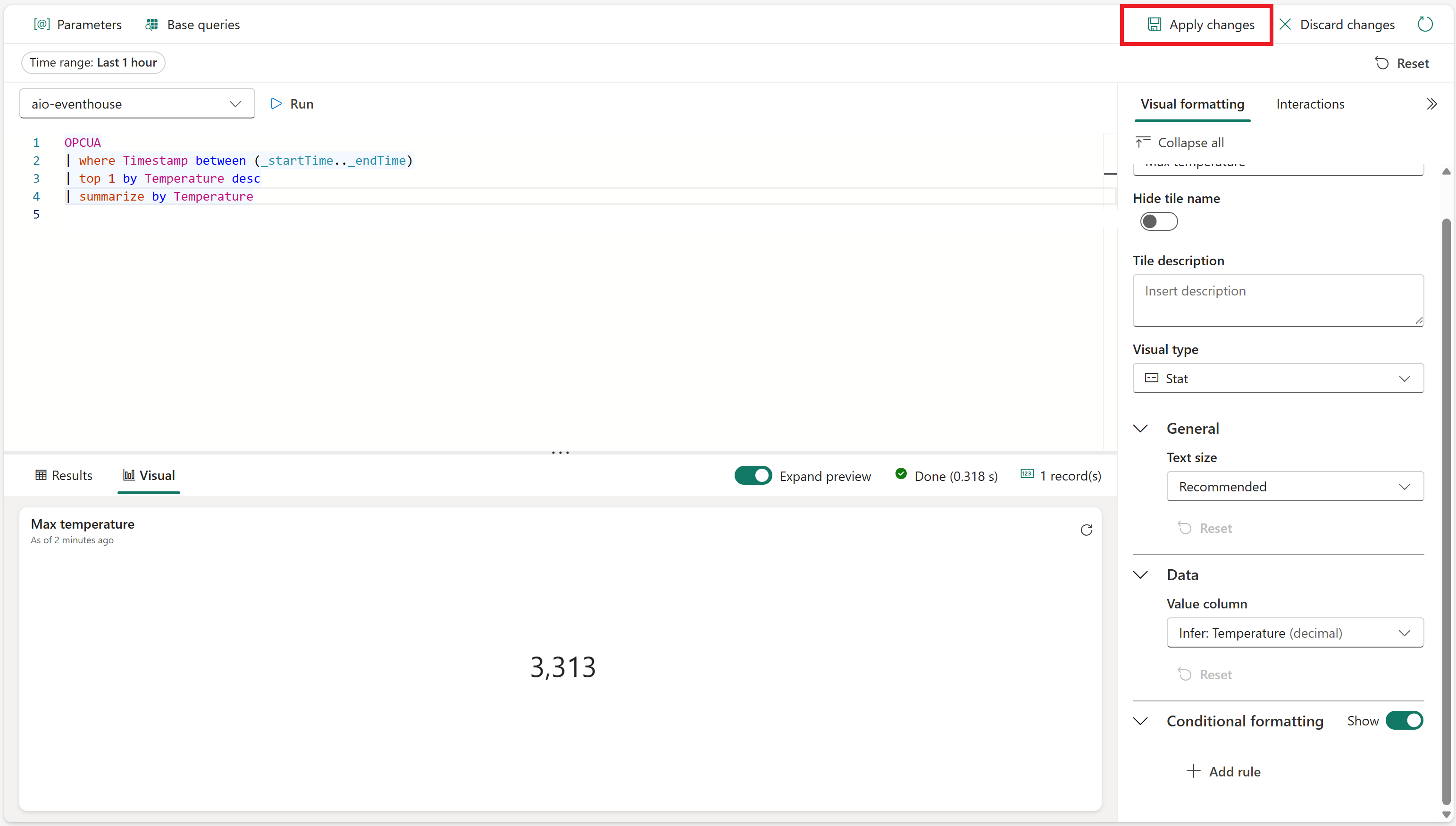
Enter the following KQL query for the tile. This query applies a built-in filter parameter from the dashboard selector for time range, and takes the highest temperature value from the resulting records.
OPCUA
| where Timestamp between (_startTime.._endTime)
| top 1 by Temperature desc
| summarize by Temperature
Run the query to verify that a maximum temperature can be found.
Select + Add visual to add a visual for this data. Create a visual with the following characteristics:
- Tile name: Max temperature
- Visual type: Stat
- Data:
- Value column: Temperature (decimal) (already inferred by default)
Select Apply changes to create the tile.
View the finished tile on your dashboard (you may want to resize the tile so the full text is visible).
Open the options for the tile, and select Duplicate tile.
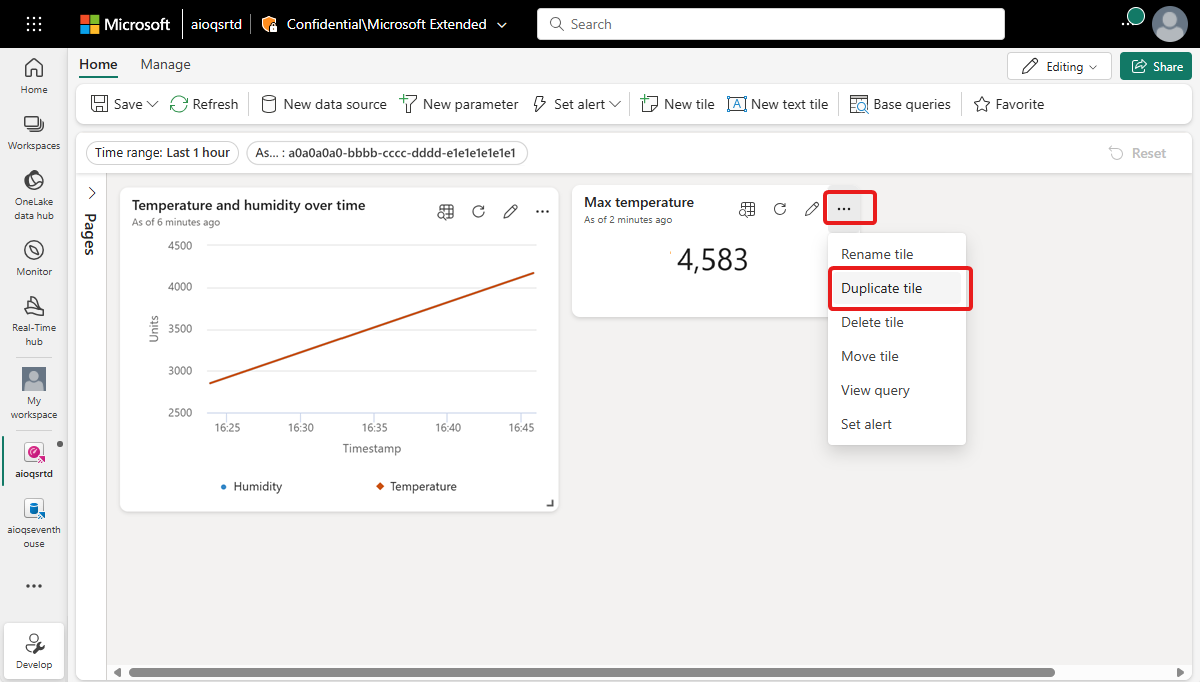
This creates a duplicate tile on the dashboard.
On the new tile, select the pencil icon to edit it.
Replace Temperature in the KQL query with Pressure, so that it matches the query below.
OPCUA
| where Timestamp between (_startTime.._endTime)
| top 1 by Pressure desc
| summarize by Pressure
Run the query to verify that a maximum pressure can be found.
In the Visual formatting pane, update the following characteristics:
- Tile name: Max pressure
- Data:
- Value column: Pressure (decimal) (already inferred by default)
Select Apply changes.
View the finished tile on your dashboard.
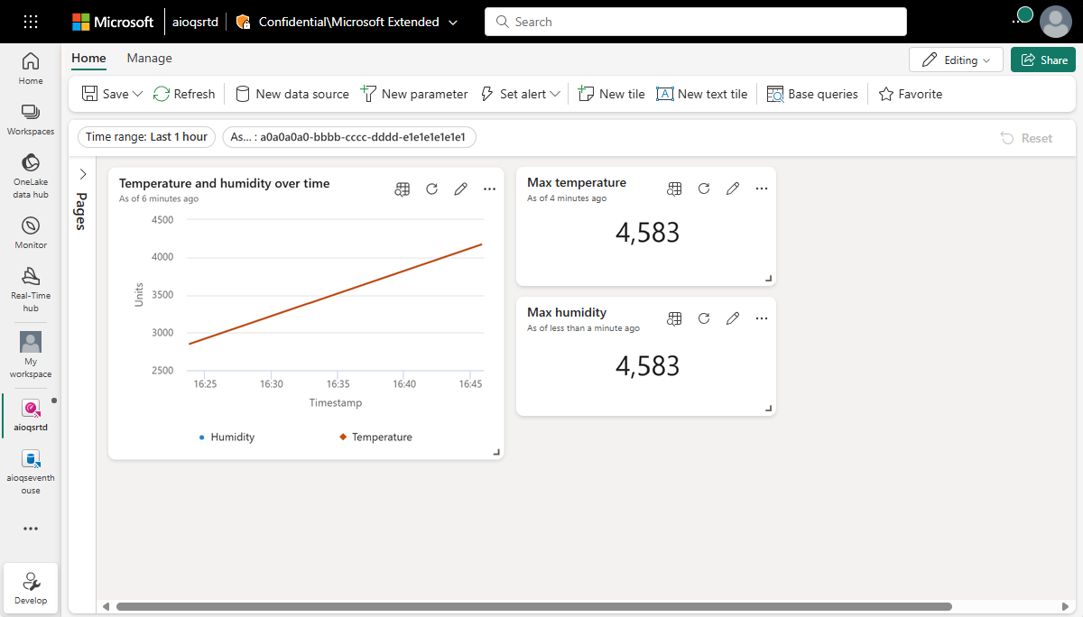
Save your completed dashboard.
Now you have a dashboard that displays different types of visuals for the asset data in these quickstarts. From here, you can experiment with the filters and adding other tile types to see how a dashboard can enable you to do more with your data.
How did we solve the problem?
In this quickstart, you used an eventstream to ingest your Event Hubs data into a KQL database in Microsoft Fabric Real-Time Intelligence. Then, you created a Real-Time Dashboard powered by that data, which visually tracks changing values over time. By relating edge data from various sources together in Microsoft Fabric, you can create reports with visualizations and interactive features that offer deeper insights into asset health, utilization, and operational trends. This can empower you to enhance productivity, improve asset performance, and drive informed decision-making for better business outcomes.
This completes the final step in the quickstart flow for using Azure IoT Operations to manage device data from deployment through analysis in the cloud.
Clean up resources
If you're not going to continue to use this deployment, delete the Kubernetes cluster where you deployed Azure IoT Operations. In Azure, remove the Azure resource group that contains the cluster and your event hub. If you used Codespaces for these quickstarts, delete your Codespace from GitHub.
You can also delete your Microsoft Fabric workspace and/or all the resources within it associated with this quickstart, including the eventstream, Eventhouse, and Real-Time Dashboard.