Invoke and dismiss dialogs
Dialogs (referred as task modules in TeamsJS v1.x) can be invoked from tabs, bots, or deep links. The response can be either in HTML, JavaScript, or as an Adaptive Card. There's a numerous flexibilities in terms of how dialogs are invoked and how to deal with the response of the user's interaction. The following table summarizes how this works.
Note
The task capability is replaced with dialog capability in both HTML-based dialogs (starting with TeamsJS v.2.0.0) and Adaptive Card-based dialogs (starting with TeamsJS v.2.8.0). For more information, see dialog.
| Invoked using | Dialog with HTML or JavaScript | Dialog with Adaptive Card |
|---|---|---|
| JavaScript in a tab | 1. Use the Teams client library function dialog.url.open() with optional submitHandler(err, result) and messageFromChildHandler(postMessageChannel) callback functions. 2. In the dialog code, when the user has performed the actions, call the TeamsJS library function dialog.url.submit() with (optionally) a result object as a parameter. If a submitHandler callback was specified in dialog.open(), Teams calls it with result as a parameter. If there was an error when invoking dialog.open(), the submitHandler function is called with an err string instead. |
1. Call the Teams client library function dialog.adaptiveCard.open() with a AdaptiveCardDialogInfo object specifying the JSON for the Adaptive Card (AdaptiveCardDialogInfo.card) to show in the modal dialog. 2. If a submitHandler callback was specified in dialog.adaptiveCard.open(), Teams calls it with an err string if there was an error when invoking the dialog or if the user closes the modal dialog. 3. If the user presses an Action.Submit button then its data object is returned as the value of result. |
| Bot card button | 1. Bot card buttons, depending on the type of button, can invoke dialogs from either a deep link URL, or by sending a task/fetch message. 2. If the button's action type is task/fetch or Action.Submit button type for Adaptive Cards, a task/fetch invoke event that is an HTTP POST is sent to the bot. The bot responds to the POST with HTTP 200 and the response body containing a wrapper around the DialogInfo object. Teams displays the dialog. 3. After the user has performed the actions, call the Actions.Submit Adaptive Card action with the result. The bot receives a task/submit invoke message that contains the result. 4. You have three different ways to respond to the task/submit message: do nothing (if the task completed successfully), display a message to the user in the dialog, or invoke another dialog. For more information, see detailed discussion on task/submit. |
|
| Deep link URL* *Deprecated; supported for backwards compability |
1. Teams invokes the dialog that is the URL that appears inside the <iframe> specified in the url parameter of the deep link. There's no submitHandler callback. 2. Within the JavaScript of the page in the dialog, call tasks.submitTask() to close it with a result object as a parameter, the same as when invoking it from a tab or a bot card button. However, completion logic is slightly different. If your completion logic resides on the client that is if there's no bot, there's no submitHandler callback, so any completion logic must be in the code preceding the call to tasks.submitTask(). Invocation errors are only reported through the console. If you have a bot, then you can specify a completionBotId parameter in the deep link to send the result object through a task/submit event. |
1. Teams invokes the dialog that is the JSON card body of the Adaptive Card that is specified as a URL-encoded value of the card parameter of the deep link. 2. The user closes the dialog by selecting the X at the upper right of the dialog or by pressing an Action.Submit button on the card. Since there's no submitHandler to call, the user must have a bot to send the value of the Adaptive Card fields. The user must use the completionBotId parameter in the deep link to specify the bot to send the data to using a task/submit invoke event. |
The next section specifies the DialogInfo object that defines certain attributes for a dialog.
DialogInfo object
The base DialogInfo object contains basic metadata for a dialog:
| Attribute | Type | Description |
|---|---|---|
title |
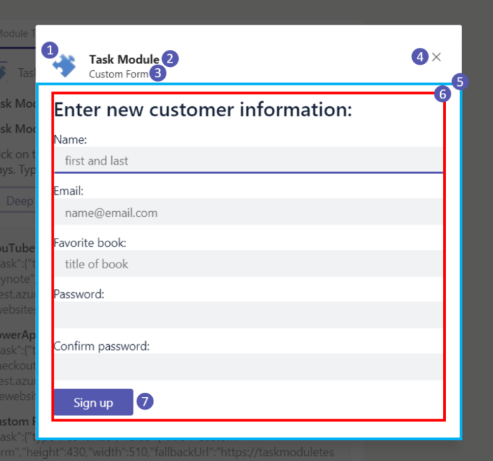
string | This attribute appears below the app name and to the right of the app icon. |
height |
number or string | This attribute can be a number representing the dialog's height in pixels, or small, medium, or large. |
width |
number or string | This attribute can be a number representing the dialog's width in pixels, or small, medium, or large. |
UrlDialogInfo object
The UrlDialogInfo object for HTML-based dialogs extends the DialogInfo object and also includes:
| Attribute | Type | Description |
|---|---|---|
url |
string | This attribute is the URL of the page loaded as an <iframe> inside the dialog. The URLs domain must be in the app's validDomains array in your app's manifest. |
AdaptiveCardDialogInfo object
The AdaptiveCardDialogInfo object for Adaptive Card-based dialogs extends the DialogInfo object and also includes:
| Attribute | Type | Description |
|---|---|---|
card |
Adaptive Card or Adaptive Card bot card attachment | This attribute is the JSON for the Adaptive Card to appear in the dialog. If the user is invoking from a bot, use the Adaptive Card JSON in a Bot Framework attachment object. From a tab, the user must use an Adaptive Card. For more information, see Adaptive Card or Adaptive Card bot card attachment |
BotAdaptiveCardDialogInfo object
The BotAdaptiveCardDialogInfo object for bot-based Adaptive Card dialogs extends the AdaptiveCardDialogInfo object and also includes:
| Attribute | Type | Description |
|---|---|---|
completionBotId |
string | This attribute specifies a bot App ID to send the result of the user's interaction with the dialog. If specified, the bot receives a task/submit invoke event with a JSON object in the event payload. |
Note
The dialog feature requires that the domains of any URLs you want to load are included in the validDomains array in your app's manifest.
The next section specifies dialog sizing that enables the user to set the height and width of the dialog.
Dialog sizing
The values of DialogInfo.width and DialogInfo.height set the height and width of the dialog in pixels. Depending on the size of the Teams window and screen resolution, these values might be reduced proportionally while maintaining aspect ratio.
If DialogInfo.width and DialogInfo.height are "small", "medium", or "large", the size of the red rectangle in the following image is a proportion of the available space, 20%, 50%, and 60% for width and 20%, 50%, and 66% for height:

Dialogs invoked from a tab can be dynamically resized. After calling dialog.*.open() you can call dialog.update.resize(newSize) where height and width properties on the newSize object conform to the DialogSize specification, for example { height: 'medium', width: 'medium' }.
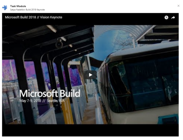
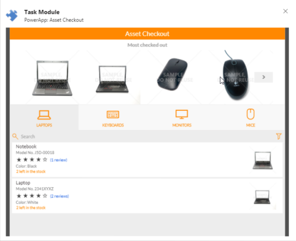
The next section provides examples of embedding dialogs in a YouTube video and a PowerApp.
CSS for HTML or JavaScript dialogs
HTML or JavaScript-based dialogs have access to the entire area of the dialog below the header. While that offers a great deal of flexibility, if you want padding around the edges to align with the header elements and avoid unnecessary scroll bars, you must specify the CSS.
Warning
Microsoft's cloud services, including web versions of Teams, Outlook, and Microsoft 365 domains, are migrating to the *.cloud.microsoft domain. Perform the following steps as soon as possible to ensure your app continues to render on supported Microsoft 365 web client hosts:
Update TeamsJS library to v.2.19.0 or later. For more information about the latest release of TeamsJS, see Microsoft Teams JavaScript client library.
If you've defined Content Security Policy (CSP) headers for your app, update the frame-ancestors directive to include the
*.cloud.microsoftdomain. To ensure backward compatibility during the migration, retain the existingframe-ancestorsvalues in your CSP headers. This approach ensures that your app continues to work across both existing and future Microsoft 365 host applications and minimizes the need for subsequent changes.
Update the following domain in the frame-ancestors directive of your app's CSP headers:
https://*.cloud.microsoft
Here are a few examples of common use cases.
Example 1: YouTube video
YouTube offers the ability to embed videos on web pages. It's easy to embed videos on web pages in a dialog using a simple stub web page.

The following code provides an example of the HTML for the web page without the CSS:
<!DOCTYPE html>
<html lang="en">
<head>
  ⋮
</head>
<body>
  <div id="embed-container">
    <iframe width="1000" height="700" src="https://www.youtube.com/embed/rd0Rd8w3FZ0" frameborder="0" allow="autoplay; encrypted-media" allowfullscreen=""></iframe>
  </div>
</body>
</html>
The following code provides an example of the CSS:
#embed-container iframe {
    position: absolute;
    top: 0;
    left: 0;
    width: 95%;
    height: 95%;
    padding-left: 20px;
    padding-right: 20px;
    padding-top: 10px;
    padding-bottom: 10px;
    border-style: none;
}
Example 2: PowerApp
You can use the same approach to embed a PowerApp. As the height or width of any individual PowerApp is customizable, you can adjust the height, and width to achieve the desired presentation.

The following code provides an example of the HTML for PowerApp:
<iframe width="720" height="520" src="https://web.powerapps.com/webplayer/iframeapp?source=iframe&screenColor=rgba(104,101,171,1)&appId=/providers/Microsoft.PowerApps/apps/xxxxxxxx-xxxx-xxxx-xxxx-xxxxxxxxxxxx"></iframe>
The following code provides an example of the CSS:
#embed-container iframe {
    position: absolute;
    top: 0;
    left: 0;
    width: 94%;
    height: 95%;
    padding-left: 20px;
    padding-right: 20px;
    padding-top: 10px;
    padding-bottom: 10px;
    border-style: none;
}
The next section provides details on invoking your card using Adaptive Card or Adaptive Card bot card attachment.
Adaptive Card or Adaptive Card bot card attachment
Depending on how you're invoking your card, you'll need to use either an Adaptive Card or an Adaptive Card bot card attachment (an Adaptive Card wrapped in an attachment object).
If you're invoking from a tab, use an Adaptive Card:
{
    "type": "AdaptiveCard",
    "body": [
        {
            "type": "TextBlock",
            "text": "Here is a ninja cat:"
        },
        {
            "type": "Image",
            "url": "http://adaptivecards.io/content/cats/1.png",
            "size": "Medium"
        }
    ],
    "version": "1.0"
}
If you're invoking from a bot, use an Adaptive Card bot card attachment:
{
    "contentType": "application/vnd.microsoft.card.adaptive",
    "content": {
        "type": "AdaptiveCard",
        "body": [
            {
                "type": "TextBlock",
                "text": "Here is a ninja cat:"
            },
            {
                "type": "Image",
                "url": "http://adaptivecards.io/content/cats/1.png",
                "size": "Medium"
            }
        ],
        "version": "1.0"
    }
}
The next section provides details on dialog accessibility.
Keyboard and accessibility guidelines
With HTML or JavaScript-based dialogs, you must ensure that users can interact with your dialog with a keyboard. Screen reader programs also depend on the ability to navigate using the keyboard. Following are the important considerations:
Using the tabindex attribute in your HTML tags to control which elements can be focused. Also, use tabindex attribute to identify where it participates in sequential keyboard navigation usually with the Tab and Shift-Tab keys.
Handling the Esc key in the JavaScript for your dialog. The following code provides an example of how to handle the Esc key:
// Handle the Esc key
document.onkeyup = function(event) {
if ((event.key === 27) || (event.key === "Escape")) {
  microsoftTeams.submitTask(null); // this will return an err object to the completionHandler()
  }
}
Microsoft Teams ensures that keyboard navigation works properly from the dialog header into your HTML and vice-versa.
Code sample
| Sample name | Description | .NET | Node.js | Manifest |
|---|---|---|---|---|
| Dialog sample bots-V4 | This sample shows how to create dialogs using bot framework v4 and Teams tab. | View | View | View |
Next step
See also
Platform Docs