Dialogs
Dialogs (referred as task modules in TeamsJS v1.x) permit you to create modal pop-up experiences in your Teams application. In the pop-up, you can:
- Run your own custom HTML or JavaScript code.
- Show an
<iframe>-based widget such as surveys, YouTube video, or Microsoft Stream video. - Display an Adaptive Card.
Dialogs are useful for initiating and completing tasks or displaying rich information, such as videos or Power Business Intelligence (BI) dashboards. A pop-up experience is often more natural for users initiating and completing tasks compared to a tab or a conversation-based bot experience.
Dialogs build on the foundation of Microsoft Teams tabs. They're essentially a tab inside a pop-up window. They use the same Microsoft Teams JavaScript client library (TeamsJS), so if you have built a tab, you're already familiar with creating a dialog.
You can invoke dialogs in three ways:
- Channel or personal tabs: Using the TeamsJS library, you can invoke dialogs from buttons, links, or menus on your tab. For more information, see using dialogs in tabs.
- Bots: Using buttons on cards sent from your bot. This is useful when you don't require everyone in a channel to see what you are doing with a bot. For example, when having users respond to a poll in a channel it isn't useful to see a record of that poll being created. For more information, see using dialogs from Teams bots.
- Outside of Teams from a deep link: You can also create URLs to invoke a dialog from anywhere. For more information, see dialog deep link syntax.
Components of a dialog
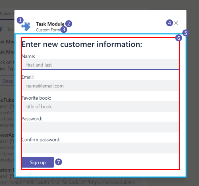
Here's what a dialog looks like when invoked from a bot:

A dialog includes the following as shown in the previous image:
Your app's
coloricon.Your app's
shortname.The dialog's title specified in the
titleproperty of the DialogInfo object.The dialog's close or cancel button. If the user selects this button, your app receives an
errevent. For more information, see example for submitting the result of a dialog.Note
It isn't possible to detect the
errevent when a dialog is invoked from a bot.The blue rectangle is where your web page appears if you're loading your own web page using the
urlproperty of the TaskInfo object. For more information, see Invoke and dismiss dialogs.If you're displaying an Adaptive Card using the
cardproperty of the TaskInfo object, the padding is added for you. For more information, see CSS for HTML or JavaScript dialogs.Adaptive Card buttons render after you select Sign up. When using your own page, create your own buttons. By design, the primary button style (solid) is applied to the last root action in an Adaptive Card. For all other actions, the default button style is applied.
Next step
See also
Platform Docs