Add canvas components to a custom page for your model-driven app
This article outlines the use of low-code canvas components to build custom UX for a custom page by utilizing shared canvas component library capability. For code first custom UX extensibility, see Add code components to a custom page for your model-driven app.
Important
Custom pages are a new feature with significant product changes and currently have a number of known limitations outlined in Custom Page Known Issues.
Note
Custom page currently supports a limited set of controls and only the currently supported controls should be used to create canvas components for the custom page.
Modern controls are currently only supported with custom pages and not with standalone canvas apps. Make sure that the modern control experimental setting is used only for component libraries used with custom pages.
Canvas components provide app makers the ability to create custom components in a low-code fashion. These components cannot only then be reused across custom pages and applications, but also can be centrally updated, packaged, and moved using Microsoft Dataverse solutions. More information: Create a component for canvas apps
Since custom page authoring is limited to only one page, canvas components can only be authored inside a component library. This is different from the standalone canvas apps, which have the ability to create components at the app level.
Create a canvas component using the component library
You can create a new component library or edit an existing one either from the Solutions area or the Component Libraries tab in the Apps area.
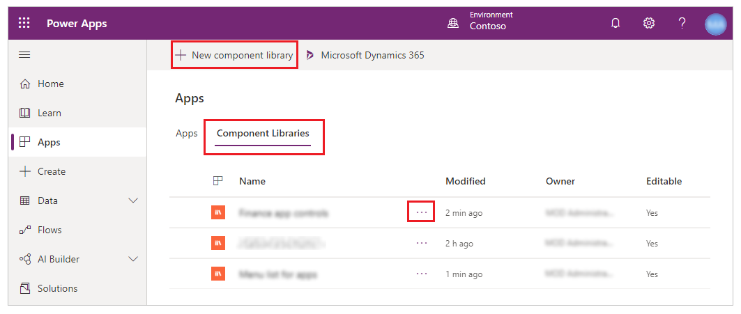
Create a canvas component for use in a custom page
This section explains how to create a canvas component that you can use in a custom page.
Enable modern controls for the component library
First, enable the Modern controls setting in the canvas app designer. To do this, go to File > Settings > Upcoming features > Experimental.
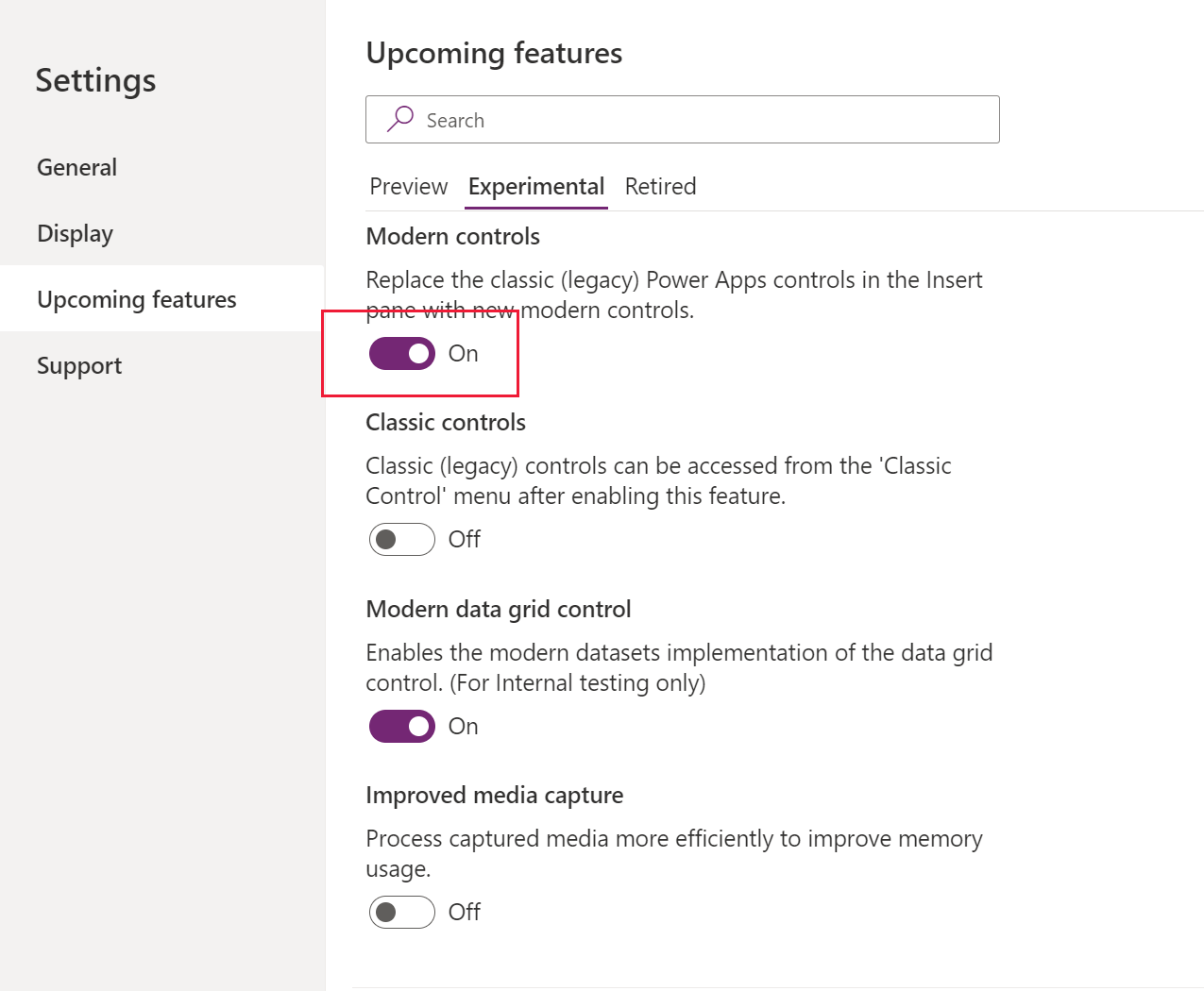
Make sure that only the supported set of controls are used to create components for custom page.
Create a canvas component
Once the modern controls are enabled, you can now create desired components inside the library and publish them once the components are ready.
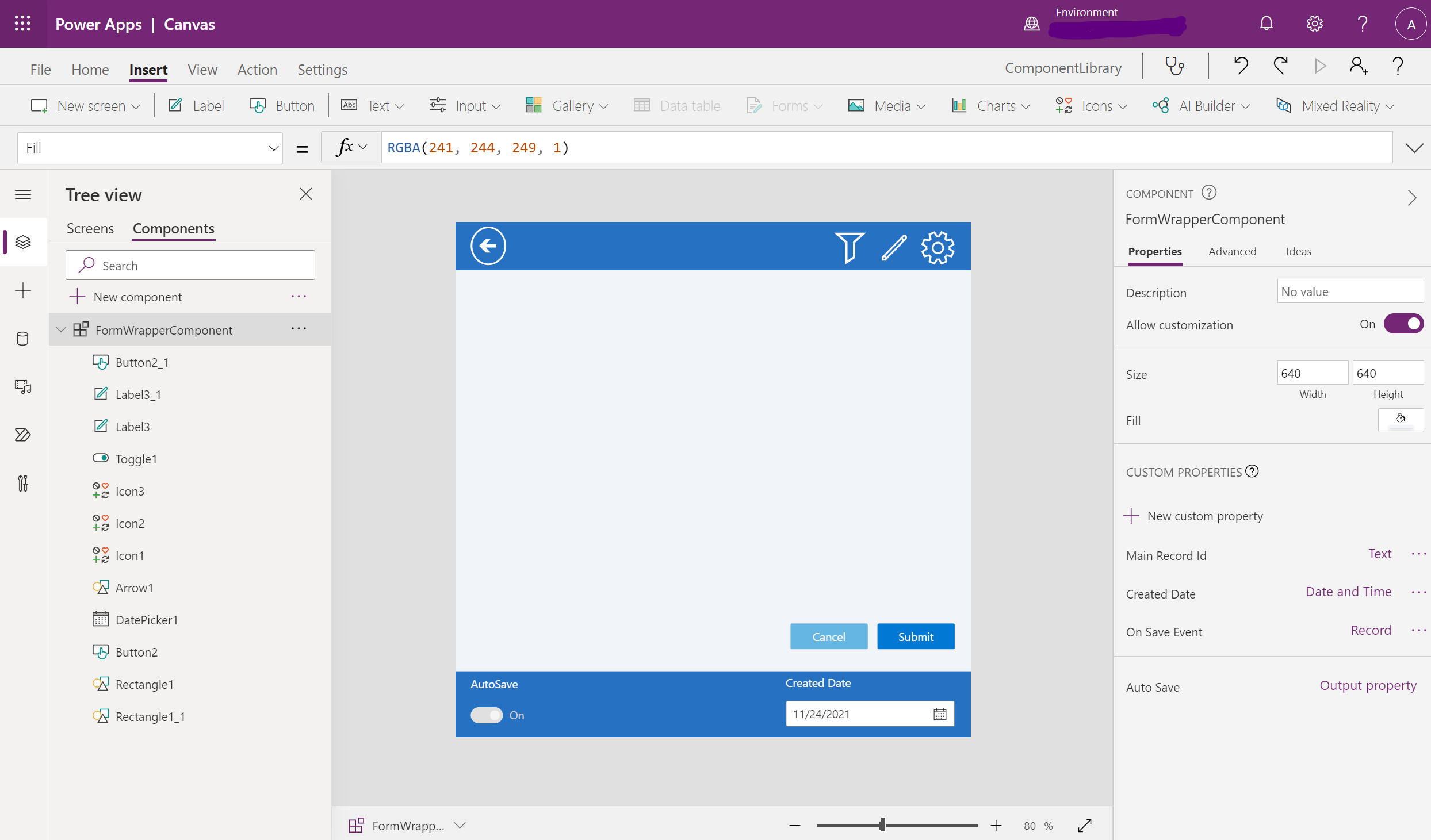
Import and use a canvas component in a custom page
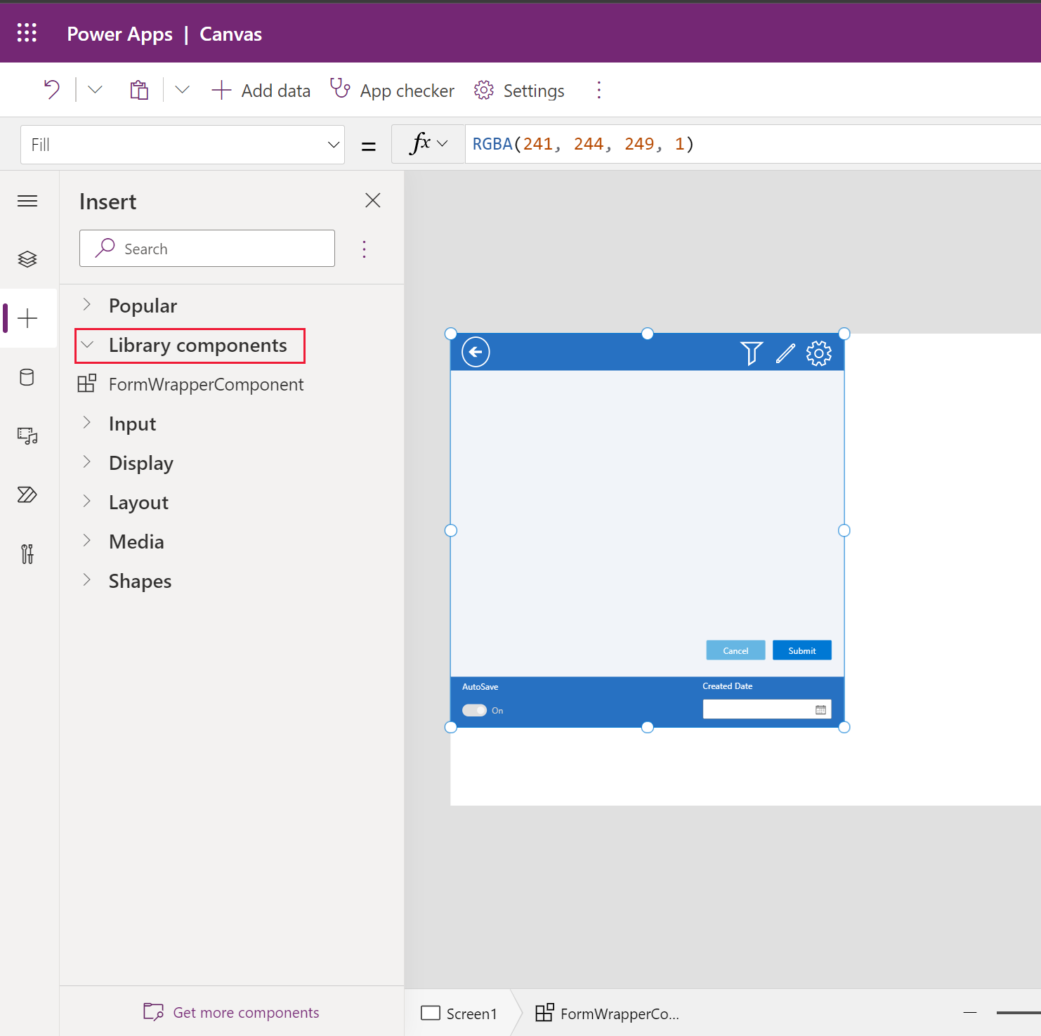
Custom pages can use the components from the canvas component library created or imported in the current environment. You can select Get more components at the bottom of the add control left navigation area.
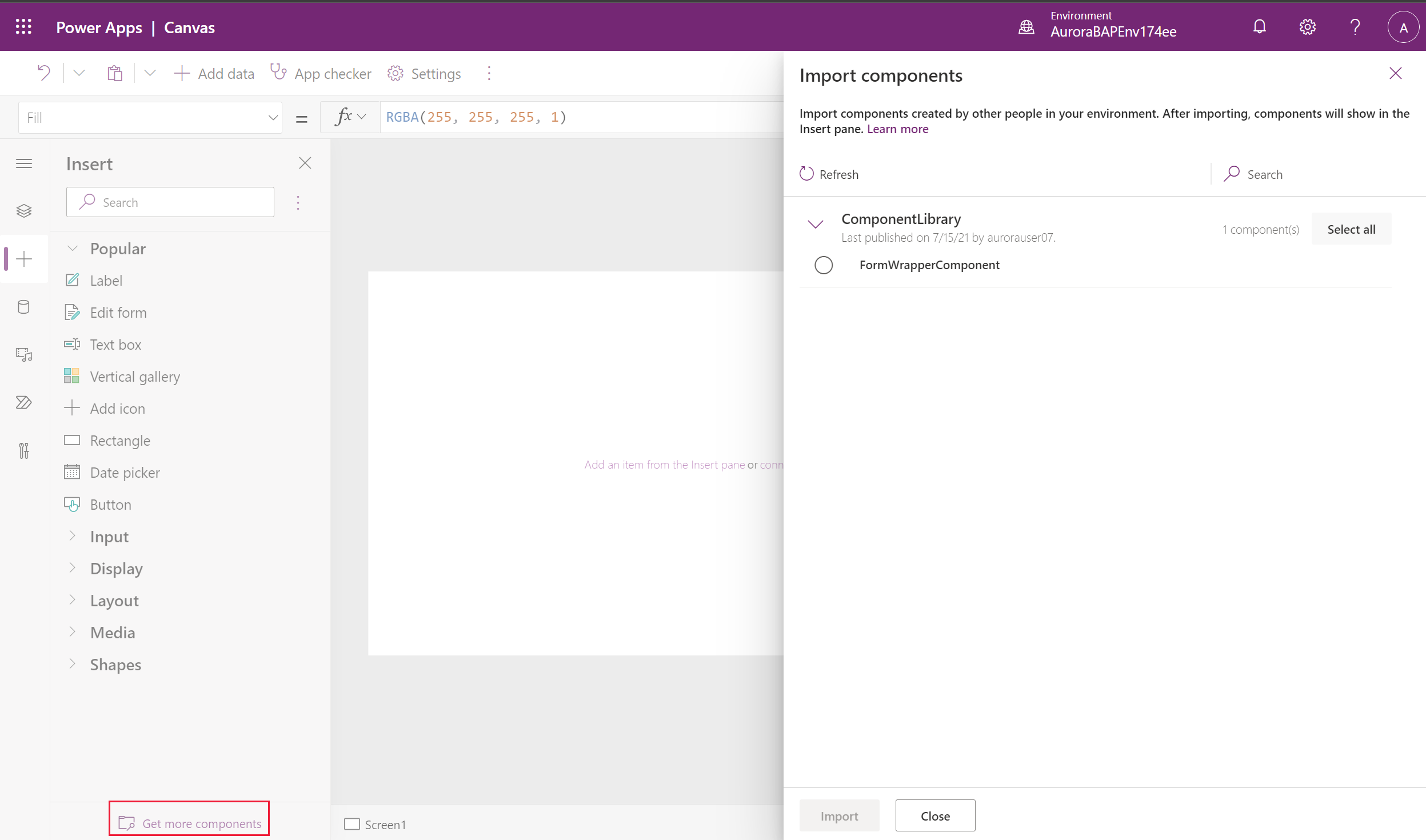
The canvas component is available under the Library components section and can be added to the custom page.
Component updates to the custom page
When the component is added to the custom page via the component library, it maintains the reference to the library. When the library owner publishes the newer library version with updated components, the custom page inline with the canvas app displays an update available message. This message is displayed when the custom page is opened for editing.
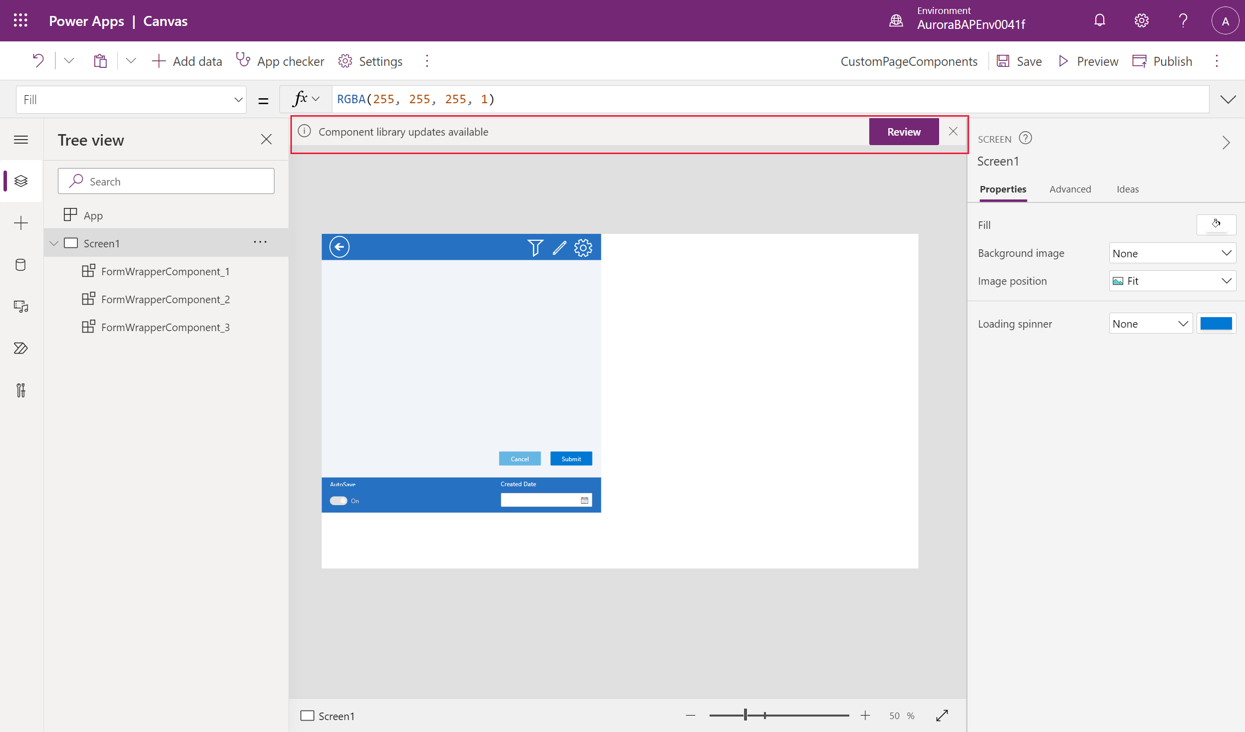
Select Review to review the updates, and then select ok to get the component refreshed with the latest changes from the canvas library.
Note
Individual custom pages present in a model-driven app should be opened individually for editing inside canvas app studio to get the latest updates from the shared component library.
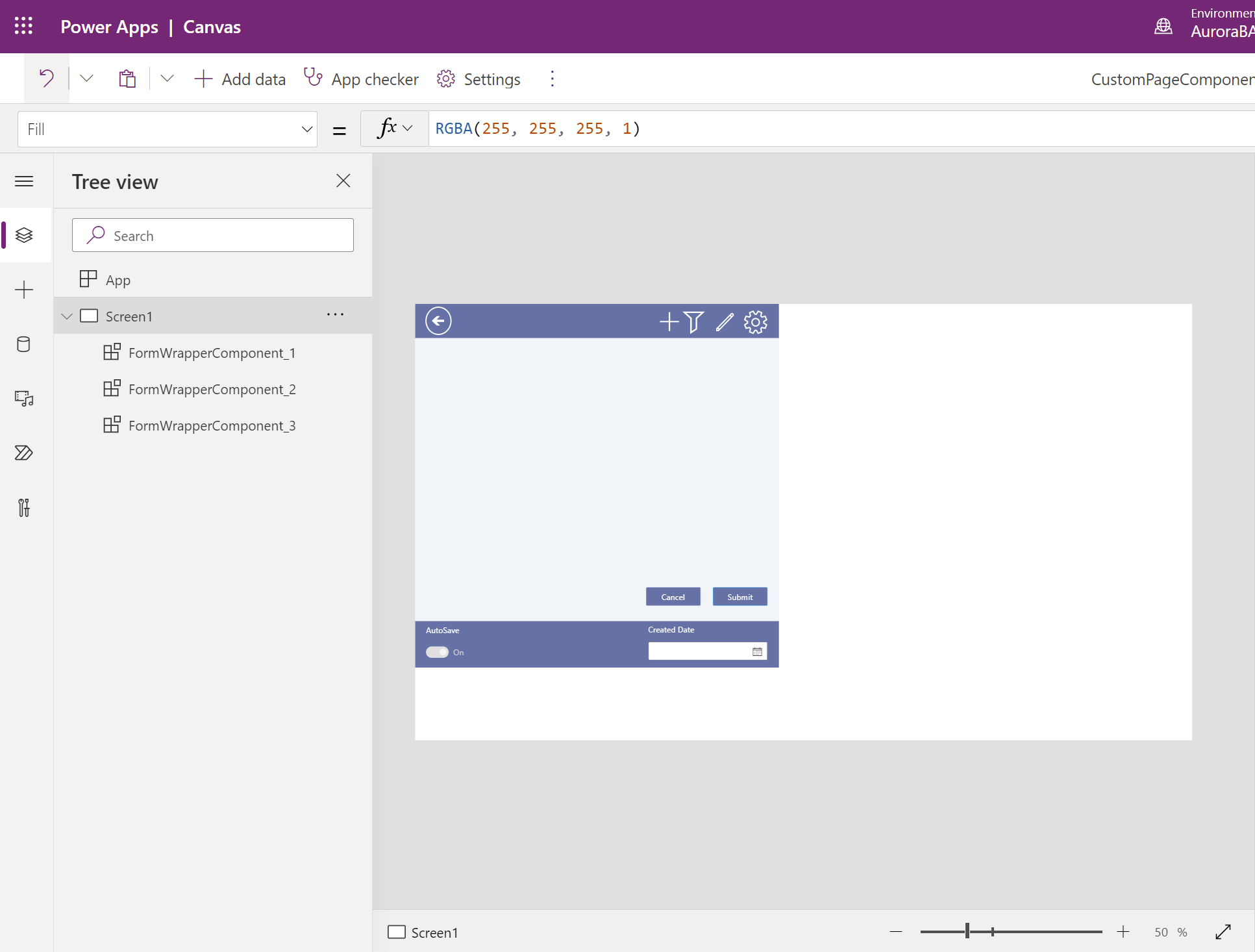
You can now publish the custom page and model-driven app to get the latest changes reflected.
Additional canvas component resources
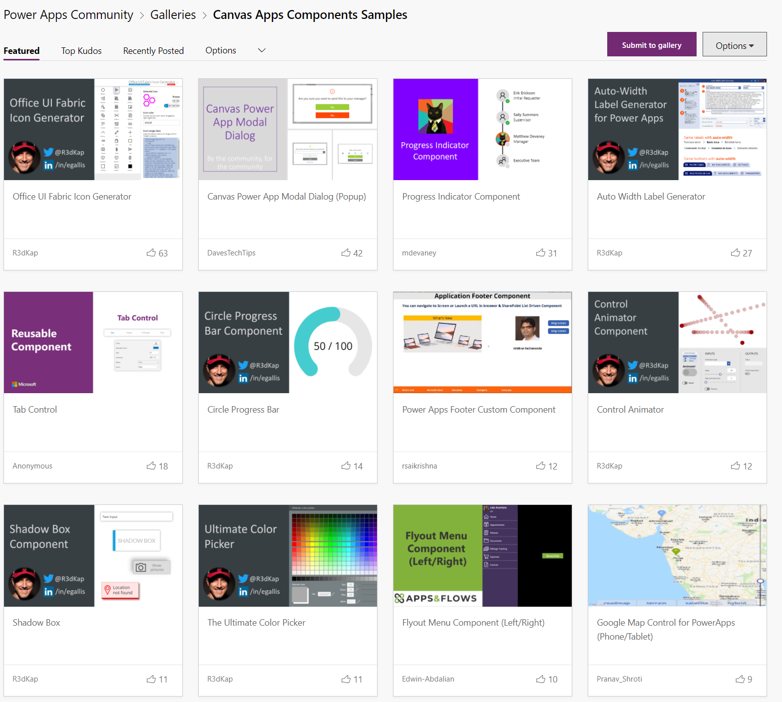
You can evaluate and use canvas component samples from Microsoft and other Power Apps community developers, which are hosted on the Canvas app components gallery.
See also
Model-driven app custom page overview
Add a custom page to your model-driven app