IT Spend Analysis sample for Power BI: Take a tour
Note
For an updated version of this sample, see Corporate Spend sample for Power BI: Take a tour.
The IT Spend Analysis built-in sample contains a dashboard, report, and semantic model that analyzes the planned vs. actual costs of an IT department. This comparison helps you understand how well the company planned for the year and investigate areas with huge deviations from the plan. The company in this example goes through a yearly planning cycle, and then quarterly it produces a new latest estimate (LE) to help analyze changes in IT spend over the fiscal year.
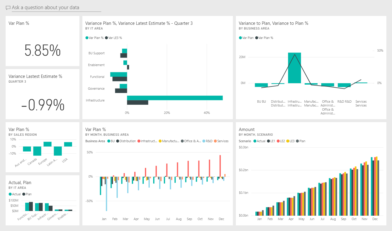
This sample is part of a series that shows how you can use Power BI with business-oriented data, reports, and dashboards. The company obviEnce created this sample using real, anonymized data. The data is available in several formats: built-in sample in the Power BI service, .pbix Power BI Desktop file, or Excel workbook. See Samples for Power BI.
This tour explores the IT Spend Analysis built-in sample in the Power BI service. Because the report experience is similar in Power BI Desktop and in the Power BI service, you can also follow along by using the sample .pbix file in Power BI Desktop.
You don't need a Power BI license to explore the samples in Power BI Desktop. You just need a Fabric free license to explore the sample in the Power BI service, and save it to your My workspace.
Before you can use the sample, get the sample in one of the following ways:
- Get the built-in sample in the service.
- Download the .pbix file.
- Download the Excel workbook.
Open the Power BI service (
app.powerbi.com), and select Learn in the left navigation.On the Learning center page, under Sample reports, scroll until you see the IT Spend Analysis Sample.
Select the sample. It opens in Reading mode.
Power BI imports the built-in sample, adding a new dashboard, report, and semantic model to your current workspace.

Select the dashboard to view the sample dashboard.
Alternatively, you can download the IT Spend Analysis sample as a .pbix file, which is designed for use with Power BI Desktop.
After you open the file in Power BI Desktop, select File > Publish > Publish to Power BI or choose Publish in the Home ribbon.
In the Publish to Power BI dialog, choose a workspace and then Select.
In the Power BI service, in your workspace, scroll down to the IT Spend Analysis Sample report and select to open.
From the More options (...) menu, select Pin to a dashboard. Select New dashboard, enter a name, and choose Pin live.
The dashboard that you create this way isn't the same as the sample dashboard created by the built-in sample. You can still use Q&A and make changes to your dashboard.
If you want to view the data source for this sample, it's also available as an Excel workbook. To see the raw data, enable the Data Analysis add-ins, and then select Power Pivot > Manage.
If you want to get and use the Excel file in the Power BI service, follow these steps:
Download the sample from Power BI Desktop samples. The file is called IT Spend Analysis Sample-no-PV.xlsx.
Open the file in Excel and then select File > Publish > Publish to Power BI.
Select a workspace, such as My workspace, and choose Export.
There are different ways to work with Excel files. For more information, see Explore the Excel samples in Excel.
In the Power BI service, the exported data appears as a semantic model in the selected workspace. Select More options (...) > Auto-create report.
Select Save, enter a name for your report, and then choose Save.
From the More options (...) menu, select Pin to a dashboard. Select New dashboard, enter a name, and choose Pin live.
The dashboard that you create this way isn't the same as the sample dashboard created by the built-in sample. You can still use Q&A and make changes to your dashboard.
If you used the built-in sample, the two numbers tiles on the left of the dashboard, Var Plan % and Variance Latest Estimate % Quarter 3, give you an overview of how well we're doing against the plan and against the latest quarterly estimate (LE3 = latest estimate quarter 3). Overall, we're about 6% off the plan. Let's explore the cause of this variance: when, where, and in which category.
When you select the Var Plan % by Sales Region dashboard tile, it displays the YTD IT Spend Trend Analysis page of the IT Spend Analysis Sample report. At a glance, we see that there's positive variance in the United States and Europe and negative variance in Canada, Latin America, and Australia. The United States has about 6% +LE variance and Australia has about 7% -LE variance.
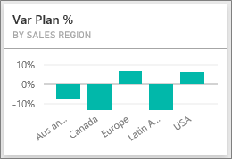
However, just looking at this chart and drawing conclusions can be misleading. We need to look at actual dollar amounts to put things in perspective.
Select Aus and NZ in the Var Plan % by Sales Region chart, and then observe the Var Plan by IT Area chart.
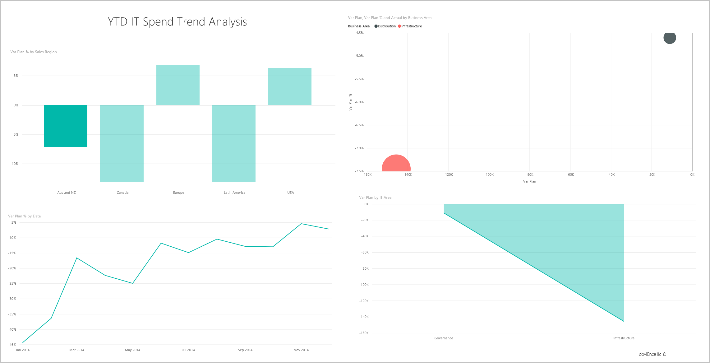
Now select USA. Notice that Australia and New Zealand are a very small part of our overall spending as compared to the United States.
Next, explore which category in the USA is causing the variance.
Return to the dashboard and look at the Variance Plan %, Variance Latest Estimate % - Quarter 3 dashboard tile.
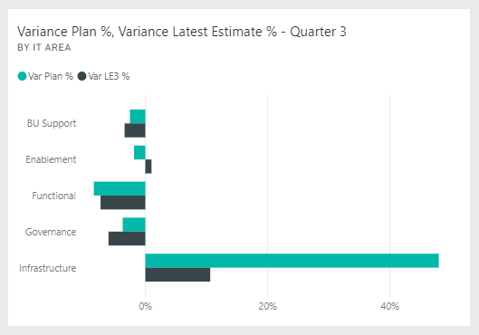
Notice that the Infrastructure area stands out with a large positive variance to the plan.
Select this tile to open the report and view the YTD Spend by Cost Elements page.
Select the Infrastructure bar in the Var Plan % and Var LE3 % by IT Area chart on the lower right, and observe the variance-to-plan values in the Var Plan % by Sales Region chart on the lower left.
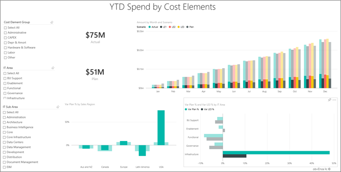
Select each name in turn in the Cost Element Group slicer to find the cost element with the largest variance.
With Other selected, select Infrastructure in the IT Area slicer and select subareas in the IT Sub Area slicer to find the subarea with the largest variance.
Notice the large variance for Networking. Apparently the company decided to give its employees phone services as a benefit, even though this move wasn't planned for.
In the dashboard, select Ask a question about your data.
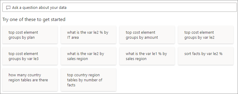
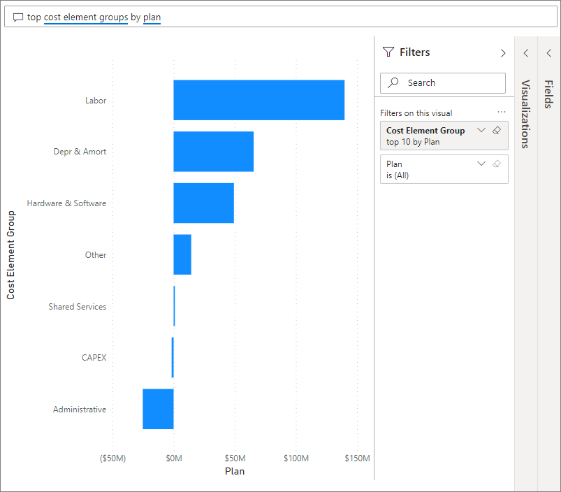
From the Try one of these to get started list on the left side, select top cost element groups by plan.
In the Q&A box, clear the previous entry and enter show IT areas, var plan % and var le3 % bar chart.
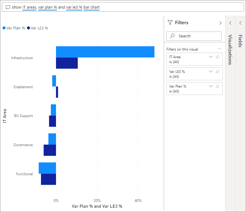
In the first IT area, Infrastructure, the percentage has changed drastically between the initial variance plan and the variance plan latest estimate.
Select the Plan Variance Analysis page.
In the Var Plan and Var Plan % by Business Area chart on the left, select the Infrastructure column to highlight infrastructure business area values in the rest of the page.
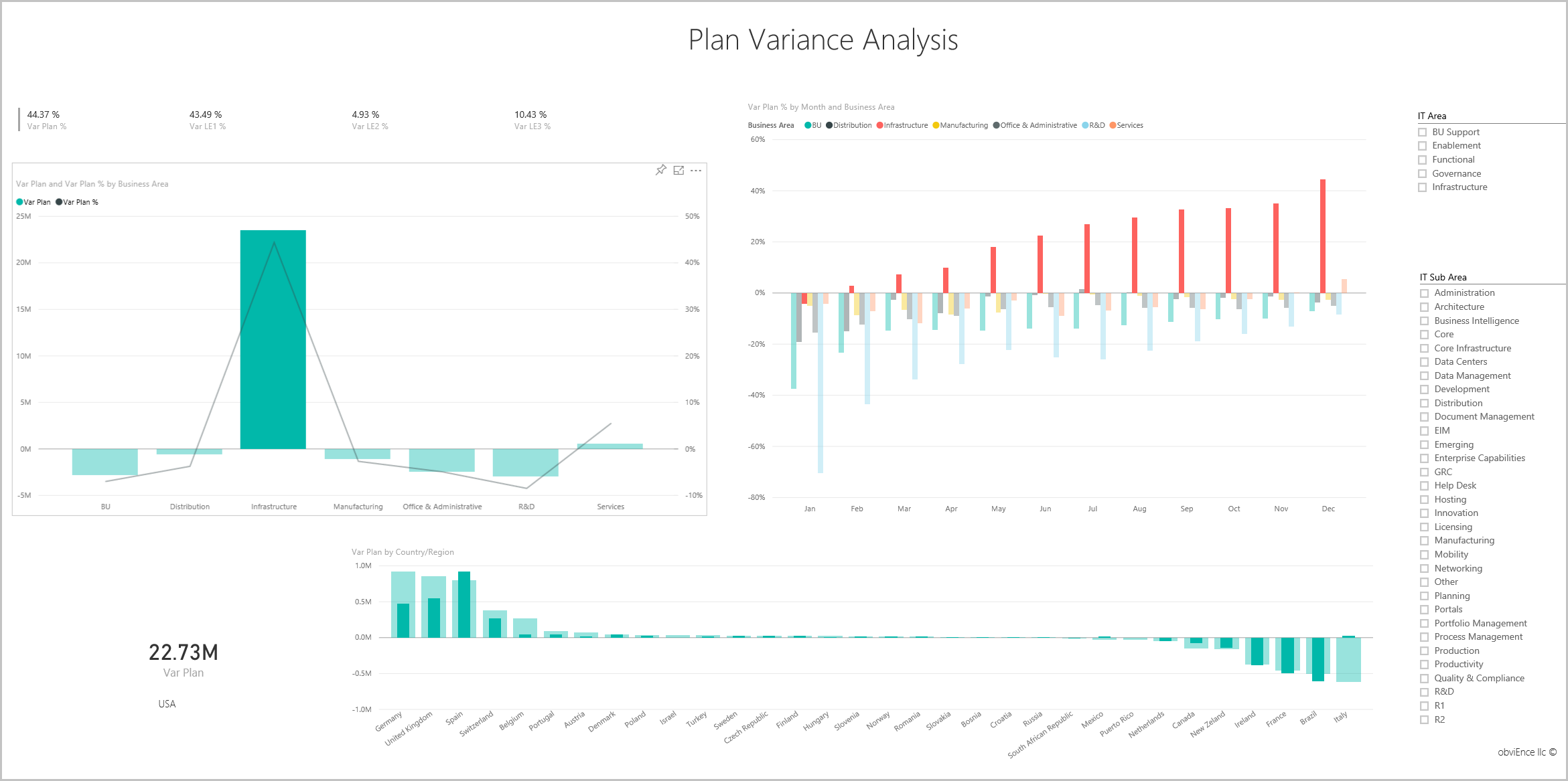
Notice in the Var plan % by Month and Business Area chart that the infrastructure business area started a positive variance in February. Also, notice how the variance-to-plan value for that business area varies by country or region, as compared to all other business areas.
Use the IT Area and IT Sub Area slicers on the right to filter the values in the rest of the page and to explore the data.
Select Edit in the black Power BI header bar to explore in the editing view:
- See how the pages are made, the fields in each chart, and the filters on the pages.
- Add pages and charts, based on the same data.
- Change the visualization type for each chart.
- Pin charts of interest to your dashboard.
This environment is a safe one to play in, because you can choose not to save your changes. But if you do save them, you can always return to the Learning center for a new copy of this sample.
We hope this tour has shown how Power BI dashboards, Q&A, and reports can provide insights into sample data. Now it's your turn. Connect to your own data. With Power BI, you can connect to a wide variety of data sources. To learn more, see Get started creating in the Power BI service.