Building accessible Windows Universal apps: Other important accessibility considerations
This series of posts describes how to avoid some common accessibility bugs when building Windows Universal apps. This post focuses on specific bugs which affect customers who use your app’s visuals.
Do “Other” bugs matter?
I was hesitant about using the term “Other” here. “Other” might imply that these considerations are somehow less important than those already discussed in this series of posts. But the bugs described here are just as important. They can lead to your customers being blocked from accessing critical functionality in your app, and even induce seizures or sickness.
I only use the term “Other” here, to help me group certain types of bugs together, and to reduce the chance that I forget to check something when looking for accessibility bugs.
The Demo app page
The demo app spotlights three types of bugs which I’ve seen in apps under development. These bugs are:
1. The app doesn’t respect the customer’s wishes to suppress UI animations.
2. The app doesn’t respect the customer’s wishes around transient UI timeout.
3. Important text is clipped and unreadable when customers have increased the size of text.
Figure 1: The “Other” page in the demo app.
Respecting your customer’s wishes to suppress UI animations
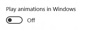
Some of your customers will set the “Play animations in Windows” setting to “Off” in the Ease of Access "Other options" Settings.
Figure 2: The “Play animations in Windows” toggle switch in the Ease of Access Settings.
Your customer may have turned off animations due to the animations’ potential to induce seizures or a feeling of sickness, or for some other reason. But whatever the reason, it’s important that your app respects your customer’s wishes.
So before you animate your UI, you’ll want to check the Ease of Access setting through the UISettings class. The demo app uses the code below to determine whether it should animate a big square when the “Other” page is loaded.
using Windows.UI.ViewManagement;
…
var uiSettings = new UISettings();
if (uiSettings.AnimationsEnabled)
{
// Animations are enabled, so animate the square…
}
Figure 3: A big square animating in the demo app, when the UISettings AnimationsEnabled setting is true.
Respecting your customer’s wishes around transient UI timeout
Sometimes your app may present important information and controls for a limited time. Perhaps you’ve popped up an automatic notification or some flyout in response to your customer’s actions. Some of your customers will be fine with the default timeout period that you’ve set on your transient UI, but many will not be. Those customers may need longer to really understand all the information that you’re presenting in your UI, or to interact with whatever controls you might be presenting.
As such, many customers will have set a timeout that best suits their needs, through the “Show notifications for” setting in the Ease of Access Settings.
Figure 4: The “Show notification for” dropdown in the Ease of Access Settings.
So whenever you present your transient UI, you’ll want to keep that UI accessible to your customers for the period accessed through the UISettings class. The demo app uses the code below to determine how long a popup should remain open when a button is invoked on the “Other” page.
using Windows.UI.ViewManagement;
using Windows.UI.Xaml;
…
private DispatcherTimer timer;
private void ShowPopupButton_Click(object sender, RoutedEventArgs e)
{
// The customer's invoked the Show Popup button.
// If the popup isn't already open, open it now.
if (!StandardPopup.IsOpen)
{
StandardPopup.IsOpen = true;
}
}
private void StandardPopup_Opened(object sender, object e)
{
// The popup is being opened. Make sure it stays open
// for as long as my customer wants it to stay open.
var uiSettings = new UISettings();
// Start a timer, and close the popup when the timer fires.
this.timer.Interval = new TimeSpan(0, 0, (int)uiSettings.MessageDuration);
this.timer.Start();
}
private void Timer_Tick(object sender, object e)
{
// The timer's fired. If the popup's still open, close it now.
if (StandardPopup.IsOpen)
{
StandardPopup.IsOpen = false;
}
}
private void ClosePopupClicked(object sender, RoutedEventArgs e)
{
// The customer's invoked the Close button on the popup. If the popup hasn't
// happened to have automatically closed around the same time, close it now.
if (StandardPopup.IsOpen)
{
StandardPopup.IsOpen = false;
}
}
private void StandardPopup_Closed(object sender, object e)
{
// The popup's closing. If we still have a timer running
// for dismissing the popup, stop the timer now.
this.timer.Stop();
}
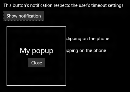
The demo app’s transient UI will now stay accessible for a period sufficient for my customer to consume the information presented by the UI, and to interact with whatever controls are contained within that UI.
Figure 5: The demo app’s transient UI respecting my customer’s choice of timeout for transient UI.
And as always, do consider whether you need to build your own custom notification UI at all. Transient UI presented by classes available in the UI framework will respect your customer’s choice of notification timeout. For example, I just added a ToolTipService.ToolTip to the “Show notification” button. Sure enough, the tooltip that appears when I tab to the button, respects the current “Show notifications for” setting.
Figure 6: Tooltip respecting the current “Show notifications for” setting.
Don’t block your customer from accessing critical information by presenting clipped text
Many of your customers will find the default size of the UI you present, to be absolutely perfect. They’ll be able to consume a lot of valuable information at a glance. However, many of your customers will not find the UI usable at all at its default size. You have a huge number of customers who will want your UI to appear at a size larger than whatever default size your app and Windows might present.
Over the years, Windows has supported a variety of settings which your customers can use to increase the size of things shown in apps. A really helpful setting on the Windows desktop today is the “Change the size of text, apps, and other items” setting, accessible through the Display Settings.
By changing this setting, your customers can make everything in your app’s UI larger and easier for them to consume.
Figure 7: The “Change the size of text, apps, and other items” setting in the Display Settings.
On the phone, your customer can change the “Text size” setting in the Ease of Access Settings, to have text in your app shown at a size that works best for them.
Figure 8: The “Text size” setting on the phone.
But this is where things get interesting. At any given moment, your app is probably presenting lots of valuable information. On a small screen, there’s less room for all that information than on a large screen. You’ll already have accounted for this by designing your UI to look great at different screen sizes and orientations. But sometimes those designs for the small screen, assumed that text would be shown at a specific size. There just may not be room on the screen for all that information when the text gets larger.
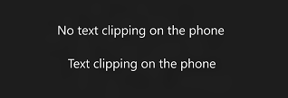
The image below shows two text strings in the demo app, with text being shown at its default size. Both text strings look just super, at least to my customers who find that text size easy to work with.
Figure 9: Two text strings shown at the default text size in the demo app.
Say my customer now goes to the Ease of Access Text Size setting, and cranks it up to its maximum. Back in the demo app, one of the text strings is a bigger version of what it was before, and still looks just super. But the other string is a disaster. It’s been clipped both horizontally and vertically, and provides a miserable experience for my customer.
Figure 10: Two text strings shown at the maximum text size in the demo app.
The demo app shows the first string perfectly, because the app doesn’t impose any fixed dimensions for the TextBlock showing the text, (or for any of the elements containing the TextBlock). But the broken string is presented by a TextBlock which has a hard-coded width and height, and those dimensions don’t account for the text being larger than default.
You might feel this bug isn’t likely to occur. After all, the UI framework has great support for the dimensions of elements and containers growing or shrinking as the size of data within those elements and containers change. But it’s easy for devs and designers to focus on absolute dimensions when considering the app visuals, and to forget about how many customers will change the text size settings.
An additional challenge for the app here is that often the screen just won’t be large enough to show all the text at the largest size. So this is where you need to get creative, and decide what the best experience is for your customer. You’ll certainly want to avoid text being clipped vertically. Vertically clipped text will often make the text useless to your customer, and even if it is still legible, it looks really unprofessional. So sometimes you may allow your text to wrap to another line if you feel there’s room for that, and sometimes you feel the best experience is to truncate the text horizontally.
In fact, the demo app truncates another string elsewhere on the “Other” page, and asks the UI framework to present an ellipsis to let my customer know that the text has been truncated.
Figure 11: The UI framework showing an ellipsis at the end of some truncated text on the page.
All the demo app has to do to get the ellipsis to appear if the text is truncated, is use the following XAML markup with the TextBlock containing the text.
TextTrimming="CharacterEllipsis"
The TextTrimming property has other handy values too.
So while the mix of screen size and text size impacts the amount of text that the app can show at any given time, my customer still has a great experience. No text is clipped such that characters are only partially shown, and my customer is informed where some text could not be displayed.
And having said all that, I could have also added a ScrollViewer to the page if I’d wanted to. In some cases, I might have chosen to have no text truncated at all. Instead, I’d allow all text to wrap across multiple lines, and then show it all inside a ScrollViewer. This would make it easy for my customers to scroll the page up and down to bring all the text into view.
Summary
While you’re considering all the ways in which your customers want to interact with your app, take a look at the device’s Ease of Access Settings.
Taking some time to consider how the variety of Ease of Access settings relates to your app’s UI, will help your app avoid some common accessibility bugs hit during development, and will prevent these bugs from blocking your customers from being able to leverage the full power of your app.
Whether your app is a productivity app, a communication app, a game, or something else, it can reach millions of potential customers through the Windows Store, and it has the potential to impact the quality of so many people’s lives. Please do consider how everyone can benefit from your work, regardless of how they interact with their device.
References
XAML
UISettings.AnimationsEnabled
UISettings.MessageDuration
UISettings
TextTrimming
WinJS
UISettings.animationsEnabled
UISettings.messageDuration
UISettings
WinJS.UI.isAnimationEnabled
WinJS.UI.enableAnimations
WinJS.UI.disableAnimations
Posts in this series
Building accessible Windows Universal apps: Introduction
Building accessible Windows Universal apps: Keyboard accessibility
Building accessible Windows Universal apps: Colors and contrast
Building accessible Windows Universal apps: Programmatic accessibility
Building accessible Windows Universal apps: Other important accessibility considerations


