Theming
Theming is a mechanism by which a consistent look and feel can be applied to all the components on a page. For now, this means sharing a color scheme across the entire page.
Note
A Theme Json object is a code block containing a set of colors. Creator Kit components are designed to accept the Theme code block generated specifically by the Fluent Theme Designer app, and map its color values to component properties. Save the object as a variable in your app (as described in the following instructions). Although a Theme Json object is designed to be easily referenced by kit components, any component outside of the kit can also reference these values, which helps easily maintain consistency across all app components.
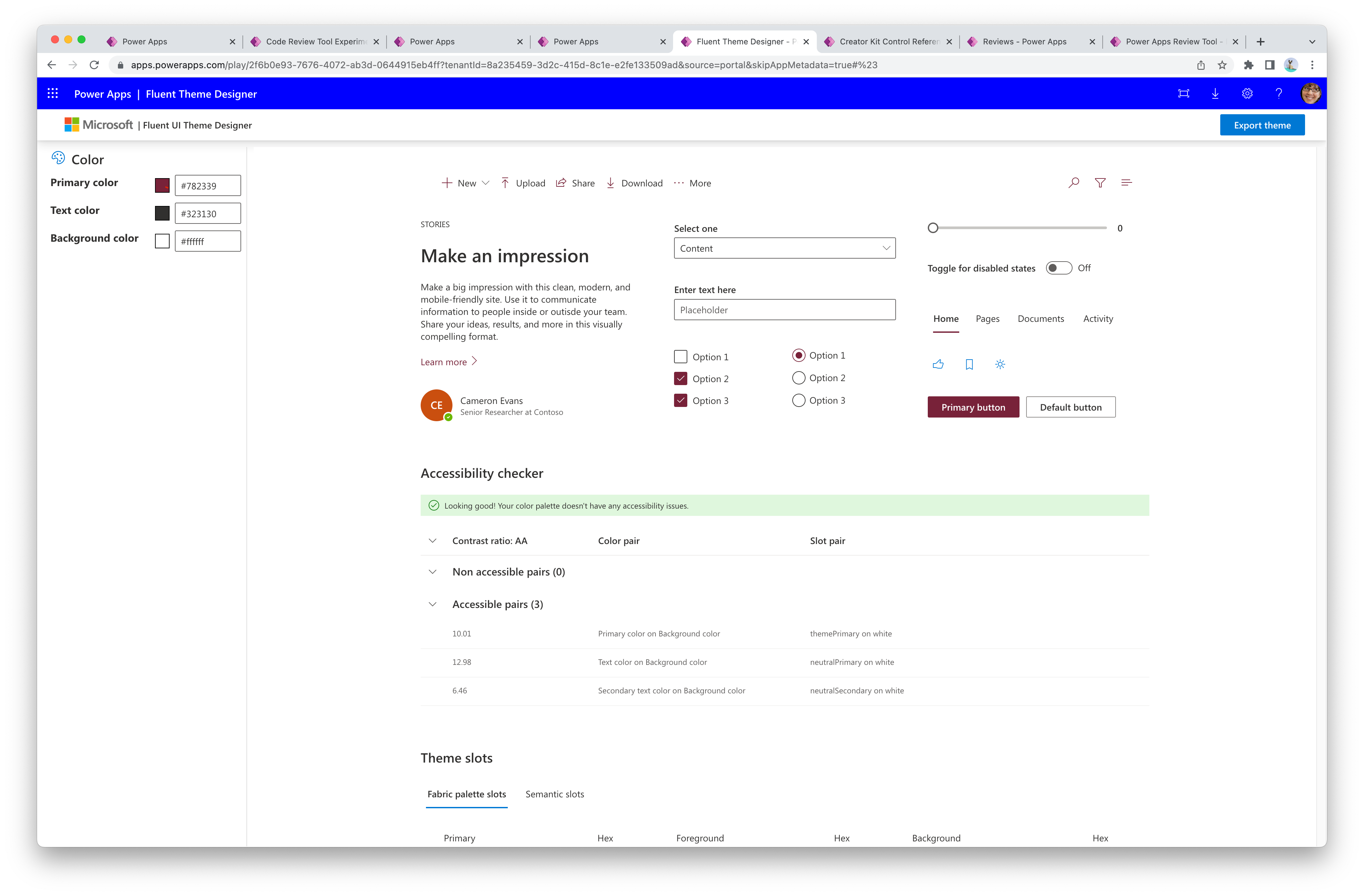
Use the Fluent Theme Designer app (provided in the CreatorKitReferences(Canvas) solution) to generate a theme Json object that can be referenced by Creator Kit components.
Play the Fluent Theme Designer app.
Modify the Primary color, Text color, and Background color values.

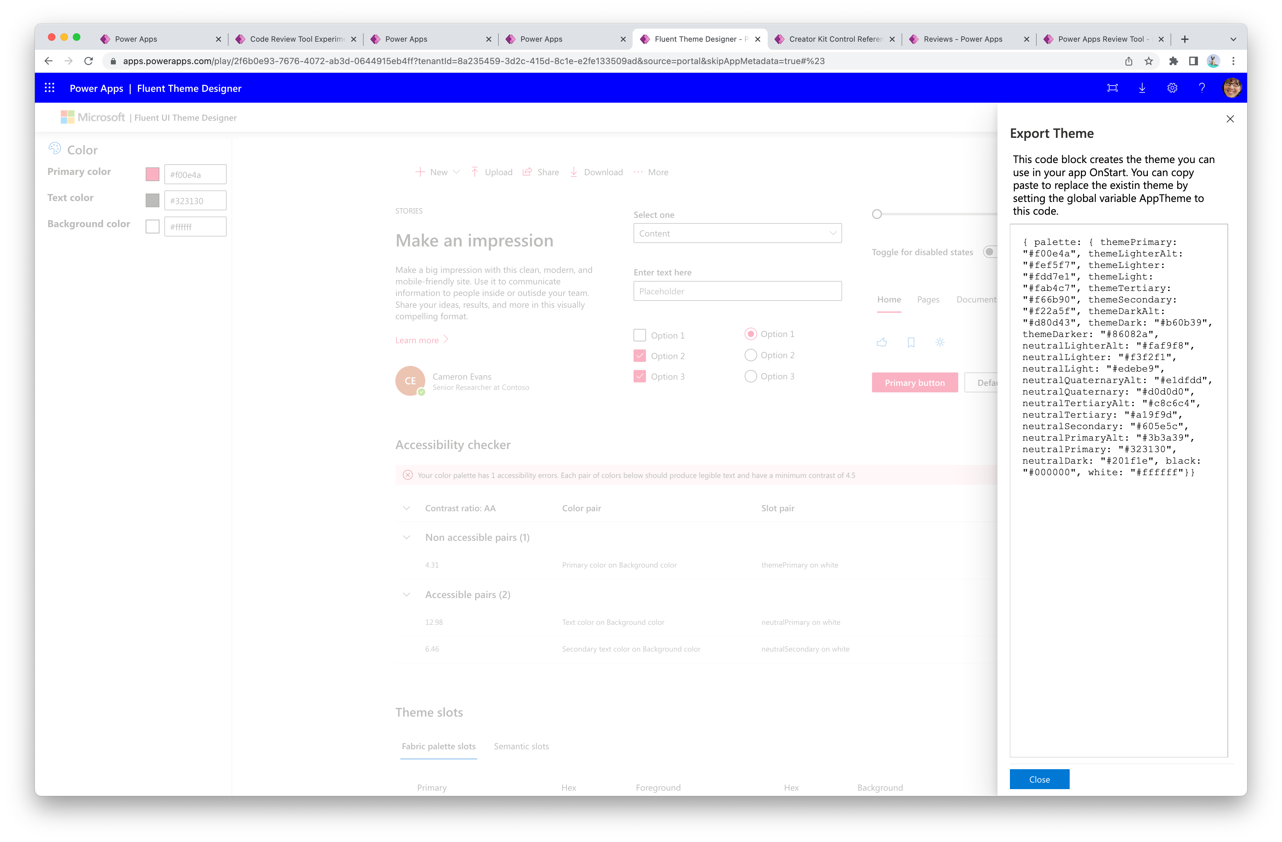
In the upper-right corner, select Export theme to generate the Power Fx expression version of the Theme JSON, and then copy the value from the panel.

Save the theme as a global variable in an app (next section).
The below Power Fx formula shows an example of how to set a global variable using the output from the Fluent UI Theme Designer app. This variable can be referenced by all components in the app.
- Place this Power Fx formula to run on the app's
OnStartproperty. - Replace the value between the
/* THEME OBJECT */comments with your own theme object from the designer.
Set(
    AppTheme,
    /* START THEME OBJECT */
    {
        palette: {
            themePrimary: "#0078d4",
            themeLighterAlt: "#eff6fc",
            themeLighter: "#deecf9",
            themeLight: "#c7e0f4",
            themeTertiary: "#71afe5",
            themeSecondary: "#2b88d8",
            themeDarkAlt: "#106ebe",
            themeDark: "#005a9e",
            themeDarker: "#004578",
            neutralLighterAlt: "#faf9f8",
            neutralLighter: "#f3f2f1",
            neutralLight: "#edebe9",
            neutralQuaternaryAlt: "#e1dfdd",
            neutralQuaternary: "#d0d0d0",
            neutralTertiaryAlt: "#c8c6c4",
            neutralTertiary: "#a19f9d",
            neutralSecondary: "#605e5c",
            neutralPrimaryAlt: "#3b3a39",
            neutralPrimary:"#323130",
            neutralDark: "#201f1e",
            black: "#000000",
            white: "#ffffff"
        }
    }
    /* END THEME OBJECT */
);
Set(
    AppThemeJson,
    JSON(
        AppTheme,
        JSONFormat.IndentFour
    )
);
A theme can be passed to the Theme property of each component.
- Canvas components must reference the
AppThemevariable. - Code components must reference the
AppThemeJsonvariable.
Any of the core components in canvas apps or custom pages can reference elements from the AppTheme object (cannot be Json formatted). These controls must reference the desired palette properties and be cast as a Color data type using the ColorValue() formula.
Example Button.Fill Power Fx formula referencing the primary color of the theme:
ColorValue(AppTheme.palette.themePrimary)
